
간단한 막대 그래프
QML 애플리케이션에서 Bars3D 사용.
'간단한 막대 그래프'에서는 Bars3D 와 QML을 사용하여 간단한 3D 막대 그래프를 만드는 방법을 보여줍니다.
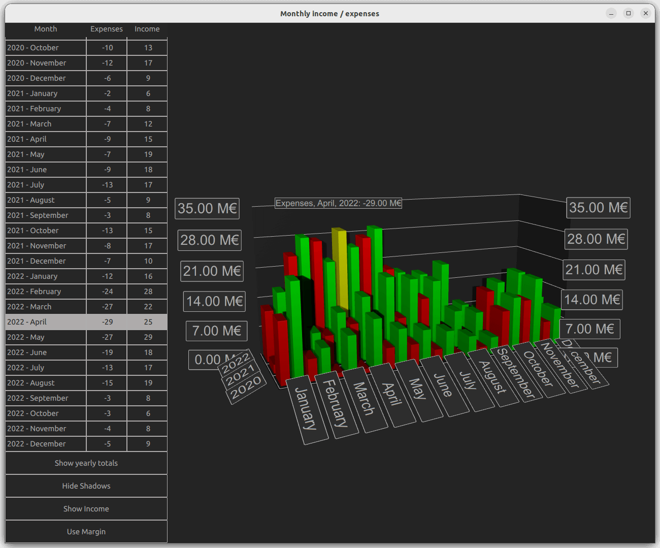
다음 섹션에서는 시리즈를 전환하고 한 번에 두 개 이상의 시리즈를 표시하는 방법을 설명합니다. 기본적인 QML 애플리케이션 기능에 대한 자세한 내용은 간단한 산점도 그래프를 참조하십시오.
예제 실행
다음 경로에서 예제를 실행할 수 있습니다.
- Qt Creator
Welcome 모드를 열고 Examples 에서 예제를 선택하십시오. 자세한 내용은 Qt Creator: 튜토리얼: 빌드 및 실행을 참조하십시오.
- Qt Extension for Visual Studio Code
Command Palette 에서 Qt: Open Qt examples 명령을 실행하고 목록에서 예제를 선택하십시오. 자세한 내용은 Qt Extension for Visual Studio Code: 튜토리얼: 빌드 및 실행을 참조하십시오.
데이터
예제 데이터 세트는 가상의 회사가 수년에 걸쳐 기록한 월별 수입 및 지출 내역입니다. 이 데이터는 Data.qml 의 목록 모델에서 다음과 같이 정의됩니다:
ListModel {
    id: dataModel
    ListElement{ timestamp: "2016-01"; expenses: "-4";  income: "5" }
    ListElement{ timestamp: "2016-02"; expenses: "-5";  income: "6" }
    ListElement{ timestamp: "2016-03"; expenses: "-7";  income: "4" }
    ...
각 데이터 항목에는 타임스탬프, 수입, 지출이라는 세 가지 역할이 있습니다. 타임스탬프 값의 형식은 <four digit year>-<two digit month> 입니다. 일반적으로 연도와 월을 막대 그래프의 행과 열에 매핑하지만, 값으로 표시할 수 있는 것은 수입 또는 지출 중 하나뿐입니다.
이제 이 데이터를 Bars3D 그래프에 추가해 보겠습니다. 그래프 내부에 두 개의 Bar3DSeries 을 생성하고, 먼저 수입 시리즈부터 시작합니다:
Bar3DSeries {
    id: barSeries
    itemLabelFormat: "Income, @colLabel, @rowLabel: @valueLabel"
    baseGradient: barGradient

    ItemModelBarDataProxy {
        id: modelProxy
        itemModel: graphData.model
        rowRole: "timestamp"
        columnRole: "timestamp"
        valueRole: "income"
        rowRolePattern: /^(\d\d\d\d).*$/
        columnRolePattern: /^.*-(\d\d)$/
        rowRoleReplace: "\\1"
        columnRoleReplace: "\\1"
        multiMatchBehavior: ItemModelBarDataProxy.MultiMatchBehavior.Cumulative
    }
    ...
데이터는 시리즈 내의 ItemModelBarDataProxy 의 itemModel 속성에 연결됩니다. valueRole 의 경우, 원하는 값이 포함된 income 필드를 지정합니다. 연도와 월은 동일한 필드에 모두 포함되어 있으므로 이를 추출하는 과정이 조금 더 복잡합니다. 이러한 값을 추출하려면 rowRole 및 columnRole 모두에 대해 timestamp 필드를 지정하십시오. 또한, 각 역할에 대해 필드 내용의 올바른 부분을 추출할 수 있도록 해당 역할에 대한 검색 패턴과 치환 규칙을 지정하십시오. 검색 패턴은 일반적인 JavaScript 정규식이며, 치환 규칙은 정규식과 일치하는 필드 내용을 무엇으로 치환할지 지정합니다. 이 경우, 필드 내용 전체를 행과 열 모두에서 첫 번째로 캡처된 부분 문자열인 연도 또는 월로만 대체합니다. 정규 표현식을 사용한 대체 기능에 대한 자세한 내용은 QString::replace(const QRegExp &rx, const QString &after) 함수 설명서를 참조하십시오.
multiMatchBehavior 속성은 여러 항목 모델 항목이 동일한 행/열 조합과 일치하는 경우 어떻게 처리할지 지정합니다. 이 경우 해당 값들을 합산합니다. 항목 모델에 중복된 달이 없으므로, 각 달의 값을 표시할 때는 이 속성이 아무런 영향을 미치지 않습니다. 하지만 나중에 연간 합계를 표시하고자 할 때 이 속성이 중요해집니다.
그런 다음, 지출에 대한 또 다른 시리즈를 추가합니다:
Bar3DSeries {
    id: secondarySeries
    visible: false
    itemLabelFormat: "Expenses, @colLabel, @rowLabel: -@valueLabel"
    baseGradient: secondaryGradient

    ItemModelBarDataProxy {
        id: secondaryProxy
        itemModel: graphData.model
        rowRole: "timestamp"
        columnRole: "timestamp"
        valueRole: "expenses"
        rowRolePattern: /^(\d\d\d\d).*$/
        columnRolePattern: /^.*-(\d\d)$/
        valueRolePattern: /-/
        rowRoleReplace: "\\1"
        columnRoleReplace: "\\1"
        multiMatchBehavior: ItemModelBarDataProxy.MultiMatchBehavior.Cumulative
    }
    ...
모델에는 지출이 음수 값으로 포함되어 있지만, 수입 막대와 쉽게 비교할 수 있도록 양수 막대로 표시할 수 있습니다. ` valueRolePattern `을 사용하여 마이너스 기호를 제거하면 되며, 기본 대체 값이 빈 문자열이므로 별도의 대체 문자열을 지정할 필요가 없습니다.
시리즈의 ` visible ` 속성을 사용하여 당분간 두 번째 시리즈를 숨기세요.
사용자 정의 축 레이블
Axes.qml 데이터에 월을 나타내는 숫자가 포함되어 있어 레이블이 복잡해질 수 있으므로, 열 축의 범주 레이블을 재정의합니다:
Category3DAxis {
    id: columnAxis
    labels: ["January", "February", "March", "April", "May", "June",
        "July", "August", "September", "October", "November", "December"]
    labelAutoAngle: 30
}
낮은 카메라 각도에서도 축 레이블을 더 잘 읽을 수 있도록 자동 축 레이블 회전 기능을 설정합니다.
시리즈 전환
main.qml 에서 그래프와 다양한 UI 요소를 설정합니다. 여기서 주목할 만한 세 가지 코드 블록이 있습니다. 첫 번째 블록은 두 시리즈의 표시 여부를 간단히 변경하여 시각화된 데이터를 수입, 지출, 또는 둘 다로 전환하는 방법을 보여줍니다:
onClicked: {
    if (text === "Show Expenses") {
        barSeries.visible = false
        secondarySeries.visible = true
        barGraph.valueAxis.labelFormat = "-%.2f M\u20AC"
        secondarySeries.itemLabelFormat = "Expenses, @colLabel, @rowLabel: @valueLabel"
        text = "Show Both"
    } else if (text === "Show Both") {
        barSeries.visible = true
        barGraph.valueAxis.labelFormat = "%.2f M\u20AC"
        secondarySeries.itemLabelFormat = "Expenses, @colLabel, @rowLabel: -@valueLabel"
        text = "Show Income"
    } else { // text === "Show Income"
        secondarySeries.visible = false
        text = "Show Expenses"
    }
}
축 레이블 형식과 항목 선택 레이블 형식을 조정하여, 실제로는 양수 값으로 처리된 지출에 대해 마이너스 기호가 올바르게 표시되도록 했습니다.
두 번째로 주목할 만한 코드 블록은 프록시 속성을 조정하여 시각화된 데이터를 변경하는 부분입니다:
onClicked: {
    if (text === "Show yearly totals") {
        modelProxy.autoRowCategories = true
        secondaryProxy.autoRowCategories = true
        modelProxy.columnRolePattern = /^.*$/
        secondaryProxy.columnRolePattern = /^.*$/
        graphAxes.value.autoAdjustRange = true
        barGraph.columnAxis = graphAxes.total
        text = "Show all years"
    } else if (text === "Show all years") {
        modelProxy.autoRowCategories = true
        secondaryProxy.autoRowCategories = true
        modelProxy.columnRolePattern = /^.*-(\d\d)$/
        secondaryProxy.columnRolePattern = /^.*-(\d\d)$/
        graphAxes.value.min = 0
        graphAxes.value.max = 35
        barGraph.columnAxis = graphAxes.column
        text = "Show 2020 - 2022"
    } else { // text === "Show 2020 - 2022"
        // Explicitly defining row categories, since we do not want to show data for
        // all years in the model, just for the selected ones.
        modelProxy.autoRowCategories = false
        secondaryProxy.autoRowCategories = false
        modelProxy.rowCategories = ["2020", "2021", "2022"]
        secondaryProxy.rowCategories = ["2020", "2021", "2022"]
        text = "Show yearly totals"
    }
}
연간 합계를 표시하려면 각 연도의 12개월을 하나의 막대로 합칩니다. 이는 모든 모델 항목과 일치하는 ‘ columnRolePattern ’를 지정함으로써 달성됩니다. 이렇게 하면 시계열은 단일 열만 갖게 됩니다. 앞서 프록시에 지정했던 누적 ‘ multiMatchBehavior ’가 이제 적용되어, 각 연도의 12개월 전체 값이 합산되어 하나의 막대로 표시됩니다.
특정 연도만 표시하려면, ItemModelBarDataProxy 항목에서 autoRowCategories 을 false로 설정하고 행 범주를 명시적으로 정의합니다. 이렇게 하면 지정된 행 범주에 속한 항목만 시각화됩니다.
세 번째 흥미로운 블록은 행 및 열 값을 알고 있을 때 ItemModelBarDataProxy 메서드인 rowCategoryIndex() 및 columnCategoryIndex() 를 사용하여 항목의 행 및 열 인덱스를 구하는 방법을 보여줍니다:
var timestamp = graphData.model.get(mainview.currentRow).timestamp
var pattern = /(\d\d\d\d)-(\d\d)/
var matches = pattern.exec(timestamp)
var rowIndex = modelProxy.rowCategoryIndex(matches[1])
var colIndex

if (barGraph.columnAxis == graphAxes.total)
    colIndex = 0 // Just one column when showing yearly totals
else
    colIndex = modelProxy.columnCategoryIndex(matches[2])

if (selectedSeries.visible)
    mainview.selectedSeries.selectedBar = Qt.point(rowIndex, colIndex)
else if (barSeries.visible)
    barSeries.selectedBar = Qt.point(rowIndex, colIndex)
else
secondarySeries.selectedBar = Qt.point(rowIndex, colIndex)© 2026 The Qt Company Ltd. Documentation contributions included herein are the copyrights of their respective owners. The documentation provided herein is licensed under the terms of the GNU Free Documentation License version 1.3 as published by the Free Software Foundation. Qt and respective logos are trademarks of The Qt Company Ltd. in Finland and/or other countries worldwide. All other trademarks are property of their respective owners.
