단순 분산형 그래프
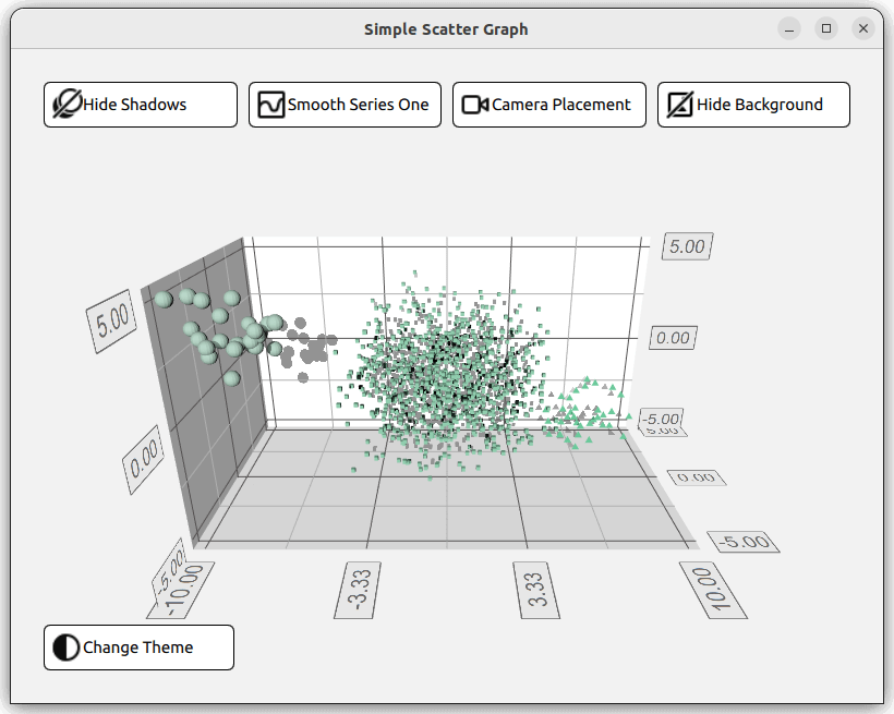
QML 애플리케이션에서 Scatter3D 사용.
단순 분산형 그래 프는 Scatter3D 및 QML을 사용하여 간단한 분산형 그래프 시각화를 만드는 방법을 보여줍니다.
그래프와 상호 작용하는 방법에 대한 지침은 이 페이지를 참조하세요.
직접 Qt Quick 애플리케이션을 새로 만드는 방법에 대한 지침은 Qt Creator 도움말을 참조하세요.
예제 실행하기
에서 예제를 실행하려면 Qt Creator에서 Welcome 모드를 열고 Examples 에서 예제를 선택합니다. 자세한 내용은 Qt Creator: 튜토리얼을 참조하세요 : 빌드 및 실행을 참조하세요.
레이아웃 설정하기
QML 코드를 살펴보기 전에 main.cpp 에서 애플리케이션을 설정합니다. main.qml 파일은 리소스(qrc:)에서 읽습니다.
viewer.setSource(QUrl("qrc:/qml/scatter/main.qml"));
이 main.qml 파일은 애플리케이션의 QML 코드의 시작점입니다. 먼저 필요한 모든 QML 모듈을 가져옵니다:
import QtQuick
import QtQuick.Controls
import QtQuick.Layouts
import QtGraphs
그런 다음 그래프에 대한 데이터를 담을 Data 항목을 만듭니다.
Data {
    id: seriesData
}
다음으로 그래프의 두 가지 테마를 정의하는 두 개의 GraphsTheme 항목, 즉 Qt 녹색 테마와 Qt 네온 녹색 테마를 만듭니다.
GraphsTheme {
    id: themeQt
    theme: GraphsTheme.Theme.QtGreen
    labelFont.pointSize: 40
}

GraphsTheme {
    id: themeQtNeonGreen
    theme: GraphsTheme.Theme.QtGreenNeon
    colorScheme: GraphsTheme.ColorScheme.Dark
}
이 애플리케이션의 레이아웃은 그래프 자체는 물론 그래프의 다양한 시각적 옵션을 켜고 끌 수 있는 다섯 가지 버튼으로 구성될 것입니다. 이를 구성하는 방법에는 여러 가지가 있는데, 한 가지 방법은 GridLayout 에 4개의 버튼, Graph, 그리고 다섯 번째 버튼이 모두 ColumnLayout 에 표시되도록 하는 것입니다.
ColumnLayout {
    id: mainLayout
    anchors.fill: parent
    anchors.margins: margin
    spacing: spacing
GridLayout 은 반응형입니다. 즉, 사용되는 열의 수는 애플리케이션 창의 너비에 따라 달라집니다. 이는 columns 속성에 삼항 연산자를 할당하여 창 너비에 따라 1, 2 또는 4로 확인하여 수행됩니다.
GridLayout {
    Layout.fillWidth: true
    rowSpacing: spacing
    columnSpacing: spacing

    columns: mainView.width < mainView.buttonMinWidth * 2 + mainView.spacing + mainView.margin * 2 // width of 2 buttons
             ? 1
             : (mainView.width < mainView.buttonMinWidth * 4 + mainView.spacing * 3 + mainView.margin * 2 // width of 4 buttons
                ? 2
                : 4)
이 GridLayout 에서는 네 개의 RoundButton이 인스턴스화됩니다. 하나는 그림자 토글, 하나는 메쉬 스무딩, 하나는 카메라 위치, 마지막으로 하나는 그래프의 배경을 변경하는 데 사용됩니다. 모든 버튼은 동일한 구조를 따릅니다. 모든 버튼에 대해 이 구조를 재정의하는 대신 사용자 정의 컴포넌트를 만들 수 있습니다.
component CustomButton : RoundButton {
    id: buttonRoot
CustomButtom RoundButton 유형을 확장하지만 몇 가지 추가 사항을 추가합니다. Layout.minimumWidth , Layout.FillWidth, radius, background 와 같은 속성이 설정됩니다. 이러한 속성은 버튼의 스타일과 레이아웃을 정의합니다.
property alias source: iconImage.source

Layout.minimumWidth: buttonMinWidth
Layout.fillWidth: true

radius: mainView.radius

background: Rectangle {
    radius: mainView.radius
    color: "white"
    border.color: "black"
}
contentItem 유형은 버튼의 콘텐츠를 정의하는 반면, 이 경우에는 아이콘과 일부 텍스트가 포함된 Row 유형입니다. 아이콘은 Image 유형을 사용하여 가져오고 source 속성을 설정합니다. 텍스트는 Label 유형을 사용하여 생성하고 text 속성을 사용하여 설정합니다. 사용자 정의 컴포넌트 상단에 이 두 속성에 대한 두 개의 별칭이 생성되어 CustomButton 인스턴스가 생성될 때 설정할 수 있습니다.
contentItem: Row {
    id: content
    Image {
        id: iconImage
    }
    Label {
        text: buttonRoot.text
        horizontalAlignment: Text.AlignLeft
        anchors.verticalCenter: parent.verticalCenter
    }
}
GridLayout 에서는 네 개의 CustomButton이 생성됩니다. 아이콘 이미지와 텍스트에 대한 두 개의 별칭과 신호 onClicked 의 세 가지 속성을 설정해야 합니다.
CustomButton {
    id: shadowButton
    text: graph.shadowQuality === Graphs3D.ShadowQuality.None ?
              qsTr("Show Shadows") : qsTr("Hide Shadows")
    source: graph.shadowQuality === Graphs3D.ShadowQuality.None ?
                "qrc:/images/shadow.svg" : "qrc:/images/shadow_hide.svg"
    onClicked: {
        graph.shadowQuality = graph.shadowQuality === Graphs3D.ShadowQuality.None ?
                    Graphs3D.ShadowQuality.High :
                    Graphs3D.ShadowQuality.None
    }
}
예를 들어 그림자 버튼은 onClicked 기호를 설정하여 그림자를 켜고 끕니다.
그래프 설정하기
레이아웃의 다음 단계는 Graph, 이는 자체 QML 파일 Graph.qml 에 정의되어 있으며 다음과 같이 인스턴스화됩니다:
Graph {
    id: graph
    Layout.fillWidth: true
    Layout.fillHeight: true
}
Graph.qml 에서 구현된 것을 보면 그래프는 Scatter3D 유형이며 Item 유형 안에 중첩되어 있습니다.
Scatter3D {
    id: scatterGraph
데이터 집합을 정의하기 전에 일부 축 속성이 구성됩니다.
axisX.segmentCount: 3
axisX.subSegmentCount: 2
axisX.labelFormat: "%.2f"
axisZ.segmentCount: 2
axisZ.subSegmentCount: 2
axisZ.labelFormat: "%.2f"
axisY.segmentCount: 2
axisY.subSegmentCount: 2
axisY.labelFormat: "%.2f"
데이터 설정하기
그래프는 Data.qml 에 주어진 데이터를 나타내는 세 개의 데이터 세트를 보여줍니다. 데이터 세트는 ListModel 유형으로 저장되며
ListModel {
    id: dataModel
    ListElement{ xPos: -10.0; yPos: 5.0; zPos: -5.0 }
    ...
    ListElement{ xPos: -7.54 ; yPos: 2.8 ; zPos: -3.68 }
}

ListModel {
    id: dataModelTwo
    ListElement{ xPos: 2.25 ; yPos: 1.36 ; zPos: -1.3 }
    ...
    ListElement{ xPos: -3.4 ; yPos: 0.6 ; zPos: 0.9 }
}

ListModel {
    id: dataModelThree
    ListElement{ xPos: 8.0; yPos: -2.0; zPos: 4.0 }
    ...
    ListElement{ xPos: 5.66 ; yPos: -4.98 ; zPos: 3.72 }
}
에 저장되고 property aliases를 사용하여 다른 파일에 노출됩니다.
property alias model: dataModel
property alias modelTwo: dataModelTwo
property alias modelThree: dataModelThree
이러한 별칭을 사용하기 전에 ItemModelScatterDataProxy 항목이 포함된 Scatter3DSeries 유형을 만듭니다.
Scatter3DSeries {
    id: scatterSeries
    itemLabelFormat: "Series 1: X:@xLabel Y:@yLabel Z:@zLabel"

    ItemModelScatterDataProxy {
        itemModel: seriesData.model
        xPosRole: "xPos"
        yPosRole: "yPos"
        zPosRole: "zPos"
    }
}
이 데이터 프록시는 itemModel 속성을 사용하여 Data.qml 의 데이터 집합을 참조합니다. 위에서 언급한 별칭은 main.qml, seriesData 에 인스턴스화된 Data 유형의 id 을 통해 액세스됩니다.
itemModel: seriesData.model
나머지 두 데이터 세트에 대해 이 과정을 반복합니다.
Scatter3DSeries {
    id: scatterSeriesTwo
    ...
ItemModelScatterDataProxy {
    itemModel: seriesData.modelTwo
    ...
    }
}
Scatter3DSeries {
    id: scatterSeriesThree
    ...
ItemModelScatterDataProxy {
    itemModel: seriesData.modelThree
    ...
    }
}
이제 분산 그래프가 세 개의 데이터 집합을 가리키고 있습니다.
남은 작업은 ColumnLayout 에 나머지 버튼인 theme button 을 추가하는 것뿐입니다. 이 버튼의 유일한 차이점은 레이아웃의 왼쪽에 위치한다는 것입니다. Layout.alignment 속성을 Qt.AlignLeft 으로, Layout.fillWidth 을 false 으로 정의하여 설정합니다.
CustomButton {
    id: themeButton
    Layout.alignment: Qt.AlignLeft
    Layout.fillWidth: false
예제 콘텐츠
© 2026 The Qt Company Ltd. Documentation contributions included herein are the copyrights of their respective owners. The documentation provided herein is licensed under the terms of the GNU Free Documentation License version 1.3 as published by the Free Software Foundation. Qt and respective logos are trademarks of The Qt Company Ltd. in Finland and/or other countries worldwide. All other trademarks are property of their respective owners.
