
Rectangle QML Type
绘制一个填充矩形,可选边框。更多...
属性
- antialiasing : bool
- border
- border.color : color
- border.pixelAligned : bool
- border.width : int
- bottomLeftRadius : real
(since 6.7) - bottomRightRadius : real
(since 6.7) - color : color
- gradient : var
- radius : real
- topLeftRadius : real
(since 6.7) - topRightRadius : real
(since 6.7)
详细说明
矩形元素用于填充实色或渐变色区域,以及/或添加矩形边框。
外观
每个“矩形”控件均采用纯色填充(通过color 属性指定)或渐变填充(通过渐变类型定义并使用gradient 属性设置)进行绘制。如果同时指定了纯色和渐变,则使用渐变。
您可以通过设置border.color 和border.width 属性,为矩形添加具有自定义颜色和粗细的可选边框。将颜色设置为“透明”可绘制无填充色的边框。
您还可以使用radius 属性创建圆角矩形。由于这会使矩形的角部呈现弧形,因此建议设置Item::antialiasing 属性以优化其外观。若要为不同角分别设置半径,可使用以下属性:topLeftRadius 、topRightRadius 、bottomLeftRadius 和bottomRightRadius 。
使用示例
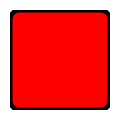
以下示例展示了某些常用属性对 Rectangle 控件的影响,此处该控件用于绘制一个正方形:
import QtQuick

Rectangle {
    width: 100
    height: 100
    color: "red"
    border.color: "black"
    border.width: 5
    radius: 10
}
性能
使用 `Item::antialiasing ` 属性可以改善圆角矩形的外观,但会牺牲渲染性能。对于正在移动的矩形,应考虑取消设置此属性,仅在矩形静止时才设置。
另请参阅 Image 。
属性文档
antialiasing : bool
用于决定矩形是否应使用抗锯齿。抗锯齿会影响此属性的性能表现。
对于具有半径的矩形,默认值为 true;否则为 false。
border group
用于绘制矩形边框的宽度和颜色。
宽度设为 1 会生成一条细线。若不显示边框,请将宽度设为 0 或使用透明颜色。
注意: 矩形边框的宽度 不会影响矩形本身的几何形状,也不会影响其相对于其他元素的位置(如果使用了锚点)。
边框在矩形边界内渲染。
如果 `pixelAligned ` 为 `true `(默认值),则渲染的边框宽度在经过设备像素比例缩放后,将四舍五入为整数像素。将 `pixelAligned ` 设置为 `false ` 将允许使用小数边框宽度,当启用 `antialiasing ` 时,这可能比较合适。
bottomLeftRadius : real [since 6.7]
该属性用于指定绘制左下角时使用的半径。
如果未设置 bottomLeftRadius,则将改用radius 。如果 bottomLeftRadius 为零,则该角将呈锐角。
该属性自 Qt 6.7 起引入。
另请参阅 radius 、topLeftRadius 、topRightRadius 以及bottomRightRadius 。
bottomRightRadius : real [since 6.7]
该属性存储用于绘制右下角的半径值。
如果未设置 bottomRightRadius,则将使用radius 。如果 bottomRightRadius 为零,则该角将呈锐角。
该属性在 Qt 6.7 中引入。
另请参阅 radius 、topLeftRadius 、topRightRadius 以及bottomLeftRadius 。
color : color
该属性用于指定填充矩形的颜色。
默认颜色为白色。

以下示例展示了使用十六进制和命名颜色表示法指定颜色的矩形:
Rectangle {
    color: "#00B000"
    width: 80; height: 80
}

Rectangle {
    color: "steelblue"
    y: 100; width: 80; height: 80
}
如果同时指定了渐变和颜色,则将使用渐变。
另请参阅 gradient 。
gradient : var
用于填充矩形的渐变效果。
该属性支持创建简单的垂直或水平渐变。通过为矩形添加旋转效果,还可以生成其他类型的渐变。
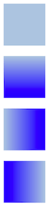
Rectangle {
    width: 80; height: 80
    color: "lightsteelblue"
}

Rectangle {
    width: 80; height: 80
    gradient: Gradient {
        GradientStop { position: 0.0; color: "lightsteelblue" }
        GradientStop { position: 1.0; color: "blue" }
    }
}

Rectangle {
    width: 80; height: 80
    gradient: Gradient {
        orientation: Gradient.Horizontal
        GradientStop { position: 0.0; color: "lightsteelblue" }
        GradientStop { position: 1.0; color: "blue" }
    }
}

Rectangle {
    width: 80; height: 80
    rotation: 90
    gradient: Gradient {
        GradientStop { position: 0.0; color: "lightsteelblue" }
        GradientStop { position: 1.0; color: "blue" }
    }
}该属性还支持QGradient::Preset 中的渐变预设。但请注意,由于 Rectangle 仅支持简单的垂直或水平渐变,任何包含不支持角度的预设都将退回到最接近的表示形式。
Rectangle {
    width: 80; height: 80
    gradient: Gradient.NightFade
}

Rectangle {
    width: 80; height: 80
    gradient: "SunnyMorning"
}
如果同时指定了渐变和颜色,则将使用渐变。
radius : real
该属性用于指定绘制圆角矩形时使用的角半径。
如果 radius 不为零,矩形将被绘制为圆角矩形;否则将被绘制为普通矩形。也可以单独设置各个角的圆角半径(见下文)。这些值将覆盖 radius。如果未设置(即将其设为undefined ),则将使用 radius。
另请参阅 topLeftRadius 、topRightRadius 、bottomLeftRadius 和bottomRightRadius 。
topLeftRadius : real [since 6.7]
该属性存储用于绘制左上角的半径。
如果未设置 topLeftRadius,则将使用radius 。如果 topLeftRadius 为零,则该角将呈锐角。
该属性在 Qt 6.7 中引入。
另请参阅 radius 、topRightRadius 、bottomLeftRadius 以及bottomRightRadius 。
topRightRadius : real [since 6.7]
该属性用于指定绘制右上角时使用的半径。
如果未设置 topRightRadius,则将使用radius 作为替代。如果 topRightRadius 为零,则该角将呈锐角。
该属性在 Qt 6.7 中引入。
另请参阅 radius 、topLeftRadius 、bottomLeftRadius 以及bottomRightRadius 。
© 2026 The Qt Company Ltd. Documentation contributions included herein are the copyrights of their respective owners. The documentation provided herein is licensed under the terms of the GNU Free Documentation License version 1.3 as published by the Free Software Foundation. Qt and respective logos are trademarks of The Qt Company Ltd. in Finland and/or other countries worldwide. All other trademarks are property of their respective owners.
