
场景图 - 绘制项
演示了如何基于QPainter 实现自定义场景图项。
“绘制项”示例演示了如何使用 QML 场景图框架,通过 `QPainter` 实现自定义场景图项。
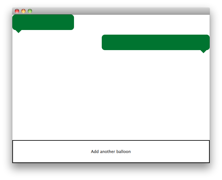
QQuickPaintedItem 类是从QQuickItem 派生而来的类,用于通过QPainter 接口实现自定义QML场景图项。
该示例包含一个项类和一个用于使用该项的 QML 文件。TextBalloon 类通过继承QQuickPaintedItem 来表示单个文本气泡,而textballoons.qml 文件则用于加载包含 TextBalloon QML 类型的模块并显示文本气泡。
我们将首先重点介绍TextBalloon 类,随后再讲解textballoons.qml 文件。关于如何为QML模块实现插件的示例,请参阅《编写扩展插件》
TextBalloon 类声明
TextBalloon 类继承自QQuickPaintedItem 。QQuickPaintedItem 是QML场景图框架中所有基于QPainter 项的基类。
class TextBalloon : public QQuickPaintedItem
{
    Q_OBJECT
    Q_PROPERTY(bool rightAligned READ isRightAligned WRITE setRightAligned NOTIFY rightAlignedChanged)
    QML_ELEMENT

    public:
        TextBalloon(QQuickItem *parent = nullptr);
        void paint(QPainter *painter) override;

        bool isRightAligned() const;
        void setRightAligned(bool rightAligned);

    private:
        bool rightAligned;

    signals:
        void rightAlignedChanged();
};要实现QQuickPaintedItem ,必须实现QQuickPaintedItem的纯虚函数paint(),该函数负责实现该类型的绘制。
TextBalloon 类定义
我们必须确保为 TextBalloon 项初始化 rightAligned 属性。
TextBalloon::TextBalloon(QQuickItem *parent)
    : QQuickPaintedItem(parent)
    , rightAligned(false)
{
}然后,我们实现paint() 函数,该函数会由场景图框架自动调用以绘制项的内容。该函数在本地坐标系中绘制该项。
void TextBalloon::paint(QPainter *painter)
{
    QBrush brush(QColor("#007430"));

    painter->setBrush(brush);
    painter->setPen(Qt::NoPen);
    painter->setRenderHint(QPainter::Antialiasing);

    QSizeF itemSize = size();
    painter->drawRoundedRect(0, 0, itemSize.width(), itemSize.height() - 10, 10, 10);

    if (rightAligned)
    {
        const QPointF points[3] = {
            QPointF(itemSize.width() - 10.0, itemSize.height() - 10.0),
            QPointF(itemSize.width() - 20.0, itemSize.height()),
            QPointF(itemSize.width() - 30.0, itemSize.height() - 10.0),
        };
        painter->drawConvexPolygon(points, 3);
    }
    else
    {
        const QPointF points[3] = {
            QPointF(10.0, itemSize.height() - 10.0),
            QPointF(20.0, itemSize.height()),
            QPointF(30.0, itemSize.height() - 10.0),
        };
        painter->drawConvexPolygon(points, 3);
    }
}首先,我们设置项的笔和画笔参数以定义项的外观。之后开始绘制。请注意,contentsBoundingRect() 函数的调用取决于项的大小。contentsBoundingRect() 函数返回的矩形即为 QML 文件中定义的项的大小。
textballoons.qml 文件
该界面由两个主要部分组成:包含对话气泡的可滚动区域,以及用于添加新气泡的控制按钮。
BalloonView
ListModel {
    id: balloonModel
    ListElement {
        balloonWidth: 200
    }
    ListElement {
        balloonWidth: 120
    }
}

ListView {
    id: balloonView
    anchors.bottom: controls.top
    anchors.bottomMargin: 2
    anchors.top: parent.top
    delegate: TextBalloon {
        anchors.right: index % 2 !== 0 ? parent?.right : undefined
        height: 60
        rightAligned: index % 2 !== 0
        width: balloonWidth
    }
    model: balloonModel
    spacing: 5
    width: parent.width
}
在应用程序启动时,balloonModel 包含两种类型的气泡,这些气泡将由 balloonView 显示。balloonView 会交替显示左对齐和右对齐的 TextBalloon 委托项。
控件
Rectangle {
    id: controls

    anchors.bottom: parent.bottom
    anchors.left: parent.left
    anchors.margins: 1
    anchors.right: parent.right
    border.width: 2
    color: "white"
    height: parent.height * 0.15

    Text {
        anchors.centerIn: parent
        text: qsTr("Add another balloon")
    }

    MouseArea {
        anchors.fill: parent
        hoverEnabled: true
        onClicked: {
            balloonModel.append({"balloonWidth": Math.floor(Math.random() * 200 + 100)})
            balloonView.positionViewAtIndex(balloonView.count -1, ListView.End)
        }
        onEntered: {
            parent.color = "#8ac953"
        }
        onExited: {
            parent.color = "white"
        }
    }
}
UI 的控件部分包含一个矩形,其中嵌有MouseArea 控件,当鼠标悬停在其上方时,该控件会改变颜色。该“按钮”控件会以随机宽度将一个新对象添加到模型的末尾。
© 2026 The Qt Company Ltd. Documentation contributions included herein are the copyrights of their respective owners. The documentation provided herein is licensed under the terms of the GNU Free Documentation License version 1.3 as published by the Free Software Foundation. Qt and respective logos are trademarks of The Qt Company Ltd. in Finland and/or other countries worldwide. All other trademarks are property of their respective owners.
