QML 高级教程 1 - 创建游戏画布和块
创建应用程序屏幕
第一步是在应用程序中创建基本的 QML 项目。
首先,我们创建 Same Game 应用程序,其主屏幕如下所示:
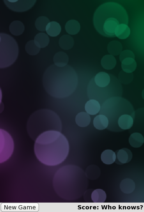
这是由主程序文件samegame.qml 定义的,它看起来像这样:
import QtQuick

Rectangle {
    id: screen

    width: 490; height: 720

    SystemPalette { id: activePalette }

    Item {
        width: parent.width
        anchors { top: parent.top; bottom: toolBar.top }

        Image {
            id: background
            anchors.fill: parent
            source: "pics/background.jpg"
            fillMode: Image.PreserveAspectCrop
        }
    }

    Rectangle {
        id: toolBar
        width: parent.width; height: 30
        color: activePalette.window
        anchors.bottom: screen.bottom

        Button {
            anchors { left: parent.left; verticalCenter: parent.verticalCenter }
            text: "New Game"
            onClicked: console.log("This doesn't do anything yet...")
        }

        Text {
            id: score
            anchors { right: parent.right; verticalCenter: parent.verticalCenter }
            text: "Score: Who knows?"
        }
    }
}
这样就有了一个基本的游戏窗口,其中包括积木的主画布、"新游戏 "按钮和分数显示。
这里有一个你可能不认识的项目,那就是SystemPalette 项目。它提供了对 Qt 系统调色板的访问权限,用于为按钮赋予更原生的外观和感觉。
注意Item 、Button 和Text 类型的锚点是用组(点)符号设置的,以便于阅读。
添加Button 和Block 组件
上述代码中的Button 项是在名为Button.qml 的单独组件文件中定义的。要创建一个功能按钮,我们在Rectangle 中使用 QML 类型Text 和MouseArea 。下面是Button.qml 代码:
import QtQuick

Rectangle {
    id: container

    property string text: "Button"

    signal clicked

    width: buttonLabel.width + 20; height: buttonLabel.height + 5
    border { width: 1; color: Qt.darker(activePalette.button) }
    antialiasing: true
    radius: 8

    // color the button with a gradient
    gradient: Gradient {
        GradientStop {
            position: 0.0
            color: {
                if (mouseArea.pressed)
                    return activePalette.dark
                else
                    return activePalette.light
            }
        }
        GradientStop { position: 1.0; color: activePalette.button }
    }

    MouseArea {
        id: mouseArea
        anchors.fill: parent
        onClicked: container.clicked();
    }

    Text {
        id: buttonLabel
        anchors.centerIn: container
        color: activePalette.buttonText
        text: container.text
    }
}
这主要定义了一个包含文本并可点击的矩形。MouseArea 有一个onClicked() 处理程序,当点击该区域时,该处理程序会发出container 的clicked() 信号。
在 Same Game 中,当游戏开始时,屏幕上会布满小块。每个区块只是一个包含图像的项目。块代码定义在一个单独的Block.qml 文件中:
import QtQuick

Item {
    id: block

    Image {
        id: img
        anchors.fill: parent
        source: "pics/redStone.png"
    }
}
目前,区块什么也不做;它只是一张图片。随着教程的深入,我们将为图块设置动画和行为。我们还没有添加任何代码来创建图块;我们将在下一章完成这项工作。
我们使用anchors.fill: parent 将图像设置为其父项的大小。这意味着,当我们在本教程稍后部分动态创建并调整块项大小时,图片将自动缩放为正确的大小。
请注意图像类型source 属性的相对路径。该路径相对于包含Image 类型的文件位置。或者,也可以将图像源设置为绝对文件路径或包含图像的 URL。
到目前为止,您对代码应该已经很熟悉了。我们刚刚创建了一些基本类型,可以开始使用。接下来,我们将在游戏画布上填充一些块。
© 2026 The Qt Company Ltd. Documentation contributions included herein are the copyrights of their respective owners. The documentation provided herein is licensed under the terms of the GNU Free Documentation License version 1.3 as published by the Free Software Foundation. Qt and respective logos are trademarks of The Qt Company Ltd. in Finland and/or other countries worldwide. All other trademarks are property of their respective owners.
