
按钮和输入控件的样式设置
本页是“控件样式参考”的一部分。有关元素树、屏幕截图和表格的说明,请参阅该页面。每个控件都会设置的常见状态标志和成员在“样式如何绘制控件”中列出。
按钮
QPushButton 绘制一个单一的控件元素CE_PushButton ,并带有QStyleOptionButton 。QCommonStyle 将其拆分为斜面、标签和焦点框:
CE_PushButtonCE_PushButtonBevel(PM_ButtonDefaultIndicator,PM_MenuButtonIndicator)PE_FrameDefaultButton,用于默认按钮PE_PanelButtonCommandPE_IndicatorArrowDown,对于带有菜单的按钮
CE_PushButtonLabel(SE_PushButtonContents,PM_ButtonShiftHorizontal,PM_ButtonShiftVertical,PM_ButtonIconSize)PE_FrameFocusRect(SE_PushButtonFocusRect)
该按钮通过CT_PushButton 和PM_ButtonMargin 计算其尺寸提示。元素边界因样式而异。在QCommonStyle 中,PE_FrameDefaultButton 可获取整个斜面矩形;PE_PanelButtonCommand 也是如此,但在自动默认按钮上除外——此时面板的每一侧都会缩小PM_ButtonDefaultIndicator 。
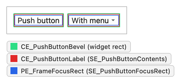
QPushButton 设置以下状态标志:
| 状态 | 设置条件 |
|---|---|
State_Sunken | 按下按钮或显示其菜单时。 |
State_On | 按钮被选中。 |
State_Raised | 按钮既非平坦状态,也未被按下。 |
QStyleOptionButton 的其他成员包括:
| 成员 | 描述 |
|---|---|
| features | QStyleOptionButton::ButtonFeature 枚举中的标志,用于描述按钮:扁平、默认、自动默认、带菜单或命令链接按钮。 |
| 图标 | 按钮的QIcon (如有)。 |
| iconSize | 图标的大小。 |
| text | 按钮上的文本。 |
复选框和单选按钮
QCheckBox 和QRadioButton 的结构完全相同。两者均使用QStyleOptionButton ,并绘制一个控件元素,即CE_CheckBox 或CE_RadioButton 。QCommonStyle 负责绘制指示器、标签和焦点框:
CE_CheckBoxPE_IndicatorCheckBox(SE_CheckBoxIndicator,PM_IndicatorWidth,PM_IndicatorHeight)CE_CheckBoxLabel(SE_CheckBoxContents,PM_CheckBoxLabelSpacing)PE_FrameFocusRect(SE_CheckBoxFocusRect)
CE_RadioButtonPE_IndicatorRadioButton(SE_RadioButtonIndicator,PM_ExclusiveIndicatorWidth,PM_ExclusiveIndicatorHeight)CE_RadioButtonLabel(SE_RadioButtonContents,PM_RadioButtonLabelSpacing)PE_FrameFocusRect(SE_RadioButtonFocusRect)
尺寸提示使用CT_CheckBox 和CT_RadioButton 。《复选框样式设置:分步指南》通过控件和QCommonStyle 代码详细说明了复选框的绘制过程。
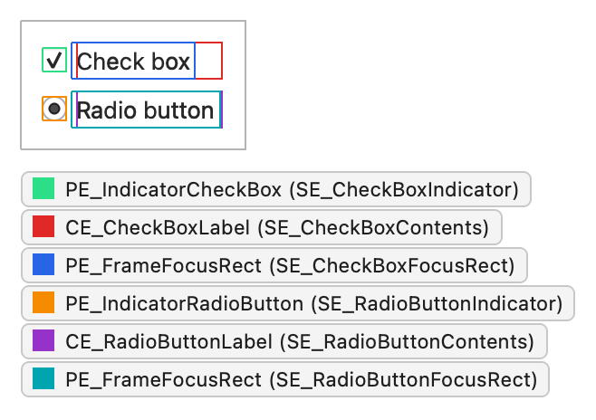
按钮会设置以下状态标志:
| 状态 | 设置条件 |
|---|---|
State_Sunken | 按下按钮时。可点击区域为SE_CheckBoxClickRect 或SE_RadioButtonClickRect ,在QCommonStyle 中,该区域同时覆盖标签和指示器。 |
State_NoChange | 复选框处于部分选中状态(三态复选框)。 |
State_On | 按钮被选中。 |
State_Off | 按钮未被选中。 |
QStyleOptionButton 的其他成员在“按钮”下列出。
工具按钮
QToolButton 绘制一个名为CC_ToolButton 的复合控件,并带有QStyleOptionToolButton 。它有两个子控件:按钮本身,以及对于带有a menu button 的按钮而言,菜单指示器。
CC_ToolButtonSC_ToolButtonPE_PanelButtonTool(PM_DefaultFrameWidth)PE_FrameFocusRectCE_ToolButtonLabel(PM_ButtonShiftHorizontal,PM_ButtonShiftVertical)
SC_ToolButtonMenu(PM_MenuButtonIndicator)PE_IndicatorButtonDropDownPE_IndicatorArrowDown
对于instant 和delayed 的弹出窗口,由于没有菜单子控件,因此QCommonStyle 会在按钮矩形的角落绘制PE_IndicatorArrowDown 。大小提示使用CT_ToolButton ,且按钮会参考SH_ToolButton_PopupDelay 和SH_ToolButtonStyle 。工具栏中的工具按钮从工具栏获取图标大小。独立按钮使用PM_ButtonIconSize 。
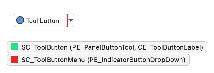
QToolButton 设置以下状态标志:
| 状态 | 设置条件 |
|---|---|
State_AutoRaise | autoRaise 属性被设置时。 |
State_Raised | 按钮未被选中或按下。若设置了State_AutoRaise 且鼠标未悬停在按钮上,则QCommonStyle 会再次清除该标志。 |
State_Sunken | 按钮被按下,或其菜单被显示。 |
State_On | 该按钮可选中且已被选中。 |
QStyleOptionToolButton 的其他成员包括:
| 成员 | 描述 |
|---|---|
| arrowType | Qt::ArrowType 的一个值,用于指定在绘制箭头(而非图标)时的方向(如有)。 |
| features | QStyleOptionToolButton::ToolButtonFeature 枚举的标志:用于指定按钮是否显示箭头、是否带有菜单按钮,或是否具有延迟弹出功能。 |
| font | 按钮标签的QFont 。 |
| icon | 按钮的QIcon 。 |
| iconSize | 图标的大小。 |
| pos | 按钮的位置,由QWidget::pos() 函数指定。 |
| text | 按钮上的文字。 |
| toolButtonStyle | 一个Qt::ToolButtonStyle 值,用于决定按钮显示图标、文本还是两者兼有。 |
下拉列表
QComboBox 使用CC_ComboBox 和CE_ComboBoxLabel 绘制按钮和标签,两者均使用QStyleOptionComboBox 。QCommonStyle 会省略可编辑框中标签的文本,该文本由QLineEdit 子元素绘制。 下拉列表是由委托绘制的项目视图,但样式通过SC_ComboBoxListBoxPopup 控制其大小和位置。对于可编辑框,样式通过SC_ComboBoxEditField 决定行编辑控件的位置;该字段本身是QLineEdit 的子元素。
CC_ComboBox(PM_ComboBoxFrameWidth)SC_ComboBoxFrameSC_ComboBoxArrow(PE_IndicatorArrowDown)SC_ComboBoxEditFieldSC_ComboBoxListBoxPopup,用于定位弹出窗口
CE_ComboBoxLabel(SC_ComboBoxEditField)
尺寸提示使用CT_ComboBox 。样式提示(如SH_ComboBox_Popup 、SH_ComboBox_PopupFrameStyle 和SH_ComboBox_UseNativePopup )决定弹出窗口的外观和行为。
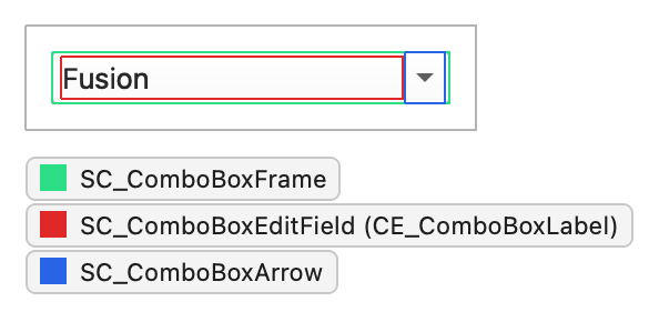
QComboBox 设置以下状态标志:
| 状态 | 设置条件 |
|---|---|
State_Selected | 框不可编辑且拥有焦点时。 |
State_Sunken | SC_ComboBoxArrow 处于活动状态。 |
State_On | 弹出列表可见时。 |
QStyleOptionComboBox 的其他成员包括:
| 成员 | 描述 |
|---|---|
| currentIcon | 当前项的图标。 |
| currentText | 当前项目的文本。 |
| editable | 下拉列表是否可编辑。 |
| frame | 下拉列表框是否具有边框。 |
| iconSize | 当前项图标的大小。 |
| popupRect | 弹出列表的边界矩形。 |
| textAlignment | 标签中文本的对齐方式。 |
旋转框
QSpinBox、QDoubleSpinBox 和QDateTimeEdit 会使用QStyleOptionSpinBox 绘制CC_SpinBox 。编辑字段是QLineEdit 的子元素,该样式会返回其几何信息,以便SC_SpinBoxEditField 使用。
CC_SpinBox(PM_SpinBoxFrameWidth)SC_SpinBoxFrameSC_SpinBoxUpPE_PanelButtonBevelPE_IndicatorSpinUp或PE_IndicatorSpinPlus,具体取决于buttonSymbols
SC_SpinBoxDownPE_PanelButtonBevelPE_IndicatorSpinDown或PE_IndicatorSpinMinus
SC_SpinBoxEditField
样式并不一定需要使用PE_PanelButtonBevel 来绘制按钮面板。尺寸提示使用CT_SpinBox ,而控件会参考诸如SH_SpinBox_ButtonsInsideFrame 、SH_SpinBox_StepModifier 和SH_SpinControls_DisableOnBounds 等提示。
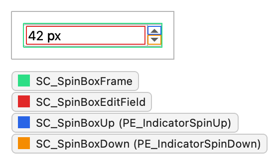
旋转框会设置此状态标志:
| 状态 | 设置条件 |
|---|---|
State_Sunken | 按下SC_SpinBoxUp 或SC_SpinBoxDown 子控件时。 |
QStyleOptionSpinBox 的其他成员包括:
| 成员 | 描述 |
|---|---|
| frame | 是否在旋转框中绘制边框。 |
| buttonSymbols | 一个QAbstractSpinBox::ButtonSymbols 值,用于选择按钮上的图标:箭头、加号和减号,或无。 |
| stepEnabled | QAbstractSpinBox::StepEnabled 用于指定哪些按钮可以对数值进行步进操作的标志。无法进行步进操作的按钮将显示为禁用状态。 |
滑块
QSlider 使用 `QStyleOptionSlider` 绘制 `CC_Slider `。它根据 `PM_SliderThickness ` 和 `CT_Slider` 计算大小提示,并根据 `PM_SliderLength` 计算最小大小提示。
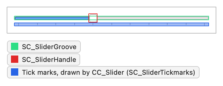
CC_Slider(PM_SliderLength,PM_SliderControlThickness,PM_SliderTickmarkOffset,PM_SliderSpaceAvailable)SC_SliderGrooveSC_SliderHandleSC_SliderTickmarks
QCommonStyle 仅绘制刻度线;刻度槽和手柄始终由样式决定。样式无需为SC_SliderTickmarks 返回矩形。Fusion 返回一个空矩形,并在截图中所示的区域内,于手柄下方绘制刻度线。该控件会参考SH_Slider_AbsoluteSetButtons 、SH_Slider_PageSetButtons 和SH_Slider_SnapToValue 。
QDial 使用相同的选项,并通过子控件SC_DialGroove 、SC_DialHandle 和SC_DialTickmarks 绘制CC_Dial 。
QSlider 设置以下状态标志:
| 状态 | 设置条件 |
|---|---|
State_Horizontal | 滑块处于水平状态时。 |
State_Sunken | 任何子控件被按下时,包括凹槽。activeSubControls 指定是哪一个。 |
QStyleOptionSlider 负责处理所有QAbstractSlider。其成员包括:
| 成员 | 描述 |
|---|---|
| orientation | 一个Qt::Orientation 值:垂直或水平。 |
| minimum | 最小值。 |
| maximum | 最大值。 |
| tickPosition | 一个QSlider::TickPosition 值,用于指定刻度线绘制的位置。 |
| tickInterval | 刻度标记之间的距离,以滑块值表示。 |
| upsideDown | 值增加的方向。所有抽象滑块均使用此成员,而非QStyleOption::direction 。 |
| sliderPosition | 滑块控点的位置,以滑块值表示。当tracking 启用时,该值等于sliderValue ;否则,该值仅在松开控点时更新。 |
| sliderValue | 当前值。 |
| singleStep | 单次操作(例如按下方向键)导致值变化的幅度。 |
| pageStep | 值在“页面步长”中的变化量,例如在凹槽中单击时。 |
| notchTarget | 刻度之间的首选距离(以像素为单位)。由QDial 使用。 |
| dialWrapping | 刻度盘是否循环。由QDial 使用。 |
| keyboardModifiers | 在允许修饰键改变拖动行为的样式中,上一次鼠标事件发生时按下的修饰键。 |
滚动条
QScrollBar 使用 `QStyleOptionSlider` 绘制 `CC_ScrollBar `。当用户拖动滑块时,如果指针超出滑块范围超过 `PM_MaximumDragDistance `,滑块会将数值弹回原位。
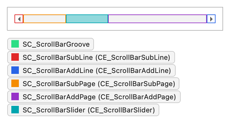
CC_ScrollBar(PM_ScrollBarExtent,PM_ScrollBarSliderMin)SC_ScrollBarGrooveSC_ScrollBarSubLine(CE_ScrollBarSubLine)SC_ScrollBarAddLine(CE_ScrollBarAddLine)SC_ScrollBarSubPage(CE_ScrollBarSubPage)SC_ScrollBarAddPage(CE_ScrollBarAddPage)SC_ScrollBarFirst(CE_ScrollBarFirst)SC_ScrollBarLast(CE_ScrollBarLast)SC_ScrollBarSlider(CE_ScrollBarSlider)PE_FrameFocusRect
QCommonStyle 使用同名的控件元素绘制每个子控件。某些样式会使用PE_IndicatorArrowUp 绘制线条指示符及其他箭头基元,并使用PE_PanelButtonBevel 绘制页面区域;具体实现取决于各样式。SC_ScrollBarFirst 和SC_ScrollBarLast 是可选按钮,用于跳转至两端;大多数样式会为它们返回一个空矩形。大小提示使用CT_ScrollBar ,行为提示包括SH_ScrollBar_LeftClickAbsolutePosition 、SH_ScrollBar_ContextMenu 和SH_ScrollBar_Transient 。
QScrollBar 设置以下状态标志:
| 状态 | 设置条件 |
|---|---|
State_Horizontal | 滚动条为水平方向时。 |
State_Sunken | 子控件被按下且指针尚未离开该控件。 |
State_On | 该滚动条为当前显示的临时滚动条。 |
QStyleOptionSlider 的成员在“滑块”下列出。sliderPosition 、sliderValue 、pageStep 和upsideDown 决定控件手柄的大小和位置。
进度条
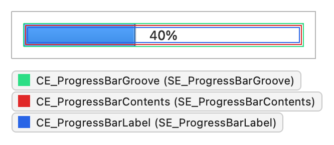
QProgressBar 绘制一个控件元素CE_ProgressBar ,并带有QStyleOptionProgressBar 。QCommonStyle 将其划分为凹槽、内容区域和标签:
CE_ProgressBarCE_ProgressBarGroove(SE_ProgressBarGroove)CE_ProgressBarContents(SE_ProgressBarContents,PM_ProgressBarChunkWidth)CE_ProgressBarLabel(SE_ProgressBarLabel)
将内容绘制为一排块状区域的样式使用 `PE_IndicatorProgressChunk`。在 `QCommonStyle ` 和 `Fusion` 中,槽、内容和标签均占据整个小节;标签是绘制在内容上方的居中文本,因此其矩形并非独立区域。 大小提示使用CT_ProgressBar 。忙碌指示器(即最小值和最大值均为零的条形)由该样式进行动画效果呈现。
QProgressBar 设置此状态标志:
| 状态 | 设置条件 |
|---|---|
State_Horizontal | 条形为水平方向时。 |
QStyleOptionProgressBar 的其他成员包括:
| 成员 | 描述 |
|---|---|
| minimum | 最小值。 |
| maximum | 最大值。 |
| 进度 | 当前值。 |
| text | 标签文本。 |
| textAlignment | 标签中文本的对齐方式。 |
| textVisible | 是否绘制该标签。 |
| invertedAppearance | 条形是否从相反一端填充,例如,在水平条形中从右向左填充。 |
| bottomToTop | 垂直条的标签是否旋转为从下往上阅读。 |
另请参阅 “小部件样式参考”、“容器和窗口的样式设置”以及“菜单和项目视图的样式设置”。
© 2026 The Qt Company Ltd. Documentation contributions included herein are the copyrights of their respective owners. The documentation provided herein is licensed under the terms of the GNU Free Documentation License version 1.3 as published by the Free Software Foundation. Qt and respective logos are trademarks of The Qt Company Ltd. in Finland and/or other countries worldwide. All other trademarks are property of their respective owners.
