Customizing Qt Quick Controls
Qt Quick Controls consist of a hierarchy (tree) of items. In order to provide a custom look and feel, the default QML implementation of each item can be replaced with a custom one.
Customizing a Control
Sometimes you'll want to create a "one-off" look for a specific part of your UI, and use a complete style everywhere else. Perhaps you're happy with the style you're using, but there's a certain button that has some special significance.
The first way to create this button is to simply define it in-place, wherever it is needed. For example, perhaps you're not satisfied with the Basic style's Button having square corners. To make them rounded, you can override the background item and set the radius property of Rectangle:
import QtQuick
import QtQuick.Controls.Basic

ApplicationWindow {
    width: 400
    height: 400
    visible: true

    Button {
        id: button
        text: "A Special Button"
        background: Rectangle {
            implicitWidth: 100
            implicitHeight: 40
            color: button.down ? "#d6d6d6" : "#f6f6f6"
            border.color: "#26282a"
            border.width: 1
            radius: 4
        }
    }
}
Note: as the different items that make up a control in any given style are designed to work together, it may be necessary to override other items to get the look you're after. In addition, not all styles can be customized. See the note in Customization Reference for more information.
The second way to create the button is good if you plan to use your rounded button in several places. It involves moving the code into its own QML file within your project.
For this approach, we'll copy the background code from the Basic style's Button.qml. This file can be found in the following path in your Qt installation:
$QTDIR/qml/QtQuick/Controls/Basic/Button.qml
After doing that, we'll simply add the following line:
radius: 4To avoid confusion with the controls in the module itself, we'll call the file MyButton.qml. To use the control in your application, refer to it by its filename:
import QtQuick.Controls.Basic

ApplicationWindow {
    MyButton {
        text: qsTr("A Special Button")
    }
}
The third way to create the button is a bit more structured, both in terms of where the file sits in the file system and how it is used in QML. First, copy an existing file as you did above, but this time, put it into a subfolder in your project named (for example) controls. To use the control, first import the folder into a namespace:
import QtQuick.Controls.Basic
import "controls" as MyControls

ApplicationWindow {
    MyControls.Button {
        text: qsTr("A Special Button")
    }
}
As you now have the MyControls namespace, you can name the controls after their actual counterparts in the Qt Quick Controls module. You can repeat this process for any control that you wish to add.
An added benefit of these three methods is that it's not necessary to implement the template from scratch.
Note: the three approaches mentioned here do not work for customizing the attached ToolTip, as that is a shared item created internally. To do a one-off customization of a ToolTip, see Custom Tool Tips. To customize the attached ToolTip, it must be provided as part of your own style.
Creating a Custom Style
There are several ways to go about creating your own styles. Below, we'll explain the various approaches.
Definition of a Style
In Qt Quick Controls, a style is essentially a set of QML files within a single directory. There are four requirements for a style to be usable:
- At least one QML file whose name matches a control (for example,
Button.qml) must exist. - Each QML file must contain the relevant type from the QtQuick.Templates import as the root item. For example, Button.qml must contain a Button template as its root item.
If we instead used the corresponding type from the QtQuick.Controls import as we did in the previous section, it would not work: the control we were defining would try to derive from itself.
- A qmldir file must exist alongside the QML file(s). Below is an example of a simple
qmldirfile for a style that provides a button:module MyStyle Button 2.15 Button.qml
If you're using compile-time style selection, the qmldir should also import the fallback style:
# ...
import QtQuick.Controls.Basic auto
This can also be done for run-time style selection instead of using, for example, QQuickStyle::setFallbackStyle().
The directory structure for such a style looks like this:
MyStyle
├─── Button.qml
└─── qmldir
- The files must be in a directory that is findable via the QML Import Path.
For example, if the path to MyStyle directory mentioned above was
/home/user/MyApp/MyStyle, then/home/user/MyAppmust be added to the QML import path.To use MyStyle in MyApp, refer to it by name:
./MyApp -style MyStyle
The style name must match the casing of the style directory; passing mystyle or MYSTYLE is not supported.
By default, the styling system uses the Basic style as a fallback for controls that aren't implemented. To customize or extend any other built-in style, it is possible to specify a different fallback style using QQuickStyle.
What this means is that you can implement as many controls as you like for your custom style, and place them almost anywhere. It also allows users to create their own styles for your application.
Previewing Custom Styles in Qt Quick Designer
Using the approach above, it is possible to preview a custom style in Qt Quick Designer. In order to do so, ensure that the project has a qtquickcontrols2.conf file, and that the following entry exists:
[Controls]
Style=MyStyle
For more information, take a look at the Flat Style example.
Style-specific C++ Extensions
Sometimes you may need to use C++ to extend your custom style.
- If the style that uses the type is the only style used by an application, register the type with the QML engine by adding the QML_ELEMENT macro and making the file part of your QML module:
qt_add_qml_module(ACoolItem
    URI MyItems
    VERSION 1.0
    SOURCES
        acoolcppitem.cpp acoolcppitem.h
)
CONFIG += qmltypes QML_IMPORT_NAME = MyItems QML_IMPORT_MAJOR_VERSION = 1
If the header the class is declared in is not accessible from your project's include path, you may have to amend the include path so that the generated registration code can be compiled.
INCLUDEPATH += MyItems
See Defining QML Types from C++ and Building a QML application for more information.
- If the style that uses the type is one of many styles used by an application, consider putting each style into a separate module. The modules will then be loaded on demand.
Considerations for custom styles
When implementing your own style and customizing controls, there are some points to keep in mind to ensure that your application is as performant as possible.
Avoid assigning an id to styles' implementations of item delegates
As explained in Definition of a Style, when you implement your own style for a control, you start off with the relevant template for that control. For example, a style's Button.qml will be structured similarly to this:
When you use a Button in your application, the background and contentItem items will be created and parented to the root Button item:
// Creates the Button root item, the Rectangle background,
// and the Text contentItem.
Button {
    text: qsTr("Confirm")
}
Suppose you then needed to do a one-off customization of the Button (as explained in Customizing a Control):
import QtQuick
import QtQuick.Controls.Basic

ApplicationWindow {
    width: 400
    height: 400
    visible: true

    Button {
        id: button
        text: "A Special Button"
        background: Rectangle {
            implicitWidth: 100
            implicitHeight: 40
            color: button.down ? "#d6d6d6" : "#f6f6f6"
            border.color: "#26282a"
            border.width: 1
            radius: 4
        }
    }
}
In QML, this would normally result in both the default background implementation and the one-off, custom background items being created. Qt Quick Controls uses a technique that avoids creating both items, and instead only creates the custom background, greatly improving the creation performance of controls.
This technique relies on the absence of an id in the style's implementation of that item. If an id is assigned, the technique cannot work, and both items will be created. For example, it can be tempting to assign an id to the background or contentItem so that other objects within the file can refer to those items:
T.Button {
    // ...

    background: Rectangle {
        id: backgroundRect
        // ...
    }

    contentItem: Text {
        // Use backgroundRect in some way...
    }

    // ...
}
With this code, every time a Button instance with a customized background is created, both backgrounds will be created, resulting in sub-optimal creation performance.
Prior to Qt 5.15, the old, unused background would be deleted to release the resources associated with it. However, as the control does not own the items, it should not delete them. As of Qt 5.15, old items are no longer deleted, and so the backgroundRect item will live longer than it needs to—typically until the application exits. Although the old item will be hidden, visually unparented from the control, and removed from the accessibility tree, it is important to keep the creation time and memory usage of these unused items in mind when assigning an id in this context.
Avoid imperative assignments of custom items
The technique mentioned in the section above only works when an item is declaratively assigned for the first time, and so imperative assignments will result in orphaned items. Always use declarative bindings to assign custom items when possible.
Don't import QtQuick.Controls in QML implementations
When writing the QML for your style's implementation of a control, it's important not to import QtQuick.Controls. Doing so will prevent the QML from being compiled by the QML compiler.
Implement types used by other types
Suppose you were using ScrollViews in your application, and decided that you want to customize their scroll bars. It is tempting to just implement a custom ScrollBar.qml and have ScrollView pick up the customized ScrollBar automatically. However, this will not work. You must implement both ScrollBar.qml and ScrollView.qml.
Attached properties
It is common for a style to have certain properties or attributes that apply to all controls. Attached properties are a great way of extending an item in QML without having to modify any existing C++ belonging to that item. For example, both the Material and Universal styles have an attached theme property that controls whether an item and its children will be rendered in a light or dark theme.
As an example, let's add an attached property that controls elevation. Our style will illustrate the elevation with a drop shadow; the higher the elevation, the larger the shadow.
The first step is to create a new Qt Quick Controls application in Qt Creator. After that, we add a C++ type that stores the elevation. Since the type will be used for every control supported by our style, and because we may wish to add other attached properties later on, we'll call it MyStyle. Here is MyStyle.h:
#ifndef MYSTYLE_H
#define MYSTYLE_H

#include <QObject>
#include <QtQml>

class MyStyle : public QObject
{
    Q_OBJECT
    Q_PROPERTY(int elevation READ elevation WRITE setElevation NOTIFY elevationChanged)

public:
    explicit MyStyle(QObject *parent = nullptr);

    static MyStyle *qmlAttachedProperties(QObject *object);

    int elevation() const;
    void setElevation(int elevation);

signals:
    void elevationChanged();

private:
    int m_elevation;
};

QML_DECLARE_TYPEINFO(MyStyle, QML_HAS_ATTACHED_PROPERTIES)

#endif // MYSTYLE_H
MyStyle.cpp:
#include "mystyle.h"

MyStyle::MyStyle(QObject *parent) :
    QObject(parent),
    m_elevation(0)
{
}

MyStyle *MyStyle::qmlAttachedProperties(QObject *object)
{
    return new MyStyle(object);
}

int MyStyle::elevation() const
{
    return m_elevation;
}

void MyStyle::setElevation(int elevation)
{
    if (elevation == m_elevation)
        return;

    m_elevation = elevation;
    emit elevationChanged();
}
The MyStyle type is special in the sense that it shouldn't be instantiated, but rather used for its attached properties. For that reason, we register it in the following manner in main.cpp:
#include <QGuiApplication>
#include <QQmlApplicationEngine>

#include "mystyle.h"

int main(int argc, char *argv[])
{
    QGuiApplication app(argc, argv);

    qmlRegisterUncreatableType<MyStyle>("MyStyle", 1, 0, "MyStyle", "MyStyle is an attached property");

    QQmlApplicationEngine engine;
    // Make the directory containing our style known to the QML engine.
    engine.addImportPath(":/");
    engine.load(QUrl(QLatin1String("qrc:/main.qml")));

    return app.exec();
}
We then copy Button.qml from the Basic style in $QTDIR/qml/QtQuick/Controls/Basic/ into a new myproject folder in our project directory. Add the newly copied Button.qml to qml.qrc, which is the resource file that contains our QML files.
Next, we add a drop shadow to the background delegate of the Button:
// ...
import QtQuick.Effects
import MyStyle
// ...

background: Rectangle {
    // ...

    layer.enabled: control.enabled && control.MyStyle.elevation > 0
    layer.effect: MultiEffect {
        shadowEnabled: true
        shadowHorizontalOffset: 3
        shadowVerticalOffset: 3
        shadowColor: control.visualFocus ? "#330066ff" : "#aaaaaa"
        shadowBlur: control.pressed ? 0.8 : 0.4
    }
}
Note that we:
- Don't bother using the drop shadow when the elevation is
0 - Change the shadow's color depending on whether or not the button has focus
- Make the size of the shadow depend on the elevation
To try out the attached property, we create a Row with two Buttons in main.qml:
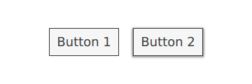
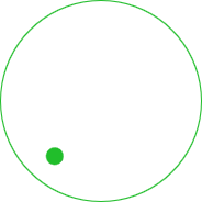
import QtQuick
import QtQuick.Controls

import MyStyle 1.0

ApplicationWindow {
    id: window
    width: 400
    height: 400
    visible: true

    Row {
        spacing: 20
        anchors.centerIn: parent

        Button {
            text: "Button 1"
        }
        Button {
            text: "Button 2"
            MyStyle.elevation: 10
        }
    }
}
One button has no elevation, and the other has an elevation of 10.
With that in place, we can run our example. To tell the application to use our new style, we pass -style MyStyle as an application argument, but there are many ways to specify the style to use.
The end result:
Note that the import MyStyle 1.0 statement is only necessary because we are using the attached property belonging to MyStyle. Both buttons will use our custom style, even if we were to remove the import.
Customization Reference
The following snippets present examples where the Basic style's controls have been customized using the same approach as the Customizing a Control section. The code can be used as a starting point to implement a custom look and feel.
Note: The macOS and Windows styles are not suitable for customizing. It is instead recommended to always base a customized control on top of a single style that is available on all platforms, e.g Basic Style, Fusion Style, Imagine Style, Material Style, Universal Style. By doing so, you are guaranteed that it will always look the same, regardless of which style the application is run with. To learn how to use a different style, see Using Styles in Qt Quick Controls. Alternatively, you can create your own style.
Note: When modifying the size of controls, the actual content size will typically remain the same. For example, some styles may make their Button fill the bounds of the control, but horizontally and/or vertically center the check indicator and text of a CheckBox. If the default resizing behaviour is not desired, override the respective delegate(s).
Customizing ApplicationWindow
ApplicationWindow consists of one visual item: background.
import QtQuick
import QtQuick.Controls.Basic

ApplicationWindow {
    visible: true

    background: Rectangle {
        gradient: Gradient {
            GradientStop { position: 0; color: "#ffffff" }
            GradientStop { position: 1; color: "#c1bbf9" }
        }
    }
}
Customizing BusyIndicator
BusyIndicator consists of two visual items: background and contentItem.

import QtQuick
import QtQuick.Controls.Basic

BusyIndicator {
    id: control

    contentItem: Item {
        implicitWidth: 64
        implicitHeight: 64

        Item {
            id: item
            x: parent.width / 2 - 32
            y: parent.height / 2 - 32
            width: 64
            height: 64
            opacity: control.running ? 1 : 0

            Behavior on opacity {
                OpacityAnimator {
                    duration: 250
                }
            }

            RotationAnimator {
                target: item
                running: control.visible && control.running
                from: 0
                to: 360
                loops: Animation.Infinite
                duration: 1250
            }

            Repeater {
                id: repeater
                model: 6

                Rectangle {
                    id: delegate
                    x: item.width / 2 - width / 2
                    y: item.height / 2 - height / 2
                    implicitWidth: 10
                    implicitHeight: 10
                    radius: 5
                    color: "#21be2b"

                    required property int index

                    transform: [
                        Translate {
                            y: -Math.min(item.width, item.height) * 0.5 + 5
                        },
                        Rotation {
                            angle: delegate.index / repeater.count * 360
                            origin.x: 5
                            origin.y: 5
                        }
                    ]
                }
            }
        }
    }
}
Customizing Button
Button consists of two visual items: background and contentItem.
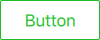
import QtQuick
import QtQuick.Controls.Basic

Button {
    id: control
    text: qsTr("Button")

    contentItem: Text {
        text: control.text
        font: control.font
        opacity: enabled ? 1.0 : 0.3
        color: control.down ? "#17a81a" : "#21be2b"
        horizontalAlignment: Text.AlignHCenter
        verticalAlignment: Text.AlignVCenter
        elide: Text.ElideRight
    }

    background: Rectangle {
        implicitWidth: 100
        implicitHeight: 40
        opacity: enabled ? 1 : 0.3
        border.color: control.down ? "#17a81a" : "#21be2b"
        border.width: 1
        radius: 2
    }
}
Customizing CheckBox
CheckBox consists of three visual items: background, contentItem and indicator.

import QtQuick
import QtQuick.Controls.Basic

CheckBox {
    id: control
    text: qsTr("CheckBox")
    checked: true

    indicator: Rectangle {
        implicitWidth: 26
        implicitHeight: 26
        x: control.leftPadding
        y: parent.height / 2 - height / 2
        radius: 3
        border.color: control.down ? "#17a81a" : "#21be2b"

        Rectangle {
            width: 14
            height: 14
            x: 6
            y: 6
            radius: 2
            color: control.down ? "#17a81a" : "#21be2b"
            visible: control.checked
        }
    }

    contentItem: Text {
        text: control.text
        font: control.font
        opacity: enabled ? 1.0 : 0.3
        color: control.down ? "#17a81a" : "#21be2b"
        verticalAlignment: Text.AlignVCenter
        leftPadding: control.indicator.width + control.spacing
    }
}
Customizing CheckDelegate
CheckDelegate consists of three visual items: background, contentItem and indicator.

import QtQuick
import QtQuick.Controls.Basic

CheckDelegate {
    id: control
    text: qsTr("CheckDelegate")
    checked: true

    contentItem: Text {
        rightPadding: control.indicator.width + control.spacing
        text: control.text
        font: control.font
        opacity: enabled ? 1.0 : 0.3
        color: control.down ? "#17a81a" : "#21be2b"
        elide: Text.ElideRight
        verticalAlignment: Text.AlignVCenter
    }

    indicator: Rectangle {
        implicitWidth: 26
        implicitHeight: 26
        x: control.width - width - control.rightPadding
        y: control.topPadding + control.availableHeight / 2 - height / 2
        radius: 3
        color: "transparent"
        border.color: control.down ? "#17a81a" : "#21be2b"

        Rectangle {
            width: 14
            height: 14
            x: 6
            y: 6
            radius: 2
            color: control.down ? "#17a81a" : "#21be2b"
            visible: control.checked
        }
    }

    background: Rectangle {
        implicitWidth: 100
        implicitHeight: 40
        visible: control.down || control.highlighted
        color: control.down ? "#bdbebf" : "#eeeeee"
    }
}
Customizing ComboBox
ComboBox consists of background, contentItem, popup, indicator, and delegate.
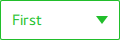
pragma ComponentBehavior: Bound

import QtQuick
import QtQuick.Controls.Basic

ComboBox {
    id: control
    model: ["First", "Second", "Third"]

    delegate: ItemDelegate {
        id: delegate

        required property var model
        required property int index

        width: control.width
        contentItem: Text {
            text: delegate.model[control.textRole]
            color: "#21be2b"
            font: control.font
            elide: Text.ElideRight
            verticalAlignment: Text.AlignVCenter
        }
        highlighted: control.highlightedIndex === index
    }

    indicator: Canvas {
        id: canvas
        x: control.width - width - control.rightPadding
        y: control.topPadding + (control.availableHeight - height) / 2
        width: 12
        height: 8
        contextType: "2d"

        Connections {
            target: control
            function onPressedChanged() { canvas.requestPaint(); }
        }

        onPaint: {
            context.reset();
            context.moveTo(0, 0);
            context.lineTo(width, 0);
            context.lineTo(width / 2, height);
            context.closePath();
            context.fillStyle = control.pressed ? "#17a81a" : "#21be2b";
            context.fill();
        }
    }

    contentItem: Text {
        leftPadding: 0
        rightPadding: control.indicator.width + control.spacing

        text: control.displayText
        font: control.font
        color: control.pressed ? "#17a81a" : "#21be2b"
        verticalAlignment: Text.AlignVCenter
        elide: Text.ElideRight
    }

    background: Rectangle {
        implicitWidth: 120
        implicitHeight: 40
        border.color: control.pressed ? "#17a81a" : "#21be2b"
        border.width: control.visualFocus ? 2 : 1
        radius: 2
    }

    popup: Popup {
        y: control.height - 1
        width: control.width
        height: Math.min(contentItem.implicitHeight, control.Window.height - topMargin - bottomMargin)
        padding: 1

        contentItem: ListView {
            clip: true
            implicitHeight: contentHeight
            model: control.popup.visible ? control.delegateModel : null
            currentIndex: control.highlightedIndex

            ScrollIndicator.vertical: ScrollIndicator { }
        }

        background: Rectangle {
            border.color: "#21be2b"
            radius: 2
        }
    }
}
As explained in ComboBox Model Roles, ComboBox supports multiple types of models.
Since all the models provide an anonymous property with modelData, the following expression retrieves the right text in all cases:
text: model[control.textRole]
When you provide a specific textRole and a model with structured data that provides the selected role, this is expression is a regular property lookup. When you provide a model with singular data, such as a list of strings, and an empty textRole, this expression retrieves the modelData.
Customizing DelayButton
DelayButton consists of two visual items: background and contentItem.
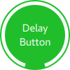
import QtQuick
import QtQuick.Controls.Basic

DelayButton {
    id: control
    checked: true
    text: qsTr("Delay\nButton")

    contentItem: Text {
        text: control.text
        font: control.font
        opacity: enabled ? 1.0 : 0.3
        color: "white"
        horizontalAlignment: Text.AlignHCenter
        verticalAlignment: Text.AlignVCenter
        elide: Text.ElideRight
    }

    background: Rectangle {
        implicitWidth: 100
        implicitHeight: 100
        opacity: enabled ? 1 : 0.3
        color: control.down ? "#17a81a" : "#21be2b"
        radius: size / 2

        readonly property real size: Math.min(control.width, control.height)
        width: size
        height: size
        anchors.centerIn: parent

        Canvas {
            id: canvas
            anchors.fill: parent

            Connections {
                target: control
                function onProgressChanged() { canvas.requestPaint(); }
            }

            onPaint: {
                var ctx = getContext("2d")
                ctx.clearRect(0, 0, width, height)
                ctx.strokeStyle = "white"
                ctx.lineWidth = parent.size / 20
                ctx.beginPath()
                var startAngle = Math.PI / 5 * 3
                var endAngle = startAngle + control.progress * Math.PI / 5 * 9
                ctx.arc(width / 2, height / 2, width / 2 - ctx.lineWidth / 2 - 2, startAngle, endAngle)
                ctx.stroke()
            }
        }
    }
}
Customizing Dial
Dial consists of two visual items: background and handle.
import QtQuick
import QtQuick.Controls.Basic

Dial {
    id: control
    background: Rectangle {
        x: control.width / 2 - width / 2
        y: control.height / 2 - height / 2
        implicitWidth: 140
        implicitHeight: 140
        width: Math.max(64, Math.min(control.width, control.height))
        height: width
        color: "transparent"
        radius: width / 2
        border.color: control.pressed ? "#17a81a" : "#21be2b"
        opacity: control.enabled ? 1 : 0.3
    }

    handle: Rectangle {
        id: handleItem
        x: control.background.x + control.background.width / 2 - width / 2
        y: control.background.y + control.background.height / 2 - height / 2
        width: 16
        height: 16
        color: control.pressed ? "#17a81a" : "#21be2b"
        radius: 8
        antialiasing: true
        opacity: control.enabled ? 1 : 0.3
        transform: [
            Translate {
                y: -Math.min(control.background.width, control.background.height) * 0.4 + handleItem.height / 2
            },
            Rotation {
                angle: control.angle
                origin.x: handleItem.width / 2
                origin.y: handleItem.height / 2
            }
        ]
    }
}
Customizing DoubleSpinBox
DoubleSpinBox can be customized in the same manner as Button.
Customizing Drawer
Drawer can have a visual background item.
background: Rectangle {
    Rectangle {
        x: parent.width - 1
        width: 1
        height: parent.height
        color: "#21be2b"
    }
}
Customizing Frame
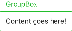
Frame consists of one visual item: background.

import QtQuick
import QtQuick.Controls.Basic

Frame {
    background: Rectangle {
        color: "transparent"
        border.color: "#21be2b"
        radius: 2
    }

    Label {
        text: qsTr("Content goes here!")
    }
}
Customizing GroupBox
GroupBox consists of two visual items: background and label.
import QtQuick
import QtQuick.Controls.Basic

GroupBox {
    id: control
    title: qsTr("GroupBox")

    background: Rectangle {
        y: control.topPadding - control.bottomPadding
        width: parent.width
        height: parent.height - control.topPadding + control.bottomPadding
        color: "transparent"
        border.color: "#21be2b"
        radius: 2
    }

    label: Label {
        x: control.leftPadding
        width: control.availableWidth
        text: control.title
        color: "#21be2b"
        elide: Text.ElideRight
    }

    Label {
        text: qsTr("Content goes here!")
    }
}
Customizing ItemDelegate
ItemDelegate consists of two visual items: background and contentItem.
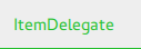
import QtQuick
import QtQuick.Controls.Basic

ItemDelegate {
    id: control
    text: qsTr("ItemDelegate")

    contentItem: Text {
        rightPadding: control.spacing
        text: control.text
        font: control.font
        color: control.enabled ? (control.down ? "#17a81a" : "#21be2b") : "#bdbebf"
        elide: Text.ElideRight
        verticalAlignment: Text.AlignVCenter
    }

    background: Rectangle {
        implicitWidth: 100
        implicitHeight: 40
        opacity: enabled ? 1 : 0.3
        color: control.down ? "#dddedf" : "#eeeeee"

        Rectangle {
            width: parent.width
            height: 1
            color: control.down ? "#17a81a" : "#21be2b"
            anchors.bottom: parent.bottom
        }
    }
}
Customizing Label
Label can have a visual background item.

import QtQuick
import QtQuick.Controls.Basic

Label {
    text: qsTr("Label")
    color: "#21be2b"
}
Customizing Menu
- Menu consists of a visual background item.
- MenuItem consists of four visual items: background, contentItem, indicator, and arrow.
- MenuSeparator consists of a visual background and contentItem.
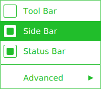
import QtQuick
import QtQuick.Controls.Basic

Menu {
    id: menu

    Action { text: qsTr("Tool Bar"); checkable: true }
    Action { text: qsTr("Side Bar"); checkable: true; checked: true }
    Action { text: qsTr("Status Bar"); checkable: true; checked: true }

    MenuSeparator {
        contentItem: Rectangle {
            implicitWidth: 200
            implicitHeight: 1
            color: "#21be2b"
        }
    }

    Menu {
        title: qsTr("Advanced")
        // ...
    }

    topPadding: 2
    bottomPadding: 2

    delegate: MenuItem {
        id: menuItem
        implicitWidth: 200
        implicitHeight: 40

        arrow: Canvas {
            x: parent.width - width
            implicitWidth: 40
            implicitHeight: 40
            visible: menuItem.subMenu
            onPaint: {
                var ctx = getContext("2d")
                ctx.fillStyle = menuItem.highlighted ? "#ffffff" : "#21be2b"
                ctx.moveTo(15, 15)
                ctx.lineTo(width - 15, height / 2)
                ctx.lineTo(15, height - 15)
                ctx.closePath()
                ctx.fill()
            }
        }

        indicator: Item {
            implicitWidth: 40
            implicitHeight: 40
            Rectangle {
                width: 26
                height: 26
                anchors.centerIn: parent
                visible: menuItem.checkable
                border.color: "#21be2b"
                radius: 3
                Rectangle {
                    width: 14
                    height: 14
                    anchors.centerIn: parent
                    visible: menuItem.checked
                    color: "#21be2b"
                    radius: 2
                }
            }
        }

        contentItem: Text {
            leftPadding: menuItem.indicator.width
            rightPadding: menuItem.arrow.width
            text: menuItem.text
            font: menuItem.font
            opacity: enabled ? 1.0 : 0.3
            color: menuItem.highlighted ? "#ffffff" : "#21be2b"
            horizontalAlignment: Text.AlignLeft
            verticalAlignment: Text.AlignVCenter
            elide: Text.ElideRight
        }

        background: Rectangle {
            implicitWidth: 200
            implicitHeight: 40
            opacity: enabled ? 1 : 0.3
            color: menuItem.highlighted ? "#21be2b" : "transparent"
        }
    }

    background: Rectangle {
        implicitWidth: 200
        implicitHeight: 40
        color: "#ffffff"
        border.color: "#21be2b"
        radius: 2
    }
}
Customizing MenuBar
MenuBar can have a visual background item, and MenuBarItem consists of two visual items: background and contentItem.
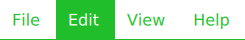
import QtQuick
import QtQuick.Controls.Basic

MenuBar {
    id: menuBar

    Menu { title: qsTr("File") }
    Menu { title: qsTr("Edit") }
    Menu { title: qsTr("View") }
    Menu { title: qsTr("Help") }

    delegate: MenuBarItem {
        id: menuBarItem

        contentItem: Text {
            text: menuBarItem.text
            font: menuBarItem.font
            opacity: enabled ? 1.0 : 0.3
            color: menuBarItem.highlighted ? "#ffffff" : "#21be2b"
            horizontalAlignment: Text.AlignLeft
            verticalAlignment: Text.AlignVCenter
            elide: Text.ElideRight
        }

        background: Rectangle {
            implicitWidth: 40
            implicitHeight: 40
            opacity: enabled ? 1 : 0.3
            color: menuBarItem.highlighted ? "#21be2b" : "transparent"
        }
    }

    background: Rectangle {
        implicitWidth: 40
        implicitHeight: 40
        color: "#ffffff"

        Rectangle {
            color: "#21be2b"
            width: parent.width
            height: 1
            anchors.bottom: parent.bottom
        }
    }
}
Customizing PageIndicator
PageIndicator consists of a background, contentItem, and delegate.

import QtQuick
import QtQuick.Controls.Basic

PageIndicator {
    id: control
    count: 5
    currentIndex: 2

    delegate: Rectangle {
        implicitWidth: 8
        implicitHeight: 8

        radius: width / 2
        color: "#21be2b"

        opacity: index === control.currentIndex ? 0.95 : pressed ? 0.7 : 0.45

        required property int index

        Behavior on opacity {
            OpacityAnimator {
                duration: 100
            }
        }
    }
}
Customizing Pane
Pane consists of a background.
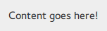
import QtQuick
import QtQuick.Controls.Basic

Pane {
    background: Rectangle {
        color: "#eeeeee"
    }

    Label {
        text: qsTr("Content goes here!")
    }
}
Customizing Popup
Popup consists of a background and contentItem.
import QtQuick
import QtQuick.Controls.Basic

Popup {
    id: popup
    background: Rectangle {
        implicitWidth: 200
        implicitHeight: 200
        border.color: "#444"
    }
    contentItem: Column {}
}
Customizing ProgressBar
ProgressBar consists of two visual items: background and contentItem.

import QtQuick
import QtQuick.Controls.Basic

ProgressBar {
    id: control
    value: 0.5
    padding: 2

    background: Rectangle {
        implicitWidth: 200
        implicitHeight: 6
        color: "#e6e6e6"
        radius: 3
    }

    contentItem: Item {
        implicitWidth: 200
        implicitHeight: 4

        // Progress indicator for determinate state.
        Rectangle {
            width: control.visualPosition * parent.width
            height: parent.height
            radius: 2
            color: "#17a81a"
            visible: !control.indeterminate
        }

        // Scrolling animation for indeterminate state.
        Item {
            anchors.fill: parent
            visible: control.indeterminate
            clip: true

            Row {
                spacing: 20

                Repeater {
                    model: control.width / 40 + 1

                    Rectangle {
                        color: "#17a81a"
                        width: 20
                        height: control.height
                    }
                }
                XAnimator on x {
                    from: 0
                    to: -40
                    loops: Animation.Infinite
                    running: control.indeterminate
                }
            }
        }
    }
}
Above, the contentItem is also animated to represent an indeterminate progress bar state.
Customizing RadioButton
RadioButton consists of three visual items: background, contentItem and indicator.

import QtQuick
import QtQuick.Controls.Basic

RadioButton {
    id: control
    text: qsTr("RadioButton")
    checked: true

    indicator: Rectangle {
        implicitWidth: 26
        implicitHeight: 26
        x: control.leftPadding
        y: parent.height / 2 - height / 2
        radius: 13
        border.color: control.down ? "#17a81a" : "#21be2b"

        Rectangle {
            width: 14
            height: 14
            x: 6
            y: 6
            radius: 7
            color: control.down ? "#17a81a" : "#21be2b"
            visible: control.checked
        }
    }

    contentItem: Text {
        text: control.text
        font: control.font
        opacity: enabled ? 1.0 : 0.3
        color: control.down ? "#17a81a" : "#21be2b"
        verticalAlignment: Text.AlignVCenter
        leftPadding: control.indicator.width + control.spacing
    }
}
Customizing RadioDelegate
RadioDelegate consists of three visual items: background, contentItem and indicator.

import QtQuick
import QtQuick.Controls.Basic

RadioDelegate {
    id: control
    text: qsTr("RadioDelegate")
    checked: true

    contentItem: Text {
        rightPadding: control.indicator.width + control.spacing
        text: control.text
        font: control.font
        opacity: enabled ? 1.0 : 0.3
        color: control.down ? "#17a81a" : "#21be2b"
        elide: Text.ElideRight
        verticalAlignment: Text.AlignVCenter
    }

    indicator: Rectangle {
        implicitWidth: 26
        implicitHeight: 26
        x: control.width - width - control.rightPadding
        y: parent.height / 2 - height / 2
        radius: 13
        color: "transparent"
        border.color: control.down ? "#17a81a" : "#21be2b"

        Rectangle {
            width: 14
            height: 14
            x: 6
            y: 6
            radius: 7
            color: control.down ? "#17a81a" : "#21be2b"
            visible: control.checked
        }
    }

    background: Rectangle {
        implicitWidth: 100
        implicitHeight: 40
        visible: control.down || control.highlighted
        color: control.down ? "#bdbebf" : "#eeeeee"
    }
}
Customizing RangeSlider
RangeSlider consists of three visual items: background, first.handle and second.handle.
import QtQuick
import QtQuick.Controls.Basic

RangeSlider {
    id: control
    first.value: 0.25
    second.value: 0.75

    background: Rectangle {
        x: control.leftPadding
        y: control.topPadding + control.availableHeight / 2 - height / 2
        implicitWidth: 200
        implicitHeight: 4
        width: control.availableWidth
        height: implicitHeight
        radius: 2
        color: "#bdbebf"

        Rectangle {
            x: control.first.visualPosition * parent.width
            width: control.second.visualPosition * parent.width - x
            height: parent.height
            color: "#21be2b"
            radius: 2
        }
    }

    first.handle: Rectangle {
        x: control.leftPadding + control.first.visualPosition * (control.availableWidth - width)
        y: control.topPadding + control.availableHeight / 2 - height / 2
        implicitWidth: 26
        implicitHeight: 26
        radius: 13
        color: control.first.pressed ? "#f0f0f0" : "#f6f6f6"
        border.color: "#bdbebf"
    }

    second.handle: Rectangle {
        x: control.leftPadding + control.second.visualPosition * (control.availableWidth - width)
        y: control.topPadding + control.availableHeight / 2 - height / 2
        implicitWidth: 26
        implicitHeight: 26
        radius: 13
        color: control.second.pressed ? "#f0f0f0" : "#f6f6f6"
        border.color: "#bdbebf"
    }
}
Customizing RoundButton
RoundButton can be customized in the same manner as Button.
Customizing ScrollBar
ScrollBar consists of two visual items: background and contentItem.

import QtQuick
import QtQuick.Controls.Basic

ScrollBar {
    id: control
    size: 0.3
    position: 0.2
    active: true
    orientation: Qt.Vertical

    contentItem: Rectangle {
        implicitWidth: 6
        implicitHeight: 100
        radius: width / 2
        color: control.pressed ? "#81e889" : "#c2f4c6"
        // Hide the ScrollBar when it's not needed.
        opacity: control.policy === ScrollBar.AlwaysOn || (control.active && control.size < 1.0) ? 0.75 : 0

        // Animate the changes in opacity (default duration is 250 ms).
        Behavior on opacity {
            NumberAnimation {}
        }
    }
}
Customizing ScrollIndicator
ScrollIndicator consists of two visual items: background and contentItem.

import QtQuick
import QtQuick.Controls.Basic

ScrollIndicator {
    id: control
    size: 0.3
    position: 0.2
    active: true
    orientation: Qt.Vertical

    contentItem: Rectangle {
        implicitWidth: 2
        implicitHeight: 100
        color: "#c2f4c6"
    }
}
Customizing ScrollView
ScrollView consists of a background item, and horizontal and vertical scroll bars.
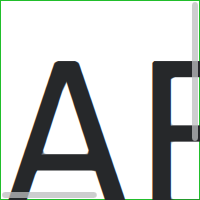
ScrollView {
    id: control

    width: 200
    height: 200
    focus: true

    Label {
        text: "ABC"
        font.pixelSize: 224
    }

    ScrollBar.vertical: ScrollBar {
        parent: control
        x: control.mirrored ? 0 : control.width - width
        y: control.topPadding
        height: control.availableHeight
        active: control.ScrollBar.horizontal.active
    }

    ScrollBar.horizontal: ScrollBar {
        parent: control
        x: control.leftPadding
        y: control.height - height
        width: control.availableWidth
        active: control.ScrollBar.vertical.active
    }

    background: Rectangle {
        border.color: control.activeFocus ? "#21be2b" : "#bdbebf"
    }
}
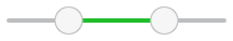
Customizing Slider
Slider consists of two visual items: background, and handle.
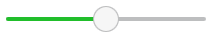
import QtQuick
import QtQuick.Controls.Basic

Slider {
    id: control
    value: 0.5

    background: Rectangle {
        x: control.leftPadding
        y: control.topPadding + control.availableHeight / 2 - height / 2
        implicitWidth: 200
        implicitHeight: 4
        width: control.availableWidth
        height: implicitHeight
        radius: 2
        color: "#bdbebf"

        Rectangle {
            width: control.visualPosition * parent.width
            height: parent.height
            color: "#21be2b"
            radius: 2
        }
    }

    handle: Rectangle {
        x: control.leftPadding + control.visualPosition * (control.availableWidth - width)
        y: control.topPadding + control.availableHeight / 2 - height / 2
        implicitWidth: 26
        implicitHeight: 26
        radius: 13
        color: control.pressed ? "#f0f0f0" : "#f6f6f6"
        border.color: "#bdbebf"
    }
}
Customizing SpinBox
SpinBox consists of four visual items: background, contentItem, up indicator, and down indicator.
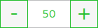
import QtQuick
import QtQuick.Controls.Basic

SpinBox {
    id: control
    value: 50
    editable: true

    contentItem: TextInput {
        z: 2
        text: control.textFromValue(control.value, control.locale)

        font: control.font
        color: "#21be2b"
        selectionColor: "#21be2b"
        selectedTextColor: "#ffffff"
        horizontalAlignment: Qt.AlignHCenter
        verticalAlignment: Qt.AlignVCenter

        readOnly: !control.editable
        validator: control.validator
        inputMethodHints: Qt.ImhFormattedNumbersOnly
    }

    up.indicator: Rectangle {
        x: control.mirrored ? 0 : parent.width - width
        height: parent.height
        implicitWidth: 40
        implicitHeight: 40
        color: control.up.pressed ? "#e4e4e4" : "#f6f6f6"
        border.color: enabled ? "#21be2b" : "#bdbebf"

        Text {
            text: "+"
            font.pixelSize: control.font.pixelSize * 2
            color: "#21be2b"
            anchors.fill: parent
            fontSizeMode: Text.Fit
            horizontalAlignment: Text.AlignHCenter
            verticalAlignment: Text.AlignVCenter
        }
    }

    down.indicator: Rectangle {
        x: control.mirrored ? parent.width - width : 0
        height: parent.height
        implicitWidth: 40
        implicitHeight: 40
        color: control.down.pressed ? "#e4e4e4" : "#f6f6f6"
        border.color: enabled ? "#21be2b" : "#bdbebf"

        Text {
            text: "-"
            font.pixelSize: control.font.pixelSize * 2
            color: "#21be2b"
            anchors.fill: parent
            fontSizeMode: Text.Fit
            horizontalAlignment: Text.AlignHCenter
            verticalAlignment: Text.AlignVCenter
        }
    }

    background: Rectangle {
        implicitWidth: 140
        border.color: "#bdbebf"
    }
}
Customizing SplitView
SplitView consists of a visual handle delegate.

SplitView {
    id: splitView
    anchors.fill: parent

    handle: Rectangle {
        implicitWidth: 4
        implicitHeight: 4
        color: SplitHandle.pressed ? "#81e889"
            : (SplitHandle.hovered ? Qt.lighter("#c2f4c6", 1.1) : "#c2f4c6")
    }

    Rectangle {
        implicitWidth: 150
        color: "#444"
    }
    Rectangle {
        implicitWidth: 50
        color: "#666"
    }
}
Customizing StackView
StackView can have a visual background item, and it allows customizing the transitions that are used for push, pop, and replace operations.
import QtQuick
import QtQuick.Controls.Basic

StackView {
    id: control

    popEnter: Transition {
        XAnimator {
            from: (control.mirrored ? -1 : 1) * -control.width
            to: 0
            duration: 400
            easing.type: Easing.OutCubic
        }
    }

    popExit: Transition {
        XAnimator {
            from: 0
            to: (control.mirrored ? -1 : 1) * control.width
            duration: 400
            easing.type: Easing.OutCubic
        }
    }
}
Customizing SwipeDelegate
SwipeDelegate consists of six visual items: background, contentItem, indicator, swipe.left, swipe.right, and swipe.behind.
import QtQuick
import QtQuick.Controls.Basic

SwipeDelegate {
    id: control
    text: qsTr("SwipeDelegate")

    Component {
        id: component

        Rectangle {
            color: SwipeDelegate.pressed ? "#333" : "#444"
            width: parent.width
            height: parent.height
            clip: true

            Label {
                text: qsTr("Press me!")
                color: "#21be2b"
                anchors.centerIn: parent
            }
        }
    }

    swipe.left: component
    swipe.right: component

    contentItem: Text {
        text: control.text
        font: control.font
        color: control.enabled ? (control.down ? "#17a81a" : "#21be2b") : "#bdbebf"
        elide: Text.ElideRight
        verticalAlignment: Text.AlignVCenter

        Behavior on x {
            enabled: !control.down
            NumberAnimation {
                easing.type: Easing.InOutCubic
                duration: 400
            }
        }
    }
}
Customizing SwipeView
SwipeView can have a visual background item. The navigation is implemented by the contentItem.
import QtQuick
import QtQuick.Controls.Basic

SwipeView {
    id: control

    background: Rectangle {
        color: "#eeeeee"
    }
}
Customizing Switch
Switch consists of three visual items: background, contentItem and indicator.

import QtQuick
import QtQuick.Controls.Basic

Switch {
    id: control
    text: qsTr("Switch")

    indicator: Rectangle {
        implicitWidth: 48
        implicitHeight: 26
        x: control.leftPadding
        y: parent.height / 2 - height / 2
        radius: 13
        color: control.checked ? "#17a81a" : "#ffffff"
        border.color: control.checked ? "#17a81a" : "#cccccc"

        Rectangle {
            x: control.checked ? parent.width - width : 0
            width: 26
            height: 26
            radius: 13
            color: control.down ? "#cccccc" : "#ffffff"
            border.color: control.checked ? (control.down ? "#17a81a" : "#21be2b") : "#999999"
        }
    }

    contentItem: Text {
        text: control.text
        font: control.font
        opacity: enabled ? 1.0 : 0.3
        color: control.down ? "#17a81a" : "#21be2b"
        verticalAlignment: Text.AlignVCenter
        leftPadding: control.indicator.width + control.spacing
    }
}
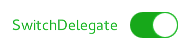
Customizing SwitchDelegate
SwitchDelegate consists of three visual items: background, contentItem and indicator.
import QtQuick
import QtQuick.Controls.Basic

SwitchDelegate {
    id: control
    text: qsTr("SwitchDelegate")
    checked: true

    contentItem: Text {
        rightPadding: control.indicator.width + control.spacing
        text: control.text
        font: control.font
        opacity: enabled ? 1.0 : 0.3
        color: control.down ? "#17a81a" : "#21be2b"
        elide: Text.ElideRight
        verticalAlignment: Text.AlignVCenter
    }

    indicator: Rectangle {
        implicitWidth: 48
        implicitHeight: 26
        x: control.width - width - control.rightPadding
        y: parent.height / 2 - height / 2
        radius: 13
        color: control.checked ? "#17a81a" : "transparent"
        border.color: control.checked ? "#17a81a" : "#cccccc"

        Rectangle {
            x: control.checked ? parent.width - width : 0
            width: 26
            height: 26
            radius: 13
            color: control.down ? "#cccccc" : "#ffffff"
            border.color: control.checked ? (control.down ? "#17a81a" : "#21be2b") : "#999999"
        }
    }

    background: Rectangle {
        implicitWidth: 100
        implicitHeight: 40
        visible: control.down || control.highlighted
        color: control.down ? "#bdbebf" : "#eeeeee"
    }
}
Customizing TabBar
TabBar consists of two visual items: background, and contentItem.
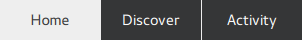
import QtQuick
import QtQuick.Controls.Basic

TabBar {
    id: control

    background: Rectangle {
        color: "#eeeeee"
    }

    TabButton {
        text: qsTr("Home")
    }
    TabButton {
        text: qsTr("Discover")
    }
    TabButton {
        text: qsTr("Activity")
    }
}
Customizing TabButton
TabButton can be customized in the same manner as Button.
Customizing TextArea
TextArea consists of a background item.
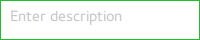
import QtQuick
import QtQuick.Controls.Basic

TextArea {
    id: control
    placeholderText: qsTr("Enter description")

    background: Rectangle {
        implicitWidth: 200
        implicitHeight: 40
        border.color: control.enabled ? "#21be2b" : "transparent"
    }
}
Customizing TextField
TextField consists of a background item.
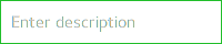
import QtQuick
import QtQuick.Controls.Basic

TextField {
    id: control
    placeholderText: qsTr("Enter description")

    background: Rectangle {
        implicitWidth: 200
        implicitHeight: 40
        color: control.enabled ? "transparent" : "#353637"
        border.color: control.enabled ? "#21be2b" : "transparent"
    }
}
Customizing ToolBar
ToolBar consists of one visual item: background.

ToolBar {
    id: control

    background: Rectangle {
        implicitHeight: 40
        color: "#eeeeee"

        Rectangle {
            width: parent.width
            height: 1
            anchors.bottom: parent.bottom
            color: "transparent"
            border.color: "#21be2b"
        }
    }

    RowLayout {
        anchors.fill: parent
        ToolButton {
            text: qsTr("Undo")
        }
        ToolButton {
            text: qsTr("Redo")
        }
    }
}
Customizing ToolButton
ToolButton consists of two visual items: background and contentItem.
import QtQuick
import QtQuick.Controls.Basic

ToolButton {
    id: control
    text: qsTr("ToolButton")
    width: 120

    contentItem: Text {
        text: control.text
        font: control.font
        opacity: enabled ? 1.0 : 0.3
        color: control.down ? "#17a81a" : "#21be2b"
        horizontalAlignment: Text.AlignHCenter
        verticalAlignment: Text.AlignVCenter
        elide: Text.ElideRight
    }

    background: Rectangle {
        implicitWidth: 40
        implicitHeight: 40
        color: Qt.darker("#33333333", control.enabled && (control.checked || control.highlighted) ? 1.5 : 1.0)
        opacity: enabled ? 1 : 0.3
        visible: control.down || (control.enabled && (control.checked || control.highlighted))
    }
}
Customizing ToolSeparator
ToolSeparator consists of two visual items: background and contentItem.
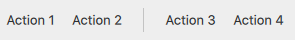
ToolBar {
    RowLayout {
        anchors.fill: parent

        ToolButton {
            text: qsTr("Action 1")
        }
        ToolButton {
            text: qsTr("Action 2")
        }

        ToolSeparator {
            padding: vertical ? 10 : 2
            topPadding: vertical ? 2 : 10
            bottomPadding: vertical ? 2 : 10

            contentItem: Rectangle {
                implicitWidth: parent.vertical ? 1 : 24
                implicitHeight: parent.vertical ? 24 : 1
                color: "#c3c3c3"
            }
        }

        ToolButton {
            text: qsTr("Action 3")
        }
        ToolButton {
            text: qsTr("Action 4")
        }

        Item {
            Layout.fillWidth: true
        }
    }
}
Customizing ToolTip
ToolTip consists of two visual items: background and contentItem.
import QtQuick
import QtQuick.Controls.Basic

ToolTip {
    id: control
    text: qsTr("A descriptive tool tip of what the button does")

    contentItem: Text {
        text: control.text
        font: control.font
        color: "#21be2b"
    }

    background: Rectangle {
        border.color: "#21be2b"
    }
}
Note: to customize the attached ToolTip, it must be provided as part of your own style. To do a one-off customization of a ToolTip, see Custom Tool Tips.
Customizing Tumbler
Tumbler consists of three visual items: background, contentItem, and delegate.

import QtQuick
import QtQuick.Controls.Basic

Tumbler {
    id: control
    model: 15

    background: Item {
        Rectangle {
            opacity: control.enabled ? 0.2 : 0.1
            border.color: "#000000"
            width: parent.width
            height: 1
            anchors.top: parent.top
        }

        Rectangle {
            opacity: control.enabled ? 0.2 : 0.1
            border.color: "#000000"
            width: parent.width
            height: 1
            anchors.bottom: parent.bottom
        }
    }

    delegate: Text {
        text: qsTr("Item %1").arg(modelData + 1)
        font: control.font
        horizontalAlignment: Text.AlignHCenter
        verticalAlignment: Text.AlignVCenter
        opacity: 1.0 - Math.abs(Tumbler.displacement) / (control.visibleItemCount / 2)

        required property var modelData
        required property int index
    }

    Rectangle {
        anchors.horizontalCenter: control.horizontalCenter
        y: control.height * 0.4
        width: 40
        height: 1
        color: "#21be2b"
    }

    Rectangle {
        anchors.horizontalCenter: control.horizontalCenter
        y: control.height * 0.6
        width: 40
        height: 1
        color: "#21be2b"
    }
}
If you want to define your own contentItem, use either a ListView or PathView as the root item. For a wrapping Tumbler, use PathView:
Tumbler {
    id: tumbler

    contentItem: PathView {
        id: pathView
        model: tumbler.model
        delegate: tumbler.delegate
        clip: true
        pathItemCount: tumbler.visibleItemCount + 1
        preferredHighlightBegin: 0.5
        preferredHighlightEnd: 0.5
        dragMargin: width / 2

        path: Path {
            startX: pathView.width / 2
            startY: -pathView.delegateHeight / 2
            PathLine {
                x: pathView.width / 2
                y: pathView.pathItemCount * pathView.delegateHeight - pathView.delegateHeight / 2
            }
        }

        property real delegateHeight: tumbler.availableHeight / tumbler.visibleItemCount
    }
}
For a non-wrapping Tumbler, use ListView:
Tumbler {
    id: tumbler

    contentItem: ListView {
        model: tumbler.model
        delegate: tumbler.delegate

        snapMode: ListView.SnapToItem
        highlightRangeMode: ListView.StrictlyEnforceRange
        preferredHighlightBegin: height / 2 - (height / tumbler.visibleItemCount / 2)
        preferredHighlightEnd: height / 2 + (height / tumbler.visibleItemCount / 2)
        clip: true
    }
}
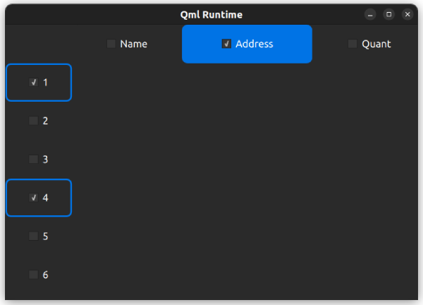
Customizing TableViewDelegate
TableViewDelegate inherits ItemDelegate, which means that it's composed of two visual items: background and contentItem.
You can always assign your own custom edit delegate to editDelegate if you have needs outside what the default edit delegate offers.

delegate: TableViewDelegate {
    id: tableCell

    checked: column === 0 ? checkBox.checked : tableView.itemAtIndex(tableView.index(row, 0)).checked
    selected: checked

    background: Item {
        Rectangle {
            anchors.fill: parent
            anchors.margins: tableCell.current ? 3 : 1
            color: tableCell.selected ? "blue" : "white"
        }

        Rectangle {
            anchors.fill: parent
            color: "transparent"
            border.color: "darkblue"
            border.width: tableCell.current ? 2 : 0
        }
    }

    contentItem: Item {
        implicitHeight: 40
        visible: !tableCell.editing

        RowLayout {
            anchors.fill: parent

            CheckBox {
                id: checkBox
                implicitWidth: height
                Layout.fillHeight: true
                checked: false
                visible: tableCell.column === 0
            }

            Text {
                Layout.leftMargin: 4
                Layout.fillWidth: true
                Layout.fillHeight: true
                verticalAlignment: Text.AlignVCenter
                color: tableCell.selected ? "white" : "black"
                text: tableCell.model.display
            }
        }
    }

    TableView.editDelegate: FocusScope {
        width: parent.width
        height: parent.height

        TableView.onCommit: {
            let qaim = tableCell.tableView.model
            if (!qaim)
                return
            const index = qaim.index(tableCell.row, tableCell.column)
            // instead of the edit role, any custom role supported by the model can be checked
            // e.g. if (!tableCell.checked || !tableCell.model.customRole)
            if (!tableCell.checked || !tableCell.model.edit)
                return
            // instead of the edit role, any custom role supported by the model can be set
            // e.g. tableCell.model.customRole = textField.text
            tableCell.model.edit = textField.text
            tableCell.model.display = textField.text
        }

        Component.onCompleted: textField.selectAll()

        TextField {
            id: textField
            anchors.fill: parent
            text: tableCell.model.edit ?? tableCell.model.display ?? ""
            focus: true
        }
    }
}
Customizing HeaderViewDelegate
HeaderViewDelegate inherits TableViewDelegate, which means that it's composed of two items: background and contentItem. You can always customize them with any arbitrary items.
Here is an example of customizing the horizontal header view delegate:
delegate: HorizontalHeaderViewDelegate {
    id: horizontalDelegate

    required property int index
    required property string modelData

    background: Rectangle {
        height: horizontalDelegate.height
        color: columnCheckBox.checked ? palette.highlight : palette.base
        radius: 8
    }

    contentItem: Item {
        implicitWidth: columnCheckBox.implicitWidth * 2
        implicitHeight: 40

        CheckBox {
            id: columnCheckBox
            anchors.centerIn: parent
            text: horizontalDelegate.modelData
            Component.onCompleted: checked = horizontalDelegate.index === 1
        }
    }
}
Here is an example of customizing the vertical header view delegate:
delegate: VerticalHeaderViewDelegate {
    id: verticalDelegate

    required property int index

    background: Rectangle {
        height: verticalDelegate.height
        color: palette.base
        border.width: rowCheckBox.checked ? 2 : 0
        border.color: palette.highlight
        radius: 8
    }

    contentItem: Item {
        implicitWidth: rowCheckBox.implicitWidth * 2
        implicitHeight: 40

        CheckBox {
            id: rowCheckBox
            anchors.centerIn: parent
            text: verticalDelegate.index + 1
            Component.onCompleted: checked = verticalDelegate.index % 3 === 0
        }
    }
}
Styling Controls using StyleKit
The Qt Labs StyleKit module provides a set of QML types for styling Qt Quick Controls, built on top of Qt Quick Templates. It lets you define a complete visual style for all your controls from a single Style object, including support for themes, state-based styling, and transitions. StyleKit handles the underlying template implementation automatically, letting you focus purely on visual aspects such as colors, dimensions, borders, and shadows.
The Qt Labs StyleKit module is a Technology Preview module in Qt 6.11.
© 2026 The Qt Company Ltd. Documentation contributions included herein are the copyrights of their respective owners. The documentation provided herein is licensed under the terms of the GNU Free Documentation License version 1.3 as published by the Free Software Foundation. Qt and respective logos are trademarks of The Qt Company Ltd. in Finland and/or other countries worldwide. All other trademarks are property of their respective owners.
