QGroupBox

Synopsis
Functions
def
alignment()def
initStyleOption(option)def
isCheckable()def
isChecked()def
isFlat()def
setAlignment(alignment)def
setCheckable(checkable)def
setFlat(flat)def
setTitle(title)def
title()
Slots
def
setChecked(checked)
Signals
Detailed Description

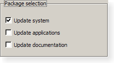
A group box provides a frame, a title on top, a keyboard shortcut, and displays various other widgets inside itself. The keyboard shortcut moves keyboard focus to one of the group box’s child widgets.
QGroupBoxalso lets you set thetitle(normally set in the constructor) and the title’s alignment . Group boxes can becheckable. Child widgets in checkable group boxes are enabled or disabled depending on whether or not the group box ischecked.You can minimize the space consumption of a group box by enabling the
flatproperty. In moststyles, enabling this property results in the removal of the left, right and bottom edges of the frame.
QGroupBoxdoesn’t automatically lay out the child widgets (which are oftenQCheckBoxes orQRadioButtons but can be any widgets). The following example shows how we can set up aQGroupBoxwith a layout:groupBox = QGroupBox("Exclusive Radio Buttons") radio1 = QRadioButton("&Radio button 1") radio2 = QRadioButton("R&adio button 2") radio3 = QRadioButton("Ra&dio button 3") radio1.setChecked(True) vbox = QVBoxLayout() vbox.addWidget(radio1) vbox.addWidget(radio2) vbox.addWidget(radio3) vbox.addStretch(1) groupBox.setLayout(vbox)See also
- class PySide2.QtWidgets.QGroupBox([parent=None])
PySide2.QtWidgets.QGroupBox(title[, parent=None])
- param parent:
- param title:
str
Constructs a group box widget with the given
parentbut with no title.Constructs a group box with the given
titleandparent.
- PySide2.QtWidgets.QGroupBox.alignment()
- Return type:
Alignment
This property holds the alignment of the group box title..
Most styles place the title at the top of the frame. The horizontal alignment of the title can be specified using single values from the following list:
AlignLeftaligns the title text with the left-hand side of the group box.AlignRightaligns the title text with the right-hand side of the group box.AlignHCenteraligns the title text with the horizontal center of the group box.
The default alignment is
AlignLeft.See also
Alignment
- PySide2.QtWidgets.QGroupBox.clicked([checked=false])
- Parameters:
checked – bool
- PySide2.QtWidgets.QGroupBox.initStyleOption(option)
- Parameters:
Initialize
optionwith the values from thisQGroupBox. This method is useful for subclasses when they need aQStyleOptionGroupBox, but don’t want to fill in all the information themselves.See also
- PySide2.QtWidgets.QGroupBox.isCheckable()
- Return type:
bool
This property holds whether the group box has a checkbox in its title.
If this property is
true, the group box displays its title using a checkbox in place of an ordinary label. If the checkbox is checked, the group box’s children are enabled; otherwise, they are disabled and inaccessible.By default, group boxes are not checkable.
If this property is enabled for a group box, it will also be initially checked to ensure that its contents are enabled.
See also
checked
- PySide2.QtWidgets.QGroupBox.isChecked()
- Return type:
bool
This property holds whether the group box is checked.
If the group box is checkable, it is displayed with a check box. If the check box is checked, the group box’s children are enabled; otherwise, the children are disabled and are inaccessible to the user.
By default, checkable group boxes are also checked.
See also
checkable
- PySide2.QtWidgets.QGroupBox.isFlat()
- Return type:
bool
This property holds whether the group box is painted flat or has a frame.
A group box usually consists of a surrounding frame with a title at the top. If this property is enabled, only the top part of the frame is drawn in most styles; otherwise, the whole frame is drawn.
By default, this property is disabled, i.e., group boxes are not flat unless explicitly specified.
Note
In some styles, flat and non-flat group boxes have similar representations and may not be as distinguishable as they are in other styles.
See also
- PySide2.QtWidgets.QGroupBox.setAlignment(alignment)
- Parameters:
alignment – int
See also
- PySide2.QtWidgets.QGroupBox.setCheckable(checkable)
- Parameters:
checkable – bool
This property holds whether the group box has a checkbox in its title.
If this property is
true, the group box displays its title using a checkbox in place of an ordinary label. If the checkbox is checked, the group box’s children are enabled; otherwise, they are disabled and inaccessible.By default, group boxes are not checkable.
If this property is enabled for a group box, it will also be initially checked to ensure that its contents are enabled.
See also
checked
- PySide2.QtWidgets.QGroupBox.setChecked(checked)
- Parameters:
checked – bool
This property holds whether the group box is checked.
If the group box is checkable, it is displayed with a check box. If the check box is checked, the group box’s children are enabled; otherwise, the children are disabled and are inaccessible to the user.
By default, checkable group boxes are also checked.
See also
checkable
- PySide2.QtWidgets.QGroupBox.setFlat(flat)
- Parameters:
flat – bool
This property holds whether the group box is painted flat or has a frame.
A group box usually consists of a surrounding frame with a title at the top. If this property is enabled, only the top part of the frame is drawn in most styles; otherwise, the whole frame is drawn.
By default, this property is disabled, i.e., group boxes are not flat unless explicitly specified.
Note
In some styles, flat and non-flat group boxes have similar representations and may not be as distinguishable as they are in other styles.
See also
- PySide2.QtWidgets.QGroupBox.setTitle(title)
- Parameters:
title – str
This property holds the group box title text.
The group box title text will have a keyboard shortcut if the title contains an ampersand (’&’) followed by a letter.
g.setTitle("&User information")
In the example above, Alt+U moves the keyboard focus to the group box. See the
QShortcutdocumentation for details (to display an actual ampersand, use ‘&&’).There is no default title text.
See also
- PySide2.QtWidgets.QGroupBox.title()
- Return type:
str
This property holds the group box title text.
The group box title text will have a keyboard shortcut if the title contains an ampersand (’&’) followed by a letter.
g.setTitle("&User information")
In the example above, Alt+U moves the keyboard focus to the group box. See the
QShortcutdocumentation for details (to display an actual ampersand, use ‘&&’).There is no default title text.
See also
- PySide2.QtWidgets.QGroupBox.toggled(arg__1)
- Parameters:
arg__1 – bool
© 2022 The Qt Company Ltd. Documentation contributions included herein are the copyrights of their respective owners. The documentation provided herein is licensed under the terms of the GNU Free Documentation License version 1.3 as published by the Free Software Foundation. Qt and respective logos are trademarks of The Qt Company Ltd. in Finland and/or other countries worldwide. All other trademarks are property of their respective owners.
