Qt Style Sheets
How to use style sheets to customize the appearance of widgets.
Qt Style Sheets are a powerful mechanism that allows you to customize the appearance of widgets, in addition to what is already possible by subclassing QStyle . The concepts, terminology, and syntax of Qt Style Sheets are heavily inspired by HTML Cascading Style Sheets (CSS) but adapted to the world of widgets.
Topics:
Note
If Qt Style Sheets are used on the same widget as functions that set the appearance of widgets, such as setFont() or setBackground() , style sheets will take precedence if the settings conflict.
Overview
Styles sheets are textual specifications that can be set on the whole application using setStyleSheet() or on a specific widget (and its children) using setStyleSheet() . If several style sheets are set at different levels, Qt derives the effective style sheet from all of those that are set. This is called cascading.
For example, the following style sheet specifies that all QLineEdit s should use yellow as their background color, and all QCheckBox es should use red as the text color:
QLineEdit { background: yellow }
QCheckBox { color: red }
For this kind of customization, style sheets are much more powerful than QPalette . For example, it might be tempting to set the Button role to red for a QPushButton to obtain a red push button. However, this wasn’t guaranteed to work for all styles, because style authors are restricted by the different platforms’ guidelines and (on Windows and macOS) by the native theme engine.
Style sheets let you perform all kinds of customizations that are difficult or impossible to perform using QPalette alone. If you want yellow backgrounds for mandatory fields, red text for potentially destructive push buttons, or fancy check boxes, style sheets are the answer.
Style sheets are applied on top of the current widget style , meaning that your applications will look as native as possible, but any style sheet constraints will be taken into consideration. Unlike palette fiddling, style sheets offer guarantees: If you set the background color of a QPushButton to be red, you can be assured that the button will have a red background in all styles, on all platforms. In addition, Qt Designer provides style sheet integration, making it easy to view the effects of a style sheet in different widget styles .
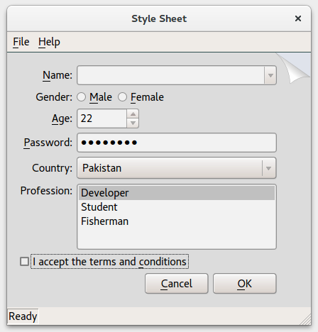
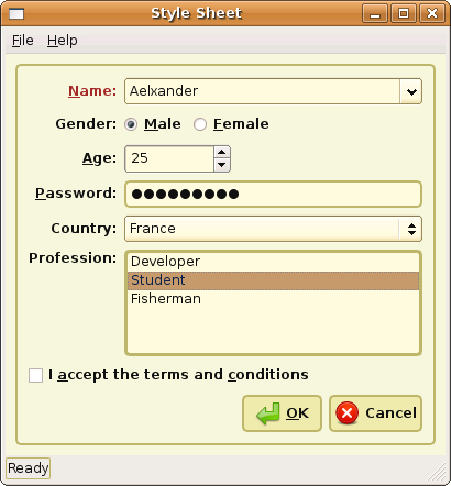
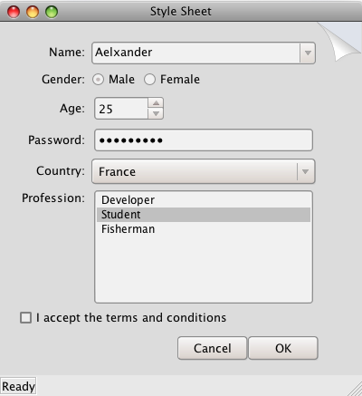
In addition, style sheets can be used to provide a distinctive look and feel for your application, without having to subclass QStyle . For example, you can specify arbitrary images for radio buttons and check boxes to make them stand out. Using this technique, you can also achieve minor customizations that would normally require subclassing several style classes, such as specifying a style hint . The Style Sheet example depicted below defines two distinctive style sheets that you can try out and modify at will.
Pagefold theme running on Windows
Coffee theme running on Ubuntu Linux
Pagefold theme running on macOS
When a style sheet is active, the QStyle returned by style() is a wrapper “style sheet” style, not the platform-specific style. The wrapper style ensures that any active style sheet is respected and otherwise forwards the drawing operations to the underlying, platform-specific style (e.g., QWindowsVistaStyle on Windows).
Since Qt 4.5, Qt style sheets fully supports macOS.
© 2022 The Qt Company Ltd. Documentation contributions included herein are the copyrights of their respective owners. The documentation provided herein is licensed under the terms of the GNU Free Documentation License version 1.3 as published by the Free Software Foundation. Qt and respective logos are trademarks of The Qt Company Ltd. in Finland and/or other countries worldwide. All other trademarks are property of their respective owners.


