PySide6.QtGui.QIcon
- class QIcon
The
QIconclass provides scalable icons in different modes and states. More…Synopsis
Methods
def
__init__()def
actualSize()def
addFile()def
addPixmap()def
availableSizes()def
cacheKey()def
isMask()def
isNull()def
name()def
paint()def
pixmap()def
setIsMask()def
swap()
Static functions
def
fromTheme()def
hasThemeIcon()def
setThemeName()def
themeName()
Note
This documentation may contain snippets that were automatically translated from C++ to Python. We always welcome contributions to the snippet translation. If you see an issue with the translation, you can also let us know by creating a ticket on https:/bugreports.qt.io/projects/PYSIDE
Detailed Description
Warning
This section contains snippets that were automatically translated from C++ to Python and may contain errors.
A
QIconcan generate smaller, larger, active, and disabled pixmaps from the set of pixmaps it is given. Such pixmaps are used by Qt UI components to show an icon representing a particular action.Creating an icon from image files
The simplest way to construct a
QIconis to create one from one or several image files or resources. For example:button = QToolButton() button.setIcon(QIcon("open.png"))
QIconcan store several images for different states, and Qt will select the image that is the closest match for the action’s current state.openIcon = QIcon("open.png") openIcon.addFile("open-disabled.png", QIcon.Disabled)
Qt will generate the required icon styles and sizes when needed, e.g. the pixmap for the
Disabledstate might be generated by graying out one of the provided pixmaps.To clear the icon, simply set a null icon in its place:
button.setIcon(QIcon())
Use the
supportedImageFormats()andsupportedImageFormats()functions to retrieve a complete list of the supported file formats.Note
If using an SVG image file, make sure to add it before any non-SVG files, so that the correct
icon enginegets selected.Creating an icon from a theme or icon library
The most convenient way to construct an icon is by using the
fromTheme()factory function. Qt implements access to the native icon library on platforms that support the Freedesktop Icon Theme Specification . Since Qt 6.7, Qt also provides access to the native icon library on macOS, iOS, and Windows 10 and 11. On Android, Qt can access icons from the Material design system as long as the MaterialIcons-Regular font is available on the system, or bundled as a resource at:/qt-project.org/icons/MaterialIcons-Regular.ttfwith the application.undoicon = QIcon.fromTheme(QIcon.ThemeIcon.EditUndo)
Applications can use the same theming specification to provide their own icon library. See below for an example theme description and the corresponding directory structure for the image files. Icons from an application-provided theme take precedence over the native icon library.
Icon Engines
Internally,
QIconinstantiates anicon enginebackend to handle and render the icon images. The type of icon engine is determined by the first file or pixmap or theme added to aQIconobject. Additional files or pixmaps will then be handled by the same engine.Icon engines differ in the way they handle and render icons. The default pixmap-based engine only deals with fixed images, while the QtSvg module provides an icon engine that can re-render the provided vector graphics files at the requested size for better quality. The theme icon engines will typically only provide images from native platform icon library, and ignore any added files or pixmaps.
In addition, it is possible to provide custom icon engines. This allows applications to customize every aspect of generated icons. With
QIconEnginePluginit is possible to register different icon engines for different file suffixes, making it possible for third parties to provide additional icon engines to those included with Qt.Making Classes that Use QIcon
If you write your own widgets that have an option to set a small pixmap, consider allowing a
QIconto be set for that pixmap. The Qt class QToolButton is an example of such a widget.Provide a method to set a
QIcon, and paint theQIconwithpaint, choosing the appropriate parameters based on the current state of your widget. For example:def drawIcon(self, painter, rect): icon.paint(painter, rect, Qt.AlignmentFlag.AlignCenter, isEnabled() ? QIcon.Normal super().__init__() isChecked() ? QIcon.On super().__init__()When you retrieve a pixmap using pixmap(QSize, Mode, State), and no pixmap for this given size, mode and state has been added with
addFile()oraddPixmap(), thenQIconwill generate one on the fly. This pixmap generation happens in aQIconEngine. The default engine scales pixmaps down if required, but never up, and it uses the current style to calculate a disabled appearance.You might also make use of the
Activemode, perhaps making your widgetActivewhen the mouse is over the widget (see QWidget::enterEvent()), while the mouse is pressed pending the release that will activate the function, or when it is the currently selected item. If the widget can be toggled, the “On” mode might be used to draw a different icon.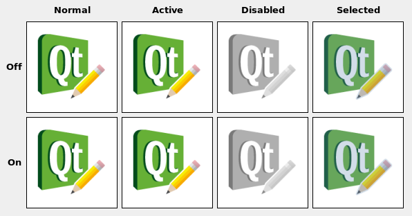
Note
QIconneeds aQGuiApplicationinstance before the icon is created.High DPI Icons
Icons that are provided by the native icon library are usually based on vector graphics, and will automatically be rendered in the appropriate resolution.
When providing your own image files via
addFile(), thenQIconwill use Qt’s"@nx" high DPI syntax. This is useful if you have your own custom directory structure and do not use follow Freedesktop Icon Theme Specification .When providing an application theme, then you need to follow the Icon Theme Specification to specify which files to use for different resolutions. To make
QIconuse the high DPI version of an image, add an additional entry to the appropriateindex.themefile:[Icon Theme] Name=Test Comment=Test Theme Directories=32x32/actions,32x32@2/actions [32x32/actions] Size=32 Context=Actions Type=Fixed # High DPI version of the entry above. [32x32@2/actions] Size=32 Scale=2 Type=Fixed
Your icon theme directory would then look something like this:
├── 32x32
│   └── actions
│       └── appointment-new.png
├── 32x32@2
│   └── actions
│       └── appointment-new.png
└── index.theme
- class Mode
This enum type describes the mode for which a pixmap is intended to be used. The currently defined modes are:
Constant
Description
QIcon.Mode.Normal
Display the pixmap when the user is not interacting with the icon, but the functionality represented by the icon is available.
QIcon.Mode.Disabled
Display the pixmap when the functionality represented by the icon is not available.
QIcon.Mode.Active
Display the pixmap when the functionality represented by the icon is available and the user is interacting with the icon, for example, moving the mouse over it or clicking it.
QIcon.Mode.Selected
Display the pixmap when the item represented by the icon is selected.
- class State
This enum describes the state for which a pixmap is intended to be used. The state can be:
Constant
Description
QIcon.State.Off
Display the pixmap when the widget is in an “off” state
QIcon.State.On
Display the pixmap when the widget is in an “on” state
- class ThemeIcon
This enum provides access to icons that are provided by most icon theme implementations.
Constant
Description
QIcon.ThemeIcon.ThemeIcon.AddressBookNew
The icon for the action to create a new address book.
QIcon.ThemeIcon.ThemeIcon.ApplicationExit
The icon for exiting an application.
QIcon.ThemeIcon.ThemeIcon.AppointmentNew
The icon for the action to create a new appointment.
QIcon.ThemeIcon.ThemeIcon.CallStart
The icon for initiating or accepting a call.
QIcon.ThemeIcon.ThemeIcon.CallStop
The icon for stopping a current call.
QIcon.ThemeIcon.ThemeIcon.ContactNew
The icon for the action to create a new contact.
QIcon.ThemeIcon.ThemeIcon.DocumentNew
The icon for the action to create a new document.
QIcon.ThemeIcon.ThemeIcon.DocumentOpen
The icon for the action to open a document.
QIcon.ThemeIcon.ThemeIcon.DocumentOpenRecent
The icon for the action to open a document that was recently opened.
QIcon.ThemeIcon.ThemeIcon.DocumentPageSetup
The icon for the page setup action.
QIcon.ThemeIcon.ThemeIcon.DocumentPrint
The icon for the print action.
QIcon.ThemeIcon.ThemeIcon.DocumentPrintPreview
The icon for the print preview action.
QIcon.ThemeIcon.ThemeIcon.DocumentProperties
The icon for the action to view the properties of a document.
QIcon.ThemeIcon.ThemeIcon.DocumentRevert
The icon for the action of reverting to a previous version of a document.
QIcon.ThemeIcon.ThemeIcon.DocumentSave
The icon for the save action.
QIcon.ThemeIcon.ThemeIcon.DocumentSaveAs
The icon for the save as action.
QIcon.ThemeIcon.ThemeIcon.DocumentSend
The icon for the send action.
QIcon.ThemeIcon.ThemeIcon.EditClear
The icon for the clear action.
QIcon.ThemeIcon.ThemeIcon.EditCopy
The icon for the copy action.
QIcon.ThemeIcon.ThemeIcon.EditCut
The icon for the cut action.
QIcon.ThemeIcon.ThemeIcon.EditDelete
The icon for the delete action.
QIcon.ThemeIcon.ThemeIcon.EditFind
The icon for the find action.
QIcon.ThemeIcon.ThemeIcon.EditPaste
The icon for the paste action.
QIcon.ThemeIcon.ThemeIcon.EditRedo
The icon for the redo action.
QIcon.ThemeIcon.ThemeIcon.EditSelectAll
The icon for the select all action.
QIcon.ThemeIcon.ThemeIcon.EditUndo
The icon for the undo action.
QIcon.ThemeIcon.ThemeIcon.FolderNew
The icon for creating a new folder.
QIcon.ThemeIcon.ThemeIcon.FormatIndentLess
The icon for the decrease indent formatting action.
QIcon.ThemeIcon.ThemeIcon.FormatIndentMore
The icon for the increase indent formatting action.
QIcon.ThemeIcon.ThemeIcon.FormatJustifyCenter
The icon for the center justification formatting action.
QIcon.ThemeIcon.ThemeIcon.FormatJustifyFill
The icon for the fill justification formatting action.
QIcon.ThemeIcon.ThemeIcon.FormatJustifyLeft
The icon for the left justification formatting action.
QIcon.ThemeIcon.ThemeIcon.FormatJustifyRight
The icon for the right justification action.
QIcon.ThemeIcon.ThemeIcon.FormatTextDirectionLtr
The icon for the left-to-right text formatting action.
QIcon.ThemeIcon.ThemeIcon.FormatTextDirectionRtl
The icon for the right-to-left formatting action.
QIcon.ThemeIcon.ThemeIcon.FormatTextBold
The icon for the bold text formatting action.
QIcon.ThemeIcon.ThemeIcon.FormatTextItalic
The icon for the italic text formatting action.
QIcon.ThemeIcon.ThemeIcon.FormatTextUnderline
The icon for the underlined text formatting action.
QIcon.ThemeIcon.ThemeIcon.FormatTextStrikethrough
The icon for the strikethrough text formatting action.
QIcon.ThemeIcon.ThemeIcon.GoDown
The icon for the go down in a list action.
QIcon.ThemeIcon.ThemeIcon.GoHome
The icon for the go to home location action.
QIcon.ThemeIcon.ThemeIcon.GoNext
The icon for the go to the next item in a list action.
QIcon.ThemeIcon.ThemeIcon.GoPrevious
The icon for the go to the previous item in a list action.
QIcon.ThemeIcon.ThemeIcon.GoUp
The icon for the go up in a list action.
QIcon.ThemeIcon.ThemeIcon.HelpAbout
The icon for the About item in the Help menu.
QIcon.ThemeIcon.ThemeIcon.HelpFaq
The icon for the FAQ item in the Help menu.
QIcon.ThemeIcon.ThemeIcon.InsertImage
The icon for the insert image action of an application.
QIcon.ThemeIcon.ThemeIcon.InsertLink
The icon for the insert link action of an application.
QIcon.ThemeIcon.ThemeIcon.InsertText
The icon for the insert text action of an application.
QIcon.ThemeIcon.ThemeIcon.ListAdd
The icon for the add to list action.
QIcon.ThemeIcon.ThemeIcon.ListRemove
The icon for the remove from list action.
QIcon.ThemeIcon.ThemeIcon.MailForward
The icon for the forward action.
QIcon.ThemeIcon.ThemeIcon.MailMarkImportant
The icon for the mark as important action.
QIcon.ThemeIcon.ThemeIcon.MailMarkRead
The icon for the mark as read action.
QIcon.ThemeIcon.ThemeIcon.MailMarkUnread
The icon for the mark as unread action.
QIcon.ThemeIcon.ThemeIcon.MailMessageNew
The icon for the compose new mail action.
QIcon.ThemeIcon.ThemeIcon.MailReplyAll
The icon for the reply to all action.
QIcon.ThemeIcon.ThemeIcon.MailReplySender
The icon for the reply to sender action.
QIcon.ThemeIcon.ThemeIcon.MailSend
The icon for the send action.
QIcon.ThemeIcon.ThemeIcon.MediaEject
The icon for the eject action of a media player or file manager.
QIcon.ThemeIcon.ThemeIcon.MediaPlaybackPause
The icon for the pause action of a media player.
QIcon.ThemeIcon.ThemeIcon.MediaPlaybackStart
The icon for the start playback action of a media player.
QIcon.ThemeIcon.ThemeIcon.MediaPlaybackStop
The icon for the stop action of a media player.
QIcon.ThemeIcon.ThemeIcon.MediaRecord
The icon for the record action of a media application.
QIcon.ThemeIcon.ThemeIcon.MediaSeekBackward
The icon for the seek backward action of a media player.
QIcon.ThemeIcon.ThemeIcon.MediaSeekForward
The icon for the seek forward action of a media player.
QIcon.ThemeIcon.ThemeIcon.MediaSkipBackward
The icon for the skip backward action of a media player.
QIcon.ThemeIcon.ThemeIcon.MediaSkipForward
The icon for the skip forward action of a media player.
QIcon.ThemeIcon.ThemeIcon.ObjectRotateLeft
The icon for the rotate left action performed on an object.
QIcon.ThemeIcon.ThemeIcon.ObjectRotateRight
The icon for the rotate right action performed on an object.
QIcon.ThemeIcon.ThemeIcon.ProcessStop
The icon for the stop action in applications with actions that may take a while to process, such as web page loading in a browser.
QIcon.ThemeIcon.ThemeIcon.SystemLockScreen
The icon for the lock screen action.
QIcon.ThemeIcon.ThemeIcon.SystemLogOut
The icon for the log out action.
QIcon.ThemeIcon.ThemeIcon.SystemSearch
The icon for the search action.
QIcon.ThemeIcon.ThemeIcon.SystemReboot
The icon for the reboot action.
QIcon.ThemeIcon.ThemeIcon.SystemShutdown
The icon for the shutdown action.
QIcon.ThemeIcon.ThemeIcon.ToolsCheckSpelling
The icon for the check spelling action.
QIcon.ThemeIcon.ThemeIcon.ViewFullscreen
The icon for the fullscreen action.
QIcon.ThemeIcon.ThemeIcon.ViewRefresh
The icon for the refresh action.
QIcon.ThemeIcon.ThemeIcon.ViewRestore
The icon for leaving the fullscreen view.
QIcon.ThemeIcon.ThemeIcon.WindowClose
The icon for the close window action.
QIcon.ThemeIcon.ThemeIcon.WindowNew
The icon for the new window action.
QIcon.ThemeIcon.ThemeIcon.ZoomFitBest
The icon for the best fit action.
QIcon.ThemeIcon.ThemeIcon.ZoomIn
The icon for the zoom in action.
QIcon.ThemeIcon.ThemeIcon.ZoomOut
The icon for the zoom out action.
QIcon.ThemeIcon.ThemeIcon.AudioCard
The icon for the audio rendering device.
QIcon.ThemeIcon.ThemeIcon.AudioInputMicrophone
The icon for the microphone audio input device.
QIcon.ThemeIcon.ThemeIcon.Battery
The icon for the system battery device.
QIcon.ThemeIcon.ThemeIcon.CameraPhoto
The icon for a digital still camera devices.
QIcon.ThemeIcon.ThemeIcon.CameraVideo
The icon for a video camera device.
QIcon.ThemeIcon.ThemeIcon.CameraWeb
The icon for a web camera device.
QIcon.ThemeIcon.ThemeIcon.Computer
The icon for the computing device as a whole.
QIcon.ThemeIcon.ThemeIcon.DriveHarddisk
The icon for hard disk drives.
QIcon.ThemeIcon.ThemeIcon.DriveOptical
The icon for optical media drives such as CD and DVD.
QIcon.ThemeIcon.ThemeIcon.InputGaming
The icon for the gaming input device.
QIcon.ThemeIcon.ThemeIcon.InputKeyboard
The icon for the keyboard input device.
QIcon.ThemeIcon.ThemeIcon.InputMouse
The icon for the mousing input device.
QIcon.ThemeIcon.ThemeIcon.InputTablet
The icon for graphics tablet input devices.
QIcon.ThemeIcon.ThemeIcon.MediaFlash
The icon for flash media, such as a memory stick.
QIcon.ThemeIcon.ThemeIcon.MediaOptical
The icon for physical optical media such as CD and DVD.
QIcon.ThemeIcon.ThemeIcon.MediaTape
The icon for generic physical tape media.
QIcon.ThemeIcon.ThemeIcon.MultimediaPlayer
The icon for generic multimedia playing devices.
QIcon.ThemeIcon.ThemeIcon.NetworkWired
The icon for wired network connections.
QIcon.ThemeIcon.ThemeIcon.NetworkWireless
The icon for wireless network connections.
QIcon.ThemeIcon.ThemeIcon.Phone
The icon for phone devices.
QIcon.ThemeIcon.ThemeIcon.Printer
The icon for a printer device.
QIcon.ThemeIcon.ThemeIcon.Scanner
The icon for a scanner device.
QIcon.ThemeIcon.ThemeIcon.VideoDisplay
The icon for the monitor that video gets displayed on.
QIcon.ThemeIcon.ThemeIcon.AppointmentMissed
The icon for when an appointment was missed.
QIcon.ThemeIcon.ThemeIcon.AppointmentSoon
The icon for when an appointment will occur soon.
QIcon.ThemeIcon.ThemeIcon.AudioVolumeHigh
The icon used to indicate high audio volume.
QIcon.ThemeIcon.ThemeIcon.AudioVolumeLow
The icon used to indicate low audio volume.
QIcon.ThemeIcon.ThemeIcon.AudioVolumeMedium
The icon used to indicate medium audio volume.
QIcon.ThemeIcon.ThemeIcon.AudioVolumeMuted
The icon used to indicate the muted state for audio playback.
QIcon.ThemeIcon.ThemeIcon.BatteryCaution
The icon used when the battery is below 40%.
QIcon.ThemeIcon.ThemeIcon.BatteryLow
The icon used when the battery is below 20%.
QIcon.ThemeIcon.ThemeIcon.DialogError
The icon used when a dialog is opened to explain an error condition to the user.
QIcon.ThemeIcon.ThemeIcon.DialogInformation
The icon used when a dialog is opened to give information to the user that may be pertinent to the requested action.
QIcon.ThemeIcon.ThemeIcon.DialogPassword
The icon used when a dialog requesting the authentication credentials for a user is opened.
QIcon.ThemeIcon.ThemeIcon.DialogQuestion
The icon used when a dialog is opened to ask a simple question to the user.
QIcon.ThemeIcon.ThemeIcon.DialogWarning
The icon used when a dialog is opened to warn the user of impending issues with the requested action.
QIcon.ThemeIcon.ThemeIcon.FolderDragAccept
The icon used for a folder while an acceptable object is being dragged onto it.
QIcon.ThemeIcon.ThemeIcon.FolderOpen
The icon used for folders, while their contents are being displayed within the same window.
QIcon.ThemeIcon.ThemeIcon.FolderVisiting
The icon used for folders, while their contents are being displayed in another window.
QIcon.ThemeIcon.ThemeIcon.ImageLoading
The icon used while another image is being loaded.
QIcon.ThemeIcon.ThemeIcon.ImageMissing
The icon used when another image could not be loaded.
QIcon.ThemeIcon.ThemeIcon.MailAttachment
The icon for a message that contains attachments.
QIcon.ThemeIcon.ThemeIcon.MailUnread
The icon for an unread message.
QIcon.ThemeIcon.ThemeIcon.MailRead
The icon for a read message.
QIcon.ThemeIcon.ThemeIcon.MailReplied
The icon for a message that has been replied to.
QIcon.ThemeIcon.ThemeIcon.MediaPlaylistRepeat
The icon for the repeat mode of a media player.
QIcon.ThemeIcon.ThemeIcon.MediaPlaylistShuffle
The icon for the shuffle mode of a media player.
QIcon.ThemeIcon.ThemeIcon.NetworkOffline
The icon used to indicate that the device is not connected to the network.
QIcon.ThemeIcon.ThemeIcon.PrinterPrinting
The icon used while a print job is successfully being spooled to a printing device.
QIcon.ThemeIcon.ThemeIcon.SecurityHigh
The icon used to indicate that the security level of an item is known to be high.
QIcon.ThemeIcon.ThemeIcon.SecurityLow
The icon used to indicate that the security level of an item is known to be low.
QIcon.ThemeIcon.ThemeIcon.SoftwareUpdateAvailable
The icon used to indicate that an update is available.
QIcon.ThemeIcon.ThemeIcon.SoftwareUpdateUrgent
The icon used to indicate that an urgent update is available.
QIcon.ThemeIcon.ThemeIcon.SyncError
The icon used when an error occurs while attempting to synchronize data across devices.
QIcon.ThemeIcon.ThemeIcon.SyncSynchronizing
The icon used while data is successfully synchronizing across devices.
QIcon.ThemeIcon.ThemeIcon.UserAvailable
The icon used to indicate that a user is available.
QIcon.ThemeIcon.ThemeIcon.UserOffline
The icon used to indicate that a user is not available.
QIcon.ThemeIcon.ThemeIcon.WeatherClear
The icon used to indicate that the sky is clear.
QIcon.ThemeIcon.ThemeIcon.WeatherClearNight
The icon used to indicate that the sky is clear during the night.
QIcon.ThemeIcon.ThemeIcon.WeatherFewClouds
The icon used to indicate that the sky is partly cloudy.
QIcon.ThemeIcon.ThemeIcon.WeatherFewCloudsNight
The icon used to indicate that the sky is partly cloudy during the night.
QIcon.ThemeIcon.ThemeIcon.WeatherFog
The icon used to indicate that the weather is foggy.
QIcon.ThemeIcon.ThemeIcon.WeatherShowers
The icon used to indicate that rain showers are occurring.
QIcon.ThemeIcon.ThemeIcon.WeatherSnow
The icon used to indicate that snow is falling.
QIcon.ThemeIcon.ThemeIcon.WeatherStorm
The icon used to indicate that the weather is stormy.
See also
QIcon#Creating an icon from a theme or icon libraryfromTheme()Added in version 6.7.
- __init__()
Constructs a null icon.
- __init__(engine)
- Parameters:
engine –
QIconEngine
Creates an icon with a specific icon
engine. The icon takes ownership of the engine.- __init__(other)
- Parameters:
other –
QIcon
Constructs a copy of
other. This is very fast.- __init__(pixmap)
- Parameters:
pixmap –
QPixmap
Constructs an icon from a
pixmap.- __init__(fileName)
- Parameters:
fileName – str
Constructs an icon from the file with the given
fileName. The file will be loaded on demand.If
fileNamecontains a relative path (e.g. the filename only) the relevant file must be found relative to the runtime working directory.The file name can refer to an actual file on disk or to one of the application’s embedded resources. See the Resource System overview for details on how to embed images and other resource files in the application’s executable.
Use the
supportedImageFormats()andsupportedImageFormats()functions to retrieve a complete list of the supported file formats.- actualSize(size[, mode=QIcon.Mode.Normal[, state=QIcon.State.Off]])
Returns the actual size of the icon for the requested
size,mode, andstate. The result might be smaller than requested, but never larger. The returned size is in device-independent pixels (This is relevant for high-dpi pixmaps.)- actualSize(window, size[, mode=QIcon.Mode.Normal[, state=QIcon.State.Off]])
-
Note
This function is deprecated.
Use
actualSize(size) instead.Returns the actual size of the icon for the requested
windowsize,mode, andstate.The pixmap can be smaller than the requested size. The returned size is in device-independent pixels (This is relevant for high-dpi pixmaps.)
See also
- addFile(fileName[, size=QSize()[, mode=QIcon.Mode.Normal[, state=QIcon.State.Off]]])
Adds an image from the file with the given
fileNameto the icon, as a specialization forsize,modeandstate. The file will be loaded on demand. Note: custom icon engines are free to ignore additionally added pixmaps.If
fileNamecontains a relative path (e.g. the filename only) the relevant file must be found relative to the runtime working directory.The file name can refer to an actual file on disk or to one of the application’s embedded resources. See the Resource System overview for details on how to embed images and other resource files in the application’s executable.
Use the
supportedImageFormats()andsupportedImageFormats()functions to retrieve a complete list of the supported file formats.If a high resolution version of the image exists (identified by the suffix
@2xon the base name), it is automatically loaded and added with the device pixel ratio set to a value of 2. This can be disabled by setting the environment variableQT_HIGHDPI_DISABLE_2X_IMAGE_LOADING(seeQImageReader).Note
When you add a non-empty filename to a
QIcon, the icon becomes non-null, even if the file doesn’t exist or points to a corrupt file.See also
addPixmap()devicePixelRatio()- addPixmap(path)
- Parameters:
path –
PyPathLike
- addPixmap(pixmap[, mode=QIcon.Mode.Normal[, state=QIcon.State.Off]])
Adds
pixmapto the icon, as a specialization formodeandstate.Custom icon engines are free to ignore additionally added pixmaps.
See also
- availableSizes([mode=QIcon.Mode.Normal[, state=QIcon.State.Off]])
Returns a list of available icon sizes for the specified
modeandstate.- cacheKey()
- Return type:
int
Returns a number that identifies the contents of this
QIconobject. DistinctQIconobjects can have the same key if they refer to the same contents.The cacheKey() will change when the icon is altered via
addPixmap()oraddFile().Cache keys are mostly useful in conjunction with caching.
See also
- static fallbackSearchPaths()
- Return type:
list of strings
Returns the fallback search paths for icons.
The fallback search paths are consulted for standalone icon files if the
current icon themeorfallback icon themedo not provide results for an icon lookup.If not set, the fallback search paths will be defined by the platform.
- static fallbackThemeName()
- Return type:
str
Returns the name of the fallback icon theme.
If not set, the fallback icon theme will be defined by the platform.
Note
Platform fallback icon themes are only implemented on Freedesktop based systems at the moment, and the icon theme depends on your desktop settings.
See also
- static fromTheme(name)
- Parameters:
name – str
- Return type:
Warning
This section contains snippets that were automatically translated from C++ to Python and may contain errors.
Returns the
QIconcorresponding tonamein thecurrent icon theme.If the current theme does not provide an icon for
name, thefallback icon themeis consulted, before falling back to looking up standalone icon files in thefallback icon search path. Finally, the platform’s native icon library is consulted.To fetch an icon from the current icon theme:
undoicon = QIcon.fromTheme(QIcon.ThemeIcon.EditUndo)
If an
icon themehas not been explicitly set viasetThemeName()a platform defined icon theme will be used.Warning
This section contains snippets that were automatically translated from C++ to Python and may contain errors.
This is an overloaded function.
Returns the
QIconcorresponding tonamein thecurrent icon theme.If the current theme does not provide an icon for
name, thefallback icon themeis consulted, before falling back to looking up standalone icon files in thefallback icon search path. Finally, the platform’s native icon library is consulted.If no icon is found
fallbackis returned.This is useful to provide a guaranteed fallback, regardless of whether the current set of icon themes and fallbacks paths support the requested icon.
For example:
undoicon = QIcon.fromTheme(QIcon.ThemeIcon.EditUndo, QIcon(":/undo.png"))
See also
This is an overloaded function.
Returns
trueif there is an icon available foriconin the current icon theme or any of the fallbacks, as described byfromTheme(), otherwise returnsfalse.See also
- static hasThemeIcon(name)
- Parameters:
name – str
- Return type:
bool
Returns
trueif there is an icon available fornamein the current icon theme or any of the fallbacks, as described byfromTheme(), otherwise returnsfalse.See also
- isMask()
- Return type:
bool
Returns
trueif this icon has been marked as a mask image. Certain platforms render mask icons differently (for example, menu icons on macOS).See also
- isNull()
- Return type:
bool
Returns
trueif the icon is empty; otherwise returnsfalse.An icon is empty if it has neither a pixmap nor a filename.
Note: Even a non-null icon might not be able to create valid pixmaps, eg. if the file does not exist or cannot be read.
- name()
- Return type:
str
Returns the name used to create the icon, if available.
Depending on the way the icon was created, it may have an associated name. This is the case for icons created with
fromTheme().See also
- paint(painter, rect[, alignment=Qt.AlignCenter[, mode=QIcon.Mode.Normal[, state=QIcon.State.Off]]])
- Parameters:
painter –
QPainterrect –
QRectalignment – Combination of
AlignmentFlagmode –
Modestate –
State
Uses the
painterto paint the icon with specifiedalignment, requiredmode, andstateinto the rectanglerect.See also
- paint(painter, x, y, w, h[, alignment=Qt.AlignCenter[, mode=QIcon.Mode.Normal[, state=QIcon.State.Off]]])
- Parameters:
painter –
QPainterx – int
y – int
w – int
h – int
alignment – Combination of
AlignmentFlagmode –
Modestate –
State
This is an overloaded function.
Paints the icon into the rectangle QRect(
x,y,w,h).- pixmap(size[, mode=QIcon.Mode.Normal[, state=QIcon.State.Off]])
Returns a pixmap with the requested
size,mode, andstate, generating one if necessary. The pixmap might be smaller than requested, but never larger, unless the device-pixel ratio of the returned pixmap is larger than 1.See also
- pixmap(extent[, mode=QIcon.Mode.Normal[, state=QIcon.State.Off]])
This is an overloaded function.
Returns a pixmap of size QSize(
extent,extent). The pixmap might be smaller than requested, but never larger, unless the device-pixel ratio of the returned pixmap is larger than 1.- pixmap(window, size[, mode=QIcon.Mode.Normal[, state=QIcon.State.Off]])
-
Note
This function is deprecated.
Use pixmap(size, devicePixelRatio) instead.
Returns a pixmap with the requested
windowsize,mode, andstate, generating one if necessary.The pixmap can be smaller than the requested size. If
windowis on a high-dpi display the pixmap can be larger. In that case it will have a devicePixelRatio larger than 1.See also
- pixmap(size, devicePixelRatio[, mode=QIcon.Mode.Normal[, state=QIcon.State.Off]])
This is an overloaded function.
Returns a pixmap with the requested
size,devicePixelRatio,mode, andstate, generating one with the givenmodeandstateif necessary. The pixmap might be smaller than requested, but never larger, unless the device-pixel ratio of the returned pixmap is larger than 1.Note
The requested devicePixelRatio might not match the returned one. This delays the scaling of the
QPixmapuntil it is drawn later on.Note
Prior to Qt 6.8 this function wronlgy passed the device dependent pixmap size to
scaledPixmap(), since Qt 6.8 it’s the device independent size (not scaled with thedevicePixelRatio).See also
- pixmap(w, h[, mode=QIcon.Mode.Normal[, state=QIcon.State.Off]])
This is an overloaded function.
Returns a pixmap of size QSize(
w,h). The pixmap might be smaller than requested, but never larger, unless the device-pixel ratio of the returned pixmap is larger than 1.- static setFallbackSearchPaths(paths)
- Parameters:
paths – list of strings
Warning
This section contains snippets that were automatically translated from C++ to Python and may contain errors.
Sets the fallback search paths for icons to
paths.The fallback search paths are consulted for standalone icon files if the
current icon themeorfallback icon themedo not provide results for an icon lookup.For example:
QIcon.setFallbackSearchPaths(QIcon.fallbackSearchPaths() << "my/search/path")
- static setFallbackThemeName(name)
- Parameters:
name – str
Sets the fallback icon theme to
name.The fallback icon theme is consulted for icons not provided by the
current icon theme, or if thecurrent icon themedoes not exist.The
nameshould correspond to theme in the same format as documented bysetThemeName(), and will be looked up inthemeSearchPaths().Note
Fallback icon themes should be set before creating
QGuiApplication, to ensure correct initialization.- setIsMask(isMask)
- Parameters:
isMask – bool
Indicate that this icon is a mask image(boolean
isMask), and hence can potentially be modified based on where it’s displayed.See also
- static setThemeName(path)
- Parameters:
path – str
Sets the current icon theme to
name.The theme will be will be looked up in
themeSearchPaths().At the moment the only supported icon theme format is the Freedesktop Icon Theme Specification . The
nameshould correspond to a directory name in the themeSearchPath() containing anindex.themefile describing its contents.- static setThemeSearchPaths(searchpath)
- Parameters:
searchpath – list of strings
Sets the search paths for icon themes to
paths.The content of
pathsshould follow the theme format documented bysetThemeName().See also
Swaps this icon with
other. This operation is very fast and never fails.- static themeName()
- Return type:
str
Returns the name of the current icon theme.
If not set, the current icon theme will be defined by the platform.
Note
Platform icon themes are only implemented on Freedesktop based systems at the moment, and the icon theme depends on your desktop settings.
- static themeSearchPaths()
- Return type:
list of strings
Returns the search paths for icon themes.
The default search paths will be defined by the platform. All platforms will also have the resource directory
:\iconsas a fallback.