풍력 터빈 대시보드
2D 및 3D 그래프가 포함된 풍력 터빈 대시보드.
풍력 터빈 대시보드 예제는 시뮬레이션된 실제 애플리케이션에서 2D 및 3D 그래프를 모두 사용하는 방법을 보여줍니다.
예제 실행하기
에서 예제를 실행하려면 Qt Creator에서 Welcome 모드를 열고 Examples 에서 예제를 선택합니다. 자세한 내용은 Qt Creator: 자습서를 참조하세요 : 빌드 및 실행을 참조하세요.
애플리케이션 개요
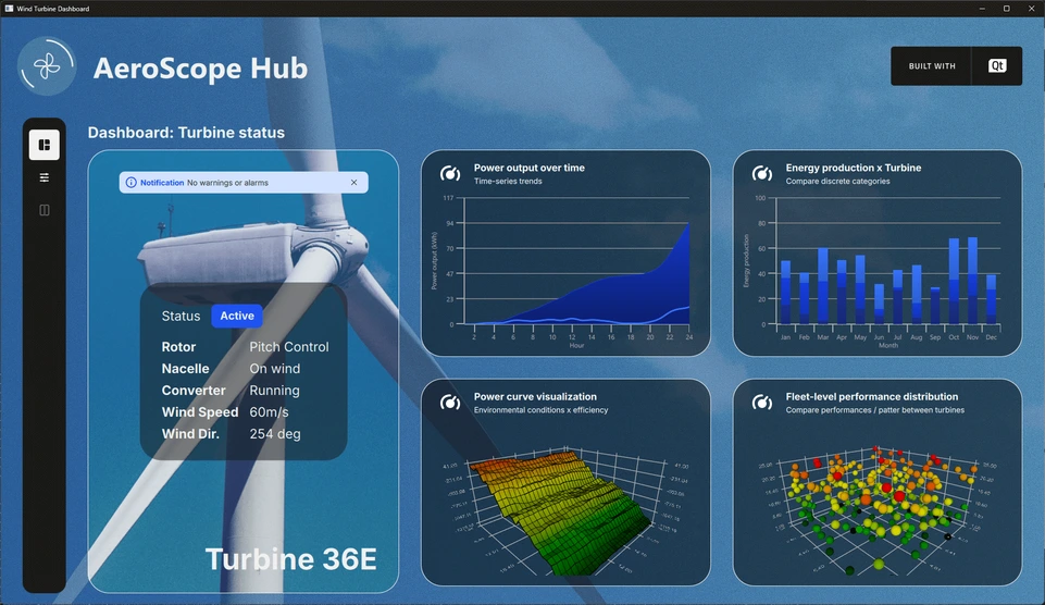
이 예에서는 가상의 풍력 터빈 필드에서 시뮬레이션된 데이터를 표시하는 항공 우주 허브라고 하는 풍력 터빈 모니터링 대시보드를 보여줍니다. 다양한 종류의 데이터를 시각화하기 위해 다양한 그래프 유형이 사용됩니다. 예를 들어, 스플라인 계열이 있는 2D 그래프는 시간별 전력 출력을 나타내며, 함께 제공되는 면적 계열은 같은 기간 동안 누적된 전력을 나타냅니다. 여러 데이터 보기를 사용할 수 있으므로 사용자는 다양한 관점에서 정보를 탐색하고 분석할 수 있습니다.
메인 인터페이스의 왼쪽에는 설정 도구 모음이 있습니다. 선택한 모드에 따라 레이아웃에는 상태 창, 작은 그래프로 구성된 대시보드, 기본 대형 그래프 또는 세부 설정 패널이 개별적으로 또는 조합하여 포함될 수 있습니다. 이 유연한 디자인 덕분에 사용자는 보기를 사용자 지정하고 현재 분석과 가장 관련성이 높은 데이터에 집중할 수 있습니다.
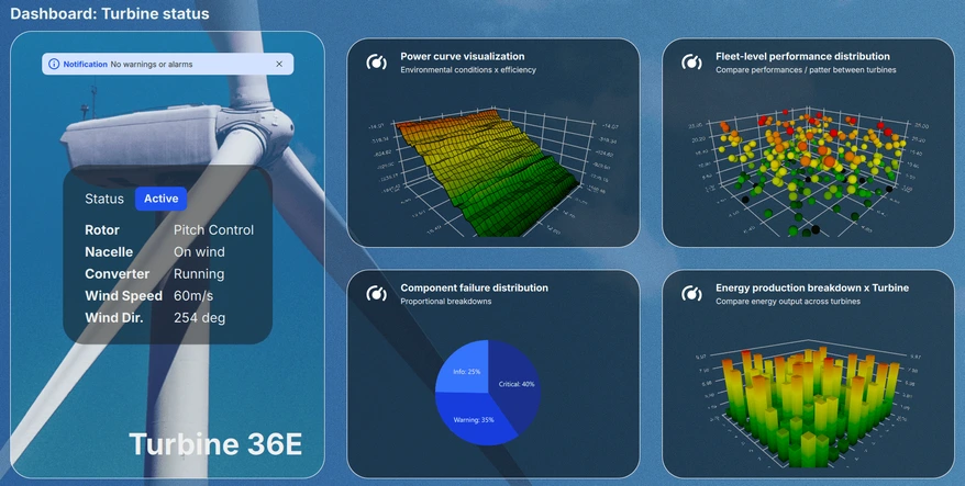
대시보드 보기
대시보드 보기는 다양한 그래프의 미니어처 미리 보기를 표시하는 스크롤 가능한 창과 함께 현재 시스템 상태를 표시합니다. 최대 4개의 그래프가 동시에 표시되므로 사용자는 사용 가능한 6개의 시각화를 모두 편리하게 탐색하고 주요 성과 지표를 한 눈에 빠르게 평가할 수 있습니다.
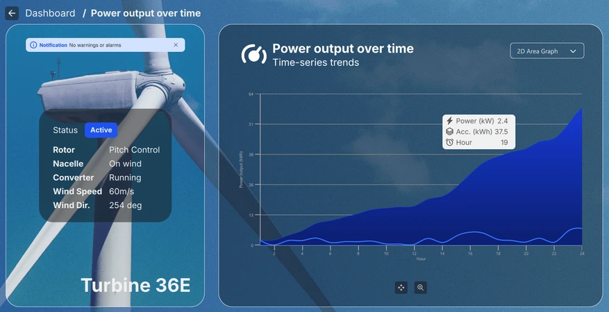
상세 보기
대시보드에서 미니어처 그래프를 선택하여 액세스할 수 있는 상세 보기를 통해 사용자는 선택한 시각화를 더 깊이 있고 더 큰 규모로 살펴볼 수 있습니다. 그래프 유형에 따라 사용자는 뷰를 확대/축소, 이동 또는 회전하여 데이터를 대화형으로 탐색할 수 있습니다. 또한 개별 데이터 포인트를 마우스로 가리키거나 클릭하면 관심 있는 특정 항목에 대한 자세한 정보를 볼 수 있습니다.
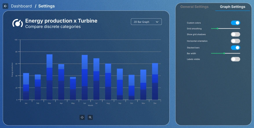
설정 보기
툴바의 설정 버튼이나 미니어처 그래프를 클릭하여 액세스할 수 있는 설정 보기에서는 그래프의 시각적 테마를 조정하고 각 그래프 유형에 맞는 설정을 수정할 수 있습니다. 특정 설정은 설정 보기를 종료한 후에도 유지되는 반면, 다른 설정은 현재 보기 내에서만 적용되므로 임시 및 영구 조정을 위한 유연성을 제공합니다.
구현 세부 사항
애플리케이션의 모든 기능은 모듈 방식으로 설계되었습니다. 메인 뷰인 Main.qml 파일은 각 그래프에 대한 데이터 시뮬레이터를 인스턴스화하는 ApplicationWindow이며, 모든 UI 요소가 있는 루트 Item 입니다.
FontLoader 은 전체 UI에 글로벌 글꼴을 적용하는 데 사용됩니다.
ApplicationWindow {
    ...

    FontLoader { ... }
    font.family: interFont.name

    // Data simulators
    PieSimulator {
        id: piesim
        ...
    }

    BarSimulator {
        id: barsim
        ...
    }

    LineSimulator {
        id: linesim
        ...
    }

    Data3DSimulator {
        id: barDataSimulator
        ...
    }

    Data3DSimulator {
        id: scatterDataSimulator
        ...
    }

    Data3DSimulator {
        id: surfaceDataSimulator
        ...
    }

    // Root item
    Item {...}
}
루트 항목에는 배경 그래픽과 뷰에서 각 UI 요소의 배치를 처리하는 Layout 이 있습니다:
// Background image
Image {
    anchors.fill: parent
    source: root.state === "ShowSettings" ? "images/settings-bg.png"
                                          : "images/dashboard-bg.png"
    fillMode: Image.PreserveAspectCrop
}

// Everything except background image
ColumnLayout {
    anchors.fill: parent
    ...
대부분의 요소는 아래 스니펫의 ToolBarItem 처럼 Main.qml 파일 자체에서 레이아웃에 사용할 자체 QML 구성 요소로 가져왔습니다:
// Vertical toolbar
ToolBarItem {
    Layout.preferredWidth: GlobalSettings.toolbarwidth
    Layout.fillHeight: true
}

// Everything except vertical toolbar, header, and background image
ColumnLayout {
    id: maincontentview
    Layout.fillWidth: true
    Layout.fillHeight: true
    ...
다른 뷰 간의 전환은 states 및 transitions 을 사용하여 처리됩니다:
states: [
    State {
        name: "ShowDashboard"
    },
    State {
        name: "ShowSettings"
        PropertyChanges {
            maincontent.opacity: 0
            settingscontent.opacity: 1
        }
        PropertyChanges {
            viewtextdesc.text: "/  Settings"
        }
    },
    ...
// Use transitions to bring the selected view to the front
transitions: [
    Transition {
        NumberAnimation {
            properties: "opacity"
            easing.type: Easing.InOutCubic
            duration: 1000
        }
    }
]
대시보드
대시보드는 메인 콘텐츠의 일부이며 Layout 계층 구조 내의 또 다른 RowLayout 입니다:
// Main content
RowLayout {
    id: maincontent
    Layout.fillWidth: true
    Layout.fillHeight: true
    ...
상태 창과 대시보드 창으로 구성되어 있습니다:
// Status area; turbine image, notification, status texts, and turbine name
StatusPane {
    id: statuspane
    Layout.preferredWidth: GlobalSettings.statusimagewidth
    Layout.fillHeight: true
}

// Scrollable dashboard graph area, shown when in ShowDashboard state
DashboardPane {
    id: dashboardpane
    contentheight: statuspane.height * 1.5
    Layout.preferredWidth: GlobalSettings.dashboardwidth
    Layout.fillHeight: true
}
상태 창
상태 창은 또한 자체 QML 구성 요소로 구현된 작은 요소들로 구성되어 있습니다:
// Masking the turbine image of the background image
ImageItem {
    anchors.fill: parent
}

// Notification
NotificationItem {
    anchors.top: turbineimage.top
    anchors.horizontalCenter: turbineimage.horizontalCenter
    anchors.topMargin: GlobalSettings.doublespacing
    width: turbineimage.width / 1.25
}

// Status
StatusItem {
    anchors.centerIn: turbineimage
    width: turbineimage.width / 1.5
    height: turbineimage.width / 1.75
}

// Turbine name
Label {
    ...
이러한 요소의 구현은 관련이 없으므로 이 부분은 건너뛰겠습니다.
대시보드 창
대시보드는 6개의 작은 그래프 미리 보기가 있는 요소입니다. 이 중 4개만 한 번에 표시되므로 스크롤할 수 있는 요소 안에 추가해야 합니다. 이 경우 GridLayout 을 포함하는 Flickable 을 사용하여 수행됩니다:
Flickable {
    property alias contentheight: content.height

    clip: true

    contentHeight: contentheight

    boundsBehavior: Flickable.StopAtBounds
    interactive: true
    visible: opacity > 0.5

    Item {
        id: content
        width: parent.width

        GridLayout {
            id: grid
            columns: 2
    ...
그래프 미리보기는 그리드 레이아웃 안에 추가되며, 대부분의 다른 요소와 마찬가지로 자체 요소 안에 구현되었습니다:
// Graph 1: Power output over time
SmallGraphItem {
    Layout.fillWidth: true
    Layout.fillHeight: true
    state: "Area2D"
    linesimulator: linesim
}

// Graph 2: Energy production x Turbine
SmallGraphItem {
    Layout.fillWidth: true
    Layout.fillHeight: true
    state: "Bar2D"
    barsimulator: barsim
}
...
SmallGraphItem 요소는 일반적인 요소로, 그 안에 모든 다른 그래프 유형을 담고 있으며, 필요한 유형은 state 으로 지정됩니다.
SmallGraphItem에는
- 헤더 요소
- 불투명도 트리거를 사용하여 기본적으로 표시 여부가 거짓으로 설정된 각 그래프 유형의 인스턴스입니다.
- 미리보기를 어둡게 하는 사각형
- 미리보기에서 마우스오버 및 마우스 클릭을 처리하는 마우스 영역
Pie2DGraph {
    id: pie2d
    anchors.topMargin: header.height + GlobalSettings.defaultspacing
    anchors.rightMargin: GlobalSettings.defaultspacing
    anchors.fill: parent
    opacity: 0
    piesimulator: smallgraph.piesimulator
}

Bar3DGraph {
    id: bar3d
    anchors.topMargin: header.height + GlobalSettings.defaultspacing
    anchors.bottomMargin: GlobalSettings.defaultspacing
    anchors.fill: parent
    opacity: 0
    cameraZoomLevel: GlobalSettings.defaultzoom
    cameraPreset: GlobalSettings.defaultpreset
}
...
불투명도는 전환 애니메이션에 사용되므로 미리보기에서 기본적으로 0으로 설정되어 있습니다. 불투명도를 0.5 이상으로 애니메이션하면 미리보기 그래프 자체가 보이도록 설정됩니다:
Bars3D {
    id: graph
    visible: opacity > 0.5
    ...
디테일
세부 정보도 메인 콘텐츠의 일부로, Layout 계층 구조 내에서 동일한 RowLayout 을 사용합니다. 대시보드와 동일한 상태 창과 세부 정보 창으로 구성되어 있습니다:
// Details graph, shown when in correct state
BigGraphItem {
    id: detailspane
    Layout.preferredWidth: GlobalSettings.dashboardwidth
    Layout.fillHeight: true
    state: root.state
    radius: GlobalSettings.defaultradius
    piesimulator: piesim
    barsimulator: barsim
    linesimulator: linesim
    detailsview: true
}
세부 정보 창( BigGraphItem)은 다른 요소 외에 각 그래프의 인스턴스도 포함한다는 점에서 SmallGraphItem 과 유사합니다:
// Graphs
Area2DGraph {
    id: area2dbig
    Layout.fillWidth: true
    Layout.fillHeight: true
    Layout.margins: GlobalSettings.defaultmargin
    opacity: 0
    panStyle: GraphsView.PanStyle.Drag
    zoomStyle: GraphsView.ZoomStyle.Center
    linesimulator: biggraph.linesimulator
    onVisibleChanged: {
        if (visible)
            biggraph.activegraph = area2dbig
    }
}

Bar2DGraph {
    id: bar2dbig
    Layout.fillWidth: true
    Layout.fillHeight: true
    Layout.margins: GlobalSettings.defaultmargin
    opacity: 0
    panStyle: GraphsView.PanStyle.Drag
    zoomStyle: GraphsView.ZoomStyle.Center
    barsimulator: biggraph.barsimulator
    onVisibleChanged: {
        if (visible)
            biggraph.activegraph = bar2dbig
    }
}
...
그래프 유형을 선택하기 위한 드롭다운 콤보 상자, 그래프 유형에 따라 회전, 이동 및 확대/축소를 위한 제어 버튼, 버튼에 대한 도구 설명 등이 포함되어 있습니다. SmallGraphItem 와 같이 표시되는 그래프 유형은 상태에 따라 결정됩니다.
설정
설정은 대시보드 또는 세부 정보 보기의 일부를 사용하지 않으므로 기본 콘텐츠 Layout 외부에서 가져왔습니다:
// Settings
SettingsItem {
    id: settingscontent
    anchors.fill: parent
    ...
설정 보기에는 그래프를 표시하는 또 다른 BigGraphItem 와 GraphsTheme 속성 또는 선택한 그래프 유형에 맞는 일부 속성을 조정할 수 있는 설정 창이 있습니다.
// Graph detail
BigGraphItem {
    id: settingsgraph
    width: GlobalSettings.settingsgraphwidth
    anchors.top: parent.top
    anchors.bottom: parent.bottom
    anchors.topMargin: GlobalSettings.graphdetailmargin
    radius: GlobalSettings.defaultradius
    opacity: parent.opacity
    piesimulator: settingsitem.piesimulator
    barsimulator: settingsitem.barsimulator
    linesimulator: settingsitem.linesimulator
}

// Settings pane
StackLayout {
    id: settingspane
    ...
글로벌 테마
General Settings 탭의 설정은 애플리케이션의 모든 그래프에 영향을 줍니다. 글로벌 GraphsTheme 은 GlobalSettings.qml 에서 Singleton 로 구현되었습니다:
pragma Singleton
...
QtObject {
    id: global
    ...
// Common graph theme
property var theme: GraphsTheme {
    plotAreaBackgroundVisible: false
    backgroundVisible: false
    colorScheme: GraphsTheme.ColorScheme.Dark
    theme: GraphsTheme.Theme.BlueSeries
    labelTextColor: "#AEAEAE"
    labelBackgroundVisible: true
    labelFont.pointSize: global.fontsize28px
    grid.mainColor: "#AEAEAE"
    grid.mainWidth: 1
    baseGradients: [ global.customgradient ]
}
이 글로벌 공유 테마는 각 그래프에 테마로 설정됩니다:
theme: GlobalSettings.theme
싱글톤으로 GlobalSettings.qml 을 CMakeLists.txt 에도 하나로 태그해야 애플리케이션에서 사용할 수 있습니다:
set_source_files_properties(qml/GlobalSettings.qml
    PROPERTIES QT_QML_SINGLETON_TYPE TRUE)
그래프 설정
Graph Settings 탭의 설정은 현재 선택된 그래프에만 영향을 줍니다. 이러한 설정은 글로벌 테마를 변경하지 않고 활성 그래프의 시리즈만 변경합니다.
© 2026 The Qt Company Ltd. Documentation contributions included herein are the copyrights of their respective owners. The documentation provided herein is licensed under the terms of the GNU Free Documentation License version 1.3 as published by the Free Software Foundation. Qt and respective logos are trademarks of The Qt Company Ltd. in Finland and/or other countries worldwide. All other trademarks are property of their respective owners.
