
QML入门
创建 QML 文档
QML文档通过结构化且易于阅读的布局来定义对象的层次结构。每个QML文档都由两部分组成:导入部分和对象声明部分。用户界面中最常见的类型和功能由QtQuick 导入提供。
导入和使用 QtQuick 模块
要使用 Qt Quick 模块,QML文档需要将其导入。导入语法如下:
import QtQuick现在, Qt Quick 提供的类型和功能现已在 QML 文档中可用!
定义对象层次结构
QML 文档中的对象声明定义了将在视觉场景中显示的内容。 Qt Quick 提供了所有用户界面的基本构建块,例如用于显示图像和文本以及处理用户输入的对象。
一个简单的对象声明可以是一个彩色窗口,其中居中显示一些文本:
Window {
    width: 640
    height: 480
    visible: true
    color: "red"

    Text {
        anchors.centerIn: parent
        text: "Hello, World!"
    }
}这定义了一个对象层次结构,其中根对象Window 拥有一个子对象Text 。Text 对象的parent 属性会自动设置为Window ,同样地,Text 对象也会由QML自动添加到Window 对象的children 属性中。
综合应用
上例中使用的Window 和Text 类型均由QtQuick 导入提供。将导入语句与对象声明结合起来,我们就得到了一个完整的 QML 文档:
import QtQuick

Window {
    width: 640
    height: 480
    visible: true
    color: "red"

    Text {
        anchors.centerIn: parent
        text: "Hello, World!"
    }
}
如果将该文档保存为“HelloWorld.qml”,我们就可以加载并显示它。
创建和运行 QML 项目
要显示由 QML 文档定义的图形场景,可以使用 Qt Creator。要在Qt Creator 中创建新的 QML 项目:
- 在File 中选择 >New Project > Qt Quick ApplicationQt Creator 。
- 输入项目名称并选择保存位置。
- 选择合适的 Qt 版本,并可根据需要为项目配置版本控制设置。
- 查看项目设置摘要,然后继续完成项目构建。
完成后,Qt Creator 将生成必要的文件并打开项目以供开发。点击绿色的“运行”按钮即可运行应用程序。您应该会在红色矩形中央看到“Hello, World!”字样。
有关在Qt Creator 中创建和运行项目的更多信息,请访问以下页面:
使用控件创建 QML 应用程序
虽然Qt Quick 提供了基本的图形元素, Qt Quick Controls 还提供了可在应用程序中直接使用的现成 QML 类型。
插入ApplicationWindow 类型是创建应用程序的一个良好起点。应用程序的用户界面具有以下基本布局:
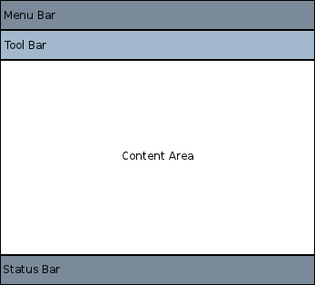
在每个区域内,可以添加不同的控件并将其连接起来,从而构成一个应用程序。例如,以下代码片段是一个基本应用程序,演示了如何利用可用空间:
//import related modules
import QtQuick
import QtQuick.Controls

//window containing the application
ApplicationWindow {
    width: 640
    height: 480
    visible: true
    //title of the application
    title: qsTr("Hello World")

    //menu containing two menu items
    header: MenuBar {
        Menu {
            title: qsTr("&File")
            Action {
                text: qsTr("&Open...")
                onTriggered: console.log("Open action triggered")
            }
            MenuSeparator { }
            Action {
                text: qsTr("&Exit")
                onTriggered: Qt.quit()
            }
        }
    }

    //Content Area

    //a button in the middle of the content area
    Button {
        text: qsTr("Hello World")
        anchors.horizontalCenter: parent.horizontalCenter
        anchors.verticalCenter: parent.verticalCenter
    }
}该应用程序包含两个菜单项和一个位于中间的按钮。点击Exit 菜单项将关闭应用程序。
此外还有多种导航方式以及按钮、滑块等不同控件。以下示例可从Qt Creator 获取,展示了各种控件和布局。
欢迎将代码片段复制粘贴到这个简单的“Hello World”应用程序中,以了解 QML 的工作原理。
处理用户输入
使用 QML 定义用户界面的一个显著优势在于,它允许用户界面设计师通过简单的 JavaScript 表达式来定义应用程序应如何响应事件。在 QML 中,我们将这些事件称为信号,而这些信号由信号处理程序来处理。
例如,请看以下示例:
import QtQuick

Window {
    id: root
    width: 200
    height: 100
    color: isRed ? "red" : "blue"
    visible: true

    property bool isRed: true  // Track the color state

    Text {
        anchors.centerIn: parent
        text: "Hello, World!"
    }

    TapHandler {
        onTapped: root.isRed = !root.isRed  // Toggle state
    }
}qml该示例可保存为“ClickableHelloWorld.qml”,并通过“QML Runtime ”(工具)运行。每当用户点击窗口内的任意位置时,矩形都会从红色变为蓝色。再次点击则会恢复为红色。
注意: TapHandler 还会为触摸事件发出 tapped 信号,因此这段代码在移动设备上同样有效。
键盘用户输入也可以通过一个简单的表达式来处理:
import QtQuick

Window {
    id: root
    width: 200
    height: 100
    color: "red"
    visible: true

    Text {
        id: myText
        anchors.centerIn: parent
        text: toggle ? "Hello, World!" : "Goodbye, World!"
        focus: true
        property bool toggle: true
        Keys.onReturnPressed: (event)=>{
            myText.toggle = !myText.toggle;
            event.accepted = true;
        }
    }
}
现在,每次按下 Enter 键,文本都会在“Hello, World”和“Goodbye, World”之间交替显示。
属性绑定
对象及其属性构成了 QML 文档中定义的图形界面的基础。QML 语言允许通过多种方式将属性相互绑定,从而实现高度动态的用户界面。
在下面的示例中,每个子元素Rectangle 的几何属性都与父元素Window 的几何属性相关联。如果父元素Window 的几何属性发生变化,由于属性绑定,每个子元素Rectangle 的几何属性也会自动更新。
import QtQuick

Window {
    id: root
    width: 200
    height: 100
    color: "red"
    visible: true


    Rectangle {
        width: root.width / 2
        height: root.height
        color: "blue"
    }

    Rectangle {
        width: root.width / 2
        height: root.height
        x: root.width / 2
        color: "green"
    }
}
动画
属性还可以通过动画进行动态更新。QtQuick 导入提供了多种动画类型,可用于对属性值的更改进行动画处理。在下面的示例中,对某个属性进行了动画处理,然后将其显示在Text 区域中:
import QtQuick

Window {
    id: root
    width: 200
    height: 100
    color: "red"
    visible: true

    property int animatedValue

    SequentialAnimation on animatedValue {
        loops: Animation.Infinite
        PropertyAnimation {
            to: 150
            duration: 1000
        }
        PropertyAnimation {
            to: 0
            duration: 1000
        }
    }

    Text {
        anchors.centerIn: parent
        text: root.animatedValue
    }
}
显示的值将周期性地在 0 到 150 之间变化。
定义可复用的自定义 QML 类型
QML 中最重要的概念之一就是类型复用。一个应用程序通常会有多个相似的视觉类型(例如多个按钮),而 QML 允许将此类内容定义为可复用的自定义类型,从而最大限度地减少代码重复并提高可读性。
例如,假设开发者在MessageLabel.qml 文件中定义了一个新的MessageLabel 类型:
// MessageLabel.qml
import QtQuick

Rectangle {
    height: 50
    property string message: "debug message"
    property var msgType: ["debug", "warning" , "critical"]
    color: "black"

    Column {
        anchors.fill: parent
        padding: 5.0
        spacing: 2
        Text {
            text: msgType.toString().toUpperCase() + ":"
            font.bold: msgType == "critical"
            font.family: "Terminal Regular"
            color: msgType === "warning" || msgType === "critical" ? "red" : "yellow"
            ColorAnimation on color {
                running: msgType == "critical"
                from: "red"
                to: "black"
                duration: 1000
                loops: msgType == "critical" ? Animation.Infinite : 1
            }
        }
        Text {
            text: message
            color: msgType === "warning" || msgType === "critical" ? "red" : "yellow"
            font.family: "Terminal Regular"
        }
    }

}
现在,该类型可以在应用程序中多次重用,如下所示:
|
通过这种方式,模块化的用户界面类型可以在应用程序中进行组装和复用。
有关如何开发自己的可重用组件的更多详细信息,请参阅《QML 对象属性》。
下一步
既然您已经见识了 QML 的实际应用,现在就可以迈出下一步了。下一页将引导您继续探索 QML 的世界。
© 2026 The Qt Company Ltd. Documentation contributions included herein are the copyrights of their respective owners. The documentation provided herein is licensed under the terms of the GNU Free Documentation License version 1.3 as published by the Free Software Foundation. Qt and respective logos are trademarks of The Qt Company Ltd. in Finland and/or other countries worldwide. All other trademarks are property of their respective owners.
