
HelloGraphs
在Qt Quick 应用程序中使用Graphs进行二维绘图。
HelloGraphs演示了如何制作简单的二维柱状图和折线图。
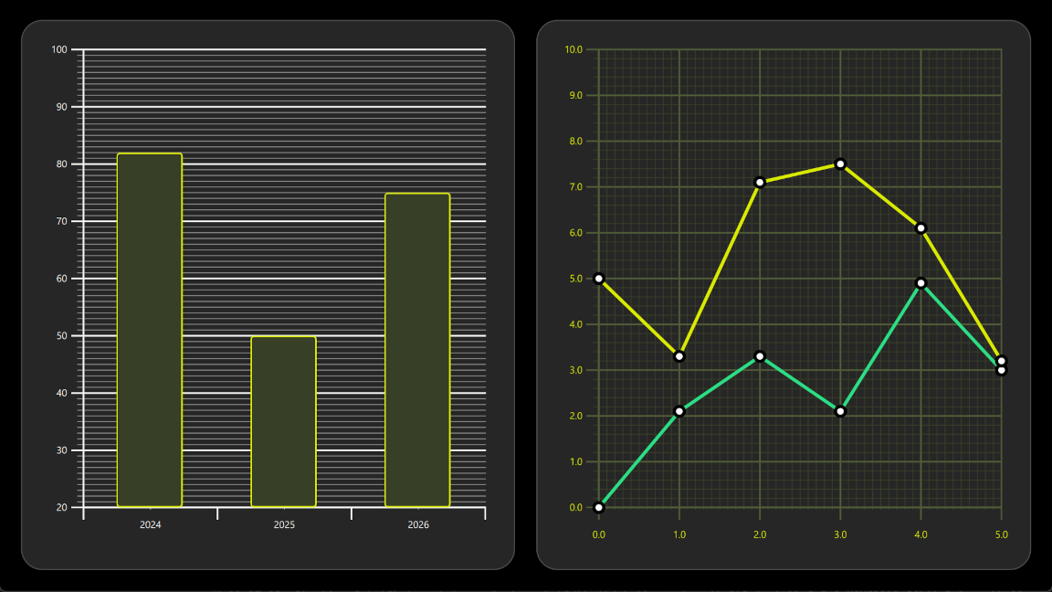
以下各节将介绍如何使用BarSeries 创建柱状图,以及如何使用LineSeries 创建折线图。
运行示例
您可以通过以下方式运行示例:
- Qt Creator
打开Welcome 模式,并从Examples 中选择该示例。有关更多信息,请参阅Qt Creator :教程:构建和运行。
- Qt Extension for Visual Studio Code
在Command Palette 中运行Qt: Open Qt examples 命令,然后从列表中选择该示例。有关更多信息,请参阅Qt Extension for Visual Studio Code :教程:构建和运行。
BarGraph
示例中的第一个图表是条形图。创建时首先需要一个GraphsView 组件,并设置X axis 、Y axis 和theme 。X轴是一个包含3个类别的BarCategoryAxis ,垂直网格和轴线均被隐藏。Y轴是一个ValueAxis ,可见范围为20到100。 将使用tickInterval 每隔 10 个数值显示带标签的主刻度。使用subTickCount 9 每隔 1 个数值显示小刻度,这意味着每个主刻度之间会有 9 个小刻度。最后,添加了theme ,该样式适用于深色背景。该主题会调整图表的背景网格、坐标轴线和标签。
GraphsView {
    anchors.fill: parent
    anchors.margins: 16
    axisX: BarCategoryAxis {
        categories: [2024, 2025, 2026]
        gridVisible: false
        subGridVisible: false
    }
    axisY: ValueAxis {
        min: 20
        max: 100
        tickInterval: 10
        subTickCount: 9
    }
    theme: GraphsTheme {
        colorScheme: GraphsTheme.ColorScheme.Dark
        theme: GraphsTheme.Theme.QtGreen
    }
...要将其转换为柱状图,请添加BarSeries 。
BarSeries {
...随后,通过BarSet 将数据添加到BarSeries 中。共有 3 个柱形,其颜色和边框属性均已自定义。这些属性将覆盖GraphsTheme 中可能设置的seriesColors 。
BarSet {
    values: [82, 50, 75]
    borderWidth: 2
    color: "#373F26"
    borderColor: "#DBEB00"
}
折线图
示例中的第二个图表是折线图。它同样从定义GraphsView 元素开始。通过创建自定义GraphsTheme 来实现自定义外观。GraphsTheme 为背景网格和坐标轴提供了相当广泛的自定义选项,这些设置将在theme 之后应用。
GraphsView 定义了适用于该图表的axisX 和axisY 。
GraphsView {
    anchors.fill: parent
    anchors.margins: 16
    theme: GraphsTheme {
        readonly property color c1: "#DBEB00"
        readonly property color c2: "#373F26"
        readonly property color c3: Qt.lighter(c2, 1.5)
        colorScheme: GraphsTheme.ColorScheme.Dark
        seriesColors: ["#2CDE85", "#DBEB00"]
        grid.mainColor: c3
        grid.subColor: c2
        axisX.mainColor: c3
        axisY.mainColor: c3
        axisX.subColor: c2
        axisY.subColor: c2
        axisX.labelTextColor: c1
        axisY.labelTextColor: c1
    }
    axisX: ValueAxis {
        max: 5
        tickInterval: 1
        subTickCount: 9
        labelDecimals: 1
    }
    axisY: ValueAxis {
        max: 10
        tickInterval: 1
        subTickCount: 4
        labelDecimals: 1
    }
...使用自定义的Delegate 组件来可视化数据点。
component Marker : Rectangle {
    width: 16
    height: 16
    color: "#ffffff"
    radius: width * 0.5
    border.width: 4
    border.color: "#000000"
}要将其制作成折线图,请添加一个LineSeries 。这将设置pointDelegate ,使其使用之前创建的自定义Delegate 组件。数据点通过XYPoint 元素添加。
LineSeries {
    id: lineSeries1
    width: 4
    pointDelegate: Marker { }
    XYPoint { x: 0; y: 0 }
    XYPoint { x: 1; y: 2.1 }
    XYPoint { x: 2; y: 3.3 }
    XYPoint { x: 3; y: 2.1 }
    XYPoint { x: 4; y: 4.9 }
    XYPoint { x: 5; y: 3.0 }
}第二个线系列与第一个类似。由于这是GraphsView 内第二个LineSeries ,系统会自动从seriesColors 中选择第二种颜色。
© 2026 The Qt Company Ltd. Documentation contributions included herein are the copyrights of their respective owners. The documentation provided herein is licensed under the terms of the GNU Free Documentation License version 1.3 as published by the Free Software Foundation. Qt and respective logos are trademarks of The Qt Company Ltd. in Finland and/or other countries worldwide. All other trademarks are property of their respective owners.
