Qt Quick 布局 - 响应式布局示例
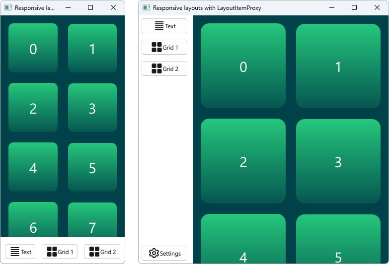
演示如何使用LayoutItemProxy 制作响应式用户界面。
该示例展示了如何结合布局使用 LayoutProxyItems 来创建响应式布局。
运行示例
要从 Qt Creator模式打开Welcome ,并从Examples 中选择示例。有关详细信息,请参阅Qt Creator: 教程:构建并运行。
创建项目
LayoutItemProxy 类型允许在不同布局中使用同一项目,但同时只能显示一种布局。这可用于创建适应窗口或屏幕大小的响应式布局。
首先,我们需要定义所有应在用户界面中出现的项目。我们使用 AnnotatedRect,它是一个简单的矩形,并添加了一些文本。
Rectangle {
    id: contentItem
    Layout.fillWidth: true
    implicitHeight: grid.implicitHeight
    implicitWidth: grid.implicitWidth
    color: "#00414A"

    GridLayout {
        id: grid
        anchors {
            fill: parent
            margins: 8
        }
        columns: Math.max(1, Math.min(Math.round(width / 130), 6))
        Repeater {
            model: 60
            delegate: Rectangle {
                required property int index
                Layout.fillWidth: true
                Layout.margins: 8
                implicitWidth: 200
                implicitHeight: width
                radius: width / 10
                gradient: Gradient {
                    GradientStop { position: -0.2; color: "#2CDE85" }
                    GradientStop { position: 1.2; color: "#00414A" }
                }
                Text {
                    color: "#ffffff"
                    font.pointSize: 22
                    anchors.centerIn: parent
                    text: parent.index + 1
                }
            }
        }
    }
}

Button {
    id: a
    text: "Text"
    icon.source: "./icons/text.svg"
    Layout.fillWidth: true
    Layout.margins: 3
}

Button {
    id: b
    text: "Grid 1"
    icon.source: "./icons/grid.svg"
    Layout.fillWidth: true
    Layout.margins: 3
}

Button {
    id: c
    text: "Grid 2"
    icon.source: "./icons/grid.svg"
    Layout.fillWidth: true
    Layout.margins: 3
}

Button {
    id: d
    text: "Settings"
    icon.source: "./icons/settings.svg"
    Layout.fillWidth: true
    Layout.margins: 3
}
创建布局
现在,我们可以使用LayoutItemProxies 声明各种布局,并以之前声明的项目为目标。单个布局的定义如下。
ColumnLayout {
    id: smallLayout
    anchors.fill: parent

    Flickable {
        Layout.fillHeight: true
        Layout.fillWidth: true
        contentWidth: width
        contentHeight: gl.implicitHeight
        clip: true
        ScrollIndicator.vertical: ScrollIndicator { }
        LayoutItemProxy {
            id: gl
            width: parent.width
            height: implicitHeight
            target: contentItem
        }
    }

    RowLayout {
        Layout.fillHeight: false
        Layout.fillWidth: true
        Layout.margins: 5
        LayoutItemProxy{ target: a; }
        LayoutItemProxy{ target: b; }
        LayoutItemProxy{ target: c; }
    }
}
该代码段展示了使用LayoutItemProxy 的多种方法。最简单的方法是将LayoutItemProxies 添加到布局中,如这里的RowLayout 。此外,我们还为 LayoutProxyItem 设置了一个额外的Layout 附加属性,该属性将仅在此特定布局中影响目标项。此外,我们看到d 项目在第一个布局中没有被使用。在第二个布局中,LayoutItemProxy 会自动隐藏该项目。另一种使用方法是将LayoutItemProxy 设置为Flickable 的内容。
另一个布局的声明如下。
RowLayout {
    id: largeLayout
    anchors.fill: parent
    ColumnLayout {
        Layout.minimumWidth: 100
        Layout.fillWidth: true
        Layout.margins: 2
        LayoutItemProxy{ target: a }
        LayoutItemProxy{ target: b }
        LayoutItemProxy{ target: c }
        Item { Layout.fillHeight: true }
        LayoutItemProxy{ target: d }
    }

    LayoutItemProxy {
        Layout.fillHeight: true
        Layout.fillWidth: true
        target: contentItem
    }
}
在这里,我们展示了LayoutItemProxies 可以与真正的Items 在同一层次结构中一起使用。一般来说,LayoutItemProxy 非常灵活,允许项目和布局的嵌套结构。
设置布局
在定义了smallLayout 和largeLayout 两种布局后,我们可以继续设置适合应用程序当前大小的布局。我们为这段代码定义了一个新函数,在窗口初始化和宽度发生变化时调用:
function setFittingLayout() {
    if (width < 450) {
        smallLayout.visible = true
        largeLayout.visible = false
    } else {
        smallLayout.visible = false
        largeLayout.visible = true
    }
}
onWidthChanged: setFittingLayout()
Component.onCompleted: setFittingLayout()
除了在初始化后调用该函数外,我们还可以在声明式代码中隐藏除初始大小的正确布局外的所有内容。
© 2026 The Qt Company Ltd. Documentation contributions included herein are the copyrights of their respective owners. The documentation provided herein is licensed under the terms of the GNU Free Documentation License version 1.3 as published by the Free Software Foundation. Qt and respective logos are trademarks of The Qt Company Ltd. in Finland and/or other countries worldwide. All other trademarks are property of their respective owners.
