
QML 教程 2 - QML 组件
本章将添加一个颜色选择器,用于更改文本的颜色。
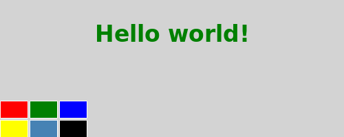
我们的颜色选择器由六个不同颜色的单元格组成。为了避免为每个单元格重复编写相同的代码,我们将创建一个新的Cell 组件。组件提供了一种定义新类型的方法,该类型可在其他QML文件中重复使用。 QML 组件就像一个“黑匣子”,通过属性、信号和函数与外部交互,通常在独立的 QML 文件中定义。(更多详细信息,请参阅Component 文档)。组件的文件名必须始终以大写字母开头。
以下是Cell.qml 的QML代码:
import QtQuick

Item {
    id: container
    property alias cellColor: rectangle.color
    signal clicked(cellColor: color)

    width: 40; height: 25

    Rectangle {
        id: rectangle
        border.color: "white"
        anchors.fill: parent
    }

    MouseArea {
        anchors.fill: parent
        onClicked: container.clicked(container.cellColor)
    }
}
操作指南
Cell 组件
Item {
    id: container
    property alias cellColor: rectangle.color
    signal clicked(cellColor: color)

width: 40; height: 25我们组件的根类型是Item ,其容器为id 。Item 是QML中最基本的视觉类型,通常用作其他类型的容器。
property alias cellColor: rectangle.color我们声明了一个cellColor 属性。该属性可从组件外部访问,这使我们能够为单元格实例化不同的颜色。该属性只是现有属性的别名——即构成单元格的矩形颜色(参见属性绑定)。
signal clicked(cellColor: color)我们希望该组件还具有一个名为clicked 的信号,其参数cellColor的类型为color。稍后,我们将使用此信号在主 QML 文件中更改文本的颜色。
    Rectangle {
        id: rectangle
        border.color: "white"
        anchors.fill: parent
}我们的单元格组件本质上是一个带id 属性的彩色矩形。
anchors.fill 属性是设置视觉元素大小的便捷方式。在此情况下,该矩形将与父元素具有相同的大小(参见“基于锚点的布局”)。
    MouseArea {
        anchors.fill: parent
        onClicked: container.clicked(container.cellColor)
}为了在点击单元格时更改文本颜色,我们创建了一个与父元素尺寸相同的MouseArea 类型。
MouseArea 定义了一个名为clicked 的信号。当此信号被触发时,我们需要发出自己的clicked信号,并将颜色作为参数传入。
主 QML 文件
在主 QML 文件中,我们使用Cell 组件来创建颜色选择器:
import QtQuick

Rectangle {
    id: page
    width: 320; height: 480
    color: "lightgray"

    Text {
        id: helloText
        text: "Hello world!"
        y: 30
        anchors.horizontalCenter: page.horizontalCenter
        font.pointSize: 24; font.bold: true
    }

    Grid {
        id: colorPicker
        x: 4; anchors.bottom: page.bottom; anchors.bottomMargin: 4
        rows: 2; columns: 3; spacing: 3

        Cell { cellColor: "red"; onClicked: helloText.color = cellColor }
        Cell { cellColor: "green"; onClicked: helloText.color = cellColor }
        Cell { cellColor: "blue"; onClicked: helloText.color = cellColor }
        Cell { cellColor: "yellow"; onClicked: helloText.color = cellColor }
        Cell { cellColor: "steelblue"; onClicked: helloText.color = cellColor }
        Cell { cellColor: "black"; onClicked: helloText.color = cellColor }
    }
}
我们通过将 6 个不同颜色的单元格放置在网格中来创建颜色选择器。
Cell { cellColor: "red"; onClicked: helloText.color = cellColor }当单元格的“clicked”信号被触发时,我们希望将文本颜色设置为作为参数传递的“cellColor”。我们可以通过名为“onSignalName”的属性来响应组件的任何信号(参见“信号属性”)。
© 2026 The Qt Company Ltd. Documentation contributions included herein are the copyrights of their respective owners. The documentation provided herein is licensed under the terms of the GNU Free Documentation License version 1.3 as published by the Free Software Foundation. Qt and respective logos are trademarks of The Qt Company Ltd. in Finland and/or other countries worldwide. All other trademarks are property of their respective owners.
