
自定义图例
注意:这是 “使用 QML 图表图库”示例的一部分。
本文将向您展示如何创建自定义图例,以替代 ChartView API 的内置图例。
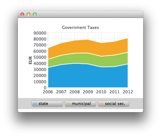
应用程序的主视图显示了一个堆叠面积图。以下是其中一个堆叠面积系列的创建方式。请参阅 ChartViewStacked.qml 和 AnimatedAreaSeries.qml。
AnimatedAreaSeries {
    id: municipalSeries
    name: "municipal"
    axisX: axisX
    axisY: axisY
    borderWidth: 0
    upperSeries: LineSeries {
        id: municipalUpper
        XYPoint { x: 2006; y: 33119 + 13443 }
        XYPoint { x: 2007; y: 37941 + 15311 }
        XYPoint { x: 2008; y: 40122 + 16552 }
        XYPoint { x: 2009; y: 38991 + 17904 }
        XYPoint { x: 2010; y: 34055 + 17599 }
        XYPoint { x: 2011; y: 34555 + 19002 }
        XYPoint { x: 2012; y: 38991 + 19177 }
    }
    lowerSeries: stateUpper
}
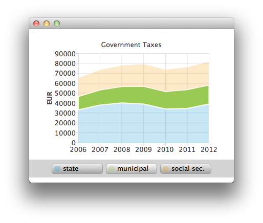
将鼠标悬停在图例上方时,悬停的系列将被高亮显示(参见 CustomLegend.qml)。
Row {
    id: legendRow
    anchors.centerIn: parent
    spacing: 10

    Repeater {
        id: legendRepeater
        model: legend.seriesCount
        delegate: legendDelegate
    }
}
Component {
    id: legendDelegate
    Rectangle {
        id: rect
    ...
        MouseArea {
            id: mouseArea
            anchors.fill: parent
            hoverEnabled: true
            onEntered: {
                rect.gradient = buttonGradientHovered;
                legend.entered(label.text);
            }
            onExited: {
                rect.gradient = buttonGradient;
                legend.exited(label.text);
                marker.opacity = 0.3;
                marker.height = 10;
            }
            onClicked: {
                legend.selected(label.text);
                marker.opacity = 1.0;
                marker.height = 12;
            }
        }
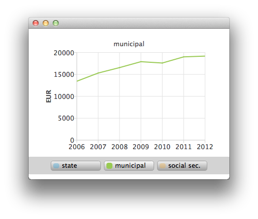
您还可以通过单击鼠标,选择其中一个堆叠区域,将其作为折线系列进行详细查看(参见 ChartViewHighlighted.qml)。
ChartView {
    id: chartViewHighlighted

    property variant selectedSeries

    signal clicked

    legend.visible: false
    margins.top: 10
    margins.bottom: 0
    antialiasing: true

    LineSeries {
        id: lineSeries

        axisX: ValueAxis {
            min: 2006
            max: 2012
            labelFormat: "%.0f"
            tickCount: 7
        }
        axisY: ValueAxis {
            id: axisY
            titleText: "EUR"
            min: 0
            max: 40000
            labelFormat: "%.0f"
            tickCount: 5
        }
    }
© 2026 The Qt Company Ltd. Documentation contributions included herein are the copyrights of their respective owners. The documentation provided herein is licensed under the terms of the GNU Free Documentation License version 1.3 as published by the Free Software Foundation. Qt and respective logos are trademarks of The Qt Company Ltd. in Finland and/or other countries worldwide. All other trademarks are property of their respective owners.
