风力涡轮机仪表盘
带有二维和三维图形的风力涡轮机仪表盘。
风力涡轮机仪表盘示例演示了如何在模拟真实世界应用中使用二维和三维图形。
运行示例
要从 Qt Creator,打开Welcome 模式,然后从Examples 中选择示例。更多信息,请参见Qt Creator: 教程:构建并运行。
应用程序概述
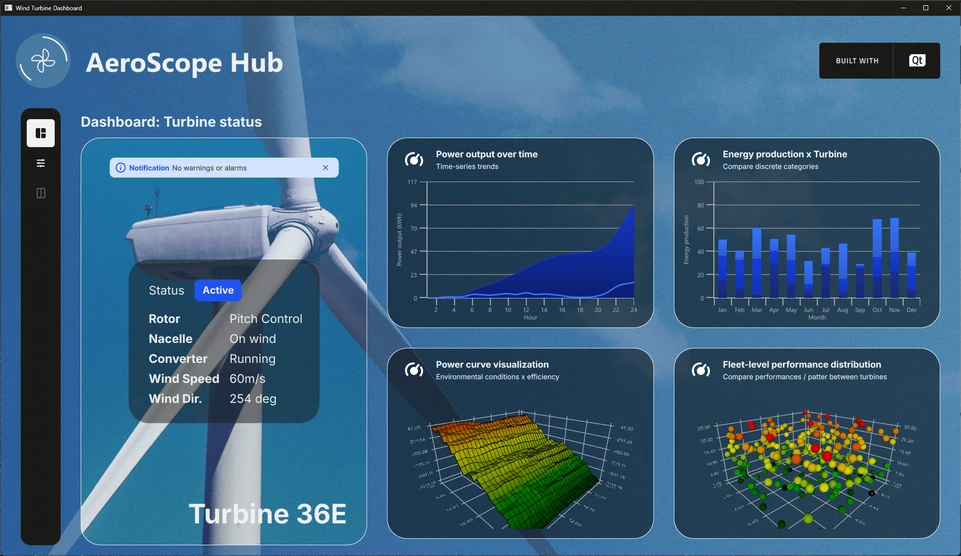
该示例演示了一个风力涡轮机监控仪表板(称为 Aerospace Hub),它显示来自假想风力涡轮机场的模拟数据。使用了多种图表类型来可视化不同类型的数据。例如,二维曲线图显示每小时的功率输出,而附带的面积序列则表示同一时期的累积功率。系统提供多种数据视图,允许用户从不同角度探索和分析信息。
主界面左侧有一个设置工具栏。根据所选模式,布局可能包括状态窗格、小型图表仪表盘、主要大型图表或详细设置面板--可以单独使用,也可以组合使用。这种灵活的设计使用户能够自定义视图,并专注于与当前分析最相关的数据。
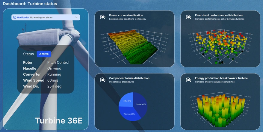
仪表盘视图
仪表盘视图在显示当前系统状态的同时,还可滚动显示各种图表的缩略预览。最多可同时显示四个图表,方便用户浏览所有六个可用的可视化图表,快速评估关键性能指标,一目了然。
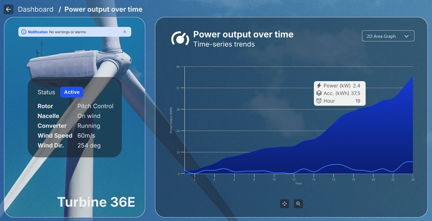
详细视图
从仪表盘上选择一个微型图表即可进入详细视图,使用户能够更深入、更大规模地查看所选的可视化图表。根据图表类型,用户可以缩放、平移或旋转视图,以交互方式探索数据。此外,还可以悬停或点击单个数据点,以显示有关特定项目的更详细信息。
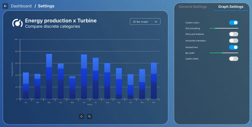
设置视图
通过点击工具栏或微型图表中的设置按钮可进入设置视图,用户可以调整图表的视觉主题,并修改每种图表类型的特定设置。某些配置在退出设置视图后仍然有效,而其他配置则仅适用于当前视图,从而为临时和永久调整提供了灵活性。
实施细节
应用程序中的所有内容都采用模块化设计。主视图(即Main.qml 文件)是一个 ApplicationWindow,其中实例化了每个图形的数据模拟器,以及包含所有 UI 元素的根Item 。
FontLoader 用于为整个用户界面应用全局字体。
ApplicationWindow {
    ...

    FontLoader { ... }
    font.family: interFont.name

    // Data simulators
    PieSimulator {
        id: piesim
        ...
    }

    BarSimulator {
        id: barsim
        ...
    }

    LineSimulator {
        id: linesim
        ...
    }

    Data3DSimulator {
        id: barDataSimulator
        ...
    }

    Data3DSimulator {
        id: scatterDataSimulator
        ...
    }

    Data3DSimulator {
        id: surfaceDataSimulator
        ...
    }

    // Root item
    Item {...}
}根项目包含背景图形和一个处理视图中每个用户界面元素位置的Layout :
// Background image
Image {
    anchors.fill: parent
    source: root.state === "ShowSettings" ? "images/settings-bg.png"
                                          : "images/dashboard-bg.png"
    fillMode: Image.PreserveAspectCrop
}

// Everything except background image
ColumnLayout {
    anchors.fill: parent
    ...
大多数元素都从Main.qml 文件中提取出来,变成自己的 QML 组件,用于布局中,如下面代码段中的ToolBarItem :
// Vertical toolbar
ToolBarItem {
    Layout.preferredWidth: GlobalSettings.toolbarwidth
    Layout.fillHeight: true
}

// Everything except vertical toolbar, header, and background image
ColumnLayout {
    id: maincontentview
    Layout.fillWidth: true
    Layout.fillHeight: true
    ...
不同视图之间的转换使用states 和transitions 来处理:
states: [
    State {
        name: "ShowDashboard"
    },
    State {
        name: "ShowSettings"
        PropertyChanges {
            maincontent.opacity: 0
            settingscontent.opacity: 1
        }
        PropertyChanges {
            viewtextdesc.text: "/  Settings"
        }
    },
    ...
// Use transitions to bring the selected view to the front
transitions: [
    Transition {
        NumberAnimation {
            properties: "opacity"
            easing.type: Easing.InOutCubic
            duration: 1000
        }
    }
]
仪表盘
Dashboard 是主内容的一部分,是Layout 层次结构中的另一个RowLayout :
// Main content
RowLayout {
    id: maincontent
    Layout.fillWidth: true
    Layout.fillHeight: true
    ...
它由状态窗格和仪表盘窗格组成:
// Status area; turbine image, notification, status texts, and turbine name
StatusPane {
    id: statuspane
    Layout.preferredWidth: GlobalSettings.statusimagewidth
    Layout.fillHeight: true
}

// Scrollable dashboard graph area, shown when in ShowDashboard state
DashboardPane {
    id: dashboardpane
    contentheight: statuspane.height * 1.5
    Layout.preferredWidth: GlobalSettings.dashboardwidth
    Layout.fillHeight: true
}
状态窗格
状态窗格也是由较小的元素组成的,用它们自己的 QML 组件实现:
// Masking the turbine image of the background image
ImageItem {
    anchors.fill: parent
}

// Notification
NotificationItem {
    anchors.top: turbineimage.top
    anchors.horizontalCenter: turbineimage.horizontalCenter
    anchors.topMargin: GlobalSettings.doublespacing
    width: turbineimage.width / 1.25
}

// Status
StatusItem {
    anchors.centerIn: turbineimage
    width: turbineimage.width / 1.5
    height: turbineimage.width / 1.75
}

// Turbine name
Label {
    ...
这些元素的实现并不相关,因此将跳过这一部分。
仪表盘窗格
仪表盘是包含六个小图表预览的元素。一次只能看到其中四个,因此必须将它们添加到可滚动的元素中。在这种情况下,可以使用Flickable ,它包含一个GridLayout :
Flickable {
    property alias contentheight: content.height

    clip: true

    contentHeight: contentheight

    boundsBehavior: Flickable.StopAtBounds
    interactive: true
    visible: opacity > 0.5

    Item {
        id: content
        width: parent.width

        GridLayout {
            id: grid
            columns: 2
    ...
图形预览被添加到网格布局中,和其他大多数元素一样,它们也被添加到自己的元素中:
// Graph 1: Power output over time
SmallGraphItem {
    Layout.fillWidth: true
    Layout.fillHeight: true
    state: "Area2D"
    linesimulator: linesim
}

// Graph 2: Energy production x Turbine
SmallGraphItem {
    Layout.fillWidth: true
    Layout.fillHeight: true
    state: "Bar2D"
    barsimulator: barsim
}
...
SmallGraphItem 元素是一个通用元素,可容纳所有不同的图形类型,所需的类型以state 的形式给定。
SmallGraphItem 有
- 一个标题元素
- 每种图形类型的一个实例,默认情况下使用不透明度触发器将其可见性设置为假
- 一个使预览变暗的矩形
- 一个鼠标区域,用于处理预览上的悬停和鼠标点击
Pie2DGraph {
    id: pie2d
    anchors.topMargin: header.height + GlobalSettings.defaultspacing
    anchors.rightMargin: GlobalSettings.defaultspacing
    anchors.fill: parent
    opacity: 0
    piesimulator: smallgraph.piesimulator
}

Bar3DGraph {
    id: bar3d
    anchors.topMargin: header.height + GlobalSettings.defaultspacing
    anchors.bottomMargin: GlobalSettings.defaultspacing
    anchors.fill: parent
    opacity: 0
    cameraZoomLevel: GlobalSettings.defaultzoom
    cameraPreset: GlobalSettings.defaultpreset
}
...
不透明度用于过渡动画,因此在预览中默认设置为 0。当不透明度动画超过 0.5 时,预览图本身将被设置为可见:
Bars3D {
    id: graph
    visible: opacity > 0.5
    ...
详细信息
详细信息也是主要内容的一部分,在Layout 层次结构中使用相同的RowLayout 。它由与仪表盘相同的状态窗格和详细信息窗格组成:
// Details graph, shown when in correct state
BigGraphItem {
    id: detailspane
    Layout.preferredWidth: GlobalSettings.dashboardwidth
    Layout.fillHeight: true
    state: root.state
    radius: GlobalSettings.defaultradius
    piesimulator: piesim
    barsimulator: barsim
    linesimulator: linesim
    detailsview: true
}
详细信息窗格(BigGraphItem )与SmallGraphItem 相似,除了其他元素外,它还包含每个图表的实例:
// Graphs
Area2DGraph {
    id: area2dbig
    Layout.fillWidth: true
    Layout.fillHeight: true
    Layout.margins: GlobalSettings.defaultmargin
    opacity: 0
    panStyle: GraphsView.PanStyle.Drag
    zoomStyle: GraphsView.ZoomStyle.Center
    linesimulator: biggraph.linesimulator
    onVisibleChanged: {
        if (visible)
            biggraph.activegraph = area2dbig
    }
}

Bar2DGraph {
    id: bar2dbig
    Layout.fillWidth: true
    Layout.fillHeight: true
    Layout.margins: GlobalSettings.defaultmargin
    opacity: 0
    panStyle: GraphsView.PanStyle.Drag
    zoomStyle: GraphsView.ZoomStyle.Center
    barsimulator: biggraph.barsimulator
    onVisibleChanged: {
        if (visible)
            biggraph.activegraph = bar2dbig
    }
}
...
其他元素包括用于选择图形类型的下拉组合框,用于旋转、平移和缩放(取决于图形类型)的控制按钮,以及按钮的工具提示。与SmallGraphItem 一样,显示的图表类型是根据状态决定的。
设置
设置 "视图没有使用 "仪表盘 "或 "详细信息"视图的任何部分,因此不属于Layout 的主要内容:
// Settings
SettingsItem {
    id: settingscontent
    anchors.fill: parent
    ...
设置 "视图包含另一个用于显示图表的BigGraphItem ,以及一个用于调整GraphsTheme 属性或所选图表类型特定属性的设置窗格。
// Graph detail
BigGraphItem {
    id: settingsgraph
    width: GlobalSettings.settingsgraphwidth
    anchors.top: parent.top
    anchors.bottom: parent.bottom
    anchors.topMargin: GlobalSettings.graphdetailmargin
    radius: GlobalSettings.defaultradius
    opacity: parent.opacity
    piesimulator: settingsitem.piesimulator
    barsimulator: settingsitem.barsimulator
    linesimulator: settingsitem.linesimulator
}

// Settings pane
StackLayout {
    id: settingspane
    ...
全局主题
General Settings 选项卡上的设置会影响应用程序中的所有图形。全局GraphsTheme 在GlobalSettings.qml 中作为Singleton 实现:
pragma Singleton
...
QtObject {
    id: global
    ...
// Common graph theme
property var theme: GraphsTheme {
    plotAreaBackgroundVisible: false
    backgroundVisible: false
    colorScheme: GraphsTheme.ColorScheme.Dark
    theme: GraphsTheme.Theme.BlueSeries
    labelTextColor: "#AEAEAE"
    labelBackgroundVisible: true
    labelFont.pointSize: global.fontsize28px
    grid.mainColor: "#AEAEAE"
    grid.mainWidth: 1
    baseGradients: [ global.customgradient ]
}
该全局共享主题被设置为每个图形的主题:
theme: GlobalSettings.theme
作为单例,GlobalSettings.qml 也需要在CMakeLists.txt 中标记为单例,才能在应用程序中使用:
set_source_files_properties(qml/GlobalSettings.qml
    PROPERTIES QT_QML_SINGLETON_TYPE TRUE)
图表设置
Graph Settings 选项卡中的设置只影响当前选定的图形。这些设置不会更改全局主题,而只会更改活动图表中的系列。
© 2026 The Qt Company Ltd. Documentation contributions included herein are the copyrights of their respective owners. The documentation provided herein is licensed under the terms of the GNU Free Documentation License version 1.3 as published by the Free Software Foundation. Qt and respective logos are trademarks of The Qt Company Ltd. in Finland and/or other countries worldwide. All other trademarks are property of their respective owners.
