風力発電ダッシュボード
2Dと3Dのグラフを使った風力タービンのダッシュボード。
風力ダッシュボードの例では、2Dと3Dの両方のグラフを実際のアプリケーションでシミュレートして使用する方法を示します。
例の実行
例題を実行するには Qt Creatorからサンプルを実行するには、Welcome モードを開き、Examples からサンプルを選択します。詳細については、Qt Creator:Tutorialを参照してください:ビルドと実行。
アプリケーションの概要
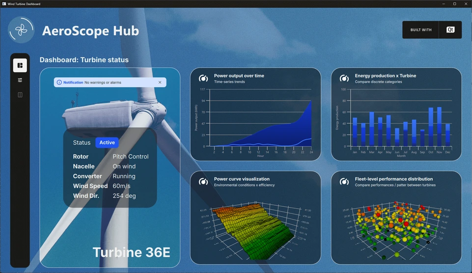
この例では、仮想の風力タービンフィールドからのシミュレーションデータを表示する、風力タービン監視ダッシュボード(Aerospace Hub)を示しています。さまざまな種類のデータを視覚化するために、さまざまなグラフタイプが採用されています。例えば、スプライン系列の2Dグラフは1時間ごとの出力を示し、付随する面積系列は同期間の累積出力を示す。複数のデータビューが用意されており、ユーザーはさまざまな視点から情報を探索・分析できる。
メイン・インターフェースには、左側に設定ツールバーがあります。選択したモードに応じて、ステータス・ペイン、小さなグラフのダッシュボード、主要な大きなグラフ、または詳細な設定パネルが、単独または組み合わせてレイアウトされる。この柔軟なデザインにより、ユーザーは表示をカスタマイズし、現在の分析に最も関連性の高いデータに集中することができます。
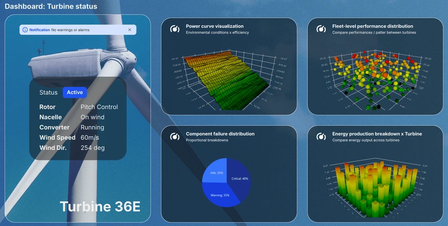
ダッシュボード・ビュー
ダッシュボード・ビューでは、現在のシステム・ステータスが、さまざまなグラフのミニチュア・プレビューを表示するスクロール可能なペインとともに表示されます。最大4つのグラフが同時に表示されるため、ユーザーは利用可能な6つのビジュアライゼーションすべてを便利に閲覧し、主要なパフォーマンス指標を一目ですばやく評価できます。
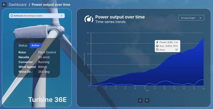
詳細ビュー
ダッシュボードからミニチュアグラフを選択してアクセスできる詳細ビューでは、選択したビジュアライゼーションをより深く、より大きなスケールで調べることができます。グラフの種類に応じて、ユーザーはビューをズーム、パン、または回転させて、インタラクティブにデータを探索することができます。さらに、個々のデータ・ポイントにカーソルを合わせたり、クリックすることで、特定の項目に関する詳細情報を表示することができます。
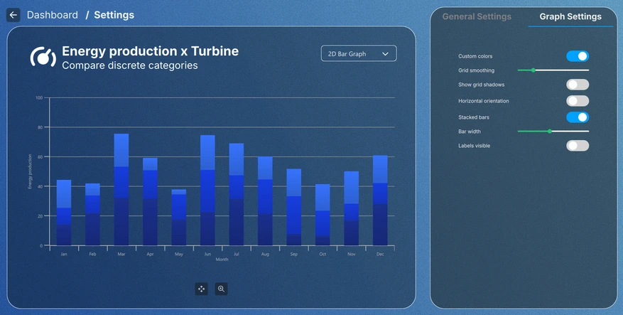
設定ビュー
設定ビューは、ツールバーまたはミニチュアグラフの設定ボタンをクリックすることでアクセスでき、グラフのビジュアルテーマを調整したり、各グラフタイプに固有の設定を変更したりすることができます。特定の設定は、設定ビューを終了しても保持されますが、他の設定は現在のビュー内でのみ適用されるため、一時的な調整と恒久的な調整の両方に柔軟に対応できます。
実装の詳細
このアプリケーションはすべてモジュール方式で設計されています。メイン・ビュー(Main.qml ファイル)は ApplicationWindow で、各グラフのデータ・シミュレータと、すべての UI 要素を保持するルートItem をインスタンス化します。
FontLoader は、UI全体にグローバル・フォントを適用するために使用されます。
ApplicationWindow {
    ...

    FontLoader { ... }
    font.family: interFont.name

    // Data simulators
    PieSimulator {
        id: piesim
        ...
    }

    BarSimulator {
        id: barsim
        ...
    }

    LineSimulator {
        id: linesim
        ...
    }

    Data3DSimulator {
        id: barDataSimulator
        ...
    }

    Data3DSimulator {
        id: scatterDataSimulator
        ...
    }

    Data3DSimulator {
        id: surfaceDataSimulator
        ...
    }

    // Root item
    Item {...}
}ルート・アイテムは、背景グラフィックスと、ビュー内の各UI要素の配置を処理するLayout :
// Background image
Image {
    anchors.fill: parent
    source: root.state === "ShowSettings" ? "images/settings-bg.png"
                                          : "images/dashboard-bg.png"
    fillMode: Image.PreserveAspectCrop
}

// Everything except background image
ColumnLayout {
    anchors.fill: parent
    ...
ほとんどの要素は、Main.qml ファイル自体から、下のスニペットのToolBarItem のように、レイアウトで使用される独自の QML コンポーネントに取り出されています:
// Vertical toolbar
ToolBarItem {
    Layout.preferredWidth: GlobalSettings.toolbarwidth
    Layout.fillHeight: true
}

// Everything except vertical toolbar, header, and background image
ColumnLayout {
    id: maincontentview
    Layout.fillWidth: true
    Layout.fillHeight: true
    ...
異なるビュー間の遷移は、states とtransitions を使って処理されます:
states: [
    State {
        name: "ShowDashboard"
    },
    State {
        name: "ShowSettings"
        PropertyChanges {
            maincontent.opacity: 0
            settingscontent.opacity: 1
        }
        PropertyChanges {
            viewtextdesc.text: "/  Settings"
        }
    },
    ...
// Use transitions to bring the selected view to the front
transitions: [
    Transition {
        NumberAnimation {
            properties: "opacity"
            easing.type: Easing.InOutCubic
            duration: 1000
        }
    }
]
ダッシュボード
ダッシュボードはメインコンテンツの一部であり、Layout の階層内にあるもう一つのRowLayout :
// Main content
RowLayout {
    id: maincontent
    Layout.fillWidth: true
    Layout.fillHeight: true
    ...
ステータスペインとダッシュボードペインで構成されています:
// Status area; turbine image, notification, status texts, and turbine name
StatusPane {
    id: statuspane
    Layout.preferredWidth: GlobalSettings.statusimagewidth
    Layout.fillHeight: true
}

// Scrollable dashboard graph area, shown when in ShowDashboard state
DashboardPane {
    id: dashboardpane
    contentheight: statuspane.height * 1.5
    Layout.preferredWidth: GlobalSettings.dashboardwidth
    Layout.fillHeight: true
}
ステータスペイン
ステータスペインもまた、小さな要素で構成されており、それぞれの QML コンポーネントで実装されています:
// Masking the turbine image of the background image
ImageItem {
    anchors.fill: parent
}

// Notification
NotificationItem {
    anchors.top: turbineimage.top
    anchors.horizontalCenter: turbineimage.horizontalCenter
    anchors.topMargin: GlobalSettings.doublespacing
    width: turbineimage.width / 1.25
}

// Status
StatusItem {
    anchors.centerIn: turbineimage
    width: turbineimage.width / 1.5
    height: turbineimage.width / 1.75
}

// Turbine name
Label {
    ...
これらの実装は関係ないので、その部分は省略します。
ダッシュボードペイン
ダッシュボードは、6つの小さなグラフのプレビューを保持する要素です。一度に表示できるのは4つだけなので、スクロールできる要素の中に追加する必要があります。この場合、GridLayout を保持するFlickable で行います:
Flickable {
    property alias contentheight: content.height

    clip: true

    contentHeight: contentheight

    boundsBehavior: Flickable.StopAtBounds
    interactive: true
    visible: opacity > 0.5

    Item {
        id: content
        width: parent.width

        GridLayout {
            id: grid
            columns: 2
    ...
グラフ・プレビューはグリッド・レイアウトの中に追加され、他のほとんどの要素と同様に、独自の要素の中に実装されています:
// Graph 1: Power output over time
SmallGraphItem {
    Layout.fillWidth: true
    Layout.fillHeight: true
    state: "Area2D"
    linesimulator: linesim
}

// Graph 2: Energy production x Turbine
SmallGraphItem {
    Layout.fillWidth: true
    Layout.fillHeight: true
    state: "Bar2D"
    barsimulator: barsim
}
...
SmallGraphItem 要素は汎用的なもので、すべての異なるグラフ・タイプを内部に保持し、必要なタイプはstate として与えられます。
SmallGraphItemには
- ヘッダー要素
- 各グラフ・タイプのインスタンスで、不透明度トリガーを使ってデフォルトで可視性がfalseに設定されている。
- プレビューを暗くする矩形
- プレビュー上でのホバーとマウス・クリックを処理するマウス・エリア
Pie2DGraph {
    id: pie2d
    anchors.topMargin: header.height + GlobalSettings.defaultspacing
    anchors.rightMargin: GlobalSettings.defaultspacing
    anchors.fill: parent
    opacity: 0
    piesimulator: smallgraph.piesimulator
}

Bar3DGraph {
    id: bar3d
    anchors.topMargin: header.height + GlobalSettings.defaultspacing
    anchors.bottomMargin: GlobalSettings.defaultspacing
    anchors.fill: parent
    opacity: 0
    cameraZoomLevel: GlobalSettings.defaultzoom
    cameraPreset: GlobalSettings.defaultpreset
}
...
不透明度はトランジション・アニメーションに使用され、そのためプレビューではデフォルトで0に設定されています。不透明度が0.5以上にアニメーションされると、プレビューのグラフ自体が見えるように設定されます:
Bars3D {
    id: graph
    visible: opacity > 0.5
    ...
詳細
Detailsもメインコンテンツの一部であり、Layout 階層内の同じRowLayout を使用しています。ダッシュボードと同じステータスペインと詳細ペインで構成される:
// Details graph, shown when in correct state
BigGraphItem {
    id: detailspane
    Layout.preferredWidth: GlobalSettings.dashboardwidth
    Layout.fillHeight: true
    state: root.state
    radius: GlobalSettings.defaultradius
    piesimulator: piesim
    barsimulator: barsim
    linesimulator: linesim
    detailsview: true
}
詳細ペイン(BigGraphItem )は、他の要素に加えて、各グラフのインスタンスも保持するという意味で、SmallGraphItem と似ている:
// Graphs
Area2DGraph {
    id: area2dbig
    Layout.fillWidth: true
    Layout.fillHeight: true
    Layout.margins: GlobalSettings.defaultmargin
    opacity: 0
    panStyle: GraphsView.PanStyle.Drag
    zoomStyle: GraphsView.ZoomStyle.Center
    linesimulator: biggraph.linesimulator
    onVisibleChanged: {
        if (visible)
            biggraph.activegraph = area2dbig
    }
}

Bar2DGraph {
    id: bar2dbig
    Layout.fillWidth: true
    Layout.fillHeight: true
    Layout.margins: GlobalSettings.defaultmargin
    opacity: 0
    panStyle: GraphsView.PanStyle.Drag
    zoomStyle: GraphsView.ZoomStyle.Center
    barsimulator: biggraph.barsimulator
    onVisibleChanged: {
        if (visible)
            biggraph.activegraph = bar2dbig
    }
}
...
その他の要素としては、グラフ・タイプを選択するためのドロップダウン・コンボボックス、グラフ・タイプに応じて回転、パン、ズームのためのコントロール・ボタン、ボタンのツールチップがある。SmallGraphItem のように、表示されるグラフ・タイプは状態に基づいて決定されます。
設定
Settings(設定)は、Dashboard(ダッシュボード)ビューやDetails(詳細)ビューのどの部分も使用していないため、メインコンテンツLayout の外に取り出されています:
// Settings
SettingsItem {
    id: settingscontent
    anchors.fill: parent
    ...
Settingsビューには、グラフを表示するための別のBigGraphItem 、GraphsTheme プロパティまたは選択されたグラフ・タイプに固有のプロパティを調整するための設定ペインがあります。
// Graph detail
BigGraphItem {
    id: settingsgraph
    width: GlobalSettings.settingsgraphwidth
    anchors.top: parent.top
    anchors.bottom: parent.bottom
    anchors.topMargin: GlobalSettings.graphdetailmargin
    radius: GlobalSettings.defaultradius
    opacity: parent.opacity
    piesimulator: settingsitem.piesimulator
    barsimulator: settingsitem.barsimulator
    linesimulator: settingsitem.linesimulator
}

// Settings pane
StackLayout {
    id: settingspane
    ...
グローバルテーマ
General Settings タブの設定は、アプリケーション内のすべてのグラフに影響します。グローバルテーマGraphsTheme は、GlobalSettings.qml のSingleton として実装されています:
pragma Singleton
...
QtObject {
    id: global
    ...
// Common graph theme
property var theme: GraphsTheme {
    plotAreaBackgroundVisible: false
    backgroundVisible: false
    colorScheme: GraphsTheme.ColorScheme.Dark
    theme: GraphsTheme.Theme.BlueSeries
    labelTextColor: "#AEAEAE"
    labelBackgroundVisible: true
    labelFont.pointSize: global.fontsize28px
    grid.mainColor: "#AEAEAE"
    grid.mainWidth: 1
    baseGradients: [ global.customgradient ]
}
このグローバル共有テーマは、テーマとして各グラフに設定されます:
theme: GlobalSettings.theme
シングルトンであるため、アプリケーションで使用するためには、GlobalSettings.qml は、CMakeLists.txt にもタグ付けされる必要があります:
set_source_files_properties(qml/GlobalSettings.qml
    PROPERTIES QT_QML_SINGLETON_TYPE TRUE)
グラフの設定
Graph Settings タブの設定は、現在選択されているグラフにのみ影響する。これらの設定は、グローバルテーマを変更するのではなく、アクティブなグラフのシリーズのみを変更します。
© 2026 The Qt Company Ltd. Documentation contributions included herein are the copyrights of their respective owners. The documentation provided herein is licensed under the terms of the GNU Free Documentation License version 1.3 as published by the Free Software Foundation. Qt and respective logos are trademarks of The Qt Company Ltd. in Finland and/or other countries worldwide. All other trademarks are property of their respective owners.
