視覚的な型
矩形タイプ
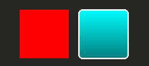
最も基本的なビジュアル用、 Qt Quickは矩形を描くためのRectangle 型を提供します。これらの矩形は色や垂直グラデーションで着色することができます。Rectangle タイプは矩形に境界線を描くこともできます。
矩形以外のカスタムシェイプの描画については、Canvas タイプを参照するか、Image タイプを使用してプリレンダリングされた画像を表示します。
import QtQuick

Item {

    width: 320
    height: 480

    Rectangle {
        color: "#272822"
        width: 320
        height: 480
    }

    // This element displays a rectangle with a gradient and a border
    Rectangle {
        x: 160
        y: 20
        width: 100
        height: 100
        radius: 8 // This gives rounded corners to the Rectangle
        gradient: Gradient { // This sets a vertical gradient fill
            GradientStop { position: 0.0; color: "aqua" }
            GradientStop { position: 1.0; color: "teal" }
        }
        border { width: 3; color: "white" } // This sets a 3px wide black border to be drawn
    }

    // This rectangle is a plain color with no border
    Rectangle {
        x: 40
        y: 20
        width: 100
        height: 100
        color: "red"
    }
}
画像タイプ
Qt Quickは、画像を表示するために使用できるImage 型を提供します。Image 型にはsource プロパティがあり、その値にはリモートまたはローカルのURL、またはコンパイルされたリソースファイルに埋め込まれた画像ファイルのURLを指定することができます。
// This element displays an image. Because the source is online, it may take some time to fetch
Image {
    x: 40
    y: 20
    width: 61
    height: 73
    source: "http://codereview.qt-project.org/static/logo_qt.png"
}
より複雑な画像については、Image に似た他の型があります。BorderImage は、グリッドスケーリングで画像を描画し、ボーダーとして使用される画像に適しています。AnimatedImage は、アニメーション化された .gif および .mng 画像を再生します。AnimatedSprite およびSpriteSequence は、アニメーション化されていない画像形式で隣接して保存された複数のフレームで構成されるアニメーションを再生します。
ビデオファイルとカメラデータの表示については Qt Multimediaモジュールを参照してください。
共有ビジュアルプロパティ
によって提供されるすべてのビジュアルアイテムは、アイテムタイプに基づいています。 Qt Quickによって提供されるすべてのビジュアル・アイテムは、Item タイプに基づいています。Item タイプは、opacity 属性と transform 属性を含む、ビジュアル・アイテムのための共通の属性セットを提供します。
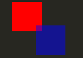
不透明度と可視性
Qt Quick が提供する QML オブジェクトタイプは、opacity をビルトインでサポートしています。Opacityはアニメーションさせることができ、透明な状態への遷移や透明な状態からの遷移をスムーズに行うことができます。可視性もvisible プロパティでより効率的に管理できますが、その代償としてアニメーションはできません。
import QtQuick

Item {

    width: 320
    height: 480

    Rectangle {
        color: "#272822"
        width: 320
        height: 480
    }

    Item {
        x: 20
        y: 270
        width: 200
        height: 200
        MouseArea {
            anchors.fill: parent
            onClicked: topRect.visible = !topRect.visible
        }
        Rectangle {
            x: 20
            y: 20
            width: 100
            height: 100
            color: "red"
        }
        Rectangle {
            id: topRect
            opacity: 0.5

            x: 100
            y: 100
            width: 100
            height: 100
            color: "blue"
        }
    }
}
トランスフォーム
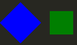
Qt Quick タイプにはトランスフォームのサポートが組み込まれています。ビジュアルコンテンツを回転または拡大縮小させたい場合は、Item::rotation またはItem::scale プロパティを設定します。これらはアニメーションも可能です。
import QtQuick

Item {

    width: 320
    height: 480

    Rectangle {
        color: "#272822"
        width: 320
        height: 480
    }

    Rectangle {
        rotation: 45 // This rotates the Rectangle by 45 degrees
        x: 20
        y: 160
        width: 100
        height: 100
        color: "blue"
    }
    Rectangle {
        scale: 0.8 // This scales the Rectangle down to 80% size
        x: 160
        y: 160
        width: 100
        height: 100
        color: "green"
    }
}
より複雑なトランスフォームについては、Item::transform プロパティを参照してください。
© 2026 The Qt Company Ltd. Documentation contributions included herein are the copyrights of their respective owners. The documentation provided herein is licensed under the terms of the GNU Free Documentation License version 1.3 as published by the Free Software Foundation. Qt and respective logos are trademarks of The Qt Company Ltd. in Finland and/or other countries worldwide. All other trademarks are property of their respective owners.
