QML 튜토리얼 2 - QML 컴포넌트
이 장에서는 텍스트의 색상을 변경하는 색상 선택기를 추가합니다.
색상 선택기는 서로 다른 색상을 가진 6개의 셀로 구성되어 있습니다. 각 셀에 대해 동일한 코드를 여러 번 작성하지 않기 위해 Cell 컴포넌트를 새로 만듭니다. 컴포넌트는 다른 QML 파일에서 재사용할 수 있는 새로운 유형을 정의하는 방법을 제공합니다. QML 컴포넌트는 블랙박스와 같으며 속성, 신호 및 함수를 통해 외부 세계와 상호 작용하며 일반적으로 자체 QML 파일에 정의됩니다. (자세한 내용은 Component 문서를 참조하세요.) 컴포넌트의 파일 이름은 항상 대문자로 시작해야 합니다.
다음은 Cell.qml 의 QML 코드입니다:
import QtQuick

Item {
    id: container
    property alias cellColor: rectangle.color
    signal clicked(cellColor: color)

    width: 40; height: 25

    Rectangle {
        id: rectangle
        border.color: "white"
        anchors.fill: parent
    }

    MouseArea {
        anchors.fill: parent
        onClicked: container.clicked(container.cellColor)
    }
}
워크스루
셀 컴포넌트
Item {
    id: container
    property alias cellColor: rectangle.color
    signal clicked(cellColor: color)

    width: 40; height: 25
컴포넌트의 루트 유형은 id 컨테이너가 있는 Item 입니다. Item 는 QML에서 가장 기본적인 시각적 유형이며 다른 유형의 컨테이너로 자주 사용됩니다.
property alias cellColor: rectangle.color
cellColor 프로퍼티를 선언합니다. 이 속성은 컴포넌트 외부에서 액세스할 수 있으므로 다른 색상으로 셀을 인스턴스화할 수 있습니다. 이 프로퍼티는 셀을 구성하는 사각형의 색상인 기존 프로퍼티에 대한 별칭일 뿐입니다( 프로퍼티 바인딩 참조).
signal clicked(cellColor: color)컴포넌트에 color 유형의 cellColor 매개변수로 클릭된 신호를 호출하는 것도 원합니다. 이 신호를 사용하여 나중에 기본 QML 파일에서 텍스트의 색상을 변경할 것입니다.
    Rectangle {
        id: rectangle
        border.color: "white"
        anchors.fill: parent
    }
셀 컴포넌트는 기본적으로 id 직사각형이 있는 컬러 사각형입니다.
anchors.fill 속성은 시각적 유형의 크기를 설정하는 편리한 방법입니다. 이 경우 직사각형은 부모와 동일한 크기를 갖습니다( 앵커 기반 레이아웃 참조).
    MouseArea {
        anchors.fill: parent
        onClicked: container.clicked(container.cellColor)
    }
셀을 클릭할 때 텍스트의 색상을 변경하기 위해 부모와 같은 크기의 MouseArea 유형을 만듭니다.
MouseArea 는 클릭이라는 신호를 정의합니다. 이 신호가 트리거되면 색상을 매개변수로 사용하여 자체 클릭 신호를 발생시키려고 합니다.
메인 QML 파일
메인 QML 파일에서는 Cell 컴포넌트를 사용하여 색상 선택기를 만듭니다:
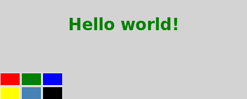
import QtQuick

Rectangle {
    id: page
    width: 320; height: 480
    color: "lightgray"

    Text {
        id: helloText
        text: "Hello world!"
        y: 30
        anchors.horizontalCenter: page.horizontalCenter
        font.pointSize: 24; font.bold: true
    }

    Grid {
        id: colorPicker
        x: 4; anchors.bottom: page.bottom; anchors.bottomMargin: 4
        rows: 2; columns: 3; spacing: 3

        Cell { cellColor: "red"; onClicked: helloText.color = cellColor }
        Cell { cellColor: "green"; onClicked: helloText.color = cellColor }
        Cell { cellColor: "blue"; onClicked: helloText.color = cellColor }
        Cell { cellColor: "yellow"; onClicked: helloText.color = cellColor }
        Cell { cellColor: "steelblue"; onClicked: helloText.color = cellColor }
        Cell { cellColor: "black"; onClicked: helloText.color = cellColor }
    }
}
서로 다른 색상을 가진 6개의 셀을 그리드에 배치하여 색상 선택기를 만듭니다.
Cell { cellColor: "red"; onClicked: helloText.color = cellColor }
셀의 클릭 신호가 트리거되면 텍스트의 색상을 매개변수로 전달된 cellColor로 설정하고 싶습니다. 컴포넌트의 모든 신호에 반응하려면 'onSignalName '이라는 프로퍼티를 통해 반응할 수 있습니다( 신호 속성 참조).
© 2026 The Qt Company Ltd. Documentation contributions included herein are the copyrights of their respective owners. The documentation provided herein is licensed under the terms of the GNU Free Documentation License version 1.3 as published by the Free Software Foundation. Qt and respective logos are trademarks of The Qt Company Ltd. in Finland and/or other countries worldwide. All other trademarks are property of their respective owners.
