헬로그래프
Qt Quick 애플리케이션에서 2D용 그래프 사용하기.
HelloGraphs는 간단한 2D 막대 그래프와 선 그래프를 만드는 방법을 보여줍니다.
다음 섹션에서는 BarSeries 을 사용하여 막대 그래프를 만드는 방법과 LineSeries 을 사용하여 선 그래프를 만드는 방법을 설명합니다.
예제 실행하기
에서 예제를 실행하려면 Qt Creator에서 Welcome 모드를 열고 Examples 에서 예제를 선택합니다. 자세한 내용은 Qt Creator: 튜토리얼을 참조하세요 : 빌드 및 실행을 참조하세요.
막대 그래프
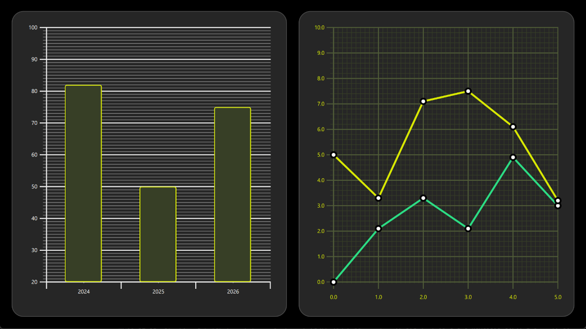
예제의 첫 번째 그래프는 막대 그래프입니다. GraphsView 컴포넌트로 시작하여 X axis, Y axis 및 theme 을 설정합니다. X축은 3개의 카테고리가 있는 BarCategoryAxis 입니다. 세로 격자와 축 선은 모두 숨겨져 있습니다. Y축은 ValueAxis 이며 표시 범위는 20에서 100 사이입니다. 레이블이 있는 주요 틱은 tickInterval 을 사용하여 10개 값마다 표시됩니다. 하위 틱은 subTickCount 9 을 사용하여 1 값마다 표시되며, 이는 모든 주요 틱 사이에 9개의 하위 틱이 있음을 의미합니다. 마지막으로 어두운 배경에 적합한 theme 을 추가합니다. 이 테마는 그래프 배경 격자, 축선 및 레이블을 조정합니다.
GraphsView {
    anchors.fill: parent
    anchors.margins: 16
    axisX: BarCategoryAxis {
        categories: [2024, 2025, 2026]
        gridVisible: false
        subGridVisible: false
    }
    axisY: ValueAxis {
        min: 20
        max: 100
        tickInterval: 10
        subTickCount: 9
    }
    theme: GraphsTheme {
        colorScheme: GraphsTheme.ColorScheme.Dark
        theme: GraphsTheme.Theme.QtGreen
    }
    ...
막대 그래프로 만들려면 BarSeries 을 추가합니다.
BarSeries {
    ...
그런 다음 BarSet 을 사용하여 BarSeries 에 데이터를 추가합니다. 사용자 정의 막대 색상 및 테두리 속성이 정의된 3개의 막대가 있습니다. 이러한 속성은 GraphsTheme 에 대해 설정 가능한 seriesColors 을 재정의합니다.
BarSet {
    values: [82, 50, 75]
    borderWidth: 2
    color: "#373F26"
    borderColor: "#DBEB00"
}
LineGraph
예제의 두 번째 그래프는 선 그래프입니다. 이 그래프도 GraphsView 요소를 정의하는 것으로 시작합니다. 사용자 정의 GraphsTheme 는 사용자 정의 모양을 얻기 위해 만들어집니다. GraphsTheme 은 배경 그리드와 축에 대해 매우 광범위한 사용자 정의 가능성을 제공하며, theme 뒤에 적용됩니다.
GraphsView 은 이 그래프에 적합한 axisX 및 axisY 을 정의합니다.
GraphsView {
    anchors.fill: parent
    anchors.margins: 16
    theme: GraphsTheme {
        readonly property color c1: "#DBEB00"
        readonly property color c2: "#373F26"
        readonly property color c3: Qt.lighter(c2, 1.5)
        colorScheme: GraphsTheme.ColorScheme.Dark
        seriesColors: ["#2CDE85", "#DBEB00"]
        grid.mainColor: c3
        grid.subColor: c2
        axisX.mainColor: c3
        axisY.mainColor: c3
        axisX.subColor: c2
        axisY.subColor: c2
        axisX.labelTextColor: c1
        axisY.labelTextColor: c1
    }
    axisX: ValueAxis {
        max: 5
        tickInterval: 1
        subTickCount: 9
        labelDecimals: 1
    }
    axisY: ValueAxis {
        max: 10
        tickInterval: 1
        subTickCount: 4
        labelDecimals: 1
    }
    ...
사용자 정의 Delegate 컴포넌트는 데이터 포인트를 시각화하는 데 사용됩니다.
component Marker : Rectangle {
    width: 16
    height: 16
    color: "#ffffff"
    radius: width * 0.5
    border.width: 4
    border.color: "#000000"
}
이를 선 그래프로 만들려면 LineSeries 을 추가합니다. 이렇게 하면 pointDelegate 이 앞서 만든 사용자 정의 Delegate 컴포넌트를 사용하도록 설정됩니다. 데이터 포인트는 XYPoint 요소를 사용하여 추가됩니다.
LineSeries {
    id: lineSeries1
    width: 4
    pointDelegate: Marker { }
    XYPoint { x: 0; y: 0 }
    XYPoint { x: 1; y: 2.1 }
    XYPoint { x: 2; y: 3.3 }
    XYPoint { x: 3; y: 2.1 }
    XYPoint { x: 4; y: 4.9 }
    XYPoint { x: 5; y: 3.0 }
}
두 번째 선 시리즈는 첫 번째 선 시리즈와 유사합니다. GraphsView 안에 두 번째 LineSeries 이므로 seriesColors 의 두 번째 색상이 자동으로 선택됩니다.
© 2026 The Qt Company Ltd. Documentation contributions included herein are the copyrights of their respective owners. The documentation provided herein is licensed under the terms of the GNU Free Documentation License version 1.3 as published by the Free Software Foundation. Qt and respective logos are trademarks of The Qt Company Ltd. in Finland and/or other countries worldwide. All other trademarks are property of their respective owners.
