Qt Quick Layouts - 반응형 레이아웃 예제
LayoutItemProxy 를 사용하여 반응형 UI를 만드는 방법을 보여줍니다.
이 예시는 레이아웃과 함께 LayoutProxyItems를 사용하여 반응형 레이아웃을 만드는 방법을 보여줍니다.
예제 실행하기
에서 예제를 실행하려면 Qt Creator에서 Welcome 모드를 열고 Examples 에서 예제를 선택합니다. 자세한 내용은 Qt Creator: 튜토리얼을 참조하세요 : 빌드 및 실행을 참조하세요.
항목 만들기
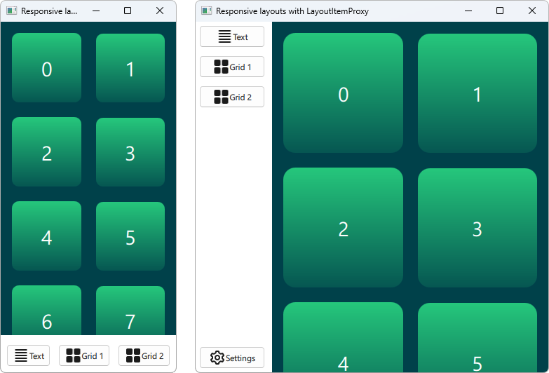
LayoutItemProxy 유형을 사용하면 동일한 항목을 여러 레이아웃에서 사용할 수 있지만 동시에 하나의 레이아웃만 표시할 수 있습니다. 이 유형은 창 또는 화면 크기에 맞게 조정되는 반응형 레이아웃을 만드는 데 사용할 수 있습니다.
먼저 UI에 표시되어야 하는 모든 항목을 정의해야 합니다. 여기서는 텍스트가 추가된 단순한 사각형인 AnnotatedRect를 사용합니다.
Rectangle {
    id: contentItem
    Layout.fillWidth: true
    implicitHeight: grid.implicitHeight
    implicitWidth: grid.implicitWidth
    color: "#00414A"

    GridLayout {
        id: grid
        anchors {
            fill: parent
            margins: 8
        }
        columns: Math.max(1, Math.min(Math.round(width / 130), 6))
        Repeater {
            model: 60
            delegate: Rectangle {
                required property int index
                Layout.fillWidth: true
                Layout.margins: 8
                implicitWidth: 200
                implicitHeight: width
                radius: width / 10
                gradient: Gradient {
                    GradientStop { position: -0.2; color: "#2CDE85" }
                    GradientStop { position: 1.2; color: "#00414A" }
                }
                Text {
                    color: "#ffffff"
                    font.pointSize: 22
                    anchors.centerIn: parent
                    text: parent.index + 1
                }
            }
        }
    }
}

Button {
    id: a
    text: "Text"
    icon.source: "./icons/text.svg"
    Layout.fillWidth: true
    Layout.margins: 3
}

Button {
    id: b
    text: "Grid 1"
    icon.source: "./icons/grid.svg"
    Layout.fillWidth: true
    Layout.margins: 3
}

Button {
    id: c
    text: "Grid 2"
    icon.source: "./icons/grid.svg"
    Layout.fillWidth: true
    Layout.margins: 3
}

Button {
    id: d
    text: "Settings"
    icon.source: "./icons/settings.svg"
    Layout.fillWidth: true
    Layout.margins: 3
}
레이아웃 만들기
이제 LayoutItemProxies 를 사용하여 이전에 선언한 항목을 대상으로 다양한 레이아웃을 선언할 수 있습니다. 단일 레이아웃은 다음과 같이 정의할 수 있습니다.
ColumnLayout {
    id: smallLayout
    anchors.fill: parent

    Flickable {
        Layout.fillHeight: true
        Layout.fillWidth: true
        contentWidth: width
        contentHeight: gl.implicitHeight
        clip: true
        ScrollIndicator.vertical: ScrollIndicator { }
        LayoutItemProxy {
            id: gl
            width: parent.width
            height: implicitHeight
            target: contentItem
        }
    }

    RowLayout {
        Layout.fillHeight: false
        Layout.fillWidth: true
        Layout.margins: 5
        LayoutItemProxy{ target: a; }
        LayoutItemProxy{ target: b; }
        LayoutItemProxy{ target: c; }
    }
}
이 스니펫은 LayoutItemProxy 을 사용하는 여러 가지 방법을 보여줍니다. 가장 간단한 방법은 여기 RowLayout 와 같은 레이아웃에 LayoutItemProxies 을 추가하는 것입니다. 또한 이 특정 레이아웃에서만 대상 항목에 영향을 주는 Layout 첨부 속성을 레이아웃프로시템에 추가로 설정합니다. 또한 d 항목이 첫 번째 레이아웃에서 사용되지 않음을 알 수 있습니다. 그러면 두 번째 레이아웃의 LayoutItemProxy 항목에 의해 자동으로 숨겨집니다. LayoutItemProxy 을 Flickable 의 콘텐츠로 설정하여 사용하는 또 다른 방법이 있습니다.
또 다른 레이아웃은 다음과 같이 선언됩니다.
RowLayout {
    id: largeLayout
    anchors.fill: parent
    ColumnLayout {
        Layout.minimumWidth: 100
        Layout.fillWidth: true
        Layout.margins: 2
        LayoutItemProxy{ target: a }
        LayoutItemProxy{ target: b }
        LayoutItemProxy{ target: c }
        Item { Layout.fillHeight: true }
        LayoutItemProxy{ target: d }
    }

    LayoutItemProxy {
        Layout.fillHeight: true
        Layout.fillWidth: true
        target: contentItem
    }
}
여기에서는 LayoutItemProxies 을 동일한 계층 수준에서 실제 Items 과 함께 사용할 수 있음을 보여줍니다. 일반적으로 LayoutItemProxy 는 유연하며 항목과 레이아웃의 중첩 구조를 허용합니다.
레이아웃 설정하기
smallLayout 및 largeLayout 두 레이아웃을 정의한 후에는 애플리케이션의 현재 크기에 맞는 레이아웃을 계속 설정할 수 있습니다. 이 코드를 위해 창이 초기화될 때와 너비가 변경될 때마다 호출하는 새 함수를 정의합니다:
function setFittingLayout() {
    if (width < 450) {
        smallLayout.visible = true
        largeLayout.visible = false
    } else {
        smallLayout.visible = false
        largeLayout.visible = true
    }
}
onWidthChanged: setFittingLayout()
Component.onCompleted: setFittingLayout()
초기화 후 이 함수를 호출하는 대신 선언적 코드에서 초기 크기에 맞는 올바른 레이아웃을 제외한 모든 레이아웃을 숨길 수 있습니다.
© 2026 The Qt Company Ltd. Documentation contributions included herein are the copyrights of their respective owners. The documentation provided herein is licensed under the terms of the GNU Free Documentation License version 1.3 as published by the Free Software Foundation. Qt and respective logos are trademarks of The Qt Company Ltd. in Finland and/or other countries worldwide. All other trademarks are property of their respective owners.
