포지셔너 및 레이아웃
QML에서 항목을 배치하는 방법에는 여러 가지가 있습니다.
다음은 간략한 개요입니다. 자세한 내용은 Qt Quick - 포지셔닝의 중요 개념을 참조하십시오.
수동 위치 지정
항목의 x,y 속성을 설정하여 화면의 특정 x,y 좌표에 항목을 배치할 수 있습니다. 이렇게 하면 시각적 좌표계 규칙에 따라 부모의 왼쪽 상단 모서리를 기준으로 위치가 설정됩니다.
이러한 속성에 상수 값 대신 바인딩을 사용하는 것과 함께, x 및 y 좌표를 적절한 바인딩으로 설정하면 상대적 위치 지정도 쉽게 수행할 수 있습니다.
import QtQuick

Item {
    width: 100; height: 100

    Rectangle {
        // Manually positioned at 20,20
        x: 20
        y: 20
        width: 80
        height: 80
        color: "red"
    }
}

앵커
Item 유형은 다른 Item 유형에 앵커링할 수 있는 기능을 제공합니다. 각 항목에는 왼쪽, 오른쪽, 세로 중앙, 위쪽, 아래쪽, 기준선 및 가로 중앙 등 7개의 앵커 라인이 있습니다. 세로 앵커 라인 3개는 다른 항목의 세로 앵커 라인 3개 중 하나에, 가로 앵커 라인 4개는 다른 항목의 가로 앵커 라인에 앵커링할 수 있습니다.
자세한 내용은 앵커로 위치 지정하기 및 anchors property 문서를 참조하세요.
import QtQuick

Item {
    width: 200; height: 200

    Rectangle {
        // Anchored to 20px off the top right corner of the parent
        anchors.right: parent.right
        anchors.top: parent.top
        anchors.margins: 20 // Sets all margins at once

        width: 80
        height: 80
        color: "orange"
    }

    Rectangle {
        // Anchored to 20px off the top center corner of the parent.
        // Notice the different group property syntax for 'anchors' compared to
        // the previous Rectangle. Both are valid.
        anchors { horizontalCenter: parent.horizontalCenter; top: parent.top; topMargin: 20 }

        width: 80
        height: 80
        color: "green"
    }
}

포지셔너
유형 집합을 일정한 패턴으로 배치하려는 일반적인 경우 Qt Quick 에서 몇 가지 포지셔너 유형을 제공합니다. 포지셔너에 배치된 항목은 어떤 방식으로든 자동으로 배치됩니다. 예를 들어 Row 는 항목을 가로로 인접하도록 배치합니다(행을 형성).
자세한 내용은 항목 포지셔너를 참조하세요.
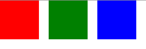
import QtQuick

Item {
    width: 300; height: 100

    Row { // The "Row" type lays out its child items in a horizontal line
        spacing: 20 // Places 20px of space between items

        Rectangle { width: 80; height: 80; color: "red" }
        Rectangle { width: 80; height: 80; color: "green" }
        Rectangle { width: 80; height: 80; color: "blue" }
    }
}
레이아웃 유형
레이아웃 유형 은 포지셔너와 비슷한 방식으로 작동하지만 레이아웃을 더 세분화하거나 제한할 수 있습니다. 구체적으로 레이아웃 유형을 사용하면 다음을 수행할 수 있습니다:
- 텍스트 및 기타 항목의 정렬 설정
- 할당된 애플리케이션 영역의 크기 조정 및 자동 채우기
- 최소 또는 최대 크기와 같은 크기 제약 설정
- 레이아웃 내 항목 사이의 간격 설정
GroupBox {
    id: gridBox
    title: "Grid layout"
    Layout.fillWidth: true

    GridLayout {
        id: gridLayout
        rows: 3
        flow: GridLayout.TopToBottom
        anchors.fill: parent
        Label { text: "Line 1" }
        Label { text: "Line 2" }
        Label { text: "Line 3" }

        TextField { }
        TextField { }
        TextField { }

        TextArea {
            text: "This widget spans over three rows in the GridLayout.\n"
                  + "All items in the GridLayout are implicitly positioned from top to bottom."
            Layout.rowSpan: 3
            Layout.fillHeight: true
            Layout.fillWidth: true
        }
    }
}
위의 스니펫은 기본 레이아웃 예제에서 가져온 것입니다. 이 스니펫은 레이아웃에 다양한 필드와 항목을 추가하는 간단한 방법을 보여줍니다. GridLayout 레이아웃은 크기를 조정할 수 있으며 다양한 속성을 통해 형식을 사용자 정의할 수 있습니다.
레이아웃 유형에 대한 자세한 내용은 여기를 참조하세요:
참고: Qt Quick Layouts 는 Qt 5.1에 도입되었으며 Qt Quick 2.1.
© 2026 The Qt Company Ltd. Documentation contributions included herein are the copyrights of their respective owners. The documentation provided herein is licensed under the terms of the GNU Free Documentation License version 1.3 as published by the Free Software Foundation. Qt and respective logos are trademarks of The Qt Company Ltd. in Finland and/or other countries worldwide. All other trademarks are property of their respective owners.
