
파일 시스템 탐색기
파일 시스템의 텍스트 파일을 표시하기 위해 사용자 정의된 파일 시스템 탐색기( Qt Quick Controls )를 활용하는 데스크톱 QML 앱입니다.
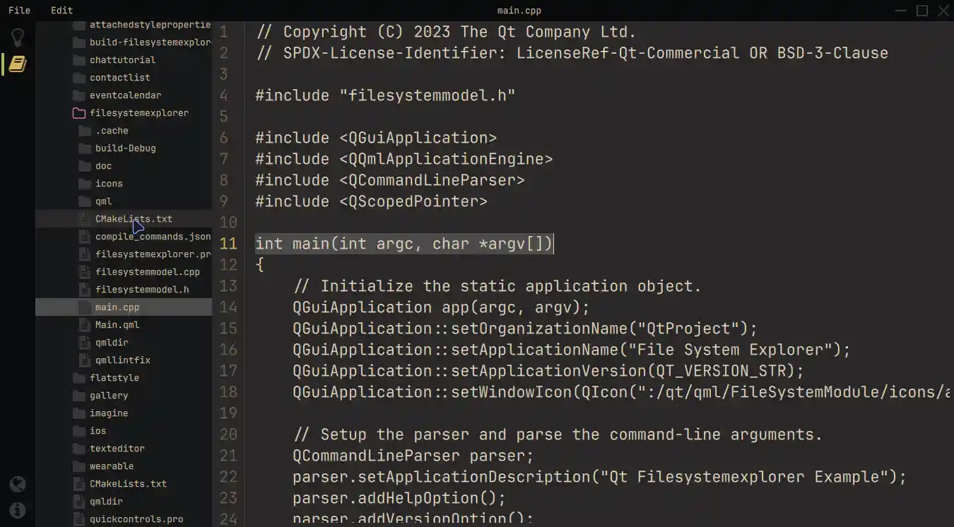
파일 시스템 탐색기 예제는 세 가지 주요 구성 요소로 이루어진 현대적인 레이아웃을 사용합니다. 왼쪽의 아이콘 기반 사이드바 ( Sidebar), QFileSystemModel 에서 파일 시스템을 표시하는 크기 조절이 가능한 TreeView, 그리고 선택된 텍스트 파일을 표시하는 TextArea 입니다. 맞춤형 퀵 컨트롤과 특수 창 장식이 적용된 프레임리스 창을 통해 모든 운영 체제에서 일관된 사용자 경험을 보장합니다. 명령줄에서 이 애플리케이션을 실행할 때 매개변수로 초기 디렉터리를 지정할 수 있습니다. 이 초기 디렉터리는 디렉터리 뷰어( TreeView )가 디렉터리 구조를 표시할 시작점을 설정하는 데 사용됩니다.
예제 실행
다음 경로에서 예제를 실행할 수 있습니다.
- Qt Creator
Welcome 모드를 열고 Examples 에서 예제를 선택합니다. 자세한 내용은 Qt Creator: 튜토리얼: 빌드 및 실행을 참조하십시오.
- Qt Extension for Visual Studio Code
Command Palette 에서 Qt: Open Qt examples 명령을 실행하고 목록에서 예제를 선택합니다. 자세한 내용은 Qt Extension for Visual Studio Code: 튜토리얼: 빌드 및 실행을 참조하십시오.
최신 레이아웃 및 구조
우선, 이 예제는 싱글톤 QML 객체 전반에 걸쳐 색상을 지정합니다. 이는 애플리케이션의 외관을 체계적으로 제어하기 위함입니다.
pragma Singleton

QtObject {
    readonly property color background: "#292828"
    readonly property color surface1: "#171819"
    readonly property color surface2: "#090A0C"
    readonly property color text: "#D4BE98"
    readonly property color textFile: "#E1D2B7"
    readonly property color disabledText: "#2C313A"
    readonly property color selection: "#4B4A4A"
    readonly property color active: "#292828"
    readonly property color inactive: "#383737"
    readonly property color folder: "#383737"
    readonly property color icon: "#383737"
    readonly property color iconIndicator: "#D5B35D"
    readonly property color color1: "#A7B464"
    readonly property color color2: "#D3869B"
}
이 예제는 운영 체제의 창 장식에 의존하는 대신, ApplicationWindow 내부에서 FramelessWindowHint 플래그를 사용하여 사용자 정의 장식을 생성합니다. 창과의 동등한 상호 작용을 구현하기 위해, 이 예제는 사용자 정의된 MenuBar 의 contentItem 속성을 재정의하고, 정보 텍스트와 애플리케이션을 드래그하거나 닫을 수 있는 상호 작용 옵션을 표시합니다. 인라인 컴포넌트(Inline Components ) 는 이 과정을 간소화합니다.
            component InteractionButton: Rectangle {
                id: interactionButton

                signal action()
                property alias hovered: hoverHandler.hovered

                Layout.fillHeight: true
                Layout.preferredWidth: height

                color: hovered ? Colors.background : "transparent"
                HoverHandler {
                    id: hoverHandler
                }
                TapHandler {
                    id: tapHandler
                    onTapped: interactionButton.action()
                }
            }

            InteractionButton {
                id: minimize

                onAction: root.dragWindow.showMinimized()
                Rectangle {
                    anchors.centerIn: parent
                    color: parent.hovered ? Colors.iconIndicator : Colors.icon
                    height: 2
                    width: parent.height - 14
                }
            }

            InteractionButton {
                id: maximize
    ...
왼쪽의 사이드바(Sidebar) 상단에는 선택 가능한 탐색 버튼이, 하단에는 일회성 버튼이 포함되어 있습니다. 특정 시점에 하나의 항목만 활성화되도록 보장하기 위해 선택 상자( ButtonGroup )와 컨테이너가 사용됩니다. 그러면 현재 위치에 대한 속성 별칭(property alias)과 선택 상자( StackLayout)를 함께 사용하여 서로 다른 뷰를 제공할 수 있습니다.
이 기법을 사용하면 StackLayout 내부에 다른 버튼과 해당 요소를 추가하여 기능을 확장할 수 있습니다.
                StackLayout {
                    anchors.fill: parent
                    currentIndex: sidebar.currentTabIndex

                    // Shows the help text.
                    Text {
                        text: qsTr("This example shows how to use and visualize the file system.\n\n"
                                 + "Customized Qt Quick Components have been used to achieve this look.\n\n"
                                 + "You can edit the files but they won't be changed on the file system.\n\n"
                                 + "Click on the folder icon to the left to get started.")
                        wrapMode: TextArea.Wrap
                        color: Colors.text
                    }

                    // Shows the files on the file system.
                    FileSystemView {
                        id: fileSystemView
                        color: Colors.surface1
                        onFileClicked: path => root.currentFilePath = path
                    }
                }
StackLayout 에는 일부 정보 텍스트 외에도 FileSystemView가 포함되어 있습니다. 이 사용자 정의 컴포넌트는 파일과 폴더를 표시하며, C++ 모델의 데이터로 내용을 채웁니다. 그러면 파일을 선택하여 해당 파일을 읽을 수 있습니다.
QString FileSystemModel::readFile(const QString &filePath)
{
    // Don't issue errors for an empty path, as the initial binding
    // will result in an empty path, and that's OK.
    if (filePath.isEmpty())
        return {};

    QFile file(filePath);

    if (file.size() >= 2'000'000)
        return tr("File size is too big.\nYou can read files up to %1 MB.").arg(2);

    static const QMimeDatabase db;
    const QMimeType mime = db.mimeTypeForFile(QFileInfo(file));

    // Check if the mimetype is supported and return the content.
    const auto mimeTypesForFile = mime.parentMimeTypes();
    for (const auto &m : mimeTypesForFile) {
        if (m.contains("text", Qt::CaseInsensitive)
                || mime.comment().contains("text", Qt::CaseInsensitive)) {
            if (!file.open(QIODevice::ReadOnly | QIODevice::Text))
                return tr("Error opening the File!");

            QTextStream stream(&file);
            return stream.readAll();
        }
    }
    return tr("Filetype not supported!");
}
TreeView 에서 폴더를 마우스 오른쪽 버튼으로 클릭하면 팝업 Menu 이 열리는데, 이를 통해 TreeView 의 rootIndex 속성을 제어할 수 있습니다.
            MyMenu {
                id: contextMenu
                Action {
                    text: qsTr("Set as root index")
                    onTriggered: {
                        fileSystemTreeView.rootIndex = fileSystemTreeView.index(treeDelegate.row, 0)
                    }
                }
                Action {
                    text: qsTr("Reset root index")
                    onTriggered: fileSystemTreeView.rootIndex = undefined
                }
            }
        }
SplitView StackLayout 과 편집기 간의 공간을 동적으로 공유할 수 있습니다. 편집기에는 열린 파일을 표시하고 텍스트 파일을 편집하는 데 필요한 모든 기능을 제공하는 가 포함되어 있습니다. 또한, 편집기는 줄 번호를 제공하며, 이는 에서 켜고 끌 수 있습니다. TextArea Menu
            Editor {
                id: editor
                showLineNumbers: root.showLineNumbers
                currentFilePath: root.currentFilePath
                SplitView.fillWidth: true
                SplitView.fillHeight: true
            }
사용자 정의 구성 요소
사용자 지정 과정을 더 잘 이해하려면 먼저 ‘컨트롤 사용자 지정’ 문서를 살펴보시기 바랍니다. 이 예제에서는 재사용 가능한 사용자 지정 컴포넌트를 사용합니다.
예를 들어, ` MyMenu ` 컴포넌트는 `Menu`의 ` background ` 속성, 해당 델리게이트의 ` contentItem` 속성, 그리고 ` background ` 속성을 사용자 정의합니다.
// Copyright (C) 2023 The Qt Company Ltd.
// SPDX-License-Identifier: LicenseRef-Qt-Commercial OR BSD-3-Clause

import QtQuick
import QtQuick.Controls.Basic
import FileSystemModule

Menu {
    id: root

    delegate: MenuItem {
        id: menuItem
        contentItem: Item {
            Text {
                anchors.verticalCenter: parent.verticalCenter
                anchors.left: parent.left
                anchors.leftMargin: 5

                text: menuItem.text
                color: enabled ? Colors.text : Colors.disabledText
            }
            Rectangle {
                id: indicator

                anchors.verticalCenter: parent.verticalCenter
                anchors.right: parent.right
                width: 6
                height: parent.height

                visible: menuItem.highlighted
                color: Colors.color2
            }
        }
        background: Rectangle {
            implicitWidth: 210
            implicitHeight: 35
            color: menuItem.highlighted ? Colors.active : "transparent"
        }
    }
    background: Rectangle {
        implicitWidth: 210
        implicitHeight: 35
        color: Colors.surface2
    }
}
또 다른 예제로는 사용자 정의 애니메이션을 사용하는 ` FileSystemView` 내부의 ` ScrollIndicator ` 사용자 지정이 있습니다. 이 예제에서는 ` contentItem` 메서드를 재정의합니다.
        ScrollIndicator.vertical: ScrollIndicator {
            active: true
            implicitWidth: 15

            contentItem: Rectangle {
                implicitWidth: 6
                implicitHeight: 6

                color: Colors.color1
                opacity: fileSystemTreeView.movingVertically ? 0.5 : 0.0

                Behavior on opacity {
                    OpacityAnimator {
                        duration: 500
                    }
                }
            }
        }
파이썬 버전
이 예제의 Python 버전에 관심이 있으시다면 여기에서 확인하실 수 있습니다. 이 예제는 Qt for Python 의 사용법을 보여주고, 이를 활용하여 동일한 애플리케이션을 만드는 방법을 시연합니다.
또한, 이 예제를 추가 기능으로 확장하는 방법에 대한 단계별 지침을 제공하는 상세한 튜토리얼이 마련되어 있습니다. 이 튜토리얼은 파일 시스템 탐색기의 기존 기능을 기반으로 애플리케이션을 확장하는 방법에 대해 더 자세히 알아보고 싶을 때 유용합니다.
소스 파일
참조: 모든 Qt 예제 및 Qt Quick Controls 예제.
© 2026 The Qt Company Ltd. Documentation contributions included herein are the copyrights of their respective owners. The documentation provided herein is licensed under the terms of the GNU Free Documentation License version 1.3 as published by the Free Software Foundation. Qt and respective logos are trademarks of The Qt Company Ltd. in Finland and/or other countries worldwide. All other trademarks are property of their respective owners.
