
PolarChartView QML Type
以极坐标图的形式展示数据。更多...
| Import Statement: | import QtCharts 2.12 |
| Inherits: | |
| Status: | Deprecated |
此类型已弃用。我们强烈建议不要在新代码中使用它。
详细说明
极坐标图以圆形图表呈现数据,其中数据的位置基于与图表中心(即极点)之间的角度和距离来确定。
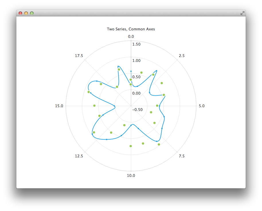
极坐标图是ChartView 类型的特化形式。它支持折线、样条曲线、面积和散点系列,以及这些系列所支持的所有坐标轴类型。每个坐标轴均可作为径向轴或角度轴使用。
角度型ValueAxis 的起始和结束刻度标记位于0/360度的同一位置。
如果系列中两个相邻点之间的角距离超过 180 度,连接这两个点的任何直线将失去意义,因此不会被绘制。取而代之的是,将绘制一条从图表中心出发并返回中心线。因此,在显示折线、样条曲线或面积系列时,必须相应地选择坐标轴范围。
极坐标图会将所有方向相同的坐标轴绘制在相同位置,因此使用多个方向相同的坐标轴可能会造成混淆,除非这些额外的坐标轴仅用于自定义网格。例如,您可以使用辅助的阴影坐标轴(CategoryAxis )来突出显示某个范围,或者通过具有隐藏标签的辅助坐标轴(ValueAxis )提供无标签的子刻度。
以下 QML 代码演示了如何创建一个包含样条曲线和散点数据系列以及两个数值轴的极坐标图:
PolarChartView {
    title: "Two Series, Common Axes"
    anchors.fill: parent
    legend.visible: false
    antialiasing: true

    ValueAxis {
        id: axisAngular
        min: 0
        max: 20
        tickCount: 9
    }

    ValueAxis {
        id: axisRadial
        min: -0.5
        max: 1.5
    }

    SplineSeries {
        id: series1
        axisAngular: axisAngular
        axisRadial: axisRadial
        pointsVisible: true
    }

    ScatterSeries {
        id: series2
        axisAngular: axisAngular
        axisRadial: axisRadial
        markerSize: 10
    }

    // Add data dynamically to the series
    Component.onCompleted: {
        for (var i = 0; i <= 20; i++) {
            series1.append(i, Math.random());
            series2.append(i, Math.random());
        }
    }
}
© 2026 The Qt Company Ltd. Documentation contributions included herein are the copyrights of their respective owners. The documentation provided herein is licensed under the terms of the GNU Free Documentation License version 1.3 as published by the Free Software Foundation. Qt and respective logos are trademarks of The Qt Company Ltd. in Finland and/or other countries worldwide. All other trademarks are property of their respective owners.
