PySide6.QtWidgets.QTabBar
- class QTabBar
The
QTabBarclass provides a tab bar, e.g. for use in tabbed dialogs. More…Synopsis
Properties
autoHideᅟ- If true, the tab bar is automatically hidden when it contains less than 2 tabschangeCurrentOnDragᅟ- If true, then the current tab is automatically changed when dragging over the tabbarcountᅟ- The number of tabs in the tab barcurrentIndexᅟ- The index of the tab bar’s visible tabdocumentModeᅟ- Whether or not the tab bar is rendered in a mode suitable for the main windowdrawBaseᅟ- Defines whether or not tab bar should draw its baseelideModeᅟ- How to elide text in the tab barexpandingᅟ- When expanding is true QTabBar will expand the tabs to use the empty spaceiconSizeᅟ- Size for icons in the tab barmovableᅟ- This property holds whether the user can move the tabs within the tabbar areaselectionBehaviorOnRemoveᅟ- What tab should be set as current when removeTab is called if the removed tab is also the current tabshapeᅟ- The shape of the tabs in the tab bartabsClosableᅟ- Whether or not a tab bar should place close buttons on each tabusesScrollButtonsᅟ- Whether or not a tab bar should use buttons to scroll tabs when it has many tabs
Methods
def
__init__()def
addTab()def
autoHide()def
count()def
currentIndex()def
documentMode()def
drawBase()def
elideMode()def
expanding()def
iconSize()def
insertTab()def
isMovable()def
isTabEnabled()def
isTabVisible()def
moveTab()def
removeTab()def
setAutoHide()def
setDrawBase()def
setElideMode()def
setExpanding()def
setIconSize()def
setMovable()def
setShape()def
setTabButton()def
setTabData()def
setTabEnabled()def
setTabIcon()def
setTabText()def
setTabToolTip()def
setTabVisible()def
shape()def
tabAt()def
tabButton()def
tabData()def
tabIcon()def
tabRect()def
tabText()def
tabTextColor()def
tabToolTip()def
tabWhatsThis()def
tabsClosable()
Virtual methods
def
tabInserted()def
tabRemoved()def
tabSizeHint()
Slots
Signals
def
currentChanged()def
tabBarClicked()def
tabMoved()
Note
This documentation may contain snippets that were automatically translated from C++ to Python. We always welcome contributions to the snippet translation. If you see an issue with the translation, you can also let us know by creating a ticket on https:/bugreports.qt.io/projects/PYSIDE
Detailed Description
QTabBaris straightforward to use; it draws the tabs using one of the predefinedshapes, and emits a signal when a tab is selected. It can be subclassed to tailor the look and feel. Qt also provides a ready-madeQTabWidget.Each tab has a
tabText(), an optionaltabIcon(), an optionaltabToolTip(), optionaltabWhatsThis()and optionaltabData(). The tabs’s attributes can be changed withsetTabText(),setTabIcon(),setTabToolTip(),setTabWhatsThisandsetTabData(). Each tabs can be enabled or disabled individually withsetTabEnabled().Each tab can display text in a distinct color. The current text color for a tab can be found with the
tabTextColor()function. Set the text color for a particular tab withsetTabTextColor().Tabs are added using
addTab(), or inserted at particular positions usinginsertTab(). The total number of tabs is given bycount(). Tabs can be removed from the tab bar withremoveTab(). CombiningremoveTab()andinsertTab()allows you to move tabs to different positions.The
shapeproperty defines the tabs’ appearance. The choice of shape is a matter of taste, although tab dialogs (for preferences and similar) invariably useRoundedNorth. Tab controls in windows other than dialogs almost always use eitherRoundedSouthorTriangularSouth. Many spreadsheets and other tab controls in which all the pages are essentially similar useTriangularSouth, whereasRoundedSouthis used mostly when the pages are different (e.g. a multi-page tool palette). The default inQTabBarisRoundedNorth.The most important part of
QTabBar‘s API is thecurrentChanged()signal. This is emitted whenever the current tab changes (even at startup, when the current tab changes from ‘none’). There is also a slot,setCurrentIndex(), which can be used to select a tab programmatically. The functioncurrentIndex()returns the index of the current tab,countholds the number of tabs.QTabBarcreates automatic mnemonic keys in the manner ofQAbstractButton; e.g. if a tab’s label is “&Graphics”, Alt+G becomes a shortcut key for switching to that tab.The following virtual functions may need to be reimplemented in order to tailor the look and feel or store extra data with each tab:
tabSizeHint()calcuates the size of a tab.tabInserted()notifies that a new tab was added.tabRemoved()notifies that a tab was removed.tabLayoutChange()notifies that the tabs have been re-laid out.paintEvent()paints all tabs.
For subclasses, you might also need the
tabRect()functions which returns the visual geometry of a single tab.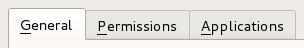
A tab bar shown in the Fusion widget style .
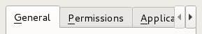
A truncated tab bar shown in the Fusion widget style.
See also
- class Shape
This enum type lists the built-in shapes supported by
QTabBar. Treat these as hints as some styles may not render some of the shapes. However, position should be honored.Constant
Description
QTabBar.Shape.RoundedNorth
The normal rounded look above the pages
QTabBar.Shape.RoundedSouth
The normal rounded look below the pages
QTabBar.Shape.RoundedWest
The normal rounded look on the left side of the pages
QTabBar.Shape.RoundedEast
The normal rounded look on the right side the pages
QTabBar.Shape.TriangularNorth
Triangular tabs above the pages.
QTabBar.Shape.TriangularSouth
Triangular tabs similar to those used in the Excel spreadsheet, for example
QTabBar.Shape.TriangularWest
Triangular tabs on the left of the pages.
QTabBar.Shape.TriangularEast
Triangular tabs on the right of the pages.
- class ButtonPosition
This enum type lists the location of the widget on a tab.
Constant
Description
QTabBar.ButtonPosition.LeftSide
Left side of the tab.
QTabBar.ButtonPosition.RightSide
Right side of the tab.
- class SelectionBehavior
This enum type lists the behavior of
QTabBarwhen a tab is removed and the tab being removed is also the current tab.Constant
Description
QTabBar.SelectionBehavior.SelectLeftTab
Select the tab to the left of the one being removed.
QTabBar.SelectionBehavior.SelectRightTab
Select the tab to the right of the one being removed.
QTabBar.SelectionBehavior.SelectPreviousTab
Select the previously selected tab.
Note
Properties can be used directly when
from __feature__ import true_propertyis used or via accessor functions otherwise.- property autoHideᅟ: bool
This property holds If true, the tab bar is automatically hidden when it contains less than 2 tabs..
By default, this property is false.
See also
visible- Access functions:
- property changeCurrentOnDragᅟ: bool
This property holds If true, then the current tab is automatically changed when dragging over the tabbar..
Note
You should also set acceptDrops property to true to make this feature work.
By default, this property is false.
- Access functions:
- property countᅟ: int
This property holds the number of tabs in the tab bar.
- Access functions:
- property currentIndexᅟ: int
This property holds the index of the tab bar’s visible tab.
The current index is -1 if there is no current tab.
- Access functions:
- property documentModeᅟ: bool
This property holds Whether or not the tab bar is rendered in a mode suitable for the main window..
This property is used as a hint for styles to draw the tabs in a different way then they would normally look in a tab widget. On macOS this will look similar to the tabs in Safari or Sierra’s Terminal.app.
See also
- Access functions:
- property drawBaseᅟ: bool
This property defines whether or not tab bar should draw its base..
If true then
QTabBardraws a base in relation to the styles overlap. Otherwise only the tabs are drawn.- Access functions:
- property elideModeᅟ: Qt.TextElideMode
This property holds how to elide text in the tab bar.
This property controls how items are elided when there is not enough space to show them for a given tab bar size.
By default the value is style-dependent.
- Access functions:
- property expandingᅟ: bool
This property holds When expanding is true
QTabBarwill expand the tabs to use the empty space..By default the value is true.
See also
- Access functions:
This property holds The size for icons in the tab bar.
The default value is style-dependent.
iconSizeis a maximum size; icons that are smaller are not scaled up.See also
- Access functions:
- property movableᅟ: bool
This property holds This property holds whether the user can move the tabs within the tabbar area..
By default, this property is
false;- Access functions:
- property selectionBehaviorOnRemoveᅟ: QTabBar.SelectionBehavior
This property holds What tab should be set as current when
removeTabis called if the removed tab is also the current tab..By default the value is
SelectRightTab.See also
- Access functions:
- property shapeᅟ: QTabBar.Shape
This property holds the shape of the tabs in the tab bar.
Possible values for this property are described by the Shape enum.
- Access functions:
- property tabsClosableᅟ: bool
This property holds Whether or not a tab bar should place close buttons on each tab.
When tabsClosable is set to true a close button will appear on the tab on either the left or right hand side depending upon the style. When the button is clicked the tab the signal
tabCloseRequestedwill be emitted.By default the value is false.
See also
- Access functions:
- property usesScrollButtonsᅟ: bool
This property holds Whether or not a tab bar should use buttons to scroll tabs when it has many tabs..
When there are too many tabs in a tab bar for its size, the tab bar can either choose to expand its size or to add buttons that allow you to scroll through the tabs.
By default the value is style-dependent.
- Access functions:
Creates a new tab bar with the given
parent.- accessibleTabName(index)
- Parameters:
index – int
- Return type:
str
Returns the accessibleName of the tab at position
index, or an empty string ifindexis out of range.See also
- addTab(text)
- Parameters:
text – str
- Return type:
int
Adds a new tab with text
text. Returns the new tab’s index.- addTab(icon, text)
- Parameters:
icon –
QIcontext – str
- Return type:
int
This is an overloaded function.
Adds a new tab with icon
iconand texttext. Returns the new tab’s index.- autoHide()
- Return type:
bool
See also
Getter of property
autoHideᅟ.- changeCurrentOnDrag()
- Return type:
bool
See also
Getter of property
changeCurrentOnDragᅟ.- count()
- Return type:
int
Getter of property
countᅟ.- currentChanged(index)
- Parameters:
index – int
This signal is emitted when the tab bar’s current tab changes. The new current has the given
index, or -1 if there isn’t a new one (for example, if there are no tab in theQTabBar)Notification signal of property
currentIndexᅟ.- currentIndex()
- Return type:
int
See also
Getter of property
currentIndexᅟ.- documentMode()
- Return type:
bool
See also
Getter of property
documentModeᅟ.- drawBase()
- Return type:
bool
See also
Getter of property
drawBaseᅟ.- elideMode()
- Return type:
See also
Getter of property
elideModeᅟ.- expanding()
- Return type:
bool
See also
Getter of property
expandingᅟ.- iconSize()
- Return type:
See also
Getter of property
iconSizeᅟ.- initStyleOption(option, tabIndex)
- Parameters:
option –
QStyleOptionTabtabIndex – int
Initialize
optionwith the values from the tab attabIndex. This method is useful for subclasses when they need aQStyleOptionTab, but don’t want to fill in all the information themselves.See also
- insertTab(index, text)
- Parameters:
index – int
text – str
- Return type:
int
Inserts a new tab with text
textat positionindex. Ifindexis out of range, the new tab is appended. Returns the new tab’s index.- insertTab(index, icon, text)
- Parameters:
index – int
icon –
QIcontext – str
- Return type:
int
This is an overloaded function.
Inserts a new tab with icon
iconand texttextat positionindex. Ifindexis out of range, the new tab is appended. Returns the new tab’s index.If the
QTabBarwas empty before this function is called, the inserted tab becomes the current tab.Inserting a new tab at an index less than or equal to the current index will increment the current index, but keep the current tab.
- isMovable()
- Return type:
bool
Getter of property
movableᅟ.- isTabEnabled(index)
- Parameters:
index – int
- Return type:
bool
Returns
trueif the tab at positionindexis enabled; otherwise returnsfalse.- isTabVisible(index)
- Parameters:
index – int
- Return type:
bool
Returns true if the tab at position
indexis visible; otherwise returns false.Returns the minimum tab size hint for the tab at position
index.- moveTab(from, to)
- Parameters:
from – int
to – int
Moves the item at index position
fromto index positionto.See also
- removeTab(index)
- Parameters:
index – int
Removes the tab at position
index.See also
- selectionBehaviorOnRemove()
- Return type:
See also
Getter of property
selectionBehaviorOnRemoveᅟ.- setAccessibleTabName(index, name)
- Parameters:
index – int
name – str
Sets the accessibleName of the tab at position
indextoname.See also
- setAutoHide(hide)
- Parameters:
hide – bool
See also
Setter of property
autoHideᅟ.- setChangeCurrentOnDrag(change)
- Parameters:
change – bool
See also
Setter of property
changeCurrentOnDragᅟ.- setCurrentIndex(index)
- Parameters:
index – int
See also
Setter of property
currentIndexᅟ.- setDocumentMode(set)
- Parameters:
set – bool
See also
Setter of property
documentModeᅟ.- setDrawBase(drawTheBase)
- Parameters:
drawTheBase – bool
See also
Setter of property
drawBaseᅟ.- setElideMode(mode)
- Parameters:
mode –
TextElideMode
See also
Setter of property
elideModeᅟ.- setExpanding(enabled)
- Parameters:
enabled – bool
See also
Setter of property
expandingᅟ.Setter of property
iconSizeᅟ.- setMovable(movable)
- Parameters:
movable – bool
See also
Setter of property
movableᅟ.- setSelectionBehaviorOnRemove(behavior)
- Parameters:
behavior –
SelectionBehavior
See also
Setter of property
selectionBehaviorOnRemoveᅟ.Setter of property
shapeᅟ.- setTabButton(index, position, widget)
- Parameters:
index – int
position –
ButtonPositionwidget –
QWidget
Sets
widgeton the tabindex. The widget is placed on the left or right hand side depending on theposition.Any previously set widget in
positionis hidden. SettingwidgettoNonewill hide the current widget atposition.The tab bar will take ownership of the widget and so all widgets set here will be deleted by the tab bar when it is destroyed unless you separately reparent the widget after setting some other widget (or
None).See also
- setTabData(index, data)
- Parameters:
index – int
data – object
Sets the data of the tab at position
indextodata.See also
- setTabEnabled(index, enabled)
- Parameters:
index – int
enabled – bool
If
enabledis true then the tab at positionindexis enabled; otherwise the item at positionindexis disabled.See also
Sets the icon of the tab at position
indextoicon.See also
- setTabText(index, text)
- Parameters:
index – int
text – str
Sets the text of the tab at position
indextotext.See also
Sets the color of the text in the tab with the given
indexto the specifiedcolor.If an invalid color is specified, the tab will use the
QTabBarforeground role instead.See also
- setTabToolTip(index, tip)
- Parameters:
index – int
tip – str
Sets the tool tip of the tab at position
indextotip.See also
- setTabVisible(index, visible)
- Parameters:
index – int
visible – bool
If
visibleis true, make the tab at positionindexvisible, otherwise make it hidden.See also
- setTabWhatsThis(index, text)
- Parameters:
index – int
text – str
Sets the What’s This help text of the tab at position
indextotext.See also
- setTabsClosable(closable)
- Parameters:
closable – bool
See also
Setter of property
tabsClosableᅟ.- setUsesScrollButtons(useButtons)
- Parameters:
useButtons – bool
See also
Setter of property
usesScrollButtonsᅟ.- shape()
- Return type:
See also
Getter of property
shapeᅟ.Returns the index of the tab that covers
positionor -1 if no tab coversposition;- tabBarClicked(index)
- Parameters:
index – int
This signal is emitted when user clicks on a tab at an
index.indexis the index of a clicked tab, or -1 if no tab is under the cursor.- tabBarDoubleClicked(index)
- Parameters:
index – int
This signal is emitted when the user double clicks on a tab at
index.indexrefers to the tab clicked, or -1 if no tab is under the cursor.- tabButton(index, position)
- Parameters:
index – int
position –
ButtonPosition
- Return type:
Returns the widget set a tab
indexandpositionorNoneif one is not set.See also
- tabCloseRequested(index)
- Parameters:
index – int
This signal is emitted when the close button on a tab is clicked. The
indexis the index that should be removed.See also
- tabData(index)
- Parameters:
index – int
- Return type:
object
Returns the data of the tab at position
index, or a null variant ifindexis out of range.See also
Returns the icon of the tab at position
index, or a null icon ifindexis out of range.See also
- tabInserted(index)
- Parameters:
index – int
This virtual handler is called after a new tab was added or inserted at position
index.See also
- tabLayoutChange()
This virtual handler is called whenever the tab layout changes.
See also
- tabMoved(from, to)
- Parameters:
from – int
to – int
This signal is emitted when the tab has moved the tab at index position
fromto index positionto.note:
QTabWidgetwill automatically move the page when this signal is emitted from its tab bar.See also
Returns the visual rectangle of the tab at position
index, or a null rectangle ifindexis hidden, or out of range.- tabRemoved(index)
- Parameters:
index – int
This virtual handler is called after a tab was removed from position
index.See also
Returns the size hint for the tab at position
index.- tabText(index)
- Parameters:
index – int
- Return type:
str
Returns the text of the tab at position
index, or an empty string ifindexis out of range.See also
Returns the text color of the tab with the given
index, or a invalid color ifindexis out of range.See also
- tabToolTip(index)
- Parameters:
index – int
- Return type:
str
Returns the tool tip of the tab at position
index, or an empty string ifindexis out of range.See also
- tabWhatsThis(index)
- Parameters:
index – int
- Return type:
str
Returns the What’s This help text of the tab at position
index, or an empty string ifindexis out of range.See also
- tabsClosable()
- Return type:
bool
See also
Getter of property
tabsClosableᅟ.- usesScrollButtons()
- Return type:
bool
See also
Getter of property
usesScrollButtonsᅟ.