ポジショナーとレイアウト
QMLでは、いくつかの方法でアイテムを配置することができます。
以下はその概要です。詳しくは「 Qt Quick における重要な概念 - ポジショニング」を参照してください。
手動ポジショニング
アイテムは、x,yプロパティを設定することで、画面上の特定のx,y座標に配置することができます。これにより、ビジュアル座標系のルールに従って、親の左上隅からの相対的な位置が設定されます。
これらのプロパティに定数値ではなくバインディングを使用することで、x,y座標を適切なバインディングに設定することで、相対的な配置も簡単に行うことができます。
import QtQuick

Item {
    width: 100; height: 100

    Rectangle {
        // Manually positioned at 20,20
        x: 20
        y: 20
        width: 80
        height: 80
        color: "red"
    }
}

アンカー
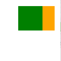
Item タイプは他のItem タイプにアンカーする機能を提供します。各項目には7本のアンカー線がある:左、右、垂直方向中央、上、下、ベースライン、水平方向中央。3本の垂直アンカー線は他のアイテムの3本の垂直アンカー線のいずれにもアンカーすることができ、4本の水平アンカー線は他のアイテムの水平アンカー線にアンカーすることができる。
詳しくは、アンカーを使ったポジショニングと anchors property のドキュメントを参照してください。
import QtQuick

Item {
    width: 200; height: 200

    Rectangle {
        // Anchored to 20px off the top right corner of the parent
        anchors.right: parent.right
        anchors.top: parent.top
        anchors.margins: 20 // Sets all margins at once

        width: 80
        height: 80
        color: "orange"
    }

    Rectangle {
        // Anchored to 20px off the top center corner of the parent.
        // Notice the different group property syntax for 'anchors' compared to
        // the previous Rectangle. Both are valid.
        anchors { horizontalCenter: parent.horizontalCenter; top: parent.top; topMargin: 20 }

        width: 80
        height: 80
        color: "green"
    }
}
ポジショナー
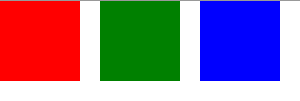
型セットを規則的なパターンで配置したいという一般的なケースのために、Qt Quick はいくつかのポジショナー型を提供します。例えば、Row は、アイテムを水平方向に隣接するように配置します(行を形成します)。
詳細についてはアイテムポジショナーを参照してください。
import QtQuick

Item {
    width: 300; height: 100

    Row { // The "Row" type lays out its child items in a horizontal line
        spacing: 20 // Places 20px of space between items

        Rectangle { width: 80; height: 80; color: "red" }
        Rectangle { width: 80; height: 80; color: "green" }
        Rectangle { width: 80; height: 80; color: "blue" }
    }
}
レイアウトタイプ
レイアウトタイプはポジショナーと似たような働きをしますが、レイアウトをさらに細かくしたり、制限したりすることができます。具体的には、レイアウトタイプでは以下のことが可能です:
- テキストやその他のアイテムの配置を設定する
- 割り当てられたアプリケーション領域を自動的にリサイズして埋める
- 最小または最大寸法などのサイズ制約を設定する
- レイアウト内のアイテムの間隔を設定する
GroupBox {
    id: gridBox
    title: "Grid layout"
    Layout.fillWidth: true

    GridLayout {
        id: gridLayout
        rows: 3
        flow: GridLayout.TopToBottom
        anchors.fill: parent
        Label { text: "Line 1" }
        Label { text: "Line 2" }
        Label { text: "Line 3" }

        TextField { }
        TextField { }
        TextField { }

        TextArea {
            text: "This widget spans over three rows in the GridLayout.\n"
                  + "All items in the GridLayout are implicitly positioned from top to bottom."
            Layout.rowSpan: 3
            Layout.fillHeight: true
            Layout.fillWidth: true
        }
    }
}
上のスニペットはBasic Layoutsのサンプルです。このスニペットは、レイアウトに様々なフィールドとアイテムを追加するシンプルさを示しています。GridLayout のサイズは変更でき、そのフォーマットは様々なプロパティでカスタマイズ可能です。
レイアウト・タイプの詳細については、こちらをご覧ください:
Note: Qt Quick Layoutsは Qt 5.1 で導入されました。 Qt Quick2.1.
© 2026 The Qt Company Ltd. Documentation contributions included herein are the copyrights of their respective owners. The documentation provided herein is licensed under the terms of the GNU Free Documentation License version 1.3 as published by the Free Software Foundation. Qt and respective logos are trademarks of The Qt Company Ltd. in Finland and/or other countries worldwide. All other trademarks are property of their respective owners.
