PolarChartView QML Type
데이터를 극좌표 차트로 표시합니다. 더 보기...
| Import Statement: | import QtCharts 2.11 |
| Inherits: |
자세한 설명
극형 차트는 원형 그래프로 데이터를 표시하며, 데이터의 배치는 그래프의 중심인 극으로부터의 각도와 거리에 따라 결정됩니다.
폴라 차트는 ChartView 유형의 특수화입니다. 선형, 스플라인, 면적, 분산형 계열 및 해당 계열에서 지원하는 모든 축 유형을 지원합니다. 각 축은 방사형 축 또는 각도 축으로 사용할 수 있습니다.
각축( ValueAxis )의 첫 번째와 마지막 눈금표는 0/360도 각도로 함께 위치합니다.
연속된 두 점 사이의 각도 거리가 180도를 초과하는 경우 두 점을 연결하는 직선은 의미가 없어지고 그려지지 않습니다. 대신 차트의 중심을 오가는 선이 그려집니다. 따라서 선, 스플라인 또는 영역 계열을 표시할 때는 축 범위를 적절히 선택해야 합니다.
극좌표형 차트는 같은 방향의 모든 축을 같은 위치에 그리므로 추가 축을 그리드를 사용자 지정하는 데만 사용하지 않는 한 같은 방향의 여러 축을 사용하면 혼란스러울 수 있습니다. 예를 들어, 강조 표시된 범위를 음영 처리된 보조 범위( CategoryAxis )로 표시하거나 레이블이 없는 하위 틱에 숨겨진 레이블이 있는 보조 범위( ValueAxis )를 제공할 수 있습니다.
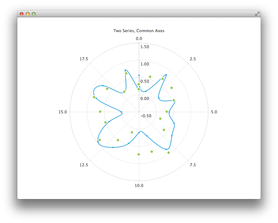
다음 QML 코드는 스플라인 및 분산형 계열과 두 개의 값 축이 있는 극좌표 차트를 만드는 방법을 보여줍니다:
PolarChartView {
    title: "Two Series, Common Axes"
    anchors.fill: parent
    legend.visible: false
    antialiasing: true

    ValueAxis {
        id: axisAngular
        min: 0
        max: 20
        tickCount: 9
    }

    ValueAxis {
        id: axisRadial
        min: -0.5
        max: 1.5
    }

    SplineSeries {
        id: series1
        axisAngular: axisAngular
        axisRadial: axisRadial
        pointsVisible: true
    }

    ScatterSeries {
        id: series2
        axisAngular: axisAngular
        axisRadial: axisRadial
        markerSize: 10
    }

    // Add data dynamically to the series
    Component.onCompleted: {
        for (var i = 0; i <= 20; i++) {
            series1.append(i, Math.random());
            series2.append(i, Math.random());
        }
    }
}
© 2026 The Qt Company Ltd. Documentation contributions included herein are the copyrights of their respective owners. The documentation provided herein is licensed under the terms of the GNU Free Documentation License version 1.3 as published by the Free Software Foundation. Qt and respective logos are trademarks of The Qt Company Ltd. in Finland and/or other countries worldwide. All other trademarks are property of their respective owners.
