
QML을 사용하여 차트 보기 사용자 정의하기
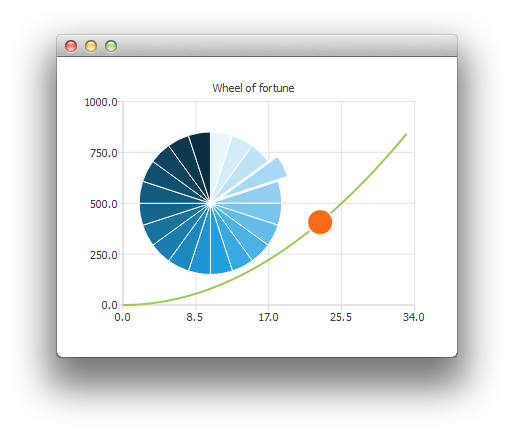
참고: 이 내용은 ‘QML을 사용한 차트 갤러리’ 예제의 일부입니다.
여기서는 파이 차트 시리즈를 사용자 정의하여 행운의 바퀴를 만드는 방법을 보여드립니다.
먼저 ChartView와 몇 개의 시리즈를 생성합니다.
ChartView {
    id: chartView
    anchors.fill: parent
    title: "Wheel of Fortune"
    legend.visible: false
    antialiasing: true

    PieSeries {
        id: wheelOfFortune
        horizontalPosition: 0.3
    }

    SplineSeries {
        id: splineSeries
    }

    ScatterSeries {
        id: scatterSeries
    }
}
애플리케이션 데이터는 메인 사각형의 Component.onCompleted에서 생성됩니다:
Component.onCompleted: {
    __intervalCoefficient = Math.random() + 0.25;

    for (var i = 0; i < 20; i++)
        wheelOfFortune.append("", 1);

    var interval = 1;
    for (var j = 0; interval < 800; j++) {
        interval = __intervalCoefficient * j * j;
        splineSeries.append(j, interval);
    }
    chartView.axisX(scatterSeries).max = j;
    chartView.axisY(scatterSeries).max = 1000;
}
다음과 같은 사용자 정의 작업은 타이머를 사용하여 반복적으로 수행됩니다. 파이 차트의 한 조각을 한 번에 강조 표시하기 위해 해당 조각의 `exploded` 속성을 수정합니다:
wheelOfFortune.at(index).exploded = false;
root.__activeIndex++;
index = root.__activeIndex % wheelOfFortune.count;
wheelOfFortune.at(index).exploded = true;
그런 다음 데이터 포인트가 하나만 있는 산점도 시리즈를 사용하여 애니메이션을 적용합니다:
scatterSeries.clear();
scatterSeries.append(root.__activeIndex, interval);
scatterSeries.color = Qt.tint(scatterSeries.color, "#05FF0000");
scatterSeries.markerSize += 0.5;
행운의 바퀴가 멈추면, 해당 조각의 색상을 변경하여 활성 조각이 깜박이도록 만듭니다.
// Switch the colors of the slice and the border
wheelOfFortune.at(index).borderWidth = 2;
switchColor = wheelOfFortune.at(index).borderColor;
wheelOfFortune.at(index).borderColor = wheelOfFortune.at(index).color;
wheelOfFortune.at(index).color = switchColor;
© 2026 The Qt Company Ltd. Documentation contributions included herein are the copyrights of their respective owners. The documentation provided herein is licensed under the terms of the GNU Free Documentation License version 1.3 as published by the Free Software Foundation. Qt and respective logos are trademarks of The Qt Company Ltd. in Finland and/or other countries worldwide. All other trademarks are property of their respective owners.
