
범례 사용자 지정
참고: 이 내용은 ‘Charts with QML Gallery’ 예제의 일부입니다.
여기서는 ChartView API의 기본 범례 대신 사용자 정의 범례를 만드는 방법을 보여드립니다.
애플리케이션의 메인 뷰에는 누적 면적 차트가 표시됩니다. 누적 면적 차트 중 하나는 다음과 같이 생성됩니다. ChartViewStacked.qml 및 AnimatedAreaSeries.qml을 참조하십시오.
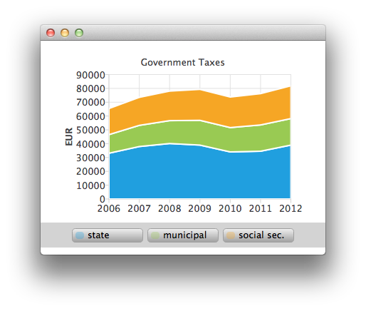
AnimatedAreaSeries {
    id: municipalSeries
    name: "municipal"
    axisX: axisX
    axisY: axisY
    borderWidth: 0
    upperSeries: LineSeries {
        id: municipalUpper
        XYPoint { x: 2006; y: 33119 + 13443 }
        XYPoint { x: 2007; y: 37941 + 15311 }
        XYPoint { x: 2008; y: 40122 + 16552 }
        XYPoint { x: 2009; y: 38991 + 17904 }
        XYPoint { x: 2010; y: 34055 + 17599 }
        XYPoint { x: 2011; y: 34555 + 19002 }
        XYPoint { x: 2012; y: 38991 + 19177 }
    }
    lowerSeries: stateUpper
}
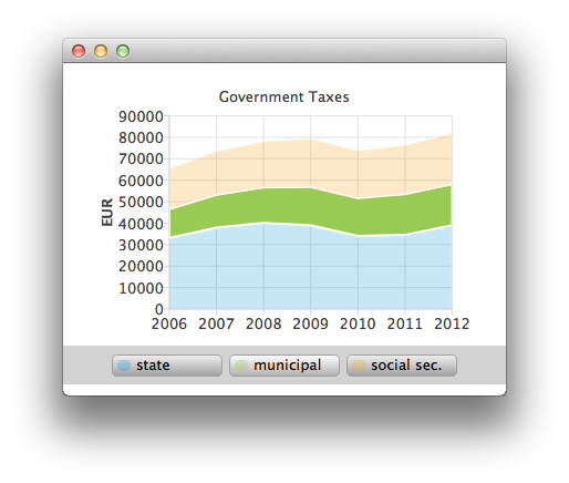
레전드 위에 마우스를 올리면 해당 시리즈가 강조 표시됩니다. (CustomLegend.qml 참조).
Row {
    id: legendRow
    anchors.centerIn: parent
    spacing: 10

    Repeater {
        id: legendRepeater
        model: legend.seriesCount
        delegate: legendDelegate
    }
}
Component {
    id: legendDelegate
    Rectangle {
        id: rect
    ...
        MouseArea {
            id: mouseArea
            anchors.fill: parent
            hoverEnabled: true
            onEntered: {
                rect.gradient = buttonGradientHovered;
                legend.entered(label.text);
            }
            onExited: {
                rect.gradient = buttonGradient;
                legend.exited(label.text);
                marker.opacity = 0.3;
                marker.height = 10;
            }
            onClicked: {
                legend.selected(label.text);
                marker.opacity = 1.0;
                marker.height = 12;
            }
        }
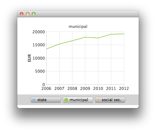
또한 마우스 클릭을 통해 중첩된 영역 중 하나를 선택하여 선형 시리즈로 자세히 살펴볼 수도 있습니다(ChartViewHighlighted.qml 참조).
ChartView {
    id: chartViewHighlighted

    property variant selectedSeries

    signal clicked

    legend.visible: false
    margins.top: 10
    margins.bottom: 0
    antialiasing: true

    LineSeries {
        id: lineSeries

        axisX: ValueAxis {
            min: 2006
            max: 2012
            labelFormat: "%.0f"
            tickCount: 7
        }
        axisY: ValueAxis {
            id: axisY
            titleText: "EUR"
            min: 0
            max: 40000
            labelFormat: "%.0f"
            tickCount: 5
        }
    }
© 2026 The Qt Company Ltd. Documentation contributions included herein are the copyrights of their respective owners. The documentation provided herein is licensed under the terms of the GNU Free Documentation License version 1.3 as published by the Free Software Foundation. Qt and respective logos are trademarks of The Qt Company Ltd. in Finland and/or other countries worldwide. All other trademarks are property of their respective owners.
