QML 고급 튜토리얼 1 - 게임 캔버스 및 블록 생성하기
애플리케이션 화면 만들기
첫 번째 단계는 애플리케이션에 기본 QML 항목을 만드는 것입니다.
우선 다음과 같은 메인 화면으로 동일한 게임 애플리케이션을 만듭니다:
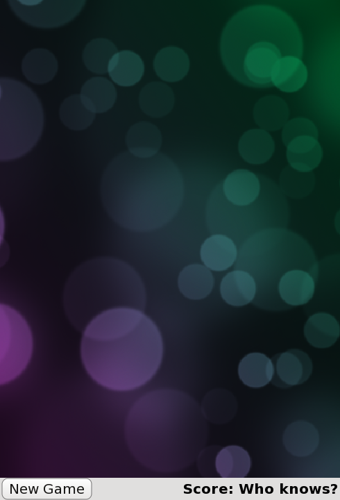
이는 다음과 같은 메인 애플리케이션 파일( samegame.qml)에 정의됩니다:
import QtQuick

Rectangle {
    id: screen

    width: 490; height: 720

    SystemPalette { id: activePalette }

    Item {
        width: parent.width
        anchors { top: parent.top; bottom: toolBar.top }

        Image {
            id: background
            anchors.fill: parent
            source: "pics/background.jpg"
            fillMode: Image.PreserveAspectCrop
        }
    }

    Rectangle {
        id: toolBar
        width: parent.width; height: 30
        color: activePalette.window
        anchors.bottom: screen.bottom

        Button {
            anchors { left: parent.left; verticalCenter: parent.verticalCenter }
            text: "New Game"
            onClicked: console.log("This doesn't do anything yet...")
        }

        Text {
            id: score
            anchors { right: parent.right; verticalCenter: parent.verticalCenter }
            text: "Score: Who knows?"
        }
    }
}
이렇게 하면 블록의 기본 캔버스, "새 게임" 버튼 및 점수 표시가 포함된 기본 게임 창이 표시됩니다.
여기서 생소할 수 있는 항목은 SystemPalette 항목입니다. 이 항목은 Qt 시스템 팔레트에 대한 액세스를 제공하며 버튼에 보다 네이티브한 모양과 느낌을 부여하는 데 사용됩니다.
Item, Button 및 Text 유형에 대한 앵커는 가독성을 위해 그룹(점) 표기법을 사용하여 설정되어 있습니다.
Button 및 Block 컴포넌트 추가하기
위 코드의 Button 항목은 Button.qml 이라는 별도의 컴포넌트 파일에 정의되어 있습니다. 기능 버튼을 생성하기 위해 Rectangle 안에 Text 및 MouseArea QML 유형을 사용합니다. 다음은 Button.qml 코드입니다:
import QtQuick

Rectangle {
    id: container

    property string text: "Button"

    signal clicked

    width: buttonLabel.width + 20; height: buttonLabel.height + 5
    border { width: 1; color: Qt.darker(activePalette.button) }
    antialiasing: true
    radius: 8

    // color the button with a gradient
    gradient: Gradient {
        GradientStop {
            position: 0.0
            color: {
                if (mouseArea.pressed)
                    return activePalette.dark
                else
                    return activePalette.light
            }
        }
        GradientStop { position: 1.0; color: activePalette.button }
    }

    MouseArea {
        id: mouseArea
        anchors.fill: parent
        onClicked: container.clicked();
    }

    Text {
        id: buttonLabel
        anchors.centerIn: container
        color: activePalette.buttonText
        text: container.text
    }
}
이것은 기본적으로 텍스트를 포함하고 클릭할 수 있는 직사각형을 정의합니다. MouseArea 에는 onClicked() 핸들러가 있어 해당 영역이 클릭될 때 container 의 clicked() 신호를 내보내도록 구현되어 있습니다.
같은 게임에서는 게임이 시작되면 화면이 작은 블록으로 채워집니다. 각 블록은 이미지가 포함된 항목입니다. 블록 코드는 별도의 Block.qml 파일에 정의되어 있습니다:
import QtQuick

Item {
    id: block

    Image {
        id: img
        anchors.fill: parent
        source: "pics/redStone.png"
    }
}
현재 블록은 아무 기능도 수행하지 않으며 이미지일 뿐입니다. 튜토리얼이 진행됨에 따라 블록에 애니메이션을 적용하고 동작을 부여할 것입니다. 아직 블록을 생성하기 위한 코드를 추가하지 않았으므로 다음 장에서 추가하겠습니다.
anchors.fill: parent 을 사용하여 이미지를 상위 항목의 크기로 설정했습니다. 즉, 튜토리얼의 뒷부분에서 블록 항목을 동적으로 만들고 크기를 조정할 때 이미지가 자동으로 올바른 크기로 조정됩니다.
이미지 유형의 source 속성의 상대 경로에 주목하세요. 이 경로는 Image 유형이 포함된 파일 위치에 상대적인 경로입니다. 또는 이미지 소스를 절대 파일 경로 또는 이미지가 포함된 URL로 설정할 수도 있습니다.
지금까지 코드에 익숙해졌을 것입니다. 시작하기 위해 몇 가지 기본 유형을 만들었습니다. 다음으로 게임 캔버스에 블록을 채우겠습니다.
© 2026 The Qt Company Ltd. Documentation contributions included herein are the copyrights of their respective owners. The documentation provided herein is licensed under the terms of the GNU Free Documentation License version 1.3 as published by the Free Software Foundation. Qt and respective logos are trademarks of The Qt Company Ltd. in Finland and/or other countries worldwide. All other trademarks are property of their respective owners.
