시각적 유형
직사각형 유형
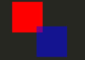
가장 기본적인 비주얼의 경우, Qt Quick 는 직사각형을 그리는 Rectangle 유형을 제공합니다. 이 직사각형은 색상 또는 수직 그라데이션으로 색상을 지정할 수 있습니다. Rectangle 유형은 직사각형에 테두리를 그릴 수도 있습니다.
직사각형 이외의 사용자 정의 모양을 그리려면 Canvas 유형을 참조하거나 Image 유형을 사용하여 미리 렌더링된 이미지를 표시하세요.
import QtQuick

Item {

    width: 320
    height: 480

    Rectangle {
        color: "#272822"
        width: 320
        height: 480
    }

    // This element displays a rectangle with a gradient and a border
    Rectangle {
        x: 160
        y: 20
        width: 100
        height: 100
        radius: 8 // This gives rounded corners to the Rectangle
        gradient: Gradient { // This sets a vertical gradient fill
            GradientStop { position: 0.0; color: "aqua" }
            GradientStop { position: 1.0; color: "teal" }
        }
        border { width: 3; color: "white" } // This sets a 3px wide black border to be drawn
    }

    // This rectangle is a plain color with no border
    Rectangle {
        x: 40
        y: 20
        width: 100
        height: 100
        color: "red"
    }
}

이미지 유형
Qt Quick 은 이미지를 표시하는 데 사용할 수 있는 Image 유형을 제공합니다. Image 유형에는 원격 또는 로컬 URL 또는 컴파일된 리소스 파일에 포함된 이미지 파일의 URL이 값이 될 수 있는 source 속성이 있습니다.
// This element displays an image. Because the source is online, it may take some time to fetch
Image {
    x: 40
    y: 20
    width: 61
    height: 73
    source: "http://codereview.qt-project.org/static/logo_qt.png"
}
보다 복잡한 이미지의 경우 Image 와 유사한 다른 유형이 있습니다. BorderImage 은 테두리로 사용되는 이미지에 적합한 그리드 스케일링으로 이미지를 그립니다. AnimatedImage 은 애니메이션 .gif 및 .mng 이미지를 재생합니다. AnimatedSprite 과 SpriteSequence 은 애니메이션이 아닌 이미지 형식으로 인접하게 저장된 여러 프레임으로 구성된 애니메이션을 재생합니다.
비디오 파일 및 카메라 데이터를 표시하려면 Qt Multimedia 모듈을 참조하세요.
공유 시각적 속성
에서 제공하는 모든 시각적 항목은 Qt Quick 에서 제공하는 모든 시각적 항목은 불투명도 및 변형 속성을 포함하여 시각적 항목에 대한 공통 속성 집합을 제공하는 항목 유형을 기반으로 합니다.
불투명도 및 가시성
Qt Quick 에서 제공하는 QML 개체 유형에는 opacity 에 대한 기본 지원이 있습니다. 불투명도는 애니메이션을 적용하여 투명 상태로 부드럽게 전환할 수 있습니다. 가시성은 visible 속성을 사용하여 더 효율적으로 관리할 수도 있지만 애니메이션을 적용할 수 없다는 단점이 있습니다.
import QtQuick

Item {

    width: 320
    height: 480

    Rectangle {
        color: "#272822"
        width: 320
        height: 480
    }

    Item {
        x: 20
        y: 270
        width: 200
        height: 200
        MouseArea {
            anchors.fill: parent
            onClicked: topRect.visible = !topRect.visible
        }
        Rectangle {
            x: 20
            y: 20
            width: 100
            height: 100
            color: "red"
        }
        Rectangle {
            id: topRect
            opacity: 0.5

            x: 100
            y: 100
            width: 100
            height: 100
            color: "blue"
        }
    }
}
트랜스폼
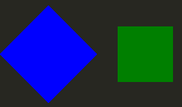
Qt Quick 유형에는 변환이 기본으로 지원됩니다. 시각적 콘텐츠를 회전하거나 크기를 조정하려면 Item::rotation 또는 Item::scale 속성을 설정하면 됩니다. 이러한 속성에도 애니메이션을 적용할 수 있습니다.
import QtQuick

Item {

    width: 320
    height: 480

    Rectangle {
        color: "#272822"
        width: 320
        height: 480
    }

    Rectangle {
        rotation: 45 // This rotates the Rectangle by 45 degrees
        x: 20
        y: 160
        width: 100
        height: 100
        color: "blue"
    }
    Rectangle {
        scale: 0.8 // This scales the Rectangle down to 80% size
        x: 160
        y: 160
        width: 100
        height: 100
        color: "green"
    }
}
보다 복잡한 변환에 대해서는 Item::transform 속성을 참조하세요.
© 2026 The Qt Company Ltd. Documentation contributions included herein are the copyrights of their respective owners. The documentation provided herein is licensed under the terms of the GNU Free Documentation License version 1.3 as published by the Free Software Foundation. Qt and respective logos are trademarks of The Qt Company Ltd. in Finland and/or other countries worldwide. All other trademarks are property of their respective owners.
