Qt Quick デモ - RSSニュース
XmlListModel とXmlListModelRole のカスタムQMLタイプを使ってXMLデータをダウンロードし、ListModel とListElement を使ってカテゴリリストを作成し、ListView を使ってデータを表示するQML RSSニュースリーダーです。
RSSニュースでは、以下の機能をデモします。 Qt Quick機能
- カスタム QML タイプの使用。
- リストモデルとリスト要素を使ってデータを表現する。
- XMLリストモデルを使ったXMLデータのダウンロード
- リストビューを使ってデータを表示する
- Component 型を使用して、ニュースアイテムリストビューのフッターを作成する。
- Image 型を使用して、アプリを閉じるためのボタンを作成する。
例の実行
からサンプルを実行するには Qt Creatorから例を実行するには、Welcome モードを開き、Examples から例を選択します。詳細については、Qt Creator: チュートリアル を参照してください:ビルドと実行を参照してください。
カスタムタイプの使用
RSS Newsアプリでは、それぞれ別の.qmlファイルで定義された以下のカスタム・タイプを使用します:
BusyIndicator.qmlCategoryDelegate.qmlNewsDelegate.qmlRssFeeds.qmlScrollBar.qml
メインウィンドウの作成
Main.qml では、アプリのメインウィンドウを作成するために、カスタムプロパティを持つRectangle タイプを使用しています:
Rectangle {
    id: window

    width: 800
    height: 480

    property string currentFeed: rssFeeds.get(0).feed
    property bool loading: feedModel.status === XmlListModel.Loading
    property bool isPortrait: Screen.primaryOrientation === Qt.PortraitOrientation
このカスタムプロパティは、XMLデータのロードや、向きに応じて画面レイアウトを調整するために後で使用します。
カテゴリー・リストの作成
Main.qml では、RssFeeds.qml で指定したRssFeeds カスタム・タイプを使用して、フィード・カテゴリのリストを作成します:
RssFeeds { id: rssFeeds }
RssFeeds.qml では、ListModel 型とListElement 型を使用して、 リスト要素がフィードのカテゴリを表すカテゴリリストを作成しています:
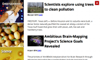
ListModel {
    ListElement { name: "Top Stories"; feed: "news.yahoo.com/rss/topstories"; image: "images/TopStories.jpg" }
    ListElement { name: "World"; feed: "news.yahoo.com/rss/world"; image: "images/World.jpg" }
    ListElement { name: "Europe"; feed: "news.yahoo.com/rss/europe"; image: "images/Europe.jpg" }
    ListElement { name: "Asia"; feed: "news.yahoo.com/rss/asia"; image: "images/Asia.jpg" }
    ListElement { name: "U.S. National"; feed: "news.yahoo.com/rss/us"; image: "images/USNational.jpg"  }
    ListElement { name: "Politics"; feed: "news.yahoo.com/rss/politics"; image: "images/Politics.jpg" }
    ListElement { name: "Business"; feed: "news.yahoo.com/rss/business"; image: "images/Business.jpg" }
    ListElement { name: "Technology"; feed: "news.yahoo.com/rss/tech"; image: "images/Technology.jpg" }
    ListElement { name: "Entertainment"; feed: "news.yahoo.com/rss/entertainment"; image: "images/Entertainment.jpg" }
    ListElement { name: "Health"; feed: "news.yahoo.com/rss/health"; image: "images/Health.jpg" }
    ListElement { name: "Science"; feed: "news.yahoo.com/rss/science"; image: "images/Science.jpg" }
    ListElement { name: "Sports"; feed: "news.yahoo.com/rss/sports"; image: "images/Sports.jpg" }
}
リスト要素は他のQMLの型と同様に定義されますが、プロパティの代わりにロールの定義が含まれます。ロールはデータへのアクセス方法を定義するものであり、データそのものを含むものでもあります。
各リスト要素では、name ロールでカテゴリ名を指定し、feed ロールでデータを読み込む URL を指定し、image ロールでカテゴリの画像を表示します。
Main.qml では、ListView タイプを使ってカテゴリー・リストを表示します:
    ListView {
        id: categories
        property int itemWidth: 190

        width: window.isPortrait ? parent.width : itemWidth
        height: window.isPortrait ? itemWidth : parent.height
        orientation: window.isPortrait ? ListView.Horizontal : ListView.Vertical
        anchors.top: parent.top
        model: rssFeeds
        delegate: CategoryDelegate {
            itemSize: categories.itemWidth
            isLoading: window.loading
            onClicked: function () {
                if (window.currentFeed == feed)
                    feedModel.reload()
                else
                    window.currentFeed = feed

            }
        }
縦向きではウィンドウの上部に水平に、横向きでは左側に垂直にカテゴリ・リストをレイアウトするには、orientation プロパティを使用します。向きに応じて、リストの幅または高さを固定値(itemWidth )にバインドします。
どちらの向きでも、anchors.top プロパティを使用して、リスト・ビューを画面の上部に配置します。
model プロパティを使用して、rssFeeds モデルから XML データをロードし、CategoryDelegate をデリゲートとして使用して、リストの各項目をインスタンス化します。
リスト要素の作成
CategoryDelegate.qml では、カスタム・プロパティを持つRectangle タイプを使用してリスト要素を作成します:
Rectangle {
    id: delegate

    required property real itemSize
    required property string name
    required property string feed
    required property string image
    required property int index
    required property bool isLoading

    property bool selected: ListView.isCurrentItem
required を使用して、モデルに期待するプロパティを宣言します。
selected プロパティをListView.isCurrentItem 添付プロパティに設定し、delegate が現在のアイテムの場合、selected がtrue になるように指定します。
Image 型source プロパティを使用して、rssFeeds リスト・モデルのimage ロールによってリスト要素に指定された画像を、デリゲートの中央に表示します:
    Image {
        anchors.centerIn: parent
        source: delegate.image
    }
Text 型を使用して、リスト要素にタイトルを追加します:
    Text {
        id: titleText

        anchors {
            left: parent.left; leftMargin: 20
            right: parent.right; rightMargin: 20
            top: parent.top; topMargin: 20
        }

        font { pixelSize: 18; bold: true }
        text: delegate.name
        color: delegate.selected ? "#ffffff" : "#ebebdd"
        scale: delegate.selected ? 1.15 : 1.0
        Behavior on color { ColorAnimation { duration: 150 } }
        Behavior on scale { PropertyAnimation { duration: 300 } }
anchors プロパティを使用して、タイトルをリスト要素の上部に20ピクセルのマージンをとって配置します。font プロパティを使って、フォント・サイズとテキスト・フォーマットを調整します。
color 、scale プロパティを使ってテキストを明るくし、リストアイテムがカレントアイテムの時に少し大きく拡大します。プロパティにBehavior を適用することで、リスト項目の選択と選択解除の動作をアニメーション化します。
MouseArea タイプを使用して、ユーザーがカテゴリ・リスト要素をタップしたときに XML データをダウンロードします:
    MouseArea {
        anchors.fill: delegate
        onClicked: {
            delegate.ListView.view.currentIndex = delegate.index
            delegate.clicked()
        }
    }
anchors.fill プロパティをdelegate に設定することで、ユーザがリスト要素内の任意の場所をタップできるようにしています。
clicked イベントでカテゴリ・リストの XML データをロードするには、ListView 添付プロパティのcurrentIndex を設定し、onClicked のclicked signal() を発信します。
XMLデータのダウンロード
Main.qml では、ListView 要素のデータ・ソースとしてXmlListModel タイプを使用し、選択されたカテゴリのニュース・アイテムを表示します:
    XmlListModel {
        id: feedModel

        source: "https://" + window.currentFeed
        query: "/rss/channel/item"
source プロパティとwindow.currentFeed カスタム・プロパティを使用して、選択したカテゴリのニュース・アイテムを取得します。
query プロパティは、XmlListModel が XML ドキュメント内の各<item> に対してモデル項目を生成することを指定します。
モデル項目の属性を指定するには、XmlListModelRole タイプを使用します。各モデル項目は、XML文書内の対応する<item> の値と一致するtitle 、content 、link 、pubDate 属性を持ちます:
        XmlListModelRole { name: "title"; elementName: "title"; attributeName: ""}
        XmlListModelRole { name: "content"; elementName: "content"; attributeName: "url" }
        XmlListModelRole { name: "link"; elementName: "link"; attributeName: "" }
        XmlListModelRole { name: "pubDate"; elementName: "pubDate"; attributeName: "" }
    }
データを表示するためにListView 型のfeedModel モデルを使います:
    ListView {
        id: list

        anchors.left: window.isPortrait ? window.left : categories.right
        anchors.right: closeButton.left
        anchors.top: window.isPortrait ? categories.bottom : window.top
        anchors.bottom: window.bottom
        anchors.leftMargin: 30
        anchors.rightMargin: 4
        clip: window.isPortrait
        model: feedModel
        footer: footerText
        delegate: NewsDelegate {}
    }
縦向きではカテゴリー・リストの下に、横向きではその右にニュース・アイテムをリストするために、isPortrait カスタム・プロパティを使って、ニュース・アイテム・リストの上部を、縦向きではwindow の左とcategories の下に、横向きではcategories の右とwindow の下にアンカーします。
anchors.bottom プロパティを使用して、両方の向きでリストビューの下部をウィンドウの下部に固定します。
縦向きでは、ニュース・アイテムが他のアイテムの上にスクロールされたときにグラフィカル・アーチファクトが発生しないように、ニュース・アイテムのペイントをリスト・ビューの外接矩形にクリップします。横向きでは、リストが画面全体に縦に広がるため、この必要はありません。
model プロパティを使用して、feedModel モデルから XML データをロードし、NewsDelegate をデリゲートとして使用して、リストの各項目をインスタンス化します。
NewsDelegate.qml では、Column 型を使用して XML データをレイアウトします:
Column {
    id: delegate

    required property string title
    required property string content
    required property string link
    required property string pubDate

    width: delegate.ListView.view.width
    spacing: 8
列の中では、行と別の列を使用して、画像とタイトルテキストを配置します:
    Row {
        width: parent.width
        spacing: 8

        Column {
            Item {
                width: 4
                height: titleText.font.pixelSize / 4
            }

            Image {
                id: titleImage
                source: delegate.content
                width: Math.min(delegate.width / 2, sourceSize.width)
                fillMode: Image.PreserveAspectFit
            }
        }

        Text {
            id: titleText

            text: delegate.title.replace(/'/g, "'")
            width: delegate.width - titleImage.width
            wrapMode: Text.WordWrap
            font.pixelSize: 26
            font.bold: true
        }
    }
timeSinceEvent() JavaScript関数を使用して、アイテムが投稿された時間のテキスト表現を生成します:
    Text {
        width: delegate.width
        font.pixelSize: 12
        textFormat: Text.RichText
        font.italic: true
        text: delegate.timeSinceEvent(delegate.pubDate) + " (<a href=\"" + delegate.link + "\">Link</a>)"
        onLinkActivated: function(link) {
            Qt.openUrlExternally(link)
        }
    }
onLinkActivated シグナルハンドラを使用して、ユーザーがリンクを選択したときに外部ブラウザでURLを開きます。
ユーザーへのフィードバック
CategoryDelegate.qml では、BusyIndicator カスタムタイプを使用して、XML データの読み込み中のアクティビティを示します:
    BusyIndicator {
        scale: 0.8
        visible: delegate.ListView.isCurrentItem && delegate.isLoading
        anchors.centerIn: parent
    }
scale プロパティを使用して、インジケータのサイズを0.8 に縮小します。visible プロパティをdelegate リスト・ビューのisCurrentItem attached プロパティとメイン・ウィンドウのloading プロパティにバインドして、カテゴリ・リスト・アイテムが現在のアイテムであり、XML データがロードされているときにインジケータ画像を表示します。
BusyIndicator.qml にBusyIndicator 型を定義します。Image 型を使用して画像を表示し、そのrotation プロパティにNumberAnimation を適用して、無限ループで画像を回転させます:
Image {
    id: container

    source: "images/busy.png";

    NumberAnimation on rotation {
        running: container.visible
        from: 0; to: 360;
        loops: Animation.Infinite;
        duration: 1200
    }
}
アプリでは、BusyIndicator タイプを Qt Quick Controlsモジュールの
スクロールバーの作成
Main.qml では、独自のカスタムScrollBar タイプを使用して、カテゴリとニュースアイテムのリストビューにスクロールバーを作成しています。アプリでは、ScrollView の型も使用できます。 Qt Quick Controlsモジュールから使用することもできます。
まず、カテゴリリストビューにスクロールバーを作成します。orientation プロパティをisPortrait プロパティに、Qt::Orientation 列挙型のHorizontal 値にバインドして、縦向きの横スクロールバーを表示し、Vertical 値にバインドして、横向きの縦スクロールバーを表示します:
    ScrollBar {
        id: listScrollBar

        orientation: window.isPortrait ? Qt.Horizontal : Qt.Vertical
        height: window.isPortrait ? 8 : categories.height;
        width: window.isPortrait ? categories.width : 8
        scrollArea: categories;
        anchors.right: categories.right
    }
categories リストビューと同様に、isPortrait プロパティに基づいてスクロールバーの幅と高さを調整します。
categories リストビューにスクロールバーを表示するには、scrollArea プロパティを使用します。
anchors.right プロパティを使用して、スクロールバーをカテゴリーリストの右側に固定します。
    ScrollBar {
        scrollArea: list
        width: 8
        anchors.right: window.right
        anchors.top: window.isPortrait ? categories.bottom : window.top
        anchors.bottom: window.bottom
    }
次に、ニュース・アイテムのリスト・ビューに別のスクロール・バーを作成します。画面の向きに関係なく、ビューの右側に縦スクロールバーを表示させたいので、width プロパティを8 に設定し、anchors.right プロパティをwindow.right プロパティにバインドします。anchors.top プロパティを使用して、縦向きの場合はカテゴリー・リストの一番下に、横向きの場合はニュース・アイテム・リストの一番上にスクロール・バーを固定します。anchors.bottom プロパティを使用して、両方の向きでスクロールバーの下部をリストビューの下部に固定します。
ScrollBar.qml でScrollBar タイプを定義します。カスタムプロパティを持つItem タイプを使用して、スクロールバーのコンテナを作成します:
position() 関数を使用して計算した x と y の位置にスクロールバーの親指を表示するためにBorderImage 型を使用します:
    BorderImage {
        source: "images/scrollbar.png"
        border { left: 1; right: 1; top: 1; bottom: 1 }
        x: container.orientation == Qt.Vertical ? 2 : container.position()
        y: container.orientation == Qt.Vertical ? container.position() : 2
        width: container.orientation == Qt.Vertical ? container.width - 4 : container.size()
        height: container.orientation == Qt.Vertical ? container.size() : container.height - 4
    }
size 関数を使用して、画面の向きに応じてサムの幅と高さを計算します。
states を使用して、ユーザーがスクロール領域を移動したときにスクロールバーが見えるようにします:
    states: State {
        name: "visible"
        when: container.orientation == Qt.Vertical ?
                  container.scrollArea.movingVertically :
                  container.scrollArea.movingHorizontally
        PropertyChanges { container { opacity: 1.0 } }
    }
transitions を使用して、"visible" からデフォルト状態に状態が変化したときに、opacity プロパティにNumberAnimation を適用します:
    transitions: Transition {
        from: "visible"; to: ""
        NumberAnimation { properties: "opacity"; duration: 600 }
    }
}
フッターの作成
Main.qml では、Component タイプとRectangle タイプを使用して、ニュース・リスト・ビュー用のフッターを作成しています:
pragma ComponentBehavior: Bound

import QtQuick
import QtQuick.Window
import QtQml.XmlListModel

Rectangle {
    id: window

    width: 800
    height: 480

    property string currentFeed: rssFeeds.get(0).feed
    property bool loading: feedModel.status === XmlListModel.Loading
    property bool isPortrait: Screen.primaryOrientation === Qt.PortraitOrientation

    onLoadingChanged: {
        if (feedModel.status == XmlListModel.Ready)
            list.positionViewAtBeginning()
    }

    RssFeeds { id: rssFeeds }

    XmlListModel {
        id: feedModel

        source: "https://" + window.currentFeed
        query: "/rss/channel/item"

        XmlListModelRole { name: "title"; elementName: "title"; attributeName: ""}
フッターのwidth をコンポーネントの幅に、height を閉じるボタンの高さにバインドして、ニュースアイテムが表示されていないときにそれらを整列させます。
ボタンの作成
Main.qml では、Image タイプを使用して、ユーザーがタップしてアプリを閉じることができるシンプルなプッシュボタンを作成します:
        XmlListModelRole { name: "content"; elementName: "content"; attributeName: "url" }
        XmlListModelRole { name: "link"; elementName: "link"; attributeName: "" }
        XmlListModelRole { name: "pubDate"; elementName: "pubDate"; attributeName: "" }
    }

    ListView {
        id: categories
        property int itemWidth: 190

        width: window.isPortrait ? parent.width : itemWidth
        height: window.isPortrait ? itemWidth : parent.height
        orientation: window.isPortrait ? ListView.Horizontal : ListView.Vertical
        anchors.top: parent.top
        model: rssFeeds
        delegate: CategoryDelegate {
            itemSize: categories.itemWidth
            isLoading: window.loading
            onClicked: function () {
                if (window.currentFeed == feed)
                    feedModel.reload()
                else
                    window.currentFeed = feed

            }
        }
        spacing: 3
    }

    ScrollBar {
        id: listScrollBar

        orientation: window.isPortrait ? Qt.Horizontal : Qt.Vertical
        height: window.isPortrait ? 8 : categories.height;
        width: window.isPortrait ? categories.width : 8
        scrollArea: categories;
        anchors.right: categories.right
    }

    ListView {
        id: list

        anchors.left: window.isPortrait ? window.left : categories.right
        anchors.right: closeButton.left
        anchors.top: window.isPortrait ? categories.bottom : window.top
        anchors.bottom: window.bottom
        anchors.leftMargin: 30
        anchors.rightMargin: 4
        clip: window.isPortrait
        model: feedModel
        footer: footerText
        delegate: NewsDelegate {}
    }

    ScrollBar {
        scrollArea: list
        width: 8
        anchors.right: window.right
        anchors.top: window.isPortrait ? categories.bottom : window.top
        anchors.bottom: window.bottom
    }

    Component {
        id: footerText

        Rectangle {
            width: parent.width
            height: closeButton.height
            color: "lightgray"

            Text {
                text: "RSS Feed from Yahoo News"
                anchors.centerIn: parent
                font.pixelSize: 14
            }
        }
    }

    Image {
        id: closeButton
        source: "content/images/btn_close.png"
        scale: 0.8
        anchors.top: parent.top
        anchors.right: parent.right
        anchors.margins: 4
        opacity: (window.isPortrait && categories.moving) ? 0.2 : 1.0
        Behavior on opacity {
            NumberAnimation { duration: 300; easing.type: Easing.OutSine }
        }

        MouseArea {
            anchors.fill: parent
            onClicked: {
                Qt.quit()
            }
        }
    }
anchors を使用して、閉じるボタンをニュース一覧ビューの右上隅に4ピクセルの余白で配置します。閉じるボタンは、縦向きではカテゴリー・リストと重なるので、ユーザーがカテゴリー・リストをスクロールしているときにボタンがほぼ完全に透明になるように、opacity プロパティをアニメーション化します。
MouseArea 内のonClicked シグナル・ハンドラを使用して、ユーザーが閉じるボタンを選択したときにquit() 関数を呼び出します。
QMLアプリケーションも参照してください 。
© 2026 The Qt Company Ltd. Documentation contributions included herein are the copyrights of their respective owners. The documentation provided herein is licensed under the terms of the GNU Free Documentation License version 1.3 as published by the Free Software Foundation. Qt and respective logos are trademarks of The Qt Company Ltd. in Finland and/or other countries worldwide. All other trademarks are property of their respective owners.
