Qt Quick Layouts - レスポンシブ・レイアウトの例
LayoutItemProxy を使用してレスポンシブ UI を作成する方法を示します。
この例では、LayoutProxyItemsとレイアウトを組み合わせて、レスポンシブレイアウトを作成する方法を示します。
例の実行
からサンプルを実行するには Qt Creatorからサンプルを実行するには、Welcome モードを開き、Examples からサンプルを選択します。詳細については、Qt Creator:Tutorialを参照してください:ビルドと実行を参照してください。
アイテムの作成
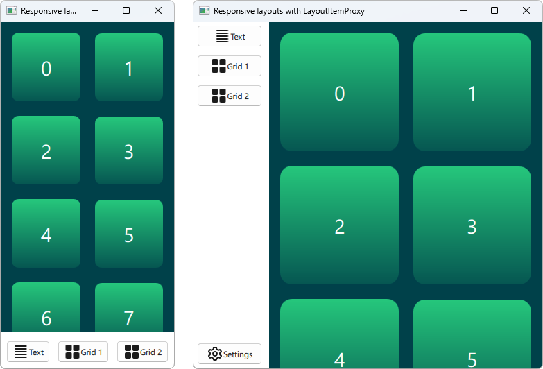
LayoutItemProxy タイプでは、同時に表示できるレイアウトは1つだけですが、同じアイテムを異なるレイアウトで使用できます。これは、ウィンドウやスクリーンサイズに適応するレスポンシブレイアウトを作成するために使用できます。
まず、ある時点でUIに表示されるすべてのアイテムを定義する必要があります。単純な矩形にテキストを追加したAnnotatedRectを使います。
Rectangle {
    id: contentItem
    Layout.fillWidth: true
    implicitHeight: grid.implicitHeight
    implicitWidth: grid.implicitWidth
    color: "#00414A"

    GridLayout {
        id: grid
        anchors {
            fill: parent
            margins: 8
        }
        columns: Math.max(1, Math.min(Math.round(width / 130), 6))
        Repeater {
            model: 60
            delegate: Rectangle {
                required property int index
                Layout.fillWidth: true
                Layout.margins: 8
                implicitWidth: 200
                implicitHeight: width
                radius: width / 10
                gradient: Gradient {
                    GradientStop { position: -0.2; color: "#2CDE85" }
                    GradientStop { position: 1.2; color: "#00414A" }
                }
                Text {
                    color: "#ffffff"
                    font.pointSize: 22
                    anchors.centerIn: parent
                    text: parent.index + 1
                }
            }
        }
    }
}

Button {
    id: a
    text: "Text"
    icon.source: "./icons/text.svg"
    Layout.fillWidth: true
    Layout.margins: 3
}

Button {
    id: b
    text: "Grid 1"
    icon.source: "./icons/grid.svg"
    Layout.fillWidth: true
    Layout.margins: 3
}

Button {
    id: c
    text: "Grid 2"
    icon.source: "./icons/grid.svg"
    Layout.fillWidth: true
    Layout.margins: 3
}

Button {
    id: d
    text: "Settings"
    icon.source: "./icons/settings.svg"
    Layout.fillWidth: true
    Layout.margins: 3
}
レイアウトの作成
LayoutItemProxies を使って様々なレイアウトを宣言することができます。1つのレイアウトは次のように定義できます。
ColumnLayout {
    id: smallLayout
    anchors.fill: parent

    Flickable {
        Layout.fillHeight: true
        Layout.fillWidth: true
        contentWidth: width
        contentHeight: gl.implicitHeight
        clip: true
        ScrollIndicator.vertical: ScrollIndicator { }
        LayoutItemProxy {
            id: gl
            width: parent.width
            height: implicitHeight
            target: contentItem
        }
    }

    RowLayout {
        Layout.fillHeight: false
        Layout.fillWidth: true
        Layout.margins: 5
        LayoutItemProxy{ target: a; }
        LayoutItemProxy{ target: b; }
        LayoutItemProxy{ target: c; }
    }
}
このスニペットでは、LayoutItemProxy を使用する複数の方法を示しています。最も簡単な方法は、RowLayout のようなレイアウトに、LayoutItemProxies を追加することです。さらに、LayoutProxyItemに追加のLayout 添付プロパティを設定し、この特定のレイアウトにおいてのみターゲットアイテムに影響を与えます。さらに、アイテムd が最初のレイアウトでは使用されていないことがわかります。そして、2番目のレイアウトでは、LayoutItemProxy によって自動的に非表示になります。もう一つの使い方は、LayoutItemProxy をFlickable のコンテンツとして設定することで示されます。
別のレイアウトは次のように宣言されます。
RowLayout {
    id: largeLayout
    anchors.fill: parent
    ColumnLayout {
        Layout.minimumWidth: 100
        Layout.fillWidth: true
        Layout.margins: 2
        LayoutItemProxy{ target: a }
        LayoutItemProxy{ target: b }
        LayoutItemProxy{ target: c }
        Item { Layout.fillHeight: true }
        LayoutItemProxy{ target: d }
    }

    LayoutItemProxy {
        Layout.fillHeight: true
        Layout.fillWidth: true
        target: contentItem
    }
}
ここでは、LayoutItemProxies が、同じ階層レベルにある実際のItems とともに使用できることを示しています。一般的に、LayoutItemProxy は柔軟性があり、アイテムやレイアウトの入れ子構造が可能です。
レイアウトの設定
smallLayout 、largeLayout の2つのレイアウトが定義されたら、アプリケーションの現在のサイズに合うレイアウトを設定します。このコードのために新しい関数を定義し、ウィンドウが初期化されたときと幅が変更されたときに呼び出します:
function setFittingLayout() {
    if (width < 450) {
        smallLayout.visible = true
        largeLayout.visible = false
    } else {
        smallLayout.visible = false
        largeLayout.visible = true
    }
}
onWidthChanged: setFittingLayout()
Component.onCompleted: setFittingLayout()
初期化後にこの関数を呼び出す代わりに、宣言的なコードで初期サイズに合ったレイアウト以外を非表示にすることができます。
© 2026 The Qt Company Ltd. Documentation contributions included herein are the copyrights of their respective owners. The documentation provided herein is licensed under the terms of the GNU Free Documentation License version 1.3 as published by the Free Software Foundation. Qt and respective logos are trademarks of The Qt Company Ltd. in Finland and/or other countries worldwide. All other trademarks are property of their respective owners.
