Qt Quick 예제 - 뷰
QML 모델-뷰 예제 모음입니다.
보기는 모델 및 보기 기능과 관련된 작은 QML 예제 모음입니다. 여기에는 Qt Quick 보기 유형을 사용하여 모델의 데이터를 표시하는 방법이 설명되어 있습니다. 자세한 내용은 Qt Quick 페이지의 모델 및 보기를 참조하세요.
예제 실행하기
에서 예제를 실행하려면 Qt Creator에서 Welcome 모드를 열고 Examples 에서 예제를 선택합니다. 자세한 내용은 Qt Creator: 자습서를 참조하세요 : 빌드 및 실행을 참조하십시오.
GridView 및 PathView 사용
GridView 및 PathView는 이러한 유형을 사용하여 뷰를 표시하는 방법을 보여줍니다.
    GridView {
        anchors.fill: parent
        cellWidth: 100
        cellHeight: 100
        focus: true
        model: appModel

        highlight: Rectangle {
            width: 80
            height: 80
            color: "lightsteelblue"
        }

        delegate: Item {
            required property string icon
            required property string name
            required property int index

            width: 100
            height: 100

            Image {
                id: myIcon
                y: 20
                anchors.horizontalCenter: parent.horizontalCenter
                source: parent.icon
            }
            Text {
                anchors {
                    top: myIcon.bottom
                    horizontalCenter: parent.horizontalCenter
                }
                text: parent.name
            }
            MouseArea {
                anchors.fill: parent
                onClicked: parent.GridView.view.currentIndex = parent.index
            }
        }
    }
동적 목록 사용
동적목록은 ListView 에 대한 런타임 추가 및 제거 애니메이션을 보여줍니다.
ListView.onAdd 신호 처리기는 뷰에 새 항목이 추가될 때 애니메이션을 실행하고 ListView.onRemove는 다른 항목이 제거될 때 애니메이션을 실행합니다.
        Item {
            SequentialAnimation {
                id: addAnimation
                PropertyAction {
                    target: delegateItem
                    property: "height"
                    value: 0
                }
                NumberAnimation {
                    target: delegateItem
                    property: "height"
                    to: 80
                    duration: 250
                    easing.type: Easing.InOutQuad
                }
            }
            ListView.onAdd: addAnimation.start()

            SequentialAnimation {
                id: removeAnimation
                PropertyAction {
                    target: delegateItem
                    property: "ListView.delayRemove"
                    value: true
                }
                NumberAnimation {
                    target: delegateItem
                    property: "height"
                    to: 0
                    duration: 250
                    easing.type: Easing.InOutQuad
                }

                // Make sure delayRemove is set back to false so that the item can be destroyed
                PropertyAction {
                    target: delegateItem
                    property: "ListView.delayRemove"
                    value: false
                }
            }
            ListView.onRemove: removeAnimation.start()
        }
델리게이트 확장
델리게이트 확장하기는 활성화될 때 확장되는 델리게이트를 보여줍니다.
크기와 모양이 변경되어 뷰의 다른 항목을 대체할 수 있는 복잡한 델리게이트가 있습니다.
        Item {
            id: recipe

            required property string title
            required property string picture
            required property string ingredients
            required property string method

            // Create a property to contain the visibility of the details.
            // We can bind multiple element's opacity to this one property,
            // rather than having a "PropertyChanges" line for each element we
            // want to fade.
            property real detailsOpacity : 0
            MouseArea {
                anchors.fill: parent
                onClicked: recipe.state = 'Details';
            }

            // Lay out the page: picture, title and ingredients at the top, and method at the
            // bottom.  Note that elements that should not be visible in the list
            // mode have their opacity set to recipe.detailsOpacity.

            Row {
                id: topLayout
                x: 10
                y: 10
                height: recipeImage.height
                width: parent.width
                spacing: 10

                Image {
                    id: recipeImage
                    width: 50
                    height: 50
                    source: recipe.picture
                }
            Item {
                id: details
                x: 10
                width: parent.width - 20

                anchors {
                    top: topLayout.bottom
                    topMargin: 10
                    bottom: parent.bottom
                    bottomMargin: 10
                }
                opacity: recipe.detailsOpacity
            }

            // A button to close the detailed view, i.e. set the state back to default ('').
            TextButton {
                y: 10
                anchors {
                    right: background.right
                    rightMargin: 10
                }
                opacity: recipe.detailsOpacity
                text: qsTr("Close")

                onClicked: recipe.state = '';
            }

            states: State {
                name: "Details"

                PropertyChanges {
                    background.color: "white"
                    recipeImage {
                         // Make picture bigger
                        width: 130
                        height: 130
                    }
                    recipe {
                        // Make details visible
                        detailsOpacity: 1
                        x: 0

                        // Fill the entire list area with the detailed view
                        height: listView.height
                    }
                }

                // Move the list so that this item is at the top.
                PropertyChanges {
                    recipe.ListView.view.contentY: recipe.y
                    explicit: true;
                }

                // Disallow flicking while we're in detailed view
                PropertyChanges {
                    recipe.ListView.view.interactive: false
                }
            }

            transitions: Transition {
                // Make the state changes smooth
                ParallelAnimation {
                    ColorAnimation {
                        property: "color"
                        duration: 500
                    }
                    NumberAnimation {
                        duration: 300
                        properties: "detailsOpacity,x,contentY,height,width"
                    }
                }
            }
        }
하이라이트 사용
하이라이트에서는 ListView 에 사용자 지정 하이라이트를 추가하는 방법을 보여 줍니다.
    // Define a highlight with customized movement between items.
    component HighlightBar : Rectangle {
        width: 200
        height: 50
        color: "#FFFF88"
        y: ListView.view.currentItem.y
        Behavior on y {
            SpringAnimation {
                spring: 2
                damping: 0.1
            }
        }
    }

    ListView {
        id: listView
        width: 200
        height: parent.height
        x: 30

        model: PetsModel { }
        delegate: PetDelegate { }
        focus: true

        // Set the highlight delegate. Note we must also set highlightFollowsCurrentItem
        // to false so the highlight delegate can control how the highlight is moved.
        highlight: HighlightBar { }
        highlightFollowsCurrentItem: false
    }
하이라이트 범위 사용
하이라이트 범위는 ListView 의 세 가지 하이라이트 범위 모드를 보여 줍니다.
Rectangle {
    id: root
    property int current: 0
    property bool increasing: true
    // Example index automation for convenience, disabled on click or tap
    SequentialAnimation {
        id: anim
        loops: -1
        running: true
        ScriptAction {
            script: if (root.increasing) {
                        root.current++;
                        if (root.current >= aModel.count -1) {
                            root.current = aModel.count - 1;
                            root.increasing = !root.increasing;
                        }
                    } else {
                        root.current--;
                        if (root.current <= 0) {
                            root.current = 0;
                            root.increasing = !root.increasing;
                        }
                    }
        }

        PauseAnimation {
            duration: 500
        }
    }
    ListView {
        id: list1
        height: 50
        width: parent.width
        model: PetsModel {
            id: aModel
        }
        delegate: petDelegate
        orientation: ListView.Horizontal
        highlight: Rectangle {
            color: "lightsteelblue"
        }
        currentIndex: root.current
        onCurrentIndexChanged: root.current = currentIndex
        focus: true
    }

    ListView {
        id: list2
        y: 160
        height: 50
        width: parent.width
        model: PetsModel { }
        delegate: petDelegate
        orientation: ListView.Horizontal
        highlight: Rectangle {
            color: "yellow"
        }
        currentIndex: root.current
        preferredHighlightBegin: 80
        preferredHighlightEnd: 220
        highlightRangeMode: ListView.ApplyRange
    }

    ListView {
        id: list3
        y: 320
        height: 50
        width: parent.width
        model: PetsModel {}
        delegate: petDelegate
        orientation: ListView.Horizontal
        highlight: Rectangle { color: "yellow" }
        currentIndex: root.current
        onCurrentIndexChanged: root.current = currentIndex
        preferredHighlightBegin: 125
        preferredHighlightEnd: 125
        highlightRangeMode: ListView.StrictlyEnforceRange
    }
}
섹션 사용
섹션에서는 ListView 에서 사용할 수 있는 다양한 섹션 머리글 및 바닥글을 보여줍니다.
    // The delegate for each section header
    Component {
        id: sectionHeading
        Rectangle {
            width: ListView.view.width
            height: childrenRect.height
            color: "lightsteelblue"

            required property string section

            Text {
                text: parent.section
                font.bold: true
                font.pixelSize: 20
            }
        }
    }

    ListView {
        id: view
        anchors.top: parent.top
        anchors.bottom: buttonBar.top
        width: parent.width
        model: animalsModel
        delegate: Text {
            required property string name

            text: name
            font.pixelSize: 18
        }

        section.property: "size"
        section.criteria: ViewSection.FullString
        section.delegate: sectionHeading
    }
패키지 사용
패키지는 Package 유형을 사용하여 두 보기 간에 델리게이트를 전환합니다.
여기에는 각 보기에 대한 델리게이트 항목과 델리게이트 간에 전송할 수 있는 항목을 정의하는 패키지 개체가 있습니다.
Package {
    id: delegate

    required property int upTo
    required property int index
    required property string display

    Text {
        id: listDelegate
        width: parent.width
        height: 25
        text: 'Empty'
        Package.name: 'list'
    }

    Text {
        id: gridDelegate
        width: parent.width / 2
        height: 50
        text: 'Empty'
        Package.name: 'grid'
    }

    Rectangle {
        id: wrapper
        width: parent?.width ?? 0
        height: 25
        color: 'lightsteelblue'

        Text {
            text: delegate.display
            anchors.centerIn: parent
        }
        state: delegate.upTo > delegate.index ? 'inGrid' : 'inList'
        states: [
            State {
                name: 'inList'
                ParentChange {
                    target: wrapper
                    parent: listDelegate
                }
            },
            State {
                name: 'inGrid'
                ParentChange {
                    target: wrapper
                    parent: gridDelegate
                    x: 0
                    y: 0
                    width: gridDelegate.width
                    height: gridDelegate.height
                }
            }
        ]

        transitions: [
            Transition {
                ParentAnimation {
                    NumberAnimation {
                        properties: 'x,y,width,height'
                        duration: 300
                    }
                }
            }
        ]
    }
}
DelegateModel 을 사용하면 개별 보기가 공유 패키지 델리게이트에서 특정 항목에 액세스할 수 있습니다.
DelegateModel {
    id: visualModel
    delegate: Delegate {
        upTo: root.upTo
    }
    model: myModel
}

ListView {
    id: lv
    height: parent.height / 2
    width: parent.width

    model: visualModel.parts.list
}
GridView {
    y: parent.height / 2
    height: parent.height / 2
    width: parent.width
    cellWidth: width / 2
    cellHeight: 50
    model: visualModel.parts.grid
}
드래그 가능한 선택은 패키지를 사용하여 선택한 여러 델리게이트를 그룹화하여 항목 보기 내에서 드래그 앤 드롭하는 방법을 보여줍니다.
        Package {
            id: packageRoot

            required property var modelData

            MouseArea {
                id: visibleContainer
                Package.name: "visible"

                width: 64
                height: 64
                enabled: packageRoot.DelegateModel.inSelected

                drag.target: draggable

                Item {
                    id: draggable

                    Drag.active: visibleContainer.drag.active
ObjectModel 사용
ObjectModel은 모델에 ListModel 대신 ObjectModel 을 사용합니다.
    ObjectModel {
        id: itemModel

        Rectangle {
            width: view.width
            height: view.height
            color: "#FFFEF0"

            Text {
                anchors.centerIn: parent
                text: qsTr("Page 1")
                font.bold: true
            }

            Component.onDestruction: if (root.printDestruction) print("destroyed 1")
        }
        Rectangle {
            width: view.width
            height: view.height
            color: "#F0FFF7"

            Text {
                anchors.centerIn: parent
                text: qsTr("Page 2")
                font.bold: true
            }

            Component.onDestruction: if (root.printDestruction) print("destroyed 2")
        }
        Rectangle {
            width: view.width
            height: view.height
            color: "#F4F0FF"

            Text {
                anchors.centerIn: parent
                text: qsTr("Page 3")
                font.bold: true
            }

            Component.onDestruction: if (root.printDestruction) print("destroyed 3")
        }
    }

    ListView {
        id: view
        anchors {
            fill: parent
            bottomMargin: 30
        }
        model: itemModel
        preferredHighlightBegin: 0
        preferredHighlightEnd: 0
        highlightRangeMode: ListView.StrictlyEnforceRange
        orientation: ListView.Horizontal
        snapMode: ListView.SnapOneItem
        flickDeceleration: 2000
        cacheBuffer: 200
    }
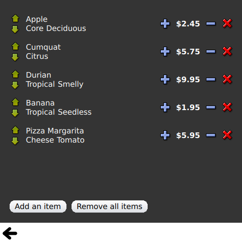
여백 표시 사용
여백표시에서는 델리게이트를 사용하여 항목을 표시하고 간단한 머리글 및 바닥글 컴포넌트를 구현합니다.
© 2026 The Qt Company Ltd. Documentation contributions included herein are the copyrights of their respective owners. The documentation provided herein is licensed under the terms of the GNU Free Documentation License version 1.3 as published by the Free Software Foundation. Qt and respective logos are trademarks of The Qt Company Ltd. in Finland and/or other countries worldwide. All other trademarks are property of their respective owners.
