QML Camera Application
This Qt Quick based application shows how to use the API to capture a still image or video.
This example demonstrates how to access camera functions via QML. It shows how to change settings and capture images or video.
Running the Example
To run the example from Qt Creator, open the Welcome mode and select the example from Examples. For more information, see Qt Creator: Tutorial: Build and run.
Application structure
Most of the QML code in this example supports the user interface. Custom types that support the requirements have been implemented using existing Qt Quick controls.
Using screen orientation to select layout
The orientation and control layout state logic is encapsulated in a separate Item, controlLayout like so:
Item {
    id: controlLayout

    readonly property bool isMobile: Qt.platform.os === "android" || Qt.platform.os === "ios"
    readonly property bool isLandscape: Screen.desktopAvailableWidth >= Screen.desktopAvailableHeight
    property int buttonsWidth: state === "MobilePortrait" ? Screen.desktopAvailableWidth / 3.4 : 114

    states: [
        State {
            name: "MobileLandscape"
            when: controlLayout.isMobile && controlLayout.isLandscape
        },
        State {
            name: "MobilePortrait"
            when: controlLayout.isMobile && !controlLayout.isLandscape
        },
        State {
            name: "Other"
            when: !controlLayout.isMobile
        }
    ]

    onStateChanged: {
        console.log("State: " + controlLayout.state)
    }
}
The stillControls and videoControls objects both bind to the state and buttonsWidth properties of this Item, as shown in stillControls:
PhotoCaptureControls {
    id: stillControls
    state: controlLayout.state
    anchors.fill: parent
    buttonsWidth: controlLayout.buttonsWidth
    buttonsPanelPortraitHeight: cameraUI.buttonsPanelPortraitHeight
    buttonsPanelWidth: cameraUI.buttonsPanelLandscapeWidth
    captureSession: captureSession
    visible: (cameraUI.state === "PhotoCapture")
    onPreviewSelected: cameraUI.state = "PhotoPreview"
    onVideoModeSelected: cameraUI.state = "VideoCapture"
    previewAvailable: imageCapture.preview.length !== 0
}
To support debugging, a message about layout state change is logged.
Here is the portrait layout:
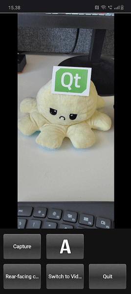
You can see the state property is initially set as PhotoCapture.
Then the states themselves are defined like so:
states: [
    State {
        name: "PhotoCapture"
        StateChangeScript {
            script: {
                camera.start()
            }
        }
    },
    State {
        name: "PhotoPreview"
    },
    State {
        name: "VideoCapture"
        StateChangeScript {
            script: {
                camera.start()
            }
        }
    },
    State {
        name: "VideoPreview"
        StateChangeScript {
            script: {
                camera.stop()
            }
        }
    }
]
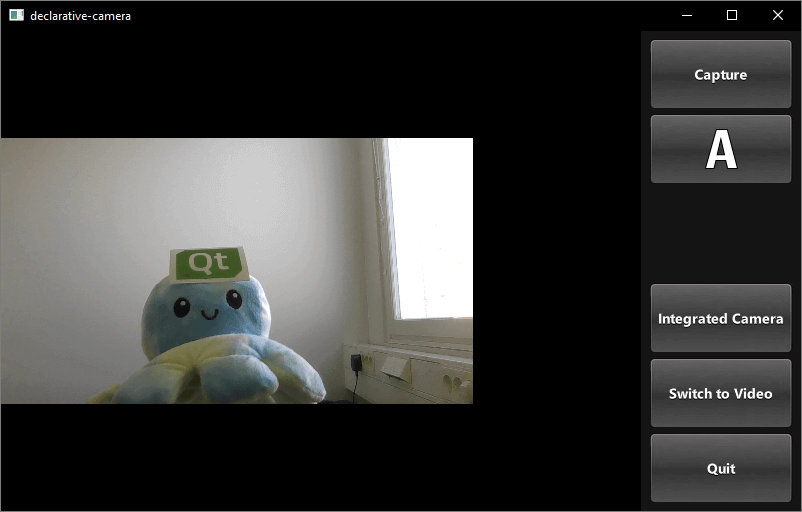
Controls for capturing
Controls for capturing are implemented in PhotoCaptureControls.qml and VideoCaptureControls.qml. They each are based on a FocusScope that defines common buttons dimensions and margins that are used by the control buttons and then declares the buttons.
This generates a column on the right hand side of the screen which includes, listed top to bottom, the following controls:
- A
CaptureorRecordbutton, which initiates capturing. - A
capture propertiesbutton that displays the icon of the current white balance mode selected and when pressed uses a pop-up to displays the following option's icons:- Flash mode (if available)
- White balance modes
- Exposure compensation
- A
Viewbutton, once something has been captured. - A button which displays the currently selected capture device and when pressed provides a list of available devices to switch to, using a pop-up.
- A
Switch Tobutton that displays the alternate capture mode (video or photo) depending on the current active selection and switches the mode when pressed. - A
Quitbutton, that exits the application.
Image capturing
The button that triggers this is defined in CameraButton.qml: but its interaction with the camera is in the controls types, lets look at PhotoCaptureControls:
CameraButton {
    text: "Capture"
    implicitWidth: captureControls.buttonsWidth
    visible: captureControls.captureSession.imageCapture.readyForCapture
    onClicked: captureControls.captureSession.imageCapture.captureToFile("")
}
Zoom control
Implemented in ZoomControl.qml the ZoomControl type is based on an Item and creates a bar that represents the zoom level, which can also be dragged. It uses an exponential calculation method to determine the zoom factor given the position of the grove.
The bar is only visible if the initialZoom is greater than 1. This means the currently active camera has a zoom function.
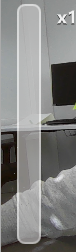
Item {
    id : zoomControl
    property real currentZoom : 1
    property real maximumZoom : 1
    property real minimumZoom : 1
    signal zoomTo(real target)

    visible: zoomControl.maximumZoom > zoomControl.minimumZoom

    MouseArea {
        id : mouseArea
        anchors.fill: parent

        property real initialZoom : 0
        property real initialPos : 0

        onPressed: {
            initialPos = mouseY
            initialZoom = zoomControl.currentZoom
        }

        onPositionChanged: {
            if (pressed) {
                var target = initialZoom * Math.pow(5, (initialPos-mouseY)/zoomControl.height);
                target = Math.max(zoomControl.minimumZoom, Math.min(target, zoomControl.maximumZoom))
                zoomControl.zoomTo(target)
            }
        }
    }

    Item {
        id : bar
        x : 16
        y : parent.height/4
        width : 24
        height : parent.height/2

        Rectangle {
            anchors.fill: parent

            smooth: true
            radius: 8
            border.color: "white"
            border.width: 2
            color: "black"
            opacity: 0.3
        }

        Rectangle {
            id: groove
            x : 0
            y : parent.height * (1.0 - (zoomControl.currentZoom-zoomControl.minimumZoom) / (zoomControl.maximumZoom-zoomControl.minimumZoom))
            width: parent.width
            height: parent.height - y
            smooth: true
            radius: 8
            color: "white"
            opacity: 0.5
        }

        Text {
            id: zoomText
            anchors {
                left: bar.right; leftMargin: 16
            }
            y: Math.min(parent.height - height, Math.max(0, groove.y - height / 2))
            text: "x" + Math.round(zoomControl.currentZoom * 100) / 100
            font.bold: true
            color: "white"
            style: Text.Raised; styleColor: "black"
            opacity: 0.85
            font.pixelSize: 18
        }
    }
}
In PhotoCaptureControls.qml and VideoCaptureControls.qml the signal zoomTo will set the selected camera's zoomFactor property to the calculated target value, as well as updating the ZoomControl bar.
ZoomControl {
    x : 0
    y : 0
    width : 100
    height: parent.height - (flashControl.visible * flashControl.height) -
            (captureControls.state === "MobilePortrait" ? buttonPaneShadow.height : 0)

    currentZoom: captureControls.camera.zoomFactor
    maximumZoom: captureControls.camera.maximumZoomFactor
    minimumZoom: captureControls.camera.minimumZoomFactor
    onZoomTo: (target) => captureControls.camera.zoomFactor = target
}
Flash and torch control
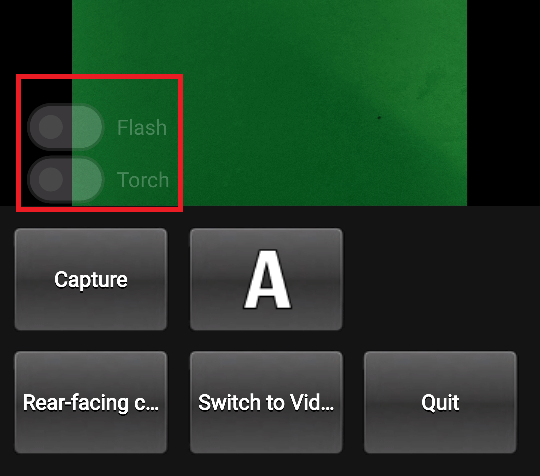
Defined in FlashControl.qml this enables flash mode selection and torch functionality to be toggled via a Switch. As with the zoom control, the switches are only visible on top of the preview window if the active device supports these functions.
Here we check if the functions are supported:
required property Camera camera

property bool mIsFlashSupported: camera.isFlashModeSupported(Camera.FlashOn)
property bool mIsTorchSupported: camera.isTorchModeSupported(Camera.TorchOn)
Here we implement the flashModeControl switch, which also directly controls the Camera device.
Switch {
    id: flashModeControl
    visible: topItem.mIsFlashSupported
    checked: topItem.camera.flashMode === Camera.FlashOn
    opacity: checked ? 0.75 : 0.25
    text: "Flash"

    contentItem: Text {
        text: flashModeControl.text
        color: "white"
        leftPadding: flashModeControl.indicator.width + flashModeControl.spacing
    }

    onClicked: topItem.camera.flashMode = checked ? Camera.FlashOn : Camera.FlashOff
}
Torch control is implemented in a similar way.
© 2026 The Qt Company Ltd. Documentation contributions included herein are the copyrights of their respective owners. The documentation provided herein is licensed under the terms of the GNU Free Documentation License version 1.3 as published by the Free Software Foundation. Qt and respective logos are trademarks of The Qt Company Ltd. in Finland and/or other countries worldwide. All other trademarks are property of their respective owners.
