C
Text QML Type
Specifies how to add text to a scene. More...
| Import Statement: | import QtQuick |
| Since: | Qt Quick Ultralite 1.0 |
| Inherits: |
Enumerations
Properties
- baselineOffset : int
- bottomPadding : real
(since Qt Quick Ultralite 1.1) - color : color
- elide : Elide
(since Qt Quick Ultralite 2.1) - font : font
- horizontalAlignment : HorizontalAlignment
- leftPadding : real
(since Qt Quick Ultralite 1.1) - lineHeight : real
(since Qt Quick Ultralite 2.10) - lineHeightMode : LineHeightMode
(since Qt Quick Ultralite 2.10) - maximumLineCount : int
(since Qt Quick Ultralite 2.12) - padding : real
(since Qt Quick Ultralite 1.1) - rightPadding : real
(since Qt Quick Ultralite 1.1) - rotation : real
(since Qt Quick Ultralite 1.3) - scale : real
(since Qt Quick Ultralite 1.3) - text : string
- textFormat : TextFormat
(since Qt Quick Ultralite 2.6) - topPadding : real
(since Qt Quick Ultralite 1.1) - transform : list<Transform>
- transformOrigin : Item::TransformOrigin
(since Qt Quick Ultralite 1.3) - truncated : bool
- verticalAlignment : VerticalAlignment
- wrapMode : WrapMode
(since Qt Quick Ultralite 2.2)
Detailed Description
Text items can display plain text. For example, red text with a specific font configuration can be defined like this:
Text {
    text: "Hello World!"
    font.family: "Helvetica"
    font.pointSize: 24
    color: "red"
}
If height and width are not explicitly set, Text will attempt to determine how much room is needed and set it accordingly. Unless wrapMode is set, it will always prefer width to height (all text will be placed on a single line).
The elide property can be used to fit the text to the set width and height.
Use the lineHeight and lineHeightMode property combination to control line spacing in an multi-line text item.
The textFormat property can be used to configure how to interpret occurances of supported HTML tags in text.
The Text element supports dynamically changing the text property. Prefer StaticText for cases where the displayed text is fixed and known at compile-time.
See also Text Rendering and Fonts, Text QML Type, StaticText, Managing Resources, and Internationalization and Localization with Qt Quick Ultralite.
Enumeration Documentation
Elide
Provides a list of elide options.
| Constant | Description |
|---|---|
Text.ElideNone | Do not elide. |
Text.ElideLeft | Elides text to beginning of the line |
Text.ElideMiddle | Elides text to middle of the line |
Text.ElideRight | Elides text to end of the line |
HorizontalAlignment
Provides a list of alternatives to align the image horizontally.
| Constant | Description |
|---|---|
Text.AlignLeft | Aligns text to the left. |
Text.AlignRight | Aligns text to the right. |
Text.AlignHCenter | Aligns text at the center. |
LineHeightMode
Provides a list of line height modes.
| Constant | Description |
|---|---|
Text.ProportionalHeight | Multiplies every individual line's spacing. For example, set to 2 for double spacing. |
Text.FixedHeight | Sets spacing between lines to a fixed value (in pixels). |
TextFormat
Provides a list of text format alternatives.
| Constant | Description |
|---|---|
Text.PlainText | All styling tags are treated as plain text. See also the section on Qt Quick compatibility. |
Text.StyledText | Supports selected HTML tags |
Text.RichText | Similar to Text.StyledText |
VerticalAlignment
Provides a list of alternatives to align the image vertically.
| Constant | Description |
|---|---|
Text.AlignTop | Aligns text to the top. |
Text.AlignBottom | Aligns text to the bottom. |
Text.AlignVCenter | Aligns text at the center. |
WrapMode
Provides different options to wrap text.
| Constant | Description |
|---|---|
Text.NoWrap | The default. No wrapping is performed. If the text does not contai newlines, it will overflow the set width. |
Text.WordWrap | Wrapping is done on word boundaries only. If a word is longer than Text item's width, the text will overflow the set width. |
Text.WrapAnywhere | Wrapping is done at any point on a line, even if it occurs in the middle of a word. |
Text.Wrap | Text is wrapped at a word boundary if possible, otherwise it is wrapped at an appropriate point on the line (even in the middle of a word). Unlike the WordWrap mode, the text does not overflow in this mode. |
Property Documentation
baselineOffset : int
Specifies the position of the item's baseline in local coordinates.
The baseline is the imaginary line on which the text sits.
bottomPadding : real [since Qt Quick Ultralite 1.1]
leftPadding : real [since Qt Quick Ultralite 1.1]
padding : real [since Qt Quick Ultralite 1.1]
rightPadding : real [since Qt Quick Ultralite 1.1]
topPadding : real [since Qt Quick Ultralite 1.1]
These properties hold the padding around the text.
These properties were introduced in Qt Quick Ultralite 1.1.
color : color
The text color.
An example of green text defined using hexadecimal notation:
Text {
    color: "#00FF00"
    text: "green text"
}
An example of steel blue text defined using an SVG color name:
Text {
    color: "steelblue"
    text: "blue text"
}
elide : Elide [default, since Qt Quick Ultralite 2.1]
Set this property to elide parts of the text to fit the Text item's size.
Text items must have their width defined explicitly for eliding text.
If a text item contains multi-line text, it must have both width and height
defined explicitly. Multi-line text supports Text.ElideRight only (eliding end of the line) and text will start eliding when it overflows the height or maximumLineCount has been reached - the last visible line will display 3 dots (...).
Qt Quick Ultralite supports multi-line elide mode, which can be enabled using MCU.Config.Experimental.multiLineElide. In this mode, any line that exceeds the available width will be elided. This mode does not require an explicit height to be set.
Note that Qt Quick does not support multi-line eliding. As a result, enabling this mode in Qt Quick Ultralite will lead to layout behavior that differs from, and is not compatible with, Qt Quick.
The elide mark follows the text's direction. For example:
 - Left-to-right (LTR) text direction.
 - The same text in Arabic has Right-to-left (RTL) text direction.
When elide mode is Text.ElideRight, the ellipsis glyph appear on the right side for LTR text and left side for RTL text.
Note: This property currently is not supported by the StaticText item.
This property was introduced in Qt Quick Ultralite 2.1.
See also MCU.Config.Experimental.multiLineElide.
font : font
The font used for displaying the text.
horizontalAlignment : HorizontalAlignment
verticalAlignment : VerticalAlignment
Sets the horizontal and vertical alignment of the text within the Text items width and height. By default, the text is vertically aligned to the top and horizontally aligned to the left.
Note: The size for a single line of text is the area of the text. In this common case, all alignments are equivalent. If you want the text to be centered to its parent, either modify the anchors, or set its horizontalAlignment to Text.AlignHCenter and bind its width to that of the parent.
lineHeight : real [since Qt Quick Ultralite 2.10]
Sets the line height for a multi-line text. The value can be in pixels or a multiplier depending on lineHeightMode.
The default value is 1.0. The line height must be a positive value.
For more information See lineHeightMode
This property was introduced in Qt Quick Ultralite 2.10.
lineHeightMode : LineHeightMode [since Qt Quick Ultralite 2.10]
This property controls how lineHeight is applied.
This property was introduced in Qt Quick Ultralite 2.10.
maximumLineCount : int [since Qt Quick Ultralite 2.12]
Limits the number of lines that will be shown. If elide is set to Text.ElideRight, the text will be elided appropriately.
The default value is the largest possible integer.
See also elide
This property was introduced in Qt Quick Ultralite 2.12.
rotation : real [since Qt Quick Ultralite 1.3]
This property holds the rotation of the item in degrees clockwise around its transformOrigin.
The default value is 0 degrees (that is, no rotation).
Rectangle {
    color: "blue"
    width: 100; height: 100
    Text {
        text: "Rotated Text"
        color: "red"
        x: 25; y: 25
        rotation: 30
    }
}
This property was introduced in Qt Quick Ultralite 1.3.
See also Transform and Rotation.
scale : real [since Qt Quick Ultralite 1.3]
This property holds the scale factor for this item.
A scale of less than 1.0 renders the item smaller, whereas a scale greater than 1.0 renders the item larger. A negative scale causes the item to be mirrored when rendered.
The default value is 1.0.
Scaling is applied from the transformOrigin.
import QtQuick 2.15

Rectangle {
    color: "blue"
    width: 100; height: 100

    Rectangle {
        color: "green"
        width: 25; height: 25
    }

    Text {
        text: "Scaled Text"
        color: "red"
        x: 25; y: 25
        scale: 1.4
        transformOrigin: Item.TopLeft
    }
}
This property was introduced in Qt Quick Ultralite 1.3.
text : string
The text to display. Text supports both plain and rich text strings.
See also textFormat.
textFormat : TextFormat [since Qt Quick Ultralite 2.6]
The way the text property should be displayed.
In Qt Quick Ultralite, both StyledText and RichText map to the same backend.
About the HTML parser
Qt Quick Ultralite uses a minimal, deterministic HTML subset parser designed for microcontroller environments. Unlike a browser HTML parser, it does not repair or reinterpret malformed markup and performs no memory allocations.
Strict parsing rules:
- Unsupported or malformed tags are ignored.
- Attribute names must be lowercase; attribute values use double quotes.
- Stray or misnested closing tags do not cause errors, but they do not produce styling.
Supported HTML tags
Inline images:
<img src="" align="bottom,middle,top">                            // Text item
<img src="" align="bottom,middle,top" width="50" height="40">     // StaticText item
Bold and Italic Styling:
<b> ... </b>   // bold
<i> ... </i>   // italic
Inline images (<img> tag)
Text {
    textFormat: Text.StyledText
    text: "Qt <img src=\"qt-logo.png\" align=\"middle\">"
}
As per the HTML 4 specification:
| Constant | Description |
|---|---|
bottom | The bottom of the image aligns with the text baseline (default) |
middle | The vertical center of the image aligns with the text baseline |
top | The image's top aligns with the top of the text line |
The baseline is the imaginary line on which characters rest. bottom and middle are relative to the baseline, while top aligns to the line height.
StaticText items require explicit width and height since no runtime image loading takes place. If a mismatch is detected, a warning is printed and rendering may not match the intended layout.
See also Managing Resources.
Example:
StaticText {
    text: "flag <img src=\"latvia-flag-small-icon.png\" width=\"38\" height=\"20\">"
    textFormat: Text.RichText
}
Bold and italic styling (<b> and <i> tags)
Mixing fonts of different styles in the same string is available since Qt Quick Ultralite 3.0, and in the 2.12.x series since Qt Quick Ultralite 2.12.2.
Text {
    textFormat: Text.StyledText
    text: "This is <b>bold</b>, this is <i>italic</i>, and this is <b><i>both</i></b>."
}
Images can also appear inside styled spans:
Text {
    textFormat: Text.StyledText
    text: "<i>Hello <img src=\"icon.png\"> world</i>"
}
In this example:
- the image is rendered inline at the correct position,
- the italic style continues across the image,
- text before and after the image uses the italic font.
The styling engine derives the font used for each span by applying the effects of <b> and <i> to the item's base font. The application must ensure that the corresponding derived font faces (bold, italic, bold+italic) are available in its font configuration.
Troubleshooting font configuration
Before using HTML syntax, verify that the expected font variants are present by setting them directly on a Text item. Once the derived font configurations are confirmed to be available, the HTML resolver can apply <b> and <i> styling correctly.
readonly property font boldItalicFont: Qt.font({
    pixelSize: 30,
    bold: true,
    italic: true
})

Text {
    anchors.centerIn: parent
    font: boldItalicFont
    text: "Verify that bold+italic is configured and supported"
}
If you are using the Spark font engine, see Font class mapping.
If you are using the Static font engine, see MCU.Config.autoGenerateGlyphs. Even when MCU.Config.autoGenerateGlyphs is set to true, you must still ensure that the application has explicitly registered the expected derived font styles. For example:
readonly property font size30Font: Qt.font({ pixelSize: 30 })
// Note the same pixel size as the base font: size30Font.
readonly property font boldSize30Font: Qt.font({
    pixelSize: 30,
    bold: true
})

Text {
    anchors.centerIn: parent
    font: size30Font
    textFormat: Text.StyledText
    text: "Qt for <b>MCUs</b>"
}
The textFormat default value Qt Quick compatibility
The textFormat property in Qt Quick Text item by default uses Text.AutoText. This format value is not implemented in Qt Quick Ultralite to avoid run-time overhead. There is only one rare case where text would render differently in Qt Quick, but this can simply be solved at the application level. Consider the following examples.
To render styled text, you must explicitly set StyledText/RichText. The following code is expected to work the same in Qt Quick Ultralite and Qt Quick.
Text {
    textFormat: Text.StyledText
    text: "Qt <img src=\"qt-logo.png\">"
}
To render text containing HTML tags as plain text in Qt Quick Ultralite, you would rely on the default value which is PlainText. Normally one should avoid explictly setting qml properties when default behaviour is desired. This enables emitting more memory optimized code.
Text {
    text: "Qt <img src=\"qt-logo.png\">"
}
Note that in the above example the textFormat property is not explicily set and therefore Qt Quick will rely on the Text.AutoText behaviour. In this rare case you will have to explicitly set the textFormat property to have the desired behaviour in both implementations.
Text {
    textFormat: Text.PlainText
    text: "Qt <img src=\"qt-logo.png\">"
}
This property was introduced in Qt Quick Ultralite 2.6.
transform : list<Transform>
This property holds the list of transformations to apply.
For more information see Transform.
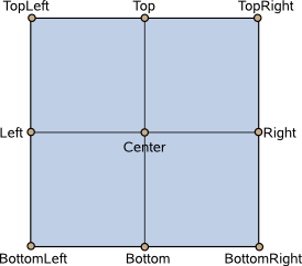
transformOrigin : Item::TransformOrigin [since Qt Quick Ultralite 1.3]
This property holds the origin point around which scale and rotation transform.
Nine transform origins are available, as shown in the image below. The default transform origin is Item.Center.
This example rotates a text around its bottom-right corner.
Text {
    text: "Hello"
    transformOrigin: Item.BottomRight
    rotation: 45
}
To set an arbitrary transform origin point use the Scale or Rotation transform types with transform.
This property was introduced in Qt Quick Ultralite 1.3.
truncated : bool [read-only]
Returns true if the text has been truncated due to elide.
See also elide.
wrapMode : WrapMode [since Qt Quick Ultralite 2.2]
Set this property to wrap the text to the Text item's width. The text will only wrap if an explicit width has been set. Use one of the following modes to wrap text:
Note: This property currently is not supported by the StaticText item.
This property was introduced in Qt Quick Ultralite 2.2.
See also MCU.Config.ideographicCharacterWrap.
Available under certain Qt licenses.
Find out more.
