
Verwendung von Polardiagrammen mit QML
Hinweis: Dies ist Teil des Beispiels „Diagramme mit QML“ in der Galerie.
Wir beginnen mit einem Diagramm, das eine Spline-Reihe und eine Streudiagramm-Reihe mit zufälligen Daten enthält. Beide Reihen verwenden dieselben Achsen.
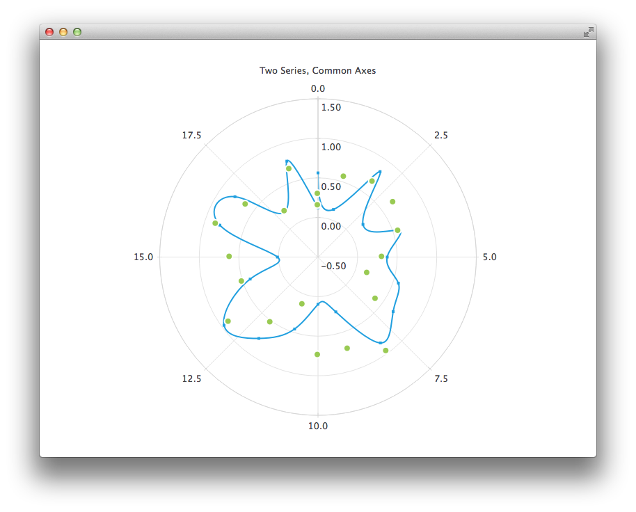
PolarChartView {
    title: "Two Series, Common Axes"
    anchors.fill: parent
    legend.visible: false
    antialiasing: true

    ValueAxis {
        id: axisAngular
        min: 0
        max: 20
        tickCount: 9
    }

    ValueAxis {
        id: axisRadial
        min: -0.5
        max: 1.5
    }

    SplineSeries {
        id: series1
        axisAngular: axisAngular
        axisRadial: axisRadial
        pointsVisible: true
    }

    ScatterSeries {
        id: series2
        axisAngular: axisAngular
        axisRadial: axisRadial
        markerSize: 10
    }

    // Add data dynamically to the series
    Component.onCompleted: {
        for (var i = 0; i <= 20; i++) {
            series1.append(i, Math.random());
            series2.append(i, Math.random());
        }
    }
}
Das nächste Diagramm zeigt einige genaue historische Daten, für die wir eine „DateTimeAxis“ und eine „AreaSeries“ verwenden müssen.
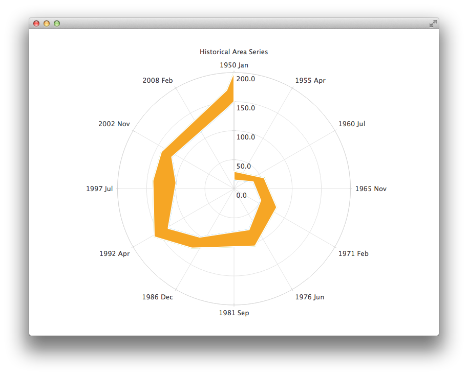
PolarChartView {
    id: root
    title: "Historical Area Chart"
    anchors.fill: parent
    legend.visible: false
    antialiasing: true

    DateTimeAxis {
        id: axis1
        format: "yyyy MMM"
        tickCount: 13
    }
    ValueAxis {
        id: axis2
    }
    LineSeries {
        id: lowerLine
        axisAngular: axis1
        axisRadial: axis2

        // Please note that month in JavaScript months are zero based, so 2 means March
        XYPoint { x: root.toMsecsSinceEpoch(new Date(1950, 0, 1)); y: 15 }
        XYPoint { x: root.toMsecsSinceEpoch(new Date(1962, 4, 1)); y: 35 }
        XYPoint { x: root.toMsecsSinceEpoch(new Date(1970, 0, 1)); y: 50 }
        XYPoint { x: root.toMsecsSinceEpoch(new Date(1978, 2, 1)); y: 75 }
        XYPoint { x: root.toMsecsSinceEpoch(new Date(1987, 11, 1)); y: 102 }
        XYPoint { x: root.toMsecsSinceEpoch(new Date(1992, 1, 1)); y: 132 }
        XYPoint { x: root.toMsecsSinceEpoch(new Date(1998, 7, 1)); y: 100 }
        XYPoint { x: root.toMsecsSinceEpoch(new Date(2002, 4, 1)); y: 120 }
        XYPoint { x: root.toMsecsSinceEpoch(new Date(2012, 8, 1)); y: 140 }
        XYPoint { x: root.toMsecsSinceEpoch(new Date(2013, 5, 1)); y: 150 }
    }
    LineSeries {
        id: upperLine
        axisAngular: axis1
        axisRadial: axis2

        // Please note that month in JavaScript months are zero based, so 2 means March
        XYPoint { x: root.toMsecsSinceEpoch(new Date(1950, 0, 1)); y: 30 }
        XYPoint { x: root.toMsecsSinceEpoch(new Date(1962, 4, 1)); y: 55 }
        XYPoint { x: root.toMsecsSinceEpoch(new Date(1970, 0, 1)); y: 80 }
        XYPoint { x: root.toMsecsSinceEpoch(new Date(1978, 2, 1)); y: 105 }
        XYPoint { x: root.toMsecsSinceEpoch(new Date(1987, 11, 1)); y: 125 }
        XYPoint { x: root.toMsecsSinceEpoch(new Date(1992, 1, 1)); y: 160 }
        XYPoint { x: root.toMsecsSinceEpoch(new Date(1998, 7, 1)); y: 140 }
        XYPoint { x: root.toMsecsSinceEpoch(new Date(2002, 4, 1)); y: 140 }
        XYPoint { x: root.toMsecsSinceEpoch(new Date(2012, 8, 1)); y: 170 }
        XYPoint { x: root.toMsecsSinceEpoch(new Date(2013, 5, 1)); y: 200 }
    }
    AreaSeries {
        axisAngular: axis1
        axisRadial: axis2
        lowerSeries: lowerLine
        upperSeries: upperLine
    }

    // DateTimeAxis is based on QDateTimes so we must convert our JavaScript dates to
    // milliseconds since epoch to make them match the DateTimeAxis values
    function toMsecsSinceEpoch(date) {
        var msecs = date.getTime();
        return msecs;
    }
}
Das nächste Diagramm verwendet eine „CategoryAxis“, um die Daten verständlicher zu machen.
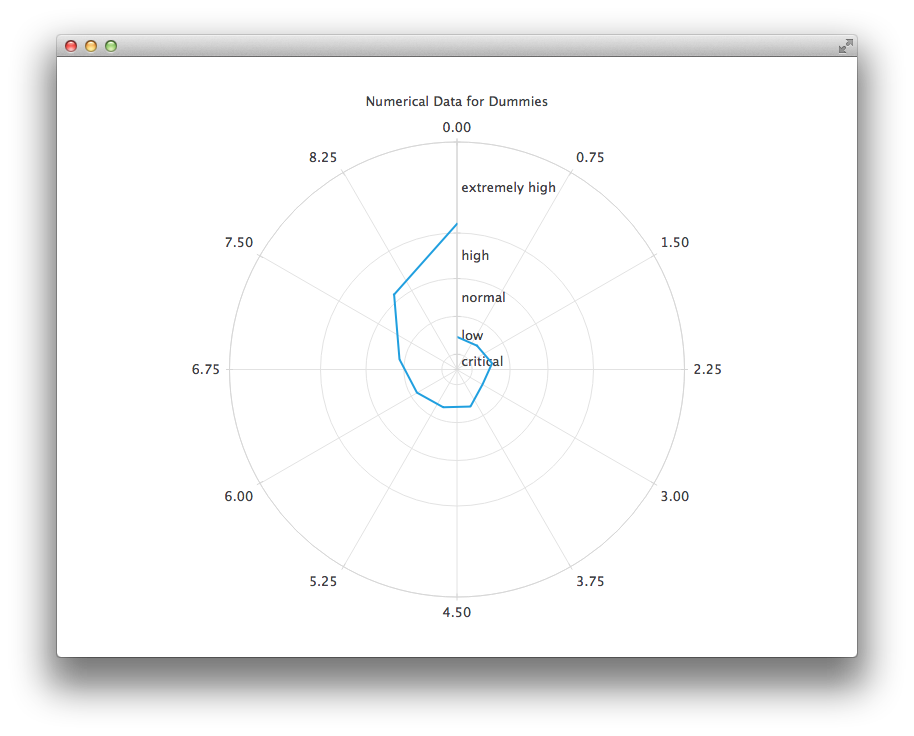
PolarChartView {
    title: "Numerical Data for Dummies"
    anchors.fill: parent
    legend.visible: false
    antialiasing: true

    LineSeries {
        axisRadial: CategoryAxis {
            min: 0
            max: 30
            CategoryRange {
                label: "critical"
                endValue: 2
            }
            CategoryRange {
                label: "low"
                endValue: 7
            }
            CategoryRange {
                label: "normal"
                endValue: 12
            }
            CategoryRange {
                label: "high"
                endValue: 18
            }
            CategoryRange {
                label: "extremely high"
                endValue: 30
            }
        }

        axisAngular: ValueAxis {
            tickCount: 13
        }

        XYPoint { x: 0; y: 4.3 }
        XYPoint { x: 1; y: 4.1 }
        XYPoint { x: 2; y: 4.7 }
        XYPoint { x: 3; y: 3.9 }
        XYPoint { x: 4; y: 5.2 }
        XYPoint { x: 5; y: 5.3 }
        XYPoint { x: 6; y: 6.1 }
        XYPoint { x: 7; y: 7.7 }
        XYPoint { x: 8; y: 12.9 }
        XYPoint { x: 9; y: 19.2 }
    }
}
© 2026 The Qt Company Ltd. Documentation contributions included herein are the copyrights of their respective owners. The documentation provided herein is licensed under the terms of the GNU Free Documentation License version 1.3 as published by the Free Software Foundation. Qt and respective logos are trademarks of The Qt Company Ltd. in Finland and/or other countries worldwide. All other trademarks are property of their respective owners.
