Qt Quick Layouts - Beispiel für ein reaktionsfähiges Layout
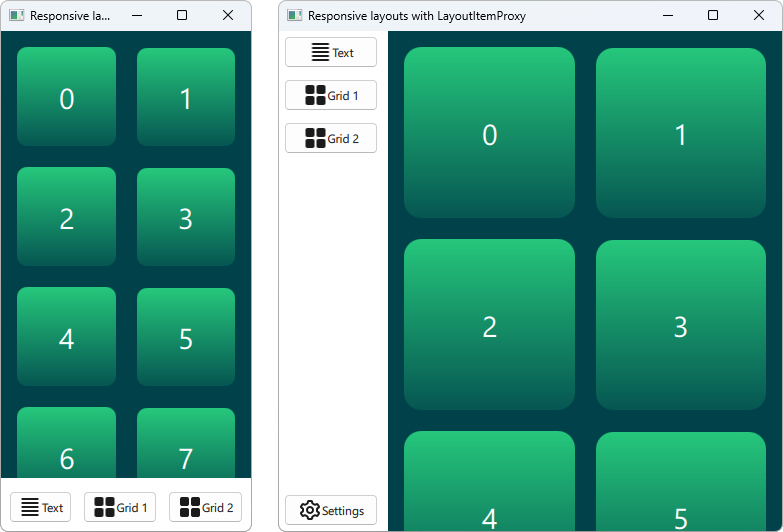
Zeigt, wie man mit LayoutItemProxy eine responsive UI erstellt.
Dieses Beispiel zeigt, wie man LayoutProxyItems in Kombination mit Layouts verwendet, um responsive Layouts zu erstellen.
Ausführen des Beispiels
Um das Beispiel auszuführen Qt Creatorauszuführen, öffnen Sie den Modus Welcome und wählen Sie das Beispiel aus Examples aus. Weitere Informationen finden Sie unter Qt Creator: Tutorial: Erstellen und Ausführen.
Erstellen von Elementen
Der Typ LayoutItemProxy ermöglicht es, dasselbe Element in verschiedenen Layouts zu verwenden, obwohl nur ein Layout gleichzeitig sichtbar sein kann. Auf diese Weise lassen sich responsive Layouts erstellen, die sich an die Fenster- oder Bildschirmgröße anpassen.
Zunächst müssen wir alle Elemente definieren, die irgendwann in der Benutzeroberfläche erscheinen sollen. Wir verwenden ein AnnotatedRect, das ein einfaches Rechteck mit etwas Text ist.
Rectangle {
    id: contentItem
    Layout.fillWidth: true
    implicitHeight: grid.implicitHeight
    implicitWidth: grid.implicitWidth
    color: "#00414A"

    GridLayout {
        id: grid
        anchors {
            fill: parent
            margins: 8
        }
        columns: Math.max(1, Math.min(Math.round(width / 130), 6))
        Repeater {
            model: 60
            delegate: Rectangle {
                required property int index
                Layout.fillWidth: true
                Layout.margins: 8
                implicitWidth: 200
                implicitHeight: width
                radius: width / 10
                gradient: Gradient {
                    GradientStop { position: -0.2; color: "#2CDE85" }
                    GradientStop { position: 1.2; color: "#00414A" }
                }
                Text {
                    color: "#ffffff"
                    font.pointSize: 22
                    anchors.centerIn: parent
                    text: parent.index + 1
                }
            }
        }
    }
}

Button {
    id: a
    text: "Text"
    icon.source: "./icons/text.svg"
    Layout.fillWidth: true
    Layout.margins: 3
}

Button {
    id: b
    text: "Grid 1"
    icon.source: "./icons/grid.svg"
    Layout.fillWidth: true
    Layout.margins: 3
}

Button {
    id: c
    text: "Grid 2"
    icon.source: "./icons/grid.svg"
    Layout.fillWidth: true
    Layout.margins: 3
}

Button {
    id: d
    text: "Settings"
    icon.source: "./icons/settings.svg"
    Layout.fillWidth: true
    Layout.margins: 3
}
Layouts erstellen
Mit LayoutItemProxies können wir nun verschiedene Layouts deklarieren, die auf die zuvor deklarierten Elemente abzielen. Ein einzelnes Layout kann wie folgt definiert werden.
ColumnLayout {
    id: smallLayout
    anchors.fill: parent

    Flickable {
        Layout.fillHeight: true
        Layout.fillWidth: true
        contentWidth: width
        contentHeight: gl.implicitHeight
        clip: true
        ScrollIndicator.vertical: ScrollIndicator { }
        LayoutItemProxy {
            id: gl
            width: parent.width
            height: implicitHeight
            target: contentItem
        }
    }

    RowLayout {
        Layout.fillHeight: false
        Layout.fillWidth: true
        Layout.margins: 5
        LayoutItemProxy{ target: a; }
        LayoutItemProxy{ target: b; }
        LayoutItemProxy{ target: c; }
    }
}
Dieses Snippet zeigt mehrere Möglichkeiten zur Verwendung von LayoutItemProxy. Die einfachste Methode ist das Hinzufügen von LayoutItemProxies zu einem Layout wie hier RowLayout. Darüber hinaus wird eine zusätzliche Layout Eigenschaft an das LayoutProxyItem angehängt, die sich nur auf das Zielelement in diesem speziellen Layout auswirkt. Außerdem sehen wir, dass das Element d im ersten Layout nicht verwendet wird. Dann wird es im zweiten Layout automatisch von LayoutItemProxy ausgeblendet. Eine andere Möglichkeit der Verwendung wird gezeigt, indem ein LayoutItemProxy als Inhalt eines Flickable festgelegt wird.
Ein anderes Layout wird wie folgt deklariert.
RowLayout {
    id: largeLayout
    anchors.fill: parent
    ColumnLayout {
        Layout.minimumWidth: 100
        Layout.fillWidth: true
        Layout.margins: 2
        LayoutItemProxy{ target: a }
        LayoutItemProxy{ target: b }
        LayoutItemProxy{ target: c }
        Item { Layout.fillHeight: true }
        LayoutItemProxy{ target: d }
    }

    LayoutItemProxy {
        Layout.fillHeight: true
        Layout.fillWidth: true
        target: contentItem
    }
}
Hier zeigen wir, dass LayoutItemProxies zusammen mit dem realen Items auf derselben Hierarchieebene verwendet werden kann. Generell ist die LayoutItemProxy flexibel und erlaubt verschachtelte Strukturen von Elementen und Layouts.
Einstellen des Layouts
Nachdem zwei Layouts, smallLayout und largeLayout, definiert sind, können wir mit dem Einstellen des Layouts fortfahren, das zur aktuellen Größe der Anwendung passt. Wir definieren eine neue Funktion für diesen Code, die wir bei der Initialisierung des Fensters und bei jeder Änderung der Breite aufrufen:
function setFittingLayout() {
    if (width < 450) {
        smallLayout.visible = true
        largeLayout.visible = false
    } else {
        smallLayout.visible = false
        largeLayout.visible = true
    }
}
onWidthChanged: setFittingLayout()
Component.onCompleted: setFittingLayout()
Alternativ zum Aufruf dieser Funktion nach der Initialisierung können wir im deklarativen Code alles außer dem korrekten Layout für die Anfangsgröße ausblenden.
© 2026 The Qt Company Ltd. Documentation contributions included herein are the copyrights of their respective owners. The documentation provided herein is licensed under the terms of the GNU Free Documentation License version 1.3 as published by the Free Software Foundation. Qt and respective logos are trademarks of The Qt Company Ltd. in Finland and/or other countries worldwide. All other trademarks are property of their respective owners.
