Qt Quick Beispiele - Ansichten
Dies ist eine Sammlung von QML-Beispielen für Modelle und Ansichten.
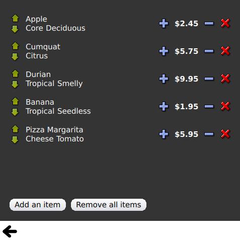
Views ist eine Sammlung von kleinen QML-Beispielen, die sich auf die Modell- und View-Funktionalität beziehen. Sie demonstrieren, wie man Daten aus einem Modell mit Hilfe der Qt Quick Ansichtstypen anzeigt. Weitere Informationen finden Sie auf der Seite Modelle und Ansichten in Qt Quick.
Ausführen des Beispiels
Zum Ausführen des Beispiels von Qt Creatorauszuführen, öffnen Sie den Modus Welcome und wählen Sie das Beispiel aus Examples. Weitere Informationen finden Sie unter Qt Creator: Tutorial: Erstellen und Ausführen.
GridView und PathView verwenden
GridView und PathView demonstrieren die Verwendung dieser Typen zur Anzeige von Ansichten.
    GridView {
        anchors.fill: parent
        cellWidth: 100
        cellHeight: 100
        focus: true
        model: appModel

        highlight: Rectangle {
            width: 80
            height: 80
            color: "lightsteelblue"
        }

        delegate: Item {
            required property string icon
            required property string name
            required property int index

            width: 100
            height: 100

            Image {
                id: myIcon
                y: 20
                anchors.horizontalCenter: parent.horizontalCenter
                source: parent.icon
            }
            Text {
                anchors {
                    top: myIcon.bottom
                    horizontalCenter: parent.horizontalCenter
                }
                text: parent.name
            }
            MouseArea {
                anchors.fill: parent
                onClicked: parent.GridView.view.currentIndex = parent.index
            }
        }
    }
Dynamische Liste verwenden
Dynamic List demonstriert die Animation von Hinzufügungen und Entfernungen zu einer ListView zur Laufzeit.
Der Signalhandler ListView.onAdd führt eine Animation aus, wenn neue Elemente zur Ansicht hinzugefügt werden, und der ListView.onRemove eine weitere, wenn sie entfernt werden.
        Item {
            SequentialAnimation {
                id: addAnimation
                PropertyAction {
                    target: delegateItem
                    property: "height"
                    value: 0
                }
                NumberAnimation {
                    target: delegateItem
                    property: "height"
                    to: 80
                    duration: 250
                    easing.type: Easing.InOutQuad
                }
            }
            ListView.onAdd: addAnimation.start()

            SequentialAnimation {
                id: removeAnimation
                PropertyAction {
                    target: delegateItem
                    property: "ListView.delayRemove"
                    value: true
                }
                NumberAnimation {
                    target: delegateItem
                    property: "height"
                    to: 0
                    duration: 250
                    easing.type: Easing.InOutQuad
                }

                // Make sure delayRemove is set back to false so that the item can be destroyed
                PropertyAction {
                    target: delegateItem
                    property: "ListView.delayRemove"
                    value: false
                }
            }
            ListView.onRemove: removeAnimation.start()
        }
Erweiternde Delegierte
Expanding Delegates demonstriert Delegierte, die sich bei Aktivierung ausdehnen.
Es verfügt über einen komplexen Delegaten, dessen Größe und Aussehen sich ändern kann, wodurch andere Elemente in der Ansicht verschoben werden.
        Item {
            id: recipe

            required property string title
            required property string picture
            required property string ingredients
            required property string method

            // Create a property to contain the visibility of the details.
            // We can bind multiple element's opacity to this one property,
            // rather than having a "PropertyChanges" line for each element we
            // want to fade.
            property real detailsOpacity : 0
            MouseArea {
                anchors.fill: parent
                onClicked: recipe.state = 'Details';
            }

            // Lay out the page: picture, title and ingredients at the top, and method at the
            // bottom.  Note that elements that should not be visible in the list
            // mode have their opacity set to recipe.detailsOpacity.

            Row {
                id: topLayout
                x: 10
                y: 10
                height: recipeImage.height
                width: parent.width
                spacing: 10

                Image {
                    id: recipeImage
                    width: 50
                    height: 50
                    source: recipe.picture
                }
            Item {
                id: details
                x: 10
                width: parent.width - 20

                anchors {
                    top: topLayout.bottom
                    topMargin: 10
                    bottom: parent.bottom
                    bottomMargin: 10
                }
                opacity: recipe.detailsOpacity
            }

            // A button to close the detailed view, i.e. set the state back to default ('').
            TextButton {
                y: 10
                anchors {
                    right: background.right
                    rightMargin: 10
                }
                opacity: recipe.detailsOpacity
                text: qsTr("Close")

                onClicked: recipe.state = '';
            }

            states: State {
                name: "Details"

                PropertyChanges {
                    background.color: "white"
                    recipeImage {
                         // Make picture bigger
                        width: 130
                        height: 130
                    }
                    recipe {
                        // Make details visible
                        detailsOpacity: 1
                        x: 0

                        // Fill the entire list area with the detailed view
                        height: listView.height
                    }
                }

                // Move the list so that this item is at the top.
                PropertyChanges {
                    recipe.ListView.view.contentY: recipe.y
                    explicit: true;
                }

                // Disallow flicking while we're in detailed view
                PropertyChanges {
                    recipe.ListView.view.interactive: false
                }
            }

            transitions: Transition {
                // Make the state changes smooth
                ParallelAnimation {
                    ColorAnimation {
                        property: "color"
                        duration: 500
                    }
                    NumberAnimation {
                        duration: 300
                        properties: "detailsOpacity,x,contentY,height,width"
                    }
                }
            }
        }
Hervorhebung verwenden
Highlight demonstriert das Hinzufügen einer benutzerdefinierten Hervorhebung zu einer ListView.
    // Define a highlight with customized movement between items.
    component HighlightBar : Rectangle {
        width: 200
        height: 50
        color: "#FFFF88"
        y: ListView.view.currentItem.y
        Behavior on y {
            SpringAnimation {
                spring: 2
                damping: 0.1
            }
        }
    }

    ListView {
        id: listView
        width: 200
        height: parent.height
        x: 30

        model: PetsModel { }
        delegate: PetDelegate { }
        focus: true

        // Set the highlight delegate. Note we must also set highlightFollowsCurrentItem
        // to false so the highlight delegate can control how the highlight is moved.
        highlight: HighlightBar { }
        highlightFollowsCurrentItem: false
    }
Hervorhebungsbereiche verwenden
Hervorhebungsbereiche zeigt die drei verschiedenen Hervorhebungsbereichsmodi von ListView.
Rectangle {
    id: root
    property int current: 0
    property bool increasing: true
    // Example index automation for convenience, disabled on click or tap
    SequentialAnimation {
        id: anim
        loops: -1
        running: true
        ScriptAction {
            script: if (root.increasing) {
                        root.current++;
                        if (root.current >= aModel.count -1) {
                            root.current = aModel.count - 1;
                            root.increasing = !root.increasing;
                        }
                    } else {
                        root.current--;
                        if (root.current <= 0) {
                            root.current = 0;
                            root.increasing = !root.increasing;
                        }
                    }
        }

        PauseAnimation {
            duration: 500
        }
    }
    ListView {
        id: list1
        height: 50
        width: parent.width
        model: PetsModel {
            id: aModel
        }
        delegate: petDelegate
        orientation: ListView.Horizontal
        highlight: Rectangle {
            color: "lightsteelblue"
        }
        currentIndex: root.current
        onCurrentIndexChanged: root.current = currentIndex
        focus: true
    }

    ListView {
        id: list2
        y: 160
        height: 50
        width: parent.width
        model: PetsModel { }
        delegate: petDelegate
        orientation: ListView.Horizontal
        highlight: Rectangle {
            color: "yellow"
        }
        currentIndex: root.current
        preferredHighlightBegin: 80
        preferredHighlightEnd: 220
        highlightRangeMode: ListView.ApplyRange
    }

    ListView {
        id: list3
        y: 320
        height: 50
        width: parent.width
        model: PetsModel {}
        delegate: petDelegate
        orientation: ListView.Horizontal
        highlight: Rectangle { color: "yellow" }
        currentIndex: root.current
        onCurrentIndexChanged: root.current = currentIndex
        preferredHighlightBegin: 125
        preferredHighlightEnd: 125
        highlightRangeMode: ListView.StrictlyEnforceRange
    }
}
Abschnitte verwenden
Abschnitte demonstriert die verschiedenen Kopf- und Fußzeilen, die ListView zur Verfügung stehen.
    // The delegate for each section header
    Component {
        id: sectionHeading
        Rectangle {
            width: ListView.view.width
            height: childrenRect.height
            color: "lightsteelblue"

            required property string section

            Text {
                text: parent.section
                font.bold: true
                font.pixelSize: 20
            }
        }
    }

    ListView {
        id: view
        anchors.top: parent.top
        anchors.bottom: buttonBar.top
        width: parent.width
        model: animalsModel
        delegate: Text {
            required property string name

            text: name
            font.pixelSize: 18
        }

        section.property: "size"
        section.criteria: ViewSection.FullString
        section.delegate: sectionHeading
    }
Pakete verwenden
Packages verwendet den Typ Package für den Übergang von Delegierten zwischen zwei Ansichten.
Es hat ein Package-Objekt, das Delegate-Elemente für jede Ansicht und ein Element definiert, das zwischen Delegates übertragen werden kann.
Package {
    id: delegate

    required property int upTo
    required property int index
    required property string display

    Text {
        id: listDelegate
        width: parent.width
        height: 25
        text: 'Empty'
        Package.name: 'list'
    }

    Text {
        id: gridDelegate
        width: parent.width / 2
        height: 50
        text: 'Empty'
        Package.name: 'grid'
    }

    Rectangle {
        id: wrapper
        width: parent?.width ?? 0
        height: 25
        color: 'lightsteelblue'

        Text {
            text: delegate.display
            anchors.centerIn: parent
        }
        state: delegate.upTo > delegate.index ? 'inGrid' : 'inList'
        states: [
            State {
                name: 'inList'
                ParentChange {
                    target: wrapper
                    parent: listDelegate
                }
            },
            State {
                name: 'inGrid'
                ParentChange {
                    target: wrapper
                    parent: gridDelegate
                    x: 0
                    y: 0
                    width: gridDelegate.width
                    height: gridDelegate.height
                }
            }
        ]

        transitions: [
            Transition {
                ParentAnimation {
                    NumberAnimation {
                        properties: 'x,y,width,height'
                        duration: 300
                    }
                }
            }
        ]
    }
}
Eine DelegateModel ermöglicht den einzelnen Ansichten den Zugriff auf ihre spezifischen Elemente über den gemeinsamen Paketdelegierten.
DelegateModel {
    id: visualModel
    delegate: Delegate {
        upTo: root.upTo
    }
    model: myModel
}

ListView {
    id: lv
    height: parent.height / 2
    width: parent.width

    model: visualModel.parts.list
}
GridView {
    y: parent.height / 2
    height: parent.height / 2
    width: parent.width
    cellWidth: width / 2
    cellHeight: 50
    model: visualModel.parts.grid
}
Draggable Selections demonstriert die Verwendung von Package, um mehrere ausgewählte Delegaten für Drag-and-Drop innerhalb einer Elementansicht zu gruppieren.
        Package {
            id: packageRoot

            required property var modelData

            MouseArea {
                id: visibleContainer
                Package.name: "visible"

                width: 64
                height: 64
                enabled: packageRoot.DelegateModel.inSelected

                drag.target: draggable

                Item {
                    id: draggable

                    Drag.active: visibleContainer.drag.active
Verwendung von ObjectModel
ObjectModel verwendet ein ObjectModel für das Modell anstelle eines ListModel.
    ObjectModel {
        id: itemModel

        Rectangle {
            width: view.width
            height: view.height
            color: "#FFFEF0"

            Text {
                anchors.centerIn: parent
                text: qsTr("Page 1")
                font.bold: true
            }

            Component.onDestruction: if (root.printDestruction) print("destroyed 1")
        }
        Rectangle {
            width: view.width
            height: view.height
            color: "#F0FFF7"

            Text {
                anchors.centerIn: parent
                text: qsTr("Page 2")
                font.bold: true
            }

            Component.onDestruction: if (root.printDestruction) print("destroyed 2")
        }
        Rectangle {
            width: view.width
            height: view.height
            color: "#F4F0FF"

            Text {
                anchors.centerIn: parent
                text: qsTr("Page 3")
                font.bold: true
            }

            Component.onDestruction: if (root.printDestruction) print("destroyed 3")
        }
    }

    ListView {
        id: view
        anchors {
            fill: parent
            bottomMargin: 30
        }
        model: itemModel
        preferredHighlightBegin: 0
        preferredHighlightEnd: 0
        highlightRangeMode: ListView.StrictlyEnforceRange
        orientation: ListView.Horizontal
        snapMode: ListView.SnapOneItem
        flickDeceleration: 2000
        cacheBuffer: 200
    }
Verwendung von Display Margins
Display Margins verwendet Delegates zur Anzeige von Elementen und implementiert eine einfache Kopf- und Fußzeilenkomponente.
© 2026 The Qt Company Ltd. Documentation contributions included herein are the copyrights of their respective owners. The documentation provided herein is licensed under the terms of the GNU Free Documentation License version 1.3 as published by the Free Software Foundation. Qt and respective logos are trademarks of The Qt Company Ltd. in Finland and/or other countries worldwide. All other trademarks are property of their respective owners.
