
PolarChartView QML Type
データを極座標グラフで表示します。詳細...
| Import Statement: | import QtCharts 2.12 |
| Inherits: | |
| Status: | Deprecated |
このタイプは非推奨です。新しいコードでの使用は強く推奨しません。
詳細な説明
極座標グラフは、データを円形のグラフ上に表示します。データの配置は、グラフの中心(極)からの角度と距離に基づいて決定されます。
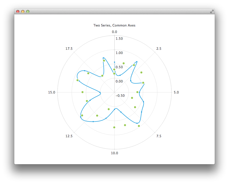
極座標グラフは、ChartView 型の特殊な形態です。線、スプライン、面、散布図の各シリーズ、およびそれらでサポートされているすべての軸タイプに対応しています。各軸は、半径軸または角度軸として使用できます。
角度軸を持つValueAxis の最初と最後の目盛りは、0度と360度の位置に配置されます。
系列内の2つの連続する点間の角度距離が180度を超える場合、その2点を結ぶ直線は意味をなさなくなるため、描画されません。その代わりに、チャートの中心点とそれらの点との間を結ぶ線が描画されます。したがって、線形、スプライン、または面形系列を表示する際は、軸の範囲を適切に選択する必要があります。
極座標チャートでは、同じ向きの軸はすべて同じ位置に描画されるため、追加の軸がグリッドのカスタマイズにのみ使用される場合を除き、同じ向きの軸を複数使用すると混乱を招く可能性があります。たとえば、セカンダリの陰影付きCategoryAxis を使用して強調表示された範囲を表示したり、ラベルを非表示にしたセカンダリのValueAxis を使用してラベルのないサブ目盛りを提供したりすることができます。
以下の QML コードは、スプラインおよび散布図のシリーズと、2 つの値軸を持つ極座標グラフを作成する方法を示しています。
PolarChartView {
    title: "Two Series, Common Axes"
    anchors.fill: parent
    legend.visible: false
    antialiasing: true

    ValueAxis {
        id: axisAngular
        min: 0
        max: 20
        tickCount: 9
    }

    ValueAxis {
        id: axisRadial
        min: -0.5
        max: 1.5
    }

    SplineSeries {
        id: series1
        axisAngular: axisAngular
        axisRadial: axisRadial
        pointsVisible: true
    }

    ScatterSeries {
        id: series2
        axisAngular: axisAngular
        axisRadial: axisRadial
        markerSize: 10
    }

    // Add data dynamically to the series
    Component.onCompleted: {
        for (var i = 0; i <= 20; i++) {
            series1.append(i, Math.random());
            series2.append(i, Math.random());
        }
    }
}
© 2026 The Qt Company Ltd. Documentation contributions included herein are the copyrights of their respective owners. The documentation provided herein is licensed under the terms of the GNU Free Documentation License version 1.3 as published by the Free Software Foundation. Qt and respective logos are trademarks of The Qt Company Ltd. in Finland and/or other countries worldwide. All other trademarks are property of their respective owners.
