
QML での軸の使用
注:これは 「QML ギャラリーのチャート」サンプルの一部です。
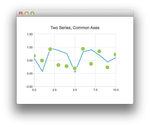
まず、ランダムなデータを含む線グラフシリーズと散布図シリーズを持つチャートから始めます。次に、共通の軸を共有する2つのシリーズを持つグラフを作成します。
ChartView {
    title: "Two Series, Common Axes"
    anchors.fill: parent
    legend.visible: false
    antialiasing: true

    ValueAxis {
        id: axisX
        min: 0
        max: 10
        tickCount: 5
    }

    ValueAxis {
        id: axisY
        min: -0.5
        max: 1.5
    }

    LineSeries {
        id: series1
        axisX: axisX
        axisY: axisY
    }

    ScatterSeries {
        id: series2
        axisX: axisX
        axisY: axisY
    }

    // Add data dynamically to the series
    Component.onCompleted: {
        for (var i = 0; i <= 10; i++) {
            series1.append(i, Math.random());
            series2.append(i, Math.random());
        }
    }
}
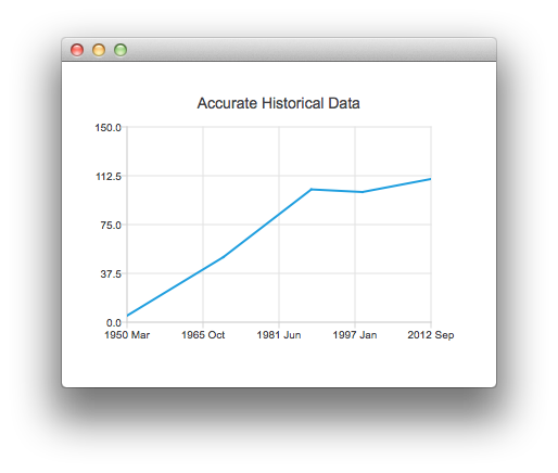
このチャートは、正確な履歴データを示しています。これは、DateTimeAxis を利用した以下のスニペットによって作成されています。
ChartView {
    id: root
    title: "Accurate Historical Data"
    anchors.fill: parent
    legend.visible: false
    antialiasing: true

    LineSeries {
        axisX: DateTimeAxis {
            format: "yyyy MMM"
            tickCount: 5
        }
        axisY: ValueAxis {
            min: 0
            max: 150
        }

        // Please note that month in JavaScript months are zero based, so 2 means March
        XYPoint { x: root.toMsecsSinceEpoch(new Date(1950, 2, 15)); y: 5 }
        XYPoint { x: root.toMsecsSinceEpoch(new Date(1970, 0, 1)); y: 50 }
        XYPoint { x: root.toMsecsSinceEpoch(new Date(1987, 12, 31)); y: 102 }
        XYPoint { x: root.toMsecsSinceEpoch(new Date(1998, 7, 1)); y: 100 }
        XYPoint { x: root.toMsecsSinceEpoch(new Date(2012, 8, 2)); y: 110 }
    }

    // DateTimeAxis is based on QDateTimes so we must convert our JavaScript dates to
    // milliseconds since epoch to make them match the DateTimeAxis values
    function toMsecsSinceEpoch(date) {
        var msecs = date.getTime();
        return msecs;
    }
}
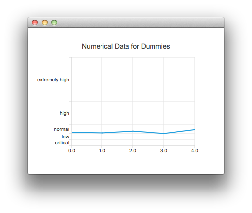
次のチャートは、データをより理解しやすくするために CategoryAxis を使用して作成されています。
ChartView {
    title: "Numerical Data for Dummies"
    anchors.fill: parent
    legend.visible: false
    antialiasing: true

    LineSeries {
        axisY: CategoryAxis {
            min: 0
            max: 30
            CategoryRange {
                label: "critical"
                endValue: 2
            }
            CategoryRange {
                label: "low"
                endValue: 4
            }
            CategoryRange {
                label: "normal"
                endValue: 7
            }
            CategoryRange {
                label: "high"
                endValue: 15
            }
            CategoryRange {
                label: "extremely high"
                endValue: 30
            }
        }

        XYPoint { x: 0; y: 4.3 }
        XYPoint { x: 1; y: 4.1 }
        XYPoint { x: 2; y: 4.7 }
        XYPoint { x: 3; y: 3.9 }
        XYPoint { x: 4; y: 5.2 }
    }
}
© 2026 The Qt Company Ltd. Documentation contributions included herein are the copyrights of their respective owners. The documentation provided herein is licensed under the terms of the GNU Free Documentation License version 1.3 as published by the Free Software Foundation. Qt and respective logos are trademarks of The Qt Company Ltd. in Finland and/or other countries worldwide. All other trademarks are property of their respective owners.
