簡単な散布図
QMLアプリケーションでScatter3D 。
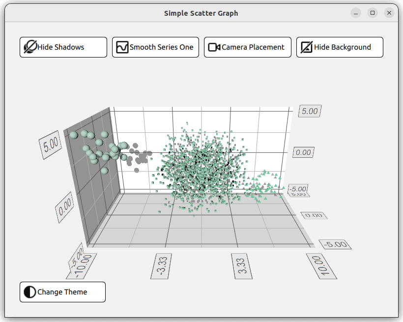
Simple Scatter Graphでは、Scatter3D と QML を使って、簡単な散布図を視覚化する方法を示しています。
グラフの操作方法については、このページを参照してください。
新しいQt Quick アプリケーションの作成方法については、Qt Creator ヘルプを参照してください。
例を実行する
からサンプルを実行するには Qt Creatorからサンプルを実行するには、Welcome モードを開き、Examples からサンプルを選択します。詳細については、Qt Creator: チュートリアルを参照してください:ビルドと実行を参照してください。
レイアウトの設定
QMLのコードに入る前に、main.cpp 。main.qml ファイルがリソース(qrc:)から読み込まれます。
viewer.setSource(QUrl("qrc:/qml/scatter/main.qml"));
このmain.qml ファイルがアプリケーションのQMLコードの出発点となります。まず、必要なQMLモジュールをすべてインポートします:
import QtQuick
import QtQuick.Controls
import QtQuick.Layouts
import QtGraphs
次に、グラフのデータを保持するData アイテムを作成します。
Data {
    id: seriesData
}
次に、グラフの2つの異なるテーマ、Qt GreenテーマとQt Neon Greenテーマを定義する2つのGraphsTheme 。
GraphsTheme {
    id: themeQt
    theme: GraphsTheme.Theme.QtGreen
    labelFont.pointSize: 40
}

GraphsTheme {
    id: themeQtNeonGreen
    theme: GraphsTheme.Theme.QtGreenNeon
    colorScheme: GraphsTheme.ColorScheme.Dark
}
このアプリケーションのレイアウトは、グラフのビジュアルオプションのオン・オフを切り替える5つの異なるボタンと、もちろんグラフ自体で構成されます。これらを整理する方法はたくさんありますが、1つの方法として、4つのボタンを含むGridLayout 、Graph 、そして5つ目のボタンを、すべてColumnLayout 。
ColumnLayout {
    id: mainLayout
    anchors.fill: parent
    anchors.margins: margin
    spacing: spacing
GridLayout 。これはどういうことかというと、使用される列の数がアプリケーション・ウィンドウの幅に依存するということです。これは、columns プロパティに三項演算子を割り当て、ウィンドウ幅に応じて1、2、4のいずれかに解決することで行われます。
GridLayout {
    Layout.fillWidth: true
    rowSpacing: spacing
    columnSpacing: spacing

    columns: mainView.width < mainView.buttonMinWidth * 2 + mainView.spacing + mainView.margin * 2 // width of 2 buttons
             ? 1
             : (mainView.width < mainView.buttonMinWidth * 4 + mainView.spacing * 3 + mainView.margin * 2 // width of 4 buttons
                ? 2
                : 4)
このGridLayout では、4つのRoundButtonがインスタンス化されています。1つは影の切り替え、1つはメッシュのスムージング、1つはカメラの位置、そして最後にグラフの背景を変更するためのものです。すべてのボタンは同じ構造になっています。すべてのボタンに対してこの構造を再定義するのではなく、カスタム・コンポーネントを作ることができます。
component CustomButton : RoundButton {
    id: buttonRoot
CustomButtom は、RoundButton タイプを拡張していますが、いくつか追加されています。Layout.minimumWidth 、Layout.FillWidth 、radius 、background などのプロパティが設定されます。これらはボタンのスタイルとレイアウトを定義します。
property alias source: iconImage.source

Layout.minimumWidth: buttonMinWidth
Layout.fillWidth: true

radius: mainView.radius

background: Rectangle {
    radius: mainView.radius
    color: "white"
    border.color: "black"
}
一方、contentItem はボタンの内容を定義するもので、この場合はアイコンとテキストを含むRow 型です。アイコンは、Image タイプを使用してインポートされ、source プロパティを設定します。テキストは、Label タイプを使用して作成され、text プロパティを使用して設定されます。カスタム・コンポーネントの最上部に、これら2つのプロパティのための2つのアリアスが作成されます。これにより、CustomButton のインスタンスが作成されたときに、これらのプロパティが設定されるようになります。
contentItem: Row {
    id: content
    Image {
        id: iconImage
    }
    Label {
        text: buttonRoot.text
        horizontalAlignment: Text.AlignLeft
        anchors.verticalCenter: parent.verticalCenter
    }
}
GridLayout では、4つのCustomButtonが作成されます。3つのプロパティを設定する必要があります。アイコン画像とテキストの2つのアリアスと、シグナルonClicked 。
CustomButton {
    id: shadowButton
    text: graph.shadowQuality === Graphs3D.ShadowQuality.None ?
              qsTr("Show Shadows") : qsTr("Hide Shadows")
    source: graph.shadowQuality === Graphs3D.ShadowQuality.None ?
                "qrc:/images/shadow.svg" : "qrc:/images/shadow_hide.svg"
    onClicked: {
        graph.shadowQuality = graph.shadowQuality === Graphs3D.ShadowQuality.None ?
                    Graphs3D.ShadowQuality.High :
                    Graphs3D.ShadowQuality.None
    }
}
例えば、シャドウ・ボタンは、onClicked 信号を設定し、シャドウのオンとオフを切り替えます。
グラフの設定
レイアウトの次はGraph です。これは独自のQMLファイルGraph.qml で定義され、次のようにインスタンス化されます:
Graph {
    id: graph
    Layout.fillWidth: true
    Layout.fillHeight: true
}
Graph.qml の実装を見ると、グラフはScatter3D 型で、Item 型の中にネストされています。
Scatter3D {
    id: scatterGraph
データセットを定義する前に、軸のプロパティをいくつか設定します。
axisX.segmentCount: 3
axisX.subSegmentCount: 2
axisX.labelFormat: "%.2f"
axisZ.segmentCount: 2
axisZ.subSegmentCount: 2
axisZ.labelFormat: "%.2f"
axisY.segmentCount: 2
axisY.subSegmentCount: 2
axisY.labelFormat: "%.2f"
データの設定
このグラフは、Data.qml で与えられたデータを表す3つのデータセットを示している。データセットはListModel
ListModel {
    id: dataModel
    ListElement{ xPos: -10.0; yPos: 5.0; zPos: -5.0 }
    ...
    ListElement{ xPos: -7.54 ; yPos: 2.8 ; zPos: -3.68 }
}

ListModel {
    id: dataModelTwo
    ListElement{ xPos: 2.25 ; yPos: 1.36 ; zPos: -1.3 }
    ...
    ListElement{ xPos: -3.4 ; yPos: 0.6 ; zPos: 0.9 }
}

ListModel {
    id: dataModelThree
    ListElement{ xPos: 8.0; yPos: -2.0; zPos: 4.0 }
    ...
    ListElement{ xPos: 5.66 ; yPos: -4.98 ; zPos: 3.72 }
}
に格納され,property aliases を使って他のファイルに公開される.
property alias model: dataModel
property alias modelTwo: dataModelTwo
property alias modelThree: dataModelThree
これらのエイリアスを使う前に,ItemModelScatterDataProxy アイテムを含むScatter3DSeries タイプを作成する.
Scatter3DSeries {
    id: scatterSeries
    itemLabelFormat: "Series 1: X:@xLabel Y:@yLabel Z:@zLabel"

    ItemModelScatterDataProxy {
        itemModel: seriesData.model
        xPosRole: "xPos"
        yPosRole: "yPos"
        zPosRole: "zPos"
    }
}
このデータ・プロキシは,itemModel プロパティを用いて,Data.qml のデータセットを参照する.上記のエイリアスは、main.qml 、seriesData でインスタンス化されたData 型のid を通してアクセスされる。
itemModel: seriesData.model
これを残りの2つのデータセットについても繰り返す。
Scatter3DSeries {
    id: scatterSeriesTwo
    ...
ItemModelScatterDataProxy {
    itemModel: seriesData.modelTwo
    ...
    }
}
Scatter3DSeries {
    id: scatterSeriesThree
    ...
ItemModelScatterDataProxy {
    itemModel: seriesData.modelThree
    ...
    }
}
これで散布図が3つのデータセットを指すようになった。
あとは、残りのボタン、theme button をColumnLayout に追加するだけである。このボタンの唯一の違いは、レイアウトの左側に配置されていることです。これは、Layout.alignment プロパティをQt.AlignLeft に、Layout.fillWidth をfalse に定義することで設定できます。
CustomButton {
    id: themeButton
    Layout.alignment: Qt.AlignLeft
    Layout.fillWidth: false
コンテンツ例
© 2026 The Qt Company Ltd. Documentation contributions included herein are the copyrights of their respective owners. The documentation provided herein is licensed under the terms of the GNU Free Documentation License version 1.3 as published by the Free Software Foundation. Qt and respective logos are trademarks of The Qt Company Ltd. in Finland and/or other countries worldwide. All other trademarks are property of their respective owners.
