シーングラフ - ペイントアイテム
QPainter ベースのカスタムシーングラフアイテムを実装する方法を示します。
Painted Item の例では、QML Scene Graph フレームワークを使って、QPainter を使ったカスタムシーングラフアイテムを実装する方法を示しています。
QQuickPaintedItem クラスは、QQuickItem から派生したクラスで、QPainter インタフェースを使用して、QML Scene Graph のカスタムアイテムを実装します。
この例は、アイテムクラスと、アイテムを使用するための QML ファイルから構成されます。TextBalloon クラスは、QQuickPaintedItem を拡張した個々のテキストバルーンを表し、textballoons.qml ファイルは、TextBalloon QML タイプを含むモジュールをロードし、テキストバルーンを表示するために使用されます。
ここでは、まずTextBalloon クラスを取り上げ、次にtextballoons.qml ファイルを取り上げます。QMLモジュールにプラグインを実装する方法については、拡張プラグインの作成を参照してください。
TextBalloon クラスの宣言
TextBalloon クラスは、QQuickPaintedItem を継承しています。QQuickPaintedItem は、QML Scene Graph フレームワークのすべてのQPainter ベースのアイテムの基底クラスです。
class TextBalloon : public QQuickPaintedItem
{
    Q_OBJECT
    Q_PROPERTY(bool rightAligned READ isRightAligned WRITE setRightAligned NOTIFY rightAlignedChanged)
    QML_ELEMENT

    public:
        TextBalloon(QQuickItem *parent = nullptr);
        void paint(QPainter *painter) override;

        bool isRightAligned() const;
        void setRightAligned(bool rightAligned);

    private:
        bool rightAligned;

    signals:
        void rightAlignedChanged();
};
QQuickPaintedItem を実装するには、QQuickPaintedIem の純粋仮想関数paint() を実装する必要があります。
TextBalloon クラスの定義
TextBalloon アイテムの rightAligned プロパティを初期化する必要があります。
TextBalloon::TextBalloon(QQuickItem *parent)
    : QQuickPaintedItem(parent)
    , rightAligned(false)
{
}
そして、アイテムの内容をペイントするために、Scene Graph フレームワークによって自動的に呼び出されるpaint() 関数を実装します。この関数は、ローカル座標でアイテムをペイントします。
void TextBalloon::paint(QPainter *painter)
{
    QBrush brush(QColor("#007430"));

    painter->setBrush(brush);
    painter->setPen(Qt::NoPen);
    painter->setRenderHint(QPainter::Antialiasing);

    QSizeF itemSize = size();
    painter->drawRoundedRect(0, 0, itemSize.width(), itemSize.height() - 10, 10, 10);

    if (rightAligned)
    {
        const QPointF points[3] = {
            QPointF(itemSize.width() - 10.0, itemSize.height() - 10.0),
            QPointF(itemSize.width() - 20.0, itemSize.height()),
            QPointF(itemSize.width() - 30.0, itemSize.height() - 10.0),
        };
        painter->drawConvexPolygon(points, 3);
    }
    else
    {
        const QPointF points[3] = {
            QPointF(10.0, itemSize.height() - 10.0),
            QPointF(20.0, itemSize.height()),
            QPointF(30.0, itemSize.height() - 10.0),
        };
        painter->drawConvexPolygon(points, 3);
    }
}
まず、アイテムにペンとブラシを設定し、アイテムの外観を定義します。その後、描画を開始します。contentsBoundingRect ()アイテムは、アイテムのサイズに応じて描画のために呼び出されることに注意してください。contentsBoundingRect ()関数が返す矩形は、QMLファイルで定義されたアイテムのサイズです。
textballoons.qml ファイル
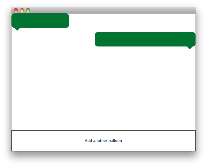
インターフェイスは主に2つの部分から構成されています。テキスト バルーンを含むスクロール可能な領域と、新しいバルーンを追加するためのコントロール ボタンです。
バルーン表示
ListModel {
    id: balloonModel
    ListElement {
        balloonWidth: 200
    }
    ListElement {
        balloonWidth: 120
    }
}

ListView {
    id: balloonView
    anchors.bottom: controls.top
    anchors.bottomMargin: 2
    anchors.top: parent.top
    delegate: TextBalloon {
        anchors.right: index % 2 !== 0 ? parent?.right : undefined
        height: 60
        rightAligned: index % 2 !== 0
        width: balloonWidth
    }
    model: balloonModel
    spacing: 5
    width: parent.width
}
balloonModel には、アプリケーション開始時に balloonView で表示される 2 つのタイプが含まれています。balloonView は、TextBalloon デリゲート アイテムを左揃えと右揃えの間で調整します。
コントロール
Rectangle {
    id: controls

    anchors.bottom: parent.bottom
    anchors.left: parent.left
    anchors.margins: 1
    anchors.right: parent.right
    border.width: 2
    color: "white"
    height: parent.height * 0.15

    Text {
        anchors.centerIn: parent
        text: qsTr("Add another balloon")
    }

    MouseArea {
        anchors.fill: parent
        hoverEnabled: true
        onClicked: {
            balloonModel.append({"balloonWidth": Math.floor(Math.random() * 200 + 100)})
            balloonView.positionViewAtIndex(balloonView.count -1, ListView.End)
        }
        onEntered: {
            parent.color = "#8ac953"
        }
        onExited: {
            parent.color = "white"
        }
    }
}
UIのコントロール部分には、MouseArea 、マウスカーソルを合わせると色が変わる矩形があります。このコントロールの'button'は、ランダムな幅でモデルの最後に新しいオブジェクトを追加します。
© 2026 The Qt Company Ltd. Documentation contributions included herein are the copyrights of their respective owners. The documentation provided herein is licensed under the terms of the GNU Free Documentation License version 1.3 as published by the Free Software Foundation. Qt and respective logos are trademarks of The Qt Company Ltd. in Finland and/or other countries worldwide. All other trademarks are property of their respective owners.
