QML上級者向けチュートリアル1 ゲームキャンバスとブロックの作成
アプリケーション画面の作成
最初のステップは、アプリケーションの基本的なQML項目を作成することです。
まずはじめに、このようなメイン画面を持つSame Gameアプリケーションを作成します:
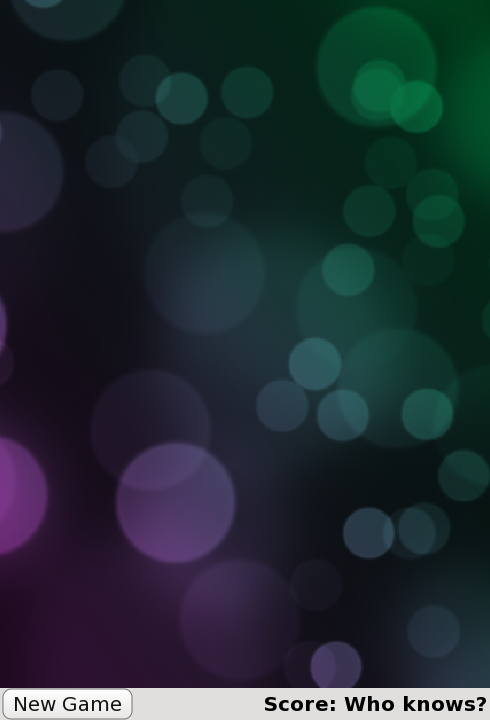
これはメインアプリケーションのファイル、samegame.qml で定義されます:
import QtQuick

Rectangle {
    id: screen

    width: 490; height: 720

    SystemPalette { id: activePalette }

    Item {
        width: parent.width
        anchors { top: parent.top; bottom: toolBar.top }

        Image {
            id: background
            anchors.fill: parent
            source: "pics/background.jpg"
            fillMode: Image.PreserveAspectCrop
        }
    }

    Rectangle {
        id: toolBar
        width: parent.width; height: 30
        color: activePalette.window
        anchors.bottom: screen.bottom

        Button {
            anchors { left: parent.left; verticalCenter: parent.verticalCenter }
            text: "New Game"
            onClicked: console.log("This doesn't do anything yet...")
        }

        Text {
            id: score
            anchors { right: parent.right; verticalCenter: parent.verticalCenter }
            text: "Score: Who knows?"
        }
    }
}
これで、ブロックのメインキャンバス、"New Game "ボタン、得点表示を含む基本的なゲームウィンドウができました。
ここで見慣れないかもしれませんが、SystemPalette という項目があります。これは Qt システムパレットにアクセスするためのもので、ボタンにネイティブなルック&フィールを与えるために使用されます。
Item,Button,Text タイプのアンカーは、読みやすくするためにグループ(ドット)表記を使っています。
Button とBlock コンポーネントの追加
上のコードのButton アイテムは、Button.qml という別のコンポーネント・ファイルで定義されています。機能的なボタンを作成するために、Rectangle の中にText とMouseArea という QML タイプを使います。以下はButton.qml のコードです:
import QtQuick

Rectangle {
    id: container

    property string text: "Button"

    signal clicked

    width: buttonLabel.width + 20; height: buttonLabel.height + 5
    border { width: 1; color: Qt.darker(activePalette.button) }
    antialiasing: true
    radius: 8

    // color the button with a gradient
    gradient: Gradient {
        GradientStop {
            position: 0.0
            color: {
                if (mouseArea.pressed)
                    return activePalette.dark
                else
                    return activePalette.light
            }
        }
        GradientStop { position: 1.0; color: activePalette.button }
    }

    MouseArea {
        id: mouseArea
        anchors.fill: parent
        onClicked: container.clicked();
    }

    Text {
        id: buttonLabel
        anchors.centerIn: container
        color: activePalette.buttonText
        text: container.text
    }
}
これは基本的に、テキストを含み、クリックできる矩形を定義します。MouseArea にはonClicked() ハンドラがあり、クリックされたときにcontainer のclicked() シグナルを出すように実装されています。
Same Gameでは、ゲームが始まると画面は小さなブロックで埋め尽くされる。各ブロックは画像を含む単なるアイテムである。ブロックのコードは別のBlock.qml :
import QtQuick

Item {
    id: block

    Image {
        id: img
        anchors.fill: parent
        source: "pics/redStone.png"
    }
}
現時点では、ブロックは何もせず、ただの画像です。チュートリアルが進むにつれて、ブロックにアニメーションをつけたり、ビヘイビアを与えたりしていきます。ブロックを作成するコードはまだ追加していません。
anchors.fill: parent を使って、画像を親Itemのサイズに設定しています。これは、チュートリアルの後半でブロックアイテムを動的に作成してサイズを変更するときに、画像が自動的に正しいサイズに拡大縮小されることを意味します。
Image タイプのsource プロパティの相対パスに注目してください。このパスは、Image タイプを含むファイルの場所からの相対パスです。別の方法として、Imageソースに絶対ファイルパスまたは画像を含むURLを設定することもできます。
ここまでのコードには慣れているはずです。まずは、基本的な型をいくつか作成しました。次に、ゲームキャンバスにブロックを配置します。
© 2026 The Qt Company Ltd. Documentation contributions included herein are the copyrights of their respective owners. The documentation provided herein is licensed under the terms of the GNU Free Documentation License version 1.3 as published by the Free Software Foundation. Qt and respective logos are trademarks of The Qt Company Ltd. in Finland and/or other countries worldwide. All other trademarks are property of their respective owners.
