
QML を使用したチャートビューのカスタマイズ
注:これは 「Charts with QML Gallery」サンプルの一部です。
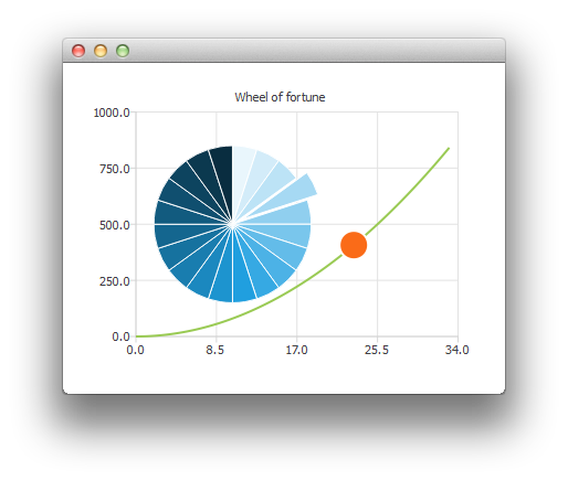
ここでは、円グラフのシリーズをカスタマイズして、運命の輪を作成する方法をご紹介します。
まず、ChartView といくつかのシリーズを作成します。
ChartView {
    id: chartView
    anchors.fill: parent
    title: "Wheel of Fortune"
    legend.visible: false
    antialiasing: true

    PieSeries {
        id: wheelOfFortune
        horizontalPosition: 0.3
    }

    SplineSeries {
        id: splineSeries
    }

    ScatterSeries {
        id: scatterSeries
    }
}
アプリケーションデータは、メインの矩形の Component.onCompleted 内で生成されます。
Component.onCompleted: {
    __intervalCoefficient = Math.random() + 0.25;

    for (var i = 0; i < 20; i++)
        wheelOfFortune.append("", 1);

    var interval = 1;
    for (var j = 0; interval < 800; j++) {
        interval = __intervalCoefficient * j * j;
        splineSeries.append(j, interval);
    }
    chartView.axisX(scatterSeries).max = j;
    chartView.axisY(scatterSeries).max = 1000;
}
以下のカスタマイズは、タイマーを使用して繰り返し実行されます。一度に1つの円グラフのスライスを強調表示するために、そのexplodedプロパティを変更します:
wheelOfFortune.at(index).exploded = false;
root.__activeIndex++;
index = root.__activeIndex % wheelOfFortune.count;
wheelOfFortune.at(index).exploded = true;
次に、データポイントが1つの散布図シリーズを使用したアニメーションを実行します:
scatterSeries.clear();
scatterSeries.append(root.__activeIndex, interval);
scatterSeries.color = Qt.tint(scatterSeries.color, "#05FF0000");
scatterSeries.markerSize += 0.5;
ルーレットが停止したら、アクティブなスライスの色を変更して点滅させます。
// Switch the colors of the slice and the border
wheelOfFortune.at(index).borderWidth = 2;
switchColor = wheelOfFortune.at(index).borderColor;
wheelOfFortune.at(index).borderColor = wheelOfFortune.at(index).color;
wheelOfFortune.at(index).color = switchColor;
© 2026 The Qt Company Ltd. Documentation contributions included herein are the copyrights of their respective owners. The documentation provided herein is licensed under the terms of the GNU Free Documentation License version 1.3 as published by the Free Software Foundation. Qt and respective logos are trademarks of The Qt Company Ltd. in Finland and/or other countries worldwide. All other trademarks are property of their respective owners.
