
ファイルシステムエクスプローラー
カスタマイズされたQt Quick コントロールを利用して、ファイルシステム上のテキストファイルを表示するデスクトップ向けQMLアプリです。
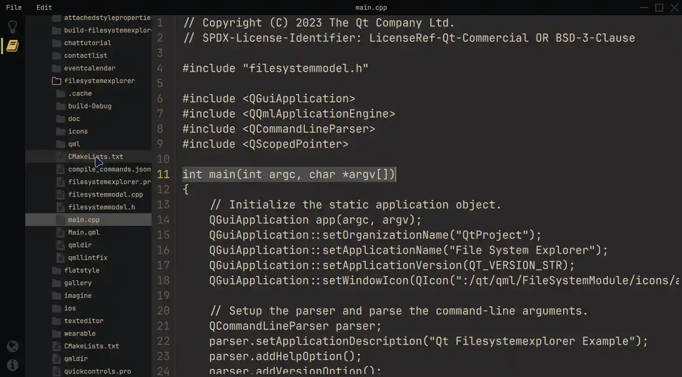
「ファイルシステムエクスプローラー」のサンプルでは、3つの主要なコンポーネントで構成されるモダンなレイアウトを採用しています。左側のアイコンベースのサイドバー、QFileSystemModel からファイルシステムを表示するサイズ変更可能なTreeView 、そして選択されたテキストファイルを表示するTextArea です。 カスタマイズされたクイックコントロールと、特殊なウィンドウ装飾が施されたフレームレスウィンドウにより、すべてのオペレーティングシステムで統一されたルックアンドフィールが確保されています。コマンドラインからこのアプリケーションを起動する際、初期ディレクトリをパラメータとして指定できます。この初期ディレクトリは、TreeView によってディレクトリ構造を表示するための開始点を設定するために使用されます。
例の動作
サンプルは次の手順で実行できます:
- Qt Creator
Welcome モードを開き、Examples からサンプルを選択します。詳細については、Qt Creator の「チュートリアル:ビルドと実行」を参照してください。
- Qt Extension for Visual Studio Code
Command Palette から `Qt: Open Qt examples ` コマンドを実行し、リストからサンプルを選択します。詳細については、Qt Extension for Visual Studio Code の「チュートリアル: ビルドと実行」を参照してください。
最新のレイアウトと構造
まず、この例では、シングルトンの QML オブジェクト全体で色を指定しています。これは、アプリケーションの外観を構造的に制御するためです。
pragma Singleton

QtObject {
    readonly property color background: "#292828"
    readonly property color surface1: "#171819"
    readonly property color surface2: "#090A0C"
    readonly property color text: "#D4BE98"
    readonly property color textFile: "#E1D2B7"
    readonly property color disabledText: "#2C313A"
    readonly property color selection: "#4B4A4A"
    readonly property color active: "#292828"
    readonly property color inactive: "#383737"
    readonly property color folder: "#383737"
    readonly property color icon: "#383737"
    readonly property color iconIndicator: "#D5B35D"
    readonly property color color1: "#A7B464"
    readonly property color color2: "#D3869B"
}このサンプルでは、ApplicationWindow 内のFramelessWindowHint フラグを使用して、オペレーティングシステムのウィンドウ装飾に依存するのではなく、カスタマイズされた装飾を作成しています。ウィンドウとの同等のインタラクションを実現するため、このサンプルでは、カスタマイズされたMenuBar のcontentItem プロパティをオーバーライドし、情報テキストや、アプリケーションのドラッグや終了といった操作方法を表示しています。インラインコンポーネントを使用することで、このプロセスが簡素化されます。
            component InteractionButton: Rectangle {
                id: interactionButton

                signal action()
                property alias hovered: hoverHandler.hovered

                Layout.fillHeight: true
                Layout.preferredWidth: height

                color: hovered ? Colors.background : "transparent"
                HoverHandler {
                    id: hoverHandler
                }
                TapHandler {
                    id: tapHandler
                    onTapped: interactionButton.action()
                }
            }

            InteractionButton {
                id: minimize

                onAction: root.dragWindow.showMinimized()
                Rectangle {
                    anchors.centerIn: parent
                    color: parent.hovered ? Colors.iconIndicator : Colors.icon
                    height: 2
                    width: parent.height - 14
                }
            }

            InteractionButton {
                id: maximize
...左側のサイドバーには、上部にチェック可能なナビゲーションボタン、下部にワンショットボタンが含まれています。ButtonGroup とコンテナを使用することで、いつでも1つのエントリのみがアクティブになるようにしています。これにより、現在の位置に対するプロパティエイリアスとStackLayout を組み合わせることで、異なるビューを提供することが可能になります。
この手法により、StackLayout 内に別のボタンとそれに対応する要素を追加することで、機能を拡張することができます。
                StackLayout {
                    anchors.fill: parent
                    currentIndex: sidebar.currentTabIndex

                    // Shows the help text.
                    Text {
                        text: qsTr("This example shows how to use and visualize the file system.\n\n"
                                 + "Customized Qt Quick Components have been used to achieve this look.\n\n"
                                 + "You can edit the files but they won't be changed on the file system.\n\n"
                                 + "Click on the folder icon to the left to get started.")
                        wrapMode: TextArea.Wrap
                        color: Colors.text
                    }

                    // Shows the files on the file system.
                    FileSystemView {
                        id: fileSystemView
                        color: Colors.surface1
                        onFileClicked: path => root.currentFilePath = path
                    }
                }
StackLayout には、いくつかの説明テキストの他に、FileSystemViewが含まれています。このカスタムコンポーネントはファイルやフォルダを表示し、C++モデルからのデータでその内容を埋めます。これにより、ファイルを選択して、それに応じて読み込むことが可能になります。
QString FileSystemModel::readFile(const QString &filePath)
{
    // Don't issue errors for an empty path, as the initial binding
    // will result in an empty path, and that's OK.
    if (filePath.isEmpty())
        return {};

    QFile file(filePath);

    if (file.size() >= 2'000'000)
        return tr("File size is too big.\nYou can read files up to %1 MB.").arg(2);

    static const QMimeDatabase db;
    const QMimeType mime = db.mimeTypeForFile(QFileInfo(file));

    // Check if the mimetype is supported and return the content.
    const auto mimeTypesForFile = mime.parentMimeTypes();
    for (const auto &m : mimeTypesForFile) {
        if (m.contains("text", Qt::CaseInsensitive)
                || mime.comment().contains("text", Qt::CaseInsensitive)) {
            if (!file.open(QIODevice::ReadOnly | QIODevice::Text))
                return tr("Error opening the File!");

            QTextStream stream(&file);
            return stream.readAll();
        }
    }
    return tr("Filetype not supported!");
}
TreeView 内のフォルダを右クリックすると、Menu というポップアップが開き、TreeView のrootIndex プロパティを制御できるようになります。
            MyMenu {
                id: contextMenu
                Action {
                    text: qsTr("Set as root index")
                    onTriggered: {
                        fileSystemTreeView.rootIndex = fileSystemTreeView.index(treeDelegate.row, 0)
                    }
                }
                Action {
                    text: qsTr("Reset root index")
                    onTriggered: fileSystemTreeView.rootIndex = undefined
                }
            }
        }
SplitView これにより、StackLayout とエディタの間でスペースを動的に共有できます。エディタには、開いているファイルを表示し、テキストファイルを編集するために必要なすべての機能を提供するTextArea が含まれています。さらに、エディタには行番号が表示され、これはMenu でオン/オフを切り替えることができます。
            Editor {
                id: editor
                showLineNumbers: root.showLineNumbers
                currentFilePath: root.currentFilePath
                SplitView.fillWidth: true
                SplitView.fillHeight: true
            }
カスタムコンポーネント
カスタマイズプロセスをより深く理解するには、まず「コントロールのカスタマイズ」の記事を参照してください。この例では、再利用可能なカスタマイズ済みコンポーネントを使用しています。
たとえば、MyMenu コンポーネントは、Menuのbackground プロパティ、そのデリゲートのcontentItem 、およびbackground プロパティをカスタマイズします。
// Copyright (C) 2023 The Qt Company Ltd.
// SPDX-License-Identifier: LicenseRef-Qt-Commercial OR BSD-3-Clause

import QtQuick
import QtQuick.Controls.Basic
import FileSystemModule

Menu {
    id: root

    delegate: MenuItem {
        id: menuItem
        contentItem: Item {
            Text {
                anchors.verticalCenter: parent.verticalCenter
                anchors.left: parent.left
                anchors.leftMargin: 5

                text: menuItem.text
                color: enabled ? Colors.text : Colors.disabledText
            }
            Rectangle {
                id: indicator

                anchors.verticalCenter: parent.verticalCenter
                anchors.right: parent.right
                width: 6
                height: parent.height

                visible: menuItem.highlighted
                color: Colors.color2
            }
        }
        background: Rectangle {
            implicitWidth: 210
            implicitHeight: 35
            color: menuItem.highlighted ? Colors.active : "transparent"
        }
    }
    background: Rectangle {
        implicitWidth: 210
        implicitHeight: 35
        color: Colors.surface2
    }
}
もう 1 つの例として、FileSystemView 内のScrollIndicator のカスタマイズがあり、ここではカスタマイズされたアニメーションが使用されています。この例では、contentItem をオーバーライドしています。
        ScrollIndicator.vertical: ScrollIndicator {
            active: true
            implicitWidth: 15

            contentItem: Rectangle {
                implicitWidth: 6
                implicitHeight: 6

                color: Colors.color1
                opacity: fileSystemTreeView.movingVertically ? 0.5 : 0.0

                Behavior on opacity {
                    OpacityAnimator {
                        duration: 500
                    }
                }
            }
        }
Python版
この例の Python 版にご興味がある場合は、こちらからご覧いただけます。ここでは、Qt for Python の使用法を紹介し、これを使用して同じアプリケーションを作成する方法を示しています。
さらに、この例に追加機能を拡張する方法について、ステップバイステップで解説した詳細なチュートリアルも用意されています。このチュートリアルは、File System Explorerの既存の機能を基にさらに発展させていく方法を探求し、学びたい場合に役立ちます。
ソースファイル
関連項目: すべての Qt サンプルおよびQt Quick コントロールのサンプル。
© 2026 The Qt Company Ltd. Documentation contributions included herein are the copyrights of their respective owners. The documentation provided herein is licensed under the terms of the GNU Free Documentation License version 1.3 as published by the Free Software Foundation. Qt and respective logos are trademarks of The Qt Company Ltd. in Finland and/or other countries worldwide. All other trademarks are property of their respective owners.
