Qt Quick 例 - ビュー
これは、QMLのモデル・ビューの例を集めたものです。
Viewsは、モデルとビューの機能に関連する、小さなQMLの例を集めたものです。これらは、Qt Quick のビューを使って、モデルからデータを表示する方法を示しています。詳しくは、 Qt Quick のモデルとビューのページをご覧ください。
サンプルを実行する
からサンプルを実行するには Qt Creatorからサンプルを実行するには、Welcome モードを開き、Examples からサンプルを選択します。詳細については、Qt Creator:Tutorial を参照してください:ビルドと実行を参照してください。
GridViewとPathViewの使用
GridViewと PathViewは、ビューを表示するためのこれらのタイプの使い方を示します。
    GridView {
        anchors.fill: parent
        cellWidth: 100
        cellHeight: 100
        focus: true
        model: appModel

        highlight: Rectangle {
            width: 80
            height: 80
            color: "lightsteelblue"
        }

        delegate: Item {
            required property string icon
            required property string name
            required property int index

            width: 100
            height: 100

            Image {
                id: myIcon
                y: 20
                anchors.horizontalCenter: parent.horizontalCenter
                source: parent.icon
            }
            Text {
                anchors {
                    top: myIcon.bottom
                    horizontalCenter: parent.horizontalCenter
                }
                text: parent.name
            }
            MouseArea {
                anchors.fill: parent
                onClicked: parent.GridView.view.currentIndex = parent.index
            }
        }
    }
動的リストの使用
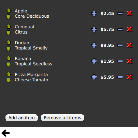
Dynamic Listは、ListView に対する実行時の追加と削除のアニメーションを示します。
ListView.onAdd シグナルハンドラは、新しいアイテムがビューに追加されたときにアニメーションを実行し、ListView.onRemove は、アイテムが削除されたときにアニメーションを実行します。
        Item {
            SequentialAnimation {
                id: addAnimation
                PropertyAction {
                    target: delegateItem
                    property: "height"
                    value: 0
                }
                NumberAnimation {
                    target: delegateItem
                    property: "height"
                    to: 80
                    duration: 250
                    easing.type: Easing.InOutQuad
                }
            }
            ListView.onAdd: addAnimation.start()

            SequentialAnimation {
                id: removeAnimation
                PropertyAction {
                    target: delegateItem
                    property: "ListView.delayRemove"
                    value: true
                }
                NumberAnimation {
                    target: delegateItem
                    property: "height"
                    to: 0
                    duration: 250
                    easing.type: Easing.InOutQuad
                }

                // Make sure delayRemove is set back to false so that the item can be destroyed
                PropertyAction {
                    target: delegateItem
                    property: "ListView.delayRemove"
                    value: false
                }
            }
            ListView.onRemove: removeAnimation.start()
        }
デリゲートの拡張
Expanding Delegatesは、アクティブになると拡張するデリゲートを示します。
複雑なデリゲートがあり、そのサイズと外観が変化し、ビュー内の他のアイテムの位置をずらすことができます。
        Item {
            id: recipe

            required property string title
            required property string picture
            required property string ingredients
            required property string method

            // Create a property to contain the visibility of the details.
            // We can bind multiple element's opacity to this one property,
            // rather than having a "PropertyChanges" line for each element we
            // want to fade.
            property real detailsOpacity : 0
            MouseArea {
                anchors.fill: parent
                onClicked: recipe.state = 'Details';
            }

            // Lay out the page: picture, title and ingredients at the top, and method at the
            // bottom.  Note that elements that should not be visible in the list
            // mode have their opacity set to recipe.detailsOpacity.

            Row {
                id: topLayout
                x: 10
                y: 10
                height: recipeImage.height
                width: parent.width
                spacing: 10

                Image {
                    id: recipeImage
                    width: 50
                    height: 50
                    source: recipe.picture
                }
            Item {
                id: details
                x: 10
                width: parent.width - 20

                anchors {
                    top: topLayout.bottom
                    topMargin: 10
                    bottom: parent.bottom
                    bottomMargin: 10
                }
                opacity: recipe.detailsOpacity
            }

            // A button to close the detailed view, i.e. set the state back to default ('').
            TextButton {
                y: 10
                anchors {
                    right: background.right
                    rightMargin: 10
                }
                opacity: recipe.detailsOpacity
                text: qsTr("Close")

                onClicked: recipe.state = '';
            }

            states: State {
                name: "Details"

                PropertyChanges {
                    background.color: "white"
                    recipeImage {
                         // Make picture bigger
                        width: 130
                        height: 130
                    }
                    recipe {
                        // Make details visible
                        detailsOpacity: 1
                        x: 0

                        // Fill the entire list area with the detailed view
                        height: listView.height
                    }
                }

                // Move the list so that this item is at the top.
                PropertyChanges {
                    recipe.ListView.view.contentY: recipe.y
                    explicit: true;
                }

                // Disallow flicking while we're in detailed view
                PropertyChanges {
                    recipe.ListView.view.interactive: false
                }
            }

            transitions: Transition {
                // Make the state changes smooth
                ParallelAnimation {
                    ColorAnimation {
                        property: "color"
                        duration: 500
                    }
                    NumberAnimation {
                        duration: 300
                        properties: "detailsOpacity,x,contentY,height,width"
                    }
                }
            }
        }
ハイライトの使用
Highlight は、ListView にカスタムハイライトを追加するデモです。
    // Define a highlight with customized movement between items.
    component HighlightBar : Rectangle {
        width: 200
        height: 50
        color: "#FFFF88"
        y: ListView.view.currentItem.y
        Behavior on y {
            SpringAnimation {
                spring: 2
                damping: 0.1
            }
        }
    }

    ListView {
        id: listView
        width: 200
        height: parent.height
        x: 30

        model: PetsModel { }
        delegate: PetDelegate { }
        focus: true

        // Set the highlight delegate. Note we must also set highlightFollowsCurrentItem
        // to false so the highlight delegate can control how the highlight is moved.
        highlight: HighlightBar { }
        highlightFollowsCurrentItem: false
    }
ハイライト範囲の使用
Highlight Ranges は、ListView の 3 つの異なるハイライト範囲モードを示します。
Rectangle {
    id: root
    property int current: 0
    property bool increasing: true
    // Example index automation for convenience, disabled on click or tap
    SequentialAnimation {
        id: anim
        loops: -1
        running: true
        ScriptAction {
            script: if (root.increasing) {
                        root.current++;
                        if (root.current >= aModel.count -1) {
                            root.current = aModel.count - 1;
                            root.increasing = !root.increasing;
                        }
                    } else {
                        root.current--;
                        if (root.current <= 0) {
                            root.current = 0;
                            root.increasing = !root.increasing;
                        }
                    }
        }

        PauseAnimation {
            duration: 500
        }
    }
    ListView {
        id: list1
        height: 50
        width: parent.width
        model: PetsModel {
            id: aModel
        }
        delegate: petDelegate
        orientation: ListView.Horizontal
        highlight: Rectangle {
            color: "lightsteelblue"
        }
        currentIndex: root.current
        onCurrentIndexChanged: root.current = currentIndex
        focus: true
    }

    ListView {
        id: list2
        y: 160
        height: 50
        width: parent.width
        model: PetsModel { }
        delegate: petDelegate
        orientation: ListView.Horizontal
        highlight: Rectangle {
            color: "yellow"
        }
        currentIndex: root.current
        preferredHighlightBegin: 80
        preferredHighlightEnd: 220
        highlightRangeMode: ListView.ApplyRange
    }

    ListView {
        id: list3
        y: 320
        height: 50
        width: parent.width
        model: PetsModel {}
        delegate: petDelegate
        orientation: ListView.Horizontal
        highlight: Rectangle { color: "yellow" }
        currentIndex: root.current
        onCurrentIndexChanged: root.current = currentIndex
        preferredHighlightBegin: 125
        preferredHighlightEnd: 125
        highlightRangeMode: ListView.StrictlyEnforceRange
    }
}
セクションの使用
セクションは、ListView で利用可能なさまざまなセクションヘッダーとフッターを示します。
    // The delegate for each section header
    Component {
        id: sectionHeading
        Rectangle {
            width: ListView.view.width
            height: childrenRect.height
            color: "lightsteelblue"

            required property string section

            Text {
                text: parent.section
                font.bold: true
                font.pixelSize: 20
            }
        }
    }

    ListView {
        id: view
        anchors.top: parent.top
        anchors.bottom: buttonBar.top
        width: parent.width
        model: animalsModel
        delegate: Text {
            required property string name

            text: name
            font.pixelSize: 18
        }

        section.property: "size"
        section.criteria: ViewSection.FullString
        section.delegate: sectionHeading
    }
パッケージの使用
PackagesはPackage タイプを使用して、2 つのビュー間でデリゲートを遷移させます。
これは、各ビューのデリゲート項目と、デリゲート間で転送できる項目を定義する Package オブジェクトを持っています。
Package {
    id: delegate

    required property int upTo
    required property int index
    required property string display

    Text {
        id: listDelegate
        width: parent.width
        height: 25
        text: 'Empty'
        Package.name: 'list'
    }

    Text {
        id: gridDelegate
        width: parent.width / 2
        height: 50
        text: 'Empty'
        Package.name: 'grid'
    }

    Rectangle {
        id: wrapper
        width: parent?.width ?? 0
        height: 25
        color: 'lightsteelblue'

        Text {
            text: delegate.display
            anchors.centerIn: parent
        }
        state: delegate.upTo > delegate.index ? 'inGrid' : 'inList'
        states: [
            State {
                name: 'inList'
                ParentChange {
                    target: wrapper
                    parent: listDelegate
                }
            },
            State {
                name: 'inGrid'
                ParentChange {
                    target: wrapper
                    parent: gridDelegate
                    x: 0
                    y: 0
                    width: gridDelegate.width
                    height: gridDelegate.height
                }
            }
        ]

        transitions: [
            Transition {
                ParentAnimation {
                    NumberAnimation {
                        properties: 'x,y,width,height'
                        duration: 300
                    }
                }
            }
        ]
    }
}
DelegateModel により、個々のビューは共有されたパッケージのデリゲートから特定のアイテムにアクセスすることができます。
DelegateModel {
    id: visualModel
    delegate: Delegate {
        upTo: root.upTo
    }
    model: myModel
}

ListView {
    id: lv
    height: parent.height / 2
    width: parent.width

    model: visualModel.parts.list
}
GridView {
    y: parent.height / 2
    height: parent.height / 2
    width: parent.width
    cellWidth: width / 2
    cellHeight: 50
    model: visualModel.parts.grid
}
Draggable Selectionsは、アイテムビュー内でドラッグ&ドロップするために、複数の選択されたデリゲートをグループ化するパッケージの使用を示しています。
        Package {
            id: packageRoot

            required property var modelData

            MouseArea {
                id: visibleContainer
                Package.name: "visible"

                width: 64
                height: 64
                enabled: packageRoot.DelegateModel.inSelected

                drag.target: draggable

                Item {
                    id: draggable

                    Drag.active: visibleContainer.drag.active
ObjectModel の使用
ObjectModelは、ListModel の代わりにObjectModel をモデルに使用します。
    ObjectModel {
        id: itemModel

        Rectangle {
            width: view.width
            height: view.height
            color: "#FFFEF0"

            Text {
                anchors.centerIn: parent
                text: qsTr("Page 1")
                font.bold: true
            }

            Component.onDestruction: if (root.printDestruction) print("destroyed 1")
        }
        Rectangle {
            width: view.width
            height: view.height
            color: "#F0FFF7"

            Text {
                anchors.centerIn: parent
                text: qsTr("Page 2")
                font.bold: true
            }

            Component.onDestruction: if (root.printDestruction) print("destroyed 2")
        }
        Rectangle {
            width: view.width
            height: view.height
            color: "#F4F0FF"

            Text {
                anchors.centerIn: parent
                text: qsTr("Page 3")
                font.bold: true
            }

            Component.onDestruction: if (root.printDestruction) print("destroyed 3")
        }
    }

    ListView {
        id: view
        anchors {
            fill: parent
            bottomMargin: 30
        }
        model: itemModel
        preferredHighlightBegin: 0
        preferredHighlightEnd: 0
        highlightRangeMode: ListView.StrictlyEnforceRange
        orientation: ListView.Horizontal
        snapMode: ListView.SnapOneItem
        flickDeceleration: 2000
        cacheBuffer: 200
    }
表示マージンの使用
Display Marginsは、デリゲートを使用してアイテムを表示し、シンプルなヘッダーとフッターのコンポーネントを実装します。
© 2026 The Qt Company Ltd. Documentation contributions included herein are the copyrights of their respective owners. The documentation provided herein is licensed under the terms of the GNU Free Documentation License version 1.3 as published by the Free Software Foundation. Qt and respective logos are trademarks of The Qt Company Ltd. in Finland and/or other countries worldwide. All other trademarks are property of their respective owners.
