Login UI: States
Illustrates how to use states to create a second UI page.
Login UI: States is the third of the Qt Design Studio Login UI tutorials, which build on each other to illustrate how to create a simple UI with some basic UI components, such as pages, buttons, and entry fields.
This tutorial describes how to use states to add a second page to the UI. On the first page, users can enter a username and password to log in. On the second page, they can register as users if they do not already have an account.
Because the complete second page contains most of the same UI components as the login page, use states to show and hide UI components as necessary when a user selects the Create Account button.
The starting point for this tutorial is the completed Login UI: Positioning project. You can download the project here.
Additionally, you can download the completed project of this tutorial here.
Adding UI components
Add another entry field for verifying the password that the user enters to create an account. You are already familiar with the tasks in this section from the previous Login UI tutorials.
To preview the changes that you make, select the run dropdown menu from the top toolbar, and then select Live Preview, or select Alt+P.
To add the entry field needed on the second page to the Screen01 component:
- Double-click Screen01.ui.qml in Projects to open it in the 2D view.
- Drag an EntryField component from Components > My Components to fields in Navigator.
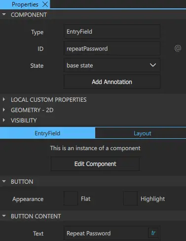
- Select the EntryField in Navigator to modify its ID and text in Properties.
- In Component > ID, enter repeatPassword.
- In EntryField > Button Content > Text, enter Repeat Password and select tr to mark the text translatable.
- Select File > Save or select Ctrl+S to save your changes.
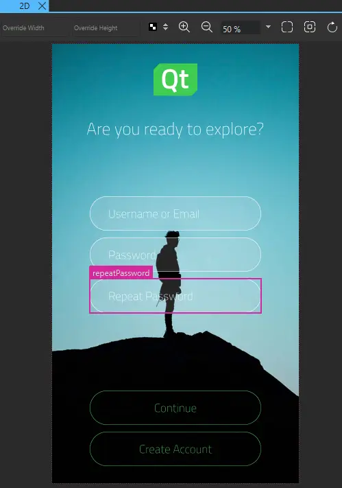
Screen01 should now look something like this in the 2D view:
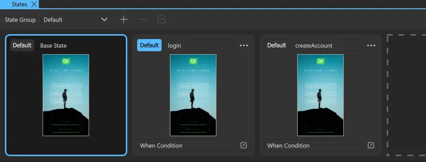
Next, add states for the login page and the account creation page, where you use the visibility property to hide the Repeat Password field on the login page and the Create Account button on the account creation page.
Using states to simulate page changes
Add states to the UI to show and hide UI components in the 2D view, depending on the current page:
- In the States view, select
 .
. - Enter login as the state name.
- Select repeatPassword in Navigator to display its properties in Properties.
- In the Visibility section, clear the Visible checkbox to hide the Repeat Password field in the login state.

- In States, select Default for login to determine that the login state is applied when the application starts.
- With the base state selected, add another state and name it createAccount. This state should now look identical to the base state.
- Select the createAccount button in Navigator to display its properties in Properties.
- In Visibility, clear the Visible checkbox to hide the Create Account button in the account creation state.
- Select File > Save or select Ctrl+S to save your changes.
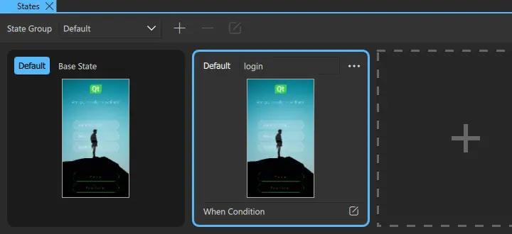
You can now see all the states in the States view:
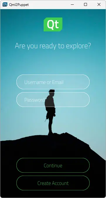
Live Preview displays the default state, login:
Next, create connections to specify that clicking the Create Account button on the login page triggers a transition to the account creation page.
Connecting buttons to states
Components have predefined signals that are emitted when users interact with the UI. The PushButton component contains a Mouse Area component that has a clicked signal. The signal is emitted whenever the mouse is clicked within the area.
Use the Connections view to connect the clicked signal of the createAccount button to createAccount state:
- Select View > Views > Connections to open the Connections view.
- Select createAccount in Navigator.
- In the Connections tab, select the button to open the connection setup options.
- Set Signal to
clicked, Action toChange State, State Group torectangle, and State tocreateAccountin the respective drop-down menus. - Select the
 button to close the connection setup options.
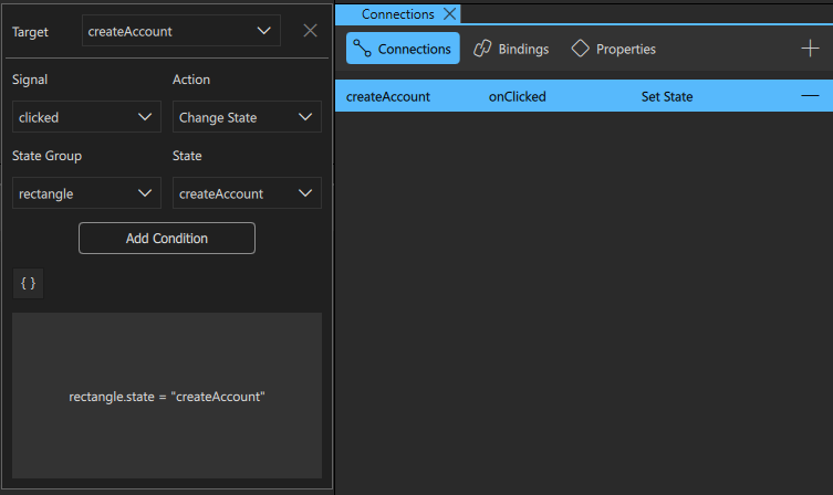
- Select File > Save or select Ctrl+S to save your changes.
Note: Alternatively, right-click the createAccount button in Navigator. Then select Connections > Add new Connection > clicked > Change State to createAccount.
In Live Preview, you can now select the Create Account button to go to the account creation page.
Next steps
To learn how to use a timeline to animate the transition between the login and account creation pages, see the next tutorial in the series, Login UI: Timeline.
Files:
See also Working with states and Signal and Handler Event System.
Available under certain Qt licenses.
Find out more.
