Scalable layouts
The position of a component in a UI is either absolute or relative to other components. The visual components exist at a particular location in the screen coordinate system at any instant in time. The x and y coordinates of a visual component are relative to those of its visual parent, with the top-left corner having the coordinate (0, 0).
If you are designing a static UI, manual positioning provides the most efficient form of positioning components. For a dynamic UI, use the following positioning methods:
| Action | Purpose |
|---|---|
| Setting bindings | To connect the properties of components. |
| Setting anchors and margins | To set the rules for attaching the component to other components. You can define the distance between the components and add margins on the components. |
| Aligning and distributing components | To align the unanchored components left, right, vertical, horizontal, top, and bottom with respect to each other. |
| Using positioners | To arrange components in rows, columns, grids, or flows. |
| Using layouts | To place the components in columns, grids, rows and stacks in layouts. The layouts adept the nature of dynamic and resizable UI. |
| Organizing components | To keep the components or controls collected with frames, groups, group boxes, pages, and panes. |
Setting bindings
Using Property Binding, you can connect the properties of components. So, change in one can affect another. Once the binding is set, the property value is automatically kept up to date if the other properties or data values change.
To set Property Binding to a component property:
- Go to the Properties view and select
 (Actions) menu next to a property, and then select Set Binding.
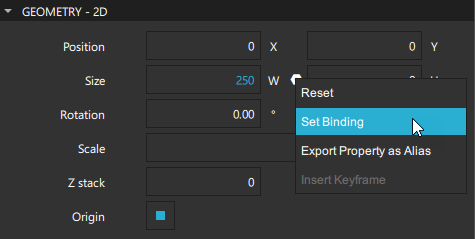
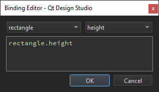
- In Binding Editor, select a component and a property from lists of available components and their properties.
When a binding is set, the Actions menu icon changes to  . To remove bindings, select Actions > Reset.
See Adding bindings between properties to learn how to set bindings using the Bindings tab in the Connections view.
Note: For better performance, set anchors and margins for binding components. For example, instead of setting parent.width for a component, anchor the component to its sibling components on the left and the right.
Setting anchors and margins
In an anchor-based layout, each component has a set of invisible anchor lines: top, bottom, left, right, fill, horizontal center, vertical center, and baseline. Use anchors to place a component either adjacent to or inside of another component by attaching one or more of the component's anchor lines to the anchor lines of the other component. If a component changes, the components that are anchored to it will adjust automatically to maintain the anchoring.
To set anchors and margins for components:
- Go to Properties > Layout > Anchors.
- Select the corresponding button for the anchor you want for the component. You can combine multiple anchors. For each selected button, you can choose the target component of that anchor from the corresponding dropdown.
- To apply fill anchors to a component, select
 (Fill to Parent).
 - To reset the anchors to their saved state, select
 (Reset Anchors).
For performance reasons, you can only anchor a component to its siblings or direct parent. By default, a component is anchored to its parent when you use the anchor buttons. To anchor to a sibling of the component, select the sibling component as Target.
Arbitrary anchoring is not supported. For example, don't select: anchor.left: parent.right. Select: anchor.left: parent.left. When you use the anchor buttons, anchors to the parent component are always set to the same side. However, anchors to sibling components are set to the opposite side: anchor.left: sibling.right. This allows you to keep sibling components together.
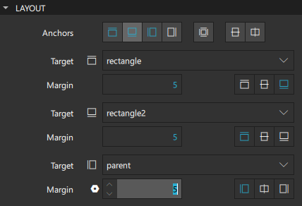
In the following image, the left edge of rectangle2 is anchored to the right edge of the sibling on its left side, rectangle1, while its top edge is anchored to the top of its parent.
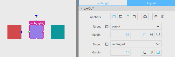
The anchors are set as follows in code:
Rectangle {
    id: rectangle2
    width: 84
    height: 84
    color: "#967de7"
    anchors.left: rectangle1.right
    anchors.top: parent.top
    anchors.leftMargin: 51
    anchors.topMargin: 56
}
To define the empty space outside of a component, set the Margin. Margins work for anchors. They do not take any effect when using layouts or absolute positioning.
Aligning and distributing components
For a group of components, select them to align and distribute them evenly. As the positions of the components are fixed, you cannot apply these functions to anchored components. For scalability, anchor the aligned and distributed components when your design is ready.
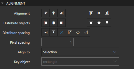
Select the buttons in the Alignment field to align the top/bottom or left/right edges of a group of components to the one farthest away from the center of the group. For example, when left-aligning, the components are aligned to the leftmost component. You can also align the horizontal/vertical centers of components, or both.
In the Align to field, select whether to align the components in respect to the selection, the root component, or a key component that you select in the Key object field. The key component must be a part of the selection.
Distribute either components or the spacing between them. If the components or spacing cannot be distributed to equal pixel values without ending up with half pixels, you receive a notification. Either allow Qt Design Studio to distribute components or spacing using the closest values possible or tweak your design so that the components and spacing is distributed perfectly.
When distributing components, select the buttons in the Distribute objects field to determine whether the distance between components is calculated from their top/bottom or left/right edges or their horizontal/vertical center.
When distributing spacing, select the buttons in the Distribute spacing field to determine whether it is distributed evenly within a target area or at specified distances, calculated from a starting point. Select the orientation in which the components are distributed evenly within the target area: horizontally along the x axis or vertically along the y axis.
Alternatively, distribute spacing in pixels by selecting one of the starting point buttons: top/left or bottom/right edge of the target area or item, or its center. The edge to use depends on whether the items are distributed horizontally or vertically:
- Select
 and
and  to use the left edge of the target area or item as the starting point.
 - Select and
 to use the top edge.
 - Select
 and to use the right edge.
 - Select and to use the bottom edge.
Note: Some components might end up outside the target area.
In the Pixel spacing field, set the space between components in pixels. To disable the distribution of spacing in pixels, select  button.
Using positioners
Positioner components are containers that manage the positions of their child components. For many use cases, the best positioner to use is a simple column, row, flow, or grid. Use the components available in Components > Default Components > Positioner to position the children of a component in these formations in the most efficient manner possible.
To position several components in a Column [Missing image column-positioner-icon-16px.png], Row [Missing image row-positioner-icon-16px.png], Grid [Missing image grid-positioner-icon-16px.png], or Flow [Missing image flow-positioner-icon-16px.png] :
- Select the components in the 2D view.
- Right-click anywhere in the 2D view and select Positioner > Row, Column, Grid or Flow Positioner.
Column positioner
A Column positions its child components along a single column. It is used as a convenient way to vertically position a series of components without using anchors.
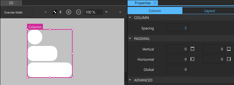
For all positioners, set the spacing between the child components in the Spacing field.
In addition, set the vertical and horizontal padding between content and the left, right, top, and bottom edges of components in the Padding section.
Row and the Flow positioners
A Row positions its child components along a single row. It is used as a convenient way to horizontally position a series of components without using anchors.
The Flow component positions its child components like words on a page, wrapping them to create rows or columns of components.
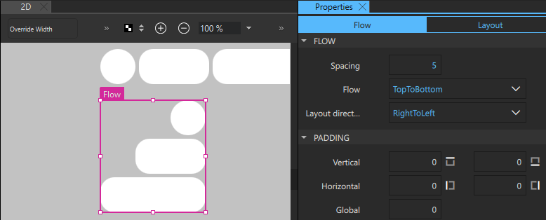
For flow and row positioners, also set the direction of a flow to either left-to-right or top-to-bottom in the Flow field. Components are positioned next to to each other according to the value you set in the Layout direction field until the width or height of the Flow component is exceeded, then wrapped to the next row or column.
Set the layout direction to either LeftToRight or RightToLeft in the Layout direction field. If the width of the row is explicitly set, the left anchor remains to the left of the row and the right anchor remains to the right of it.
Grid positioner
A Grid creates a grid of cells that is large enough to hold all of its child components, and places these components in the cells from left to right and top to bottom. Each component is positioned at the top-left corner of its cell with position (0, 0).
Qt Design Studio generates the grid based on the positions of the child components in the 2D view. You can modify the number of rows and columns in the Rows and Columns fields.
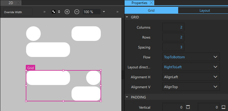
In addition to the flow and layout direction, you can set the horizontal and vertical alignment of grid components. By default, grid components are vertically aligned to the top. Horizontal alignment follows the value of the Layout direction field. For example, when layout direction is set to LeftToRight, the components are aligned on the left.
To mirror the layout, set the layout direction to RightToLeft. To also mirror the horizontal alignment of components, select AlignRight in the Alignment H field.
Using layouts
Use the components available in Components > Qt Quick Layouts to arrange components in UIs.
Unlike positioners, layouts manage both the positions and sizes of their child components, and are therefore well suited for dynamic and resizable UIs. However, do not select fixed positions and sizes for the child components in the Geometry - 2D section in Properties, unless their implicit sizes are not satisfactory.
Use anchors or the width and height properties of the layout itself to select its size in respect to its non-layout parent component. However, do not anchor the child components within layouts.
To put components in Grid Layout:
- Select all the components and right-click on one of them.
- From the context menu, select Layout > Grid Layout.
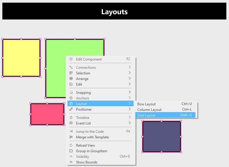
- After you assign them to Grid Layout, the components are arranged in rows and columns.
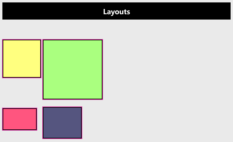
To make the components adept the width and height within the grid, follow these steps:
- Select a Rectangle component in the 2D view and go to Layout in the Properties view.
- In the Fill layout, select both the Width and Height checkboxes.
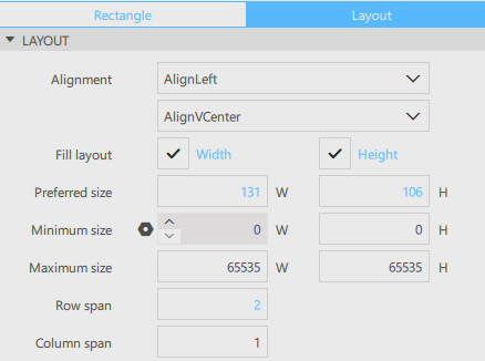
Note: Manipulate the Row span and the Column span to allow the components to take more row and column spaces within the Grid Layout.
- Repeat the previous steps for all the Rectangle components.
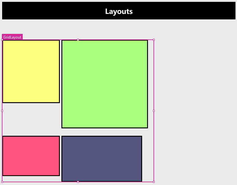
- Select Grid Layout in the Navigator view.
- Go to Geometry-2D in the Properties view. In Size, increase the Width and Height.
- All the Rectangle components follow the change accordingly.
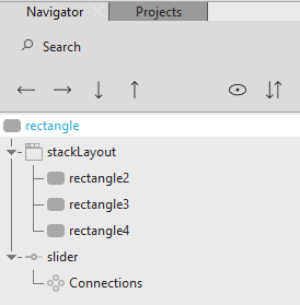
Stack Layout
To stack components on top of each other you can use Stack Layout.
To use Stack Layout:
- Drag the Stack Layout component to the 2D view or Navigator view.
- Drag the components you want to stack from the Components view to the 2D view or Navigator view, and place on the top of the Stack Layout component.
Note: Alternatively, you can add components to the Stack Layout by selecting the
 button next to the Stack Layout component name in the 2D view.
 - To move between components of Stack Layout, select the Stack Layout component in the 2D view. Then select the
 (Previous) and
  (Next) buttons. This updates the Current index of the Stack Layout and brings the Current index component on top of the stack.
Note: Alternatively, select the Stack Layout component, then go to the Properties view > Stack Layout, and update the Current index. The index starts from "0" (zero).
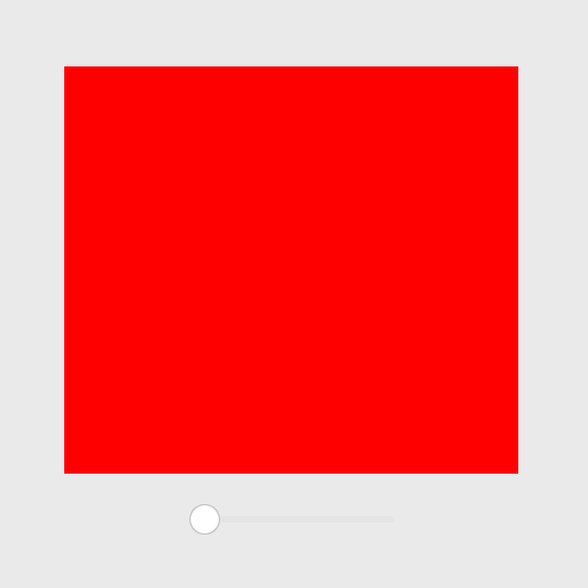
Follow the example below to understand how the Stack Layout works:
- Drag a Stack Layout from the Component view to the Navigator or 2D view.
- Drag three Rectangle components to the Stack Layout component in the Navigator view.
- Select a rectangle component and go to the Properties view > Rectangle > Fill color, and change it to "#ff0000".
- For the second rectangle, follow the previous process and change the Fill color to "0000ff".
- For the third rectangle, follow the previous process and change the Fill color to "00ff00".
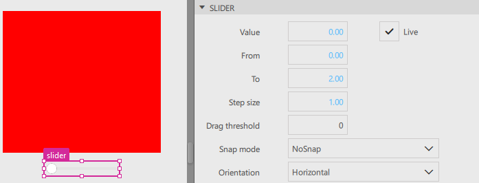
- Drag a Slider component from the Components view to the 2D view.
- Select the Slider component and go to the Properties view > Slider. Set the Value to "0", From to "0", To to "2", and Step size to "1".
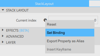
- Go to the Navigator view and select the Stack Layout component.
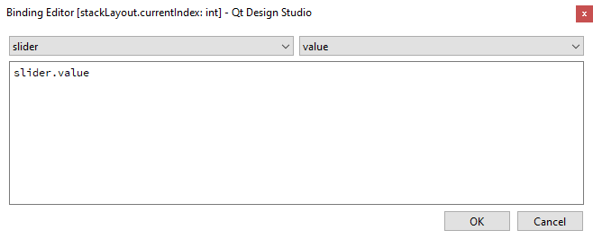
- Go to the Properties view > Stack Layout. Select to access the context menu, then select Set Binding.
- In the Binding Editor, in the left dropdown, select Slider; in the right dropdown, select Value. Select OK to accept the binding.
- Select Live Preview or Run Project to run the application.
- Drag the slider to change the color in the rectangle.
Organizing components
You can use the Frame and Group Box controls to draw frames around groups of controls.
If you don't want a frame, use the Group component instead.
The following table lists the UI controls that you can use to organize components in UIs (since Qt 5.7). The Location column indicates the location of the component in Components.
| Icon | Name | Location | Purpose |
|---|---|---|---|
 | Frame | Qt Quick Controls | A visual frame around a group of controls. |
 | Group | Qt Quick Studio Components | Enables handling the selected components as a group. |
 | Group Box | Qt Quick Controls | A titled visual frame around a group of controls. |
 | Page | Qt Quick Controls | A styled page control with support for a header and footer. |
 | Pane | Qt Quick Controls | A background that matches the application style and theme. |
Note:
To access Frame, Group Box, Pane, and Page controls, go to Components > Qt Quick Controls.
To access Group control, go to Components > Qt Quick Studio Components.
Available under certain Qt licenses.
Find out more.
